Jelle Maréchal and Kees Bakker were asked to redesign the visual identity for Belgian contemporary art museum M HKA. The project lasted more than a year from start to finish, and involved several presentations and design directions.
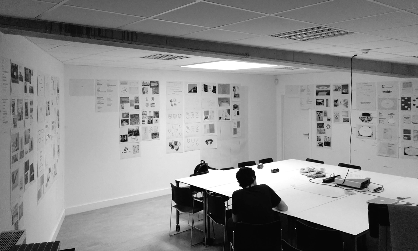
The images below reflect some of the materials developed, but are drafts only. The project got cancelled by the Board of Directors due to internal disagreement with the management of the museum regarding future plans for the museum. Unfortunate and frustrating, since the project was reaching its launch date and a lot of work had already been done.
We decided that the work is still worth showing, with the mention of it being drafts and non-finalized work.
We started the project by advising the museum to move away from the name M HKA (Museum van Hedendaagse Kunst Antwerpen). Over years the name proved impossible to pronounce and got misspelled externally and internally all the time. Instead we advised to write it as Muhka, as it is known and pronounced by the locals.
Radical. Playful. Dialogue. Contemporary. Window to the world.
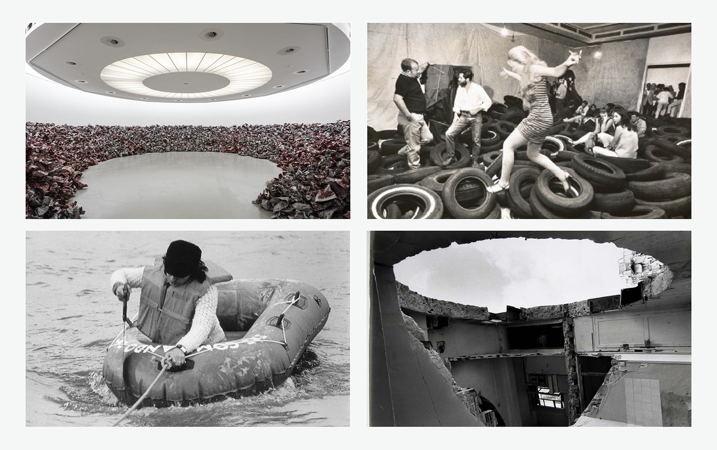
The museum has its origins, amongst others, in the Gordon Matta-Clark foundation. The spirit of this artist's work—his famous cut-outs, pictured above—were a big inspiration for the visual identity we developed. The idea of cutting a piece out of something and placing it somewhere else, in a different context, seemed like a relevant metaphor for the museum and art
in general.
in general.

In the visual system, we literally cut away part of the logo, leaving us with a "base-shape" and a "rest-shape". The oval shape could be considered "friendly" but behaves in a rather "radical" way, much like the museum itself. It also reminds of the iconic round galleries of the museum.
Both the base-shape and rest-shape were considered logo's. A primary and a secondary logo which "play" and interact together on a page, sequence or application. This radical and playful element reminds of the "Happening" art movement, which played a crucial part in the formative years of the museum, and continues to be a guiding principle in its programming and view on the art world.

Both the primary and secondary logo shape have specific properties, and will always appear together on an application. The shapes can function as a frame, content holder of playful graphic element.

Draft of extension of the visual identity system to the building signage.

Look-and-feel sketches showing how the visual identity could get an interactive personality.

Approved, but never finalized items for the museum's stationery.


Look-and-feel sketches showing how the visual identity could get an interactive personality.
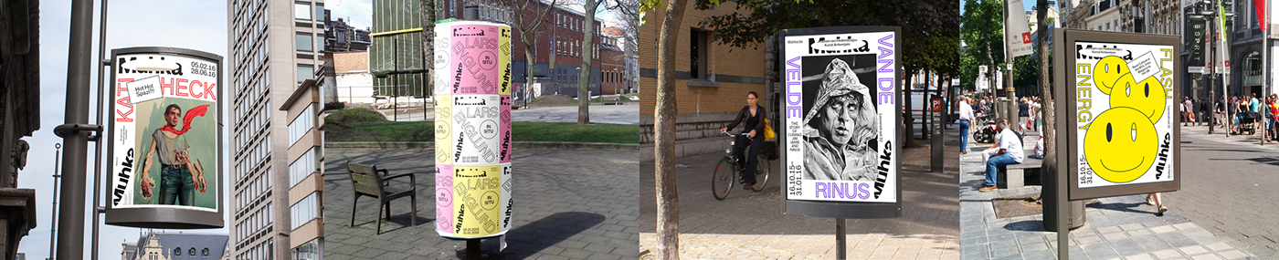
Drafts of exhibition posters.
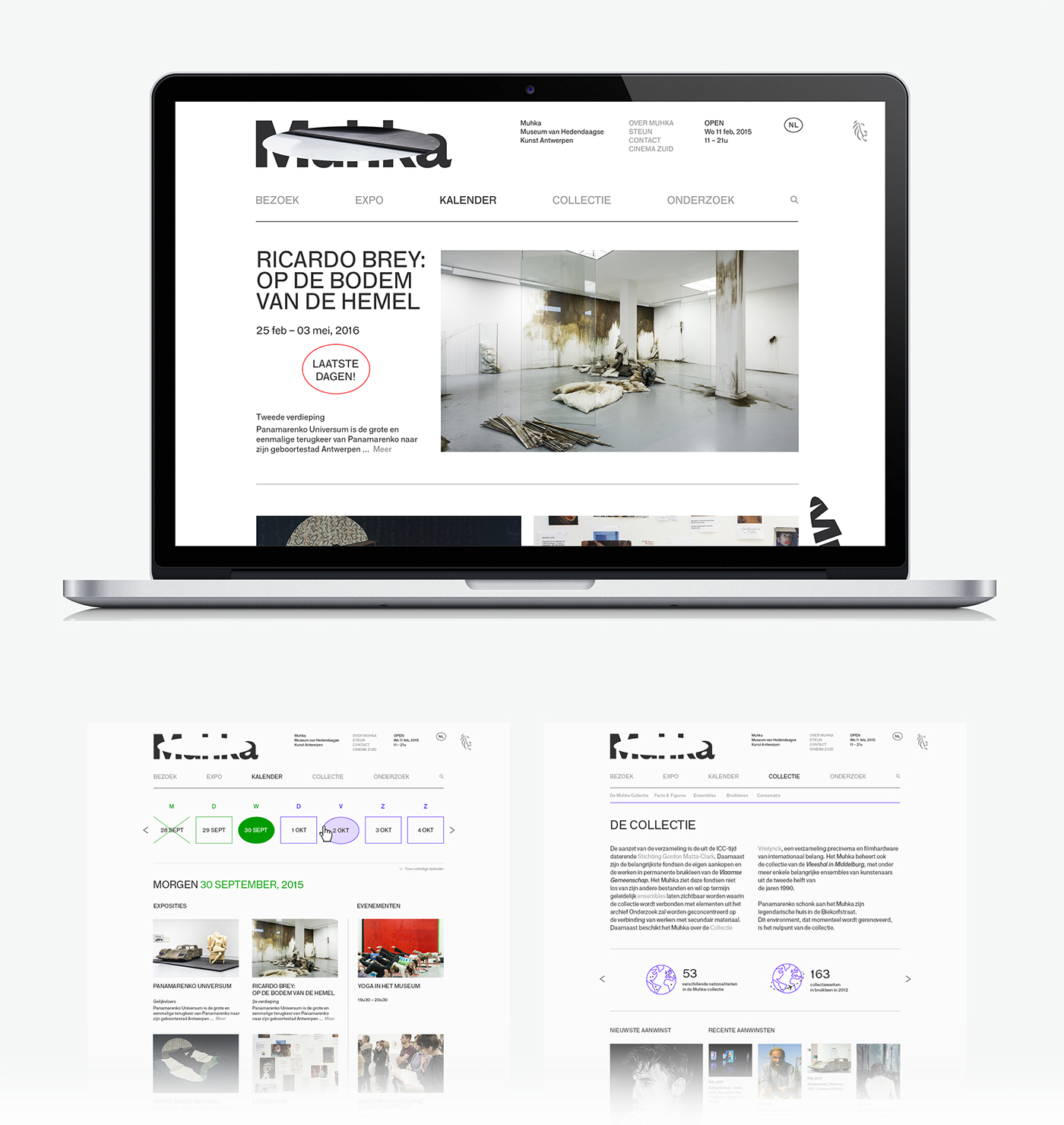
Selected pages for the website.