Console is a network interconnection platform – a community of Cloud service providers and enterprises, a global physical network and an automated network management tool all rolled into one. The technology and its traditional products and tools are complicated and intimidating. Console changes that: catering for humans rather than technology.
Incredibly capable, always friendly, simple to use and even a little fun


The graphic mark refers to the dual nature of the product: social network and physical network management tool.


A geometric typeface was chosen to emulate port symbols (o) and the markings on console dials and switches (c).


We chose green to reflect the capable, friendly nature of Console. It's also reminiscent of the LED lights in electronic equipment indicating everything is operating well. A limited colour palette is used to create a bold, striking and memorable brand.


Console takes lengthy, complex processes and makes them as simple as possible. It is important this be reflected in our tone of voice. With a work-smarter-not-harder attitude, our tone is fairly relaxed and friendly yet always to-the-point:
“what would a helpful human say?”.
“what would a helpful human say?”.


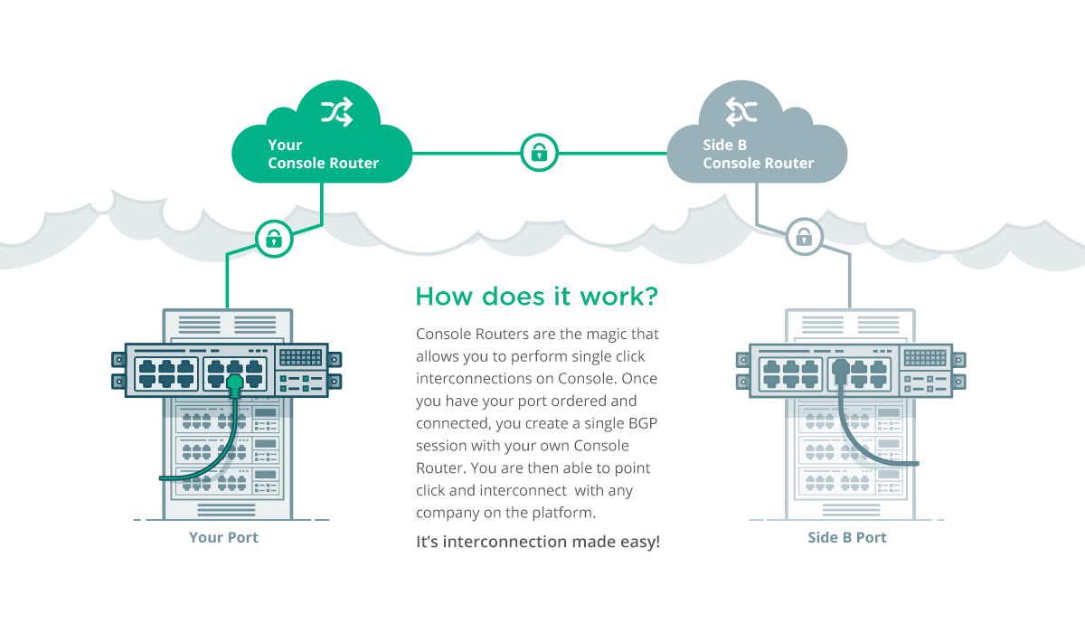
Our illustrations aim to re-assure our customers that when using Console, managing your network isn't complicated or intimidating.


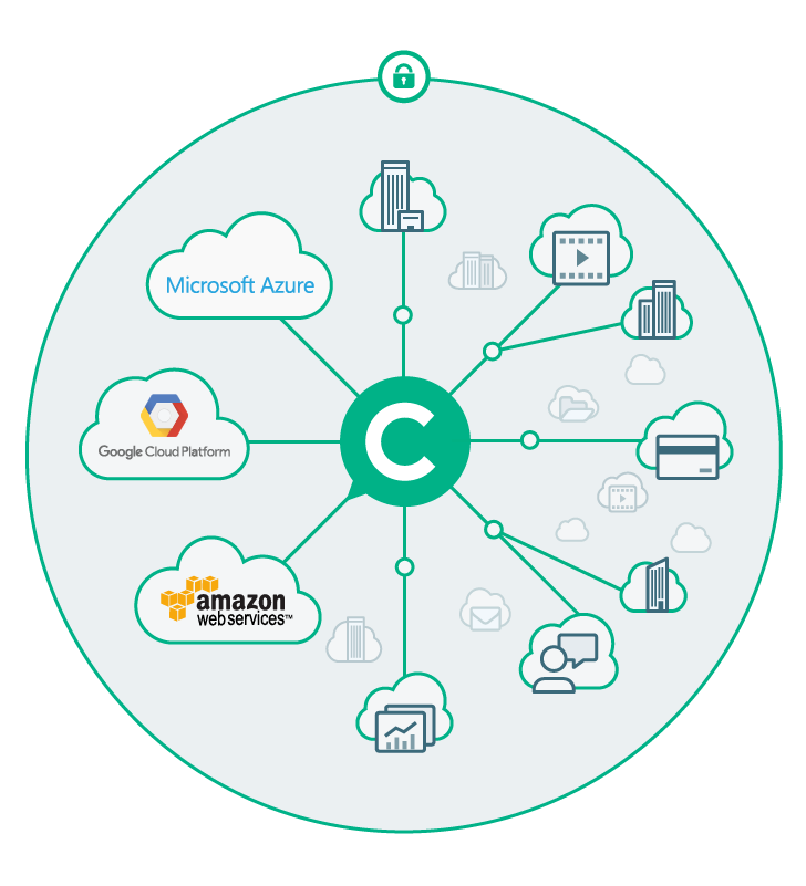


For background fills in items such as brochure covers and banners we use a graphic derived from the network visualisation used in the Console application. The central 'C' in the graphic links it to the Console logo.