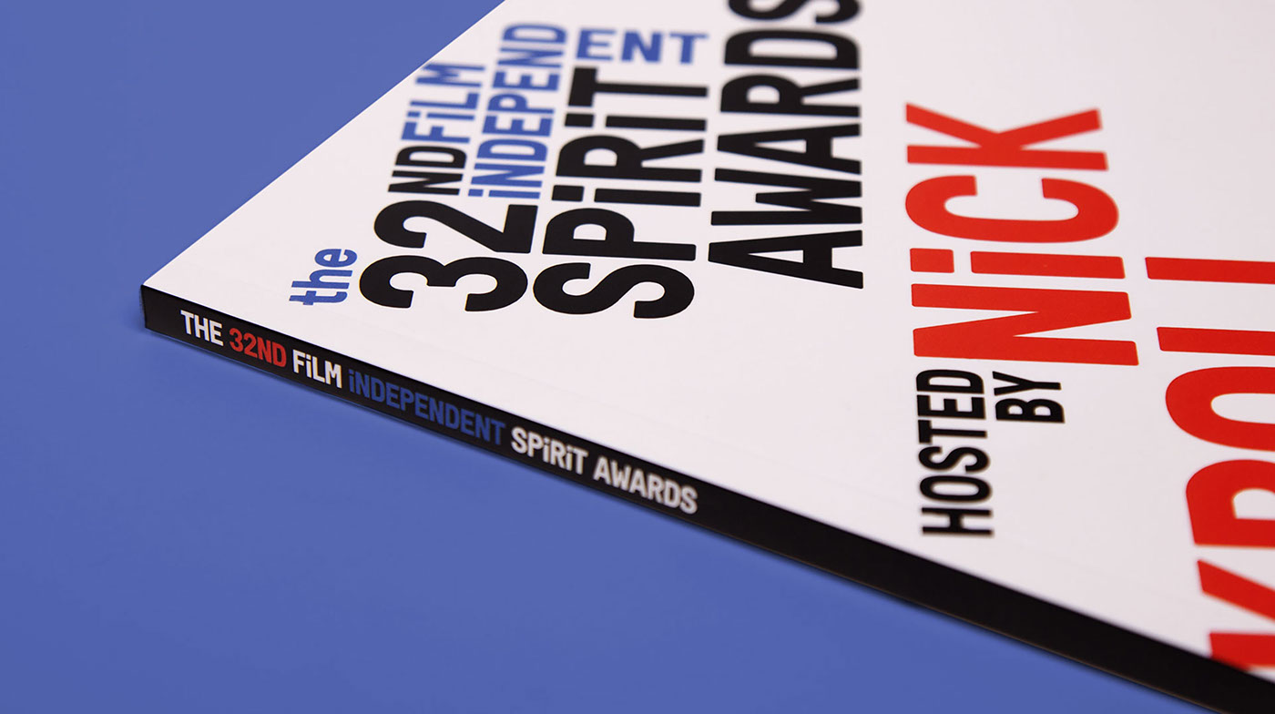
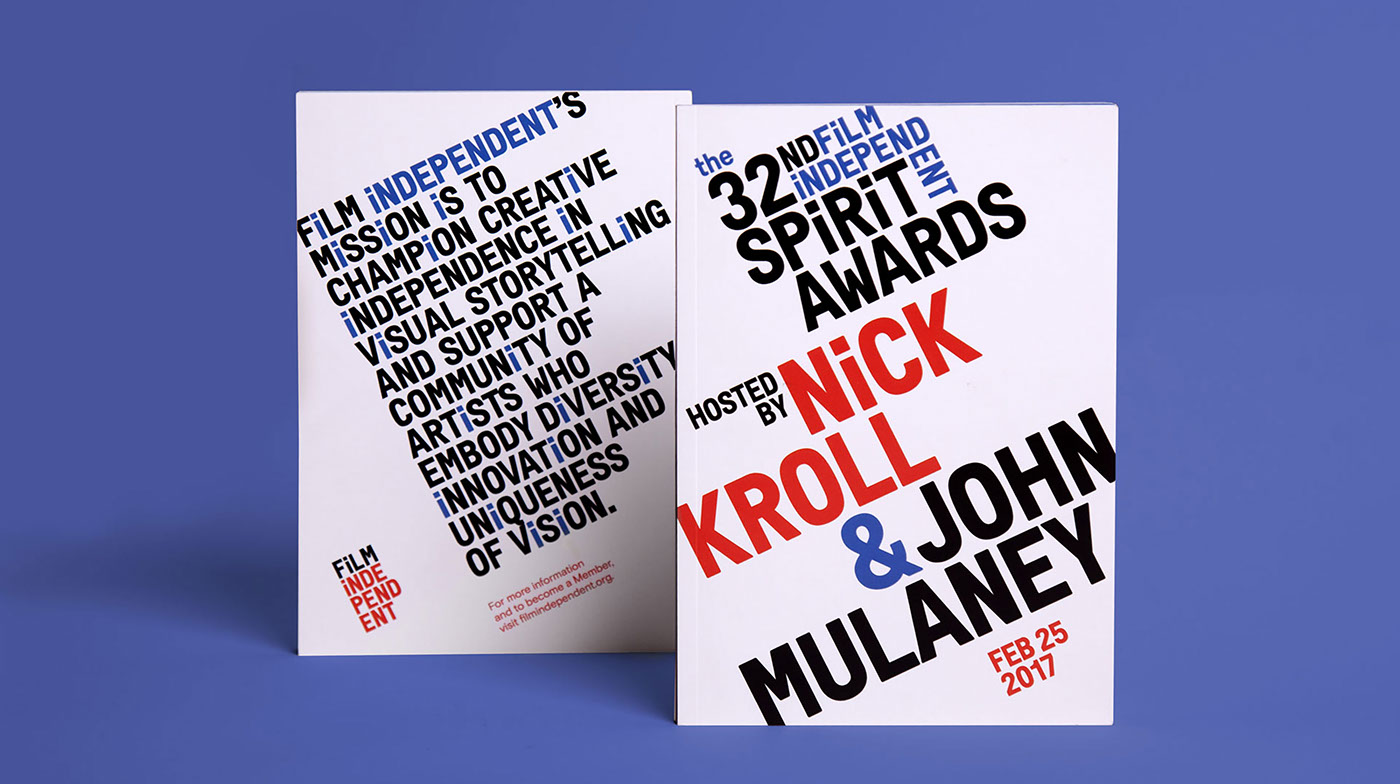
For the third year running, Pentagram has designed the show packaging and graphics for the Film Independent Spirit Awards, the annual ceremony that recognizes the best and brightest in independent film. The 2017 graphics build on the branding Pentagram created for Film Independent, the non-profit organization that produces the awards. This year, the typography literally pushes and pulls at the boundaries of the identity, reflecting the awards’ maverick approach.
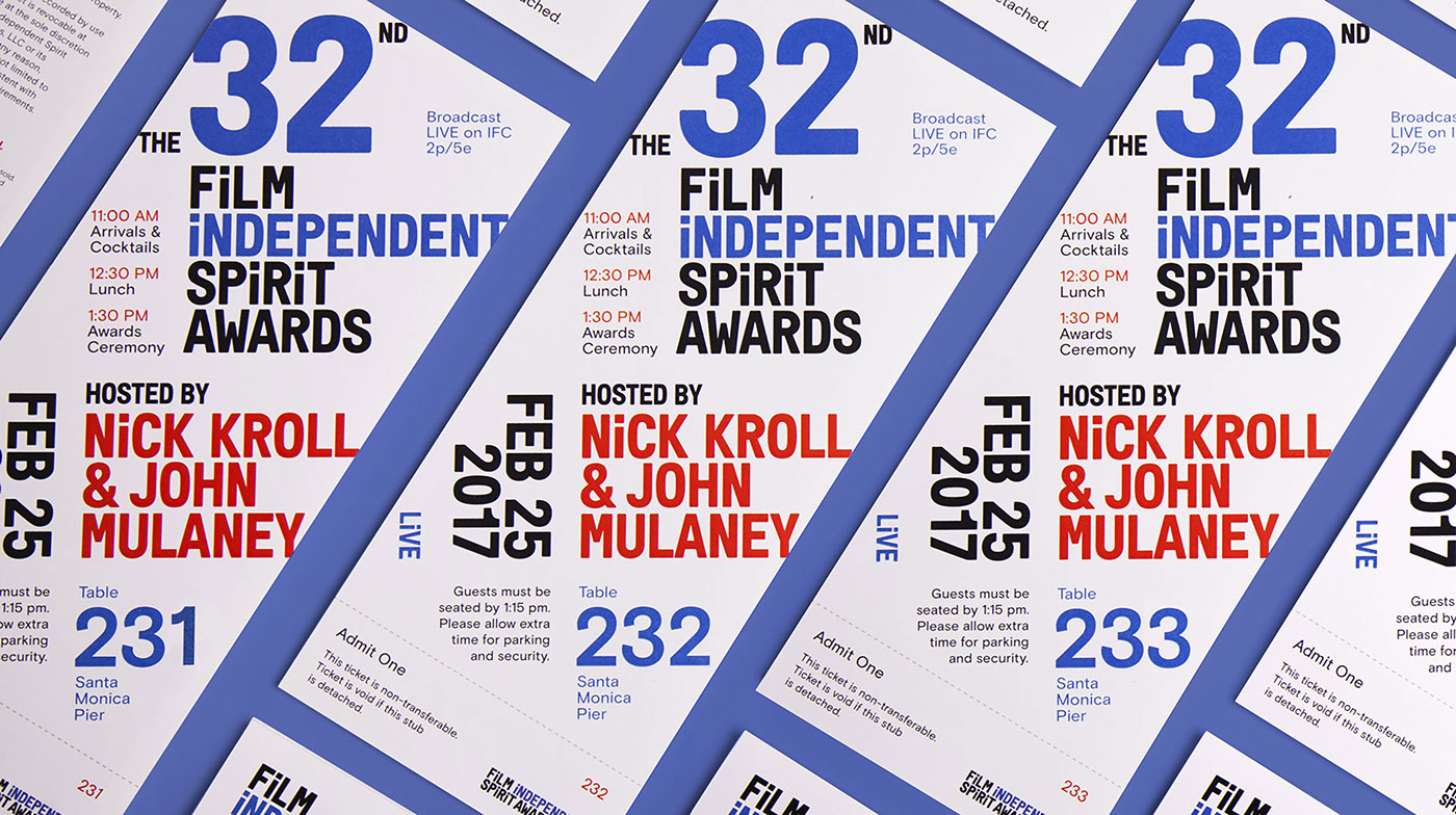
The Spirit Awards are held the day before the Academy Awards and presented in an oceanside tent in Santa Monica—all with a casual feel and a spirited vibe in contrast to the Oscars. This year’s festivities were emceed by the comedians Nick Kroll and John Mulaney, and the drama “Moonlight” dominated with six wins, including Best Feature. The Pentagram designers created all of the identity and show packaging for the ceremony, from the show’s title sequence, animations introducing each category, and other on-air graphics, to the promotional campaign, program and tickets.
The Spirit Awards are one of the many components that make up Film Independent, and the organization’s branding is used across all of its programming, which also include the LA Film Festival and the year-round Film Independent at LACMA series, as well as a host of annual screenings, educational events and artist development programs.
The Film Independent identity is a cohesive system that utilizes a distinctive custom typeface, Font Independent, which plays a starring role in the motion graphics for the Spirit Awards ceremony and broadcast. Like the master identity, the Spirit Awards graphics utilize stacked and shifting typography, with the words split, spliced and rearranged into multiple shapes, stacks and compositions, suggesting the way film is constantly in motion.
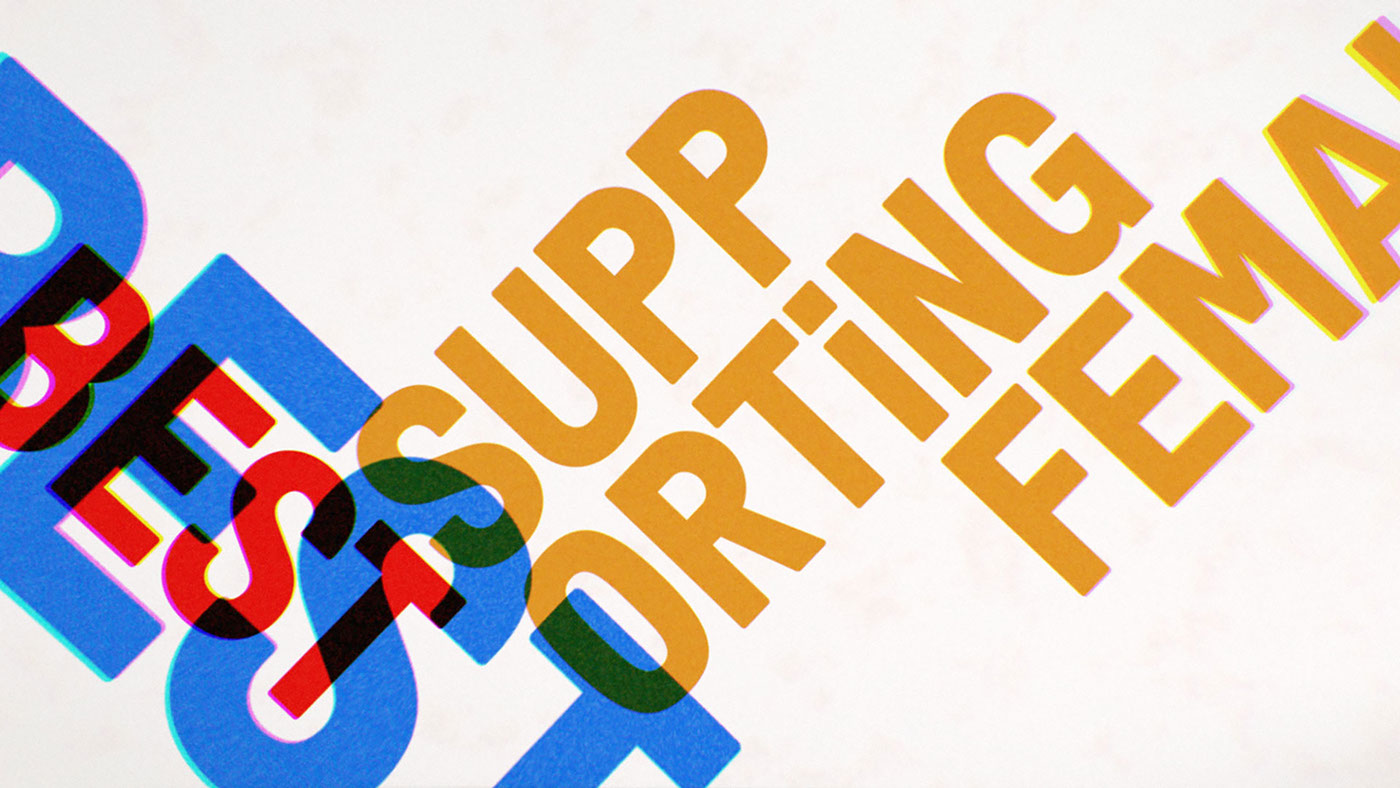
The 2017 custom logo is stacked in the signature look of the Film Independent identity, but in a Constructivist-inspired lockup that is all angles, reinforcing the Awards’ unorthodox point of view. The off-kilter arrangements are carried through typography in the category animations, printed materials and advertising campaign. The designers developed about 20 sequences that were used to introduce categories like Best Director, Best Female Lead, and Best Documentary Feature, for example.
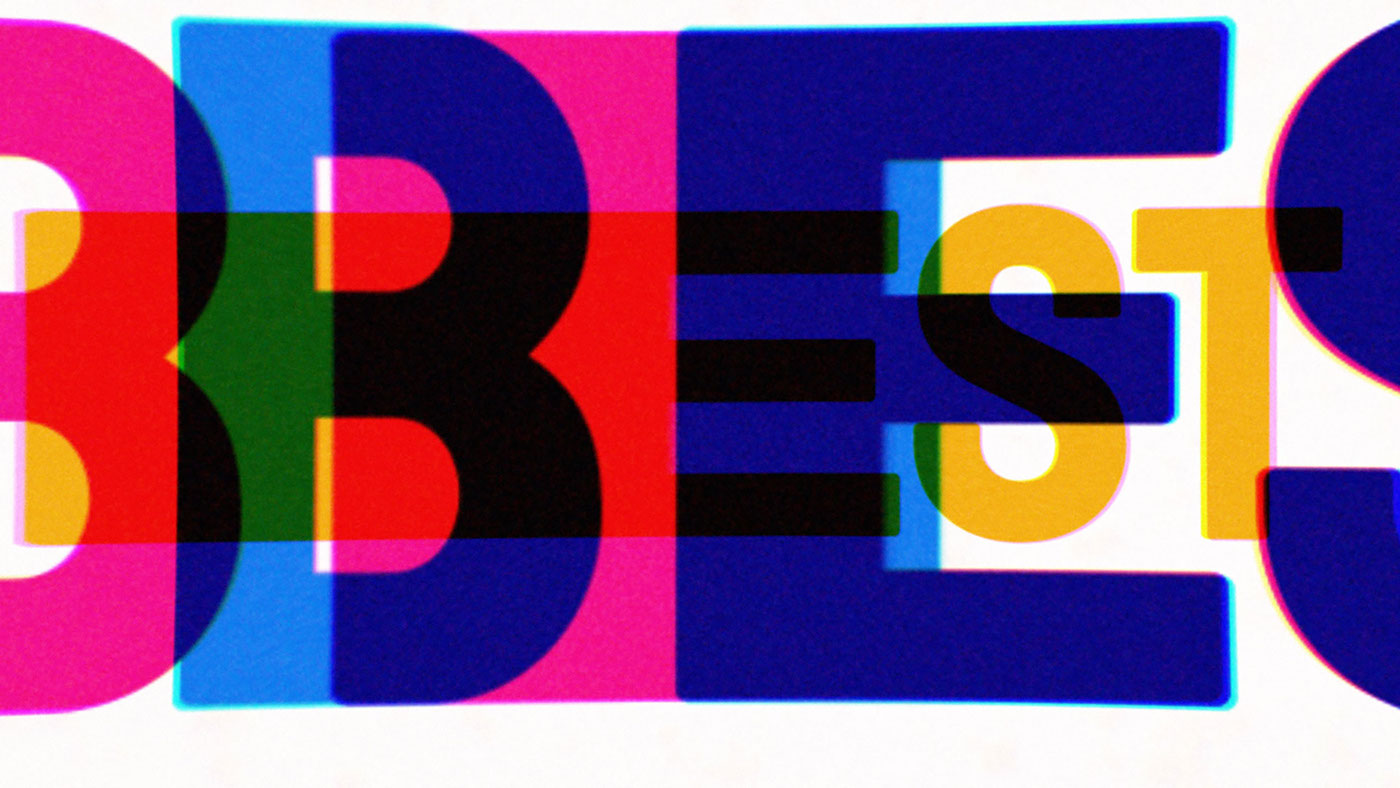


The motion graphics for last year’s awards flew through three-dimensional space, zooming, flipping, expanding and exploding in an approach the team dubbed the “cinematic universe.” For 2017, the designers wanted to try something a little more offbeat, weird and handmade. The movement all takes place in a flat, horizontal space, with the typography stretching, sliding and bouncing, before coming together and locking into place, only to pull apart again.
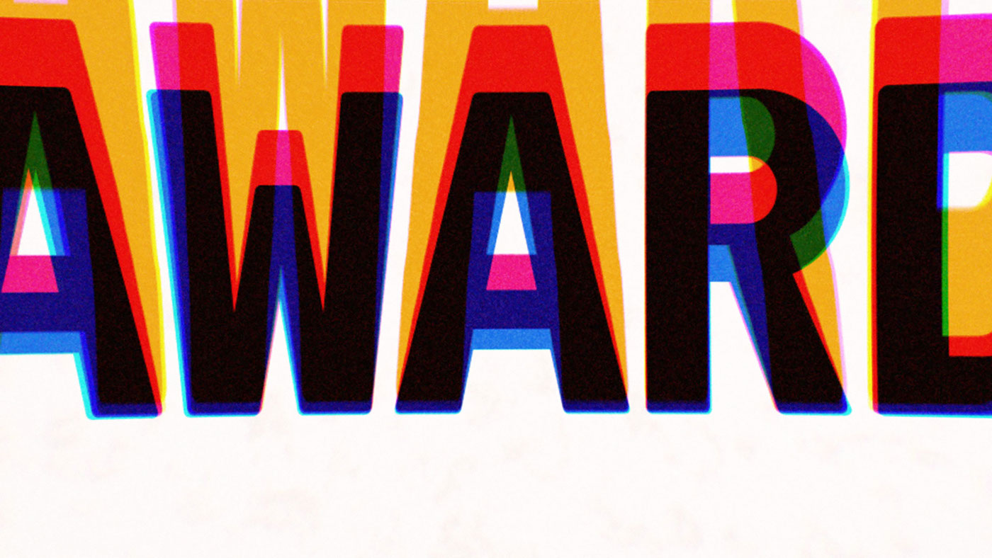
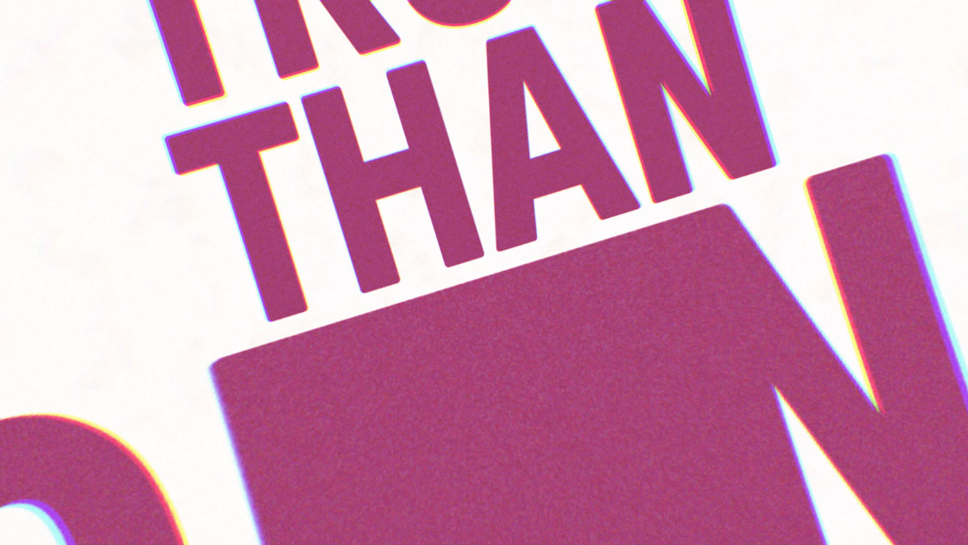
The graphics have a liquid and elastic quality that plays with legibility. The typography appears to be built of layers of additive color and leaves trails as it moves, in hues that go beyond the brand palette. The kaleidoscopic effect alternately suggests the color layers in motion picture film stock, the color separation of screen-printed posters, and the jittery RGB “artifacts” of lo-fi video.
Most importantly, the offbeat weirdness feels true to the spirit of Film Independent—brash, energetic, flexible, connective and supportive. The type finds each other to form words, not unlike what the organization and its members do to make films (probably stretching the point, but so is the type!).