T–ADS
Logo & Visual Identity Redesign
T–ADS is organisation within the Department of Architecture, The University of Tokyo, connecting three research–oriented laboratories: Yusuke Obuchi, Kengo Kuma and Manabu Chiba. Their old logo has been plagued with discrepancies (several versions of both logos and names were being used simultaneously) as well as limited impact and recognizability; visual identity was virtually non–existent. Since
T–ADS publishes books and organises number of exhibitions, lectures, symposiums and various academic ventures, lack of clear visual language standards gradually became a significant issue.
After fixing the T–ADS abbreviation spelling (formerly simultaneously T_ADS, T-ADS and T–ADS), a simple, typographical logo has been developed. The aim was to create versatile and unobtrusive identity which would sit comfortably within the academic field of (mostly computational) research in architecture. Cornerstone of the identity is thus custom–designed tilted em dash utilised in both the logo and throughout the applications together with distinct yet understated layouts, supported by similarly unique yet understated typography.

Letterhead, business cards and pin badges

T–ADS logotype

The simplified symbol hints towards the word Engineering in Japanese (both 工学 and エンジニアリング) since T–ADS belongs to the Graduate School of Engineering

Book edition cover design


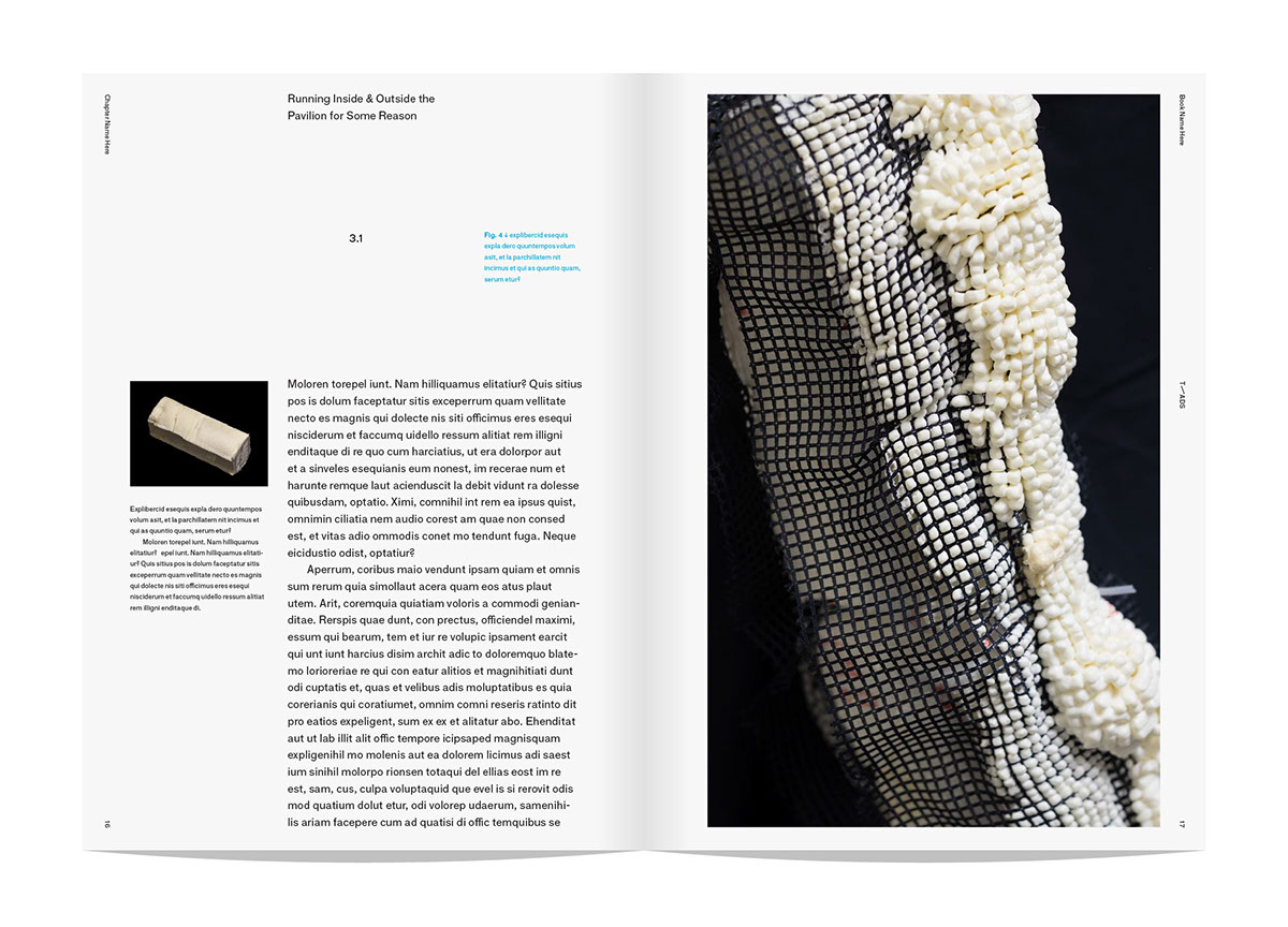
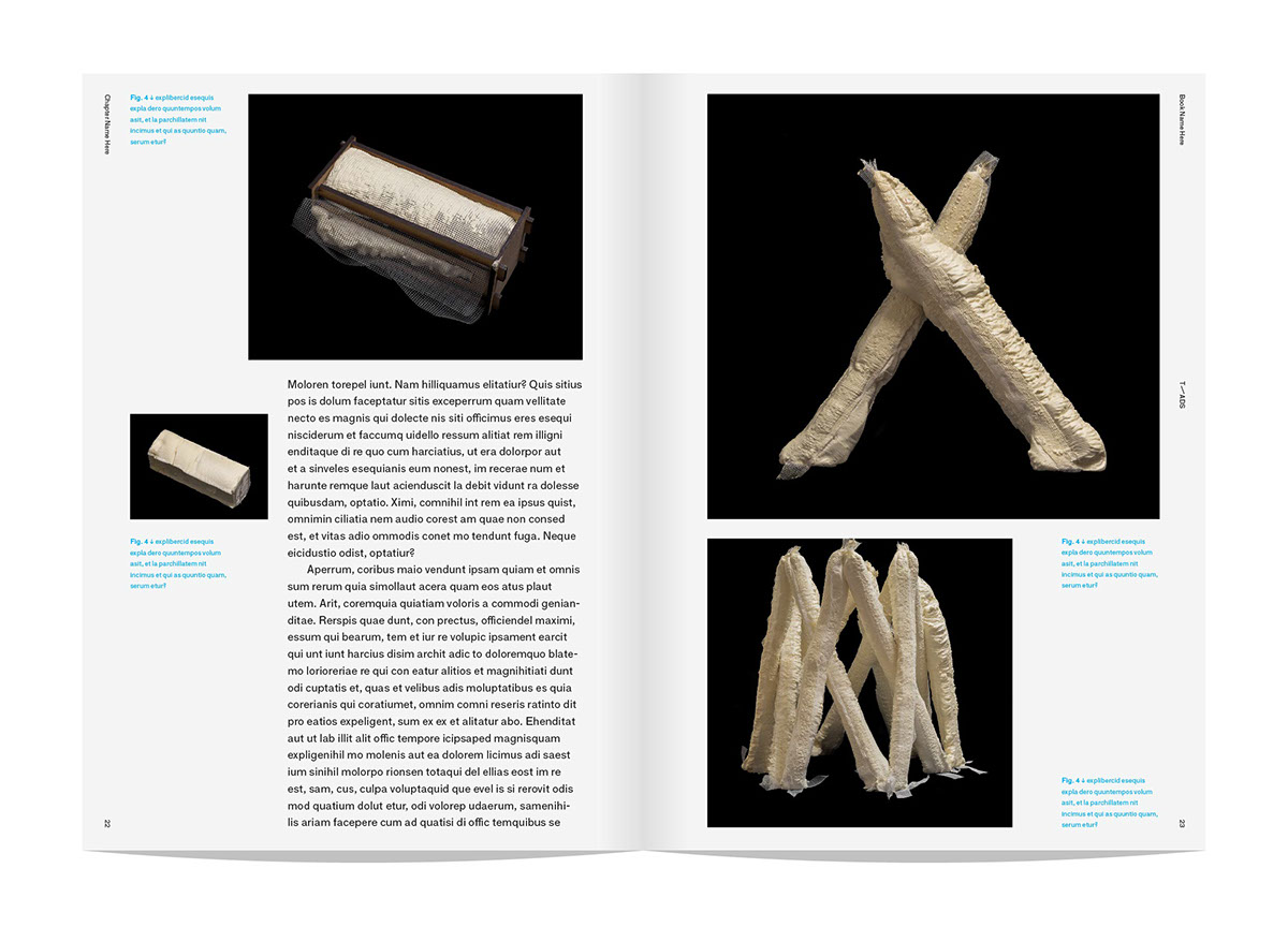
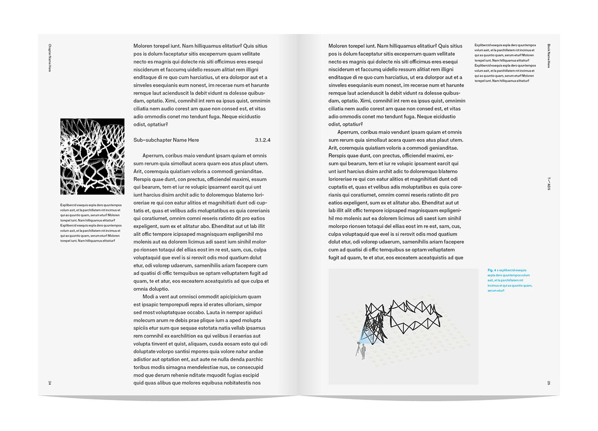


Book edition page layout design

Website concept design


