

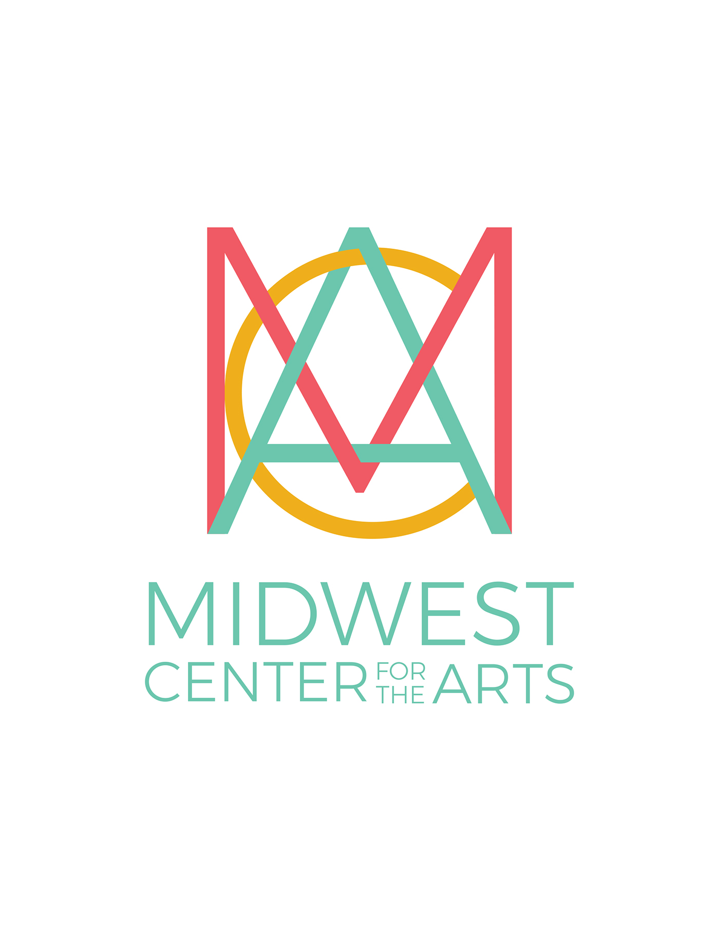


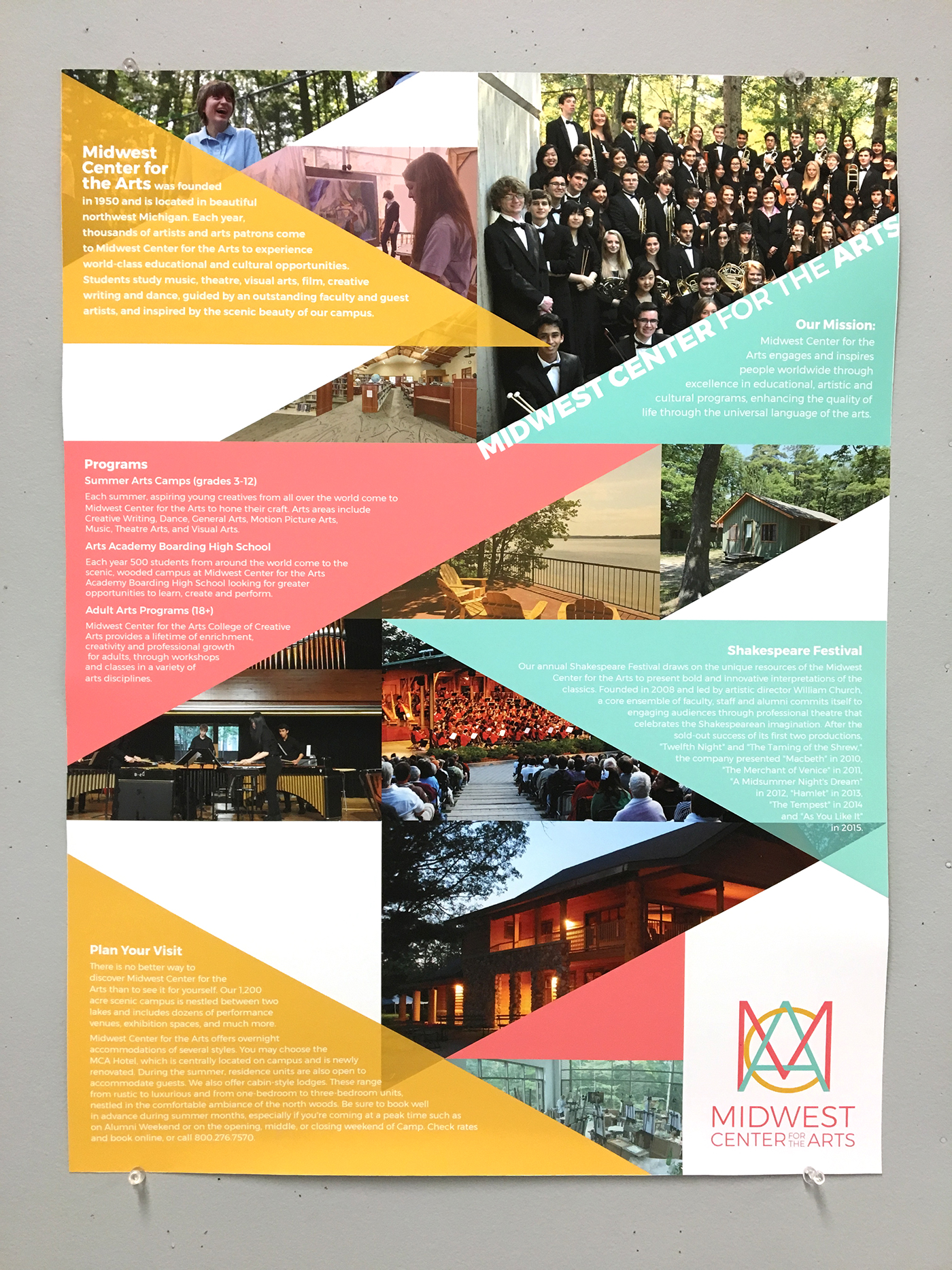
This was a brand identity creation project in my Professional Practice course. I first created the logo for the Midwest Center for the Arts by interlacing the letters MCA to create a weaving effect. I chose colors that had a lot of energy and vibrancy to represent the broad range of art forms at the center. I wanted the logo to be fun but also clean and modern to appeal to people of all ages, from elementary-aged kids coming to the center's summer camp to adults interested in the adults art program. From the basis of the brand, I created a poster and brochure using geometric shapes to reflect the logo.


