


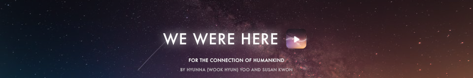

WHY?
The purpose of this project was to bring something innovative to this age where social interaction primarily transpires in a virtual space. While many lament this as a loss of the true human connection - our app seeks to take advantage of our technology dominant lives and be a platform with which that human connection can be reached. (See the slides below for more details)
This project was created during a course at Yonsei University - there were no particular constraints asides from having a true target audience and developing the app's desirability and viability. Feasibility was largely disregarded due to the hypothetical nature of the app. Regardless, our team strongly believes the potential our app has in reaching the real world.
Below are some close-ups of the screens seen in the presentation above.
The process
Ideation began with the idea of pursuing geo-tagging and music. We wished to expand and simplify the process of discovering music within our lives. From there we saw the immense value of having geo-tagging creating an ephemeral and priceless experience.
We adhered to the app's visual identity of galactic, starry nights and pursued the use of soft gradients that serve as a relative to the hyper-real background visuals when in the Library of the app.
The sole typeface used for the app's design was the family of Futura. The visual synthesizers and icons were all made with Adobe Illustrator. They were then transferred to Adobe Photoshop where the main GUI design was assembled.
These screens were then later transferred into a Adobe After Effects video template. With which we customized the color and several sequences to better fit our app's features.
Primary design themes of this app were white forms over real-life visuals (as seen in the Public, Private, and Personal realms). Outer glow to emulate the fantastical, magical, ephemeral nature, and soft gradients to differentiate the Library from the Newsfeed but still be collective as a whole.


The upper icon is a variation of the Spark icon (original viewed in the Newsfeed or below), created in order to be less obtrusive in the music playing process for the user.

Visual synthesizers were created in Adobe Illustrator and stylized with the Outer glow effect.


This streaming icon resonates with the app's logo and Spark icon (with the curves emulating sound waves) and represents the stream through the radio waves in the foreground.
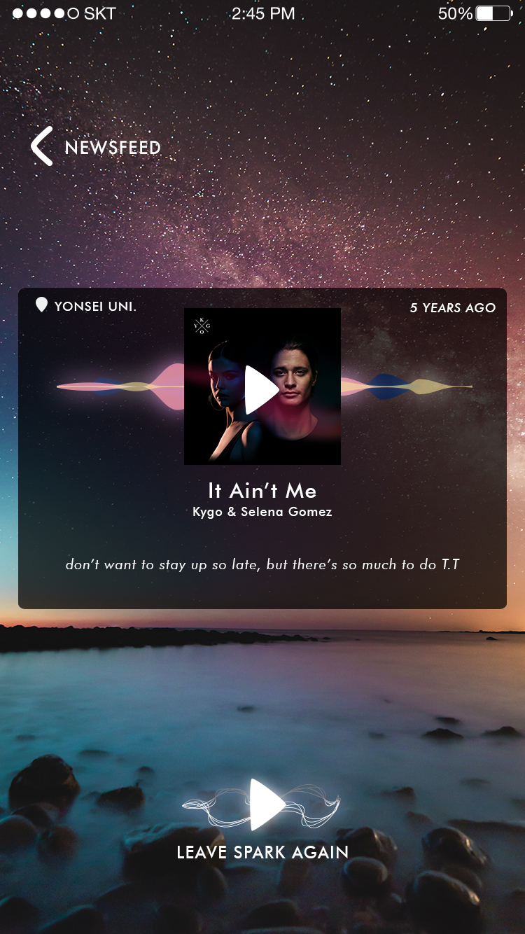
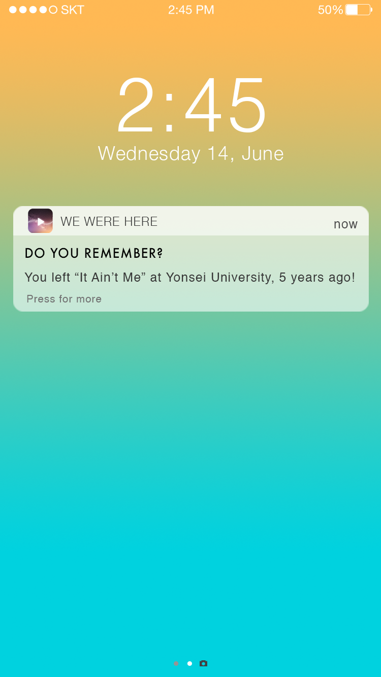
Once being reminded of a Spark, users can listen to the song and leave it again if they wish.


Users make leave sparks through the Library

Playlists saved from others go hand in hand with our app's potential function of users leaving bread trails for others to find (in the form of Sparks).

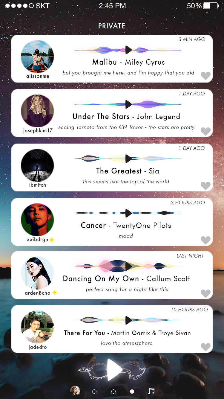
Public figures have a star icon besides their usernames to be differentiated from other friends.
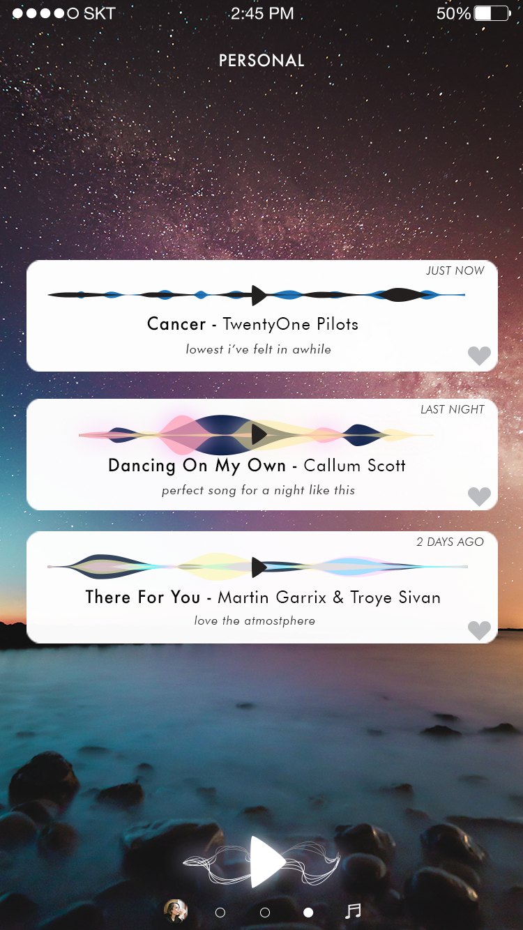

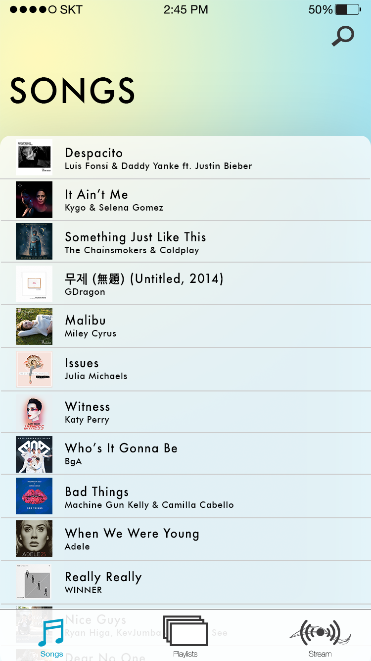
Users can search through the Library for any of the music they have ever saved. It calls for a simple music experience with which many can enjoy.
THANK YOU.
for more information: work.hyuyoo@gmail.com
WE WERE HERE IS THE PROPERTY OF HYUNNA (WOOK HYUN) YOO AND SUSAN KWON
SPECIAL THANKS TO JIYOON KIM, CHAEYEON KIM, AND ANASTASSIYA KIM


