
uma mulher
Design: Valquíria Rabelo | Fotos: Esther Azevedo
Destaque em: Fonts In use, TypeMates, Women of Graphic Design e Packaging of the World
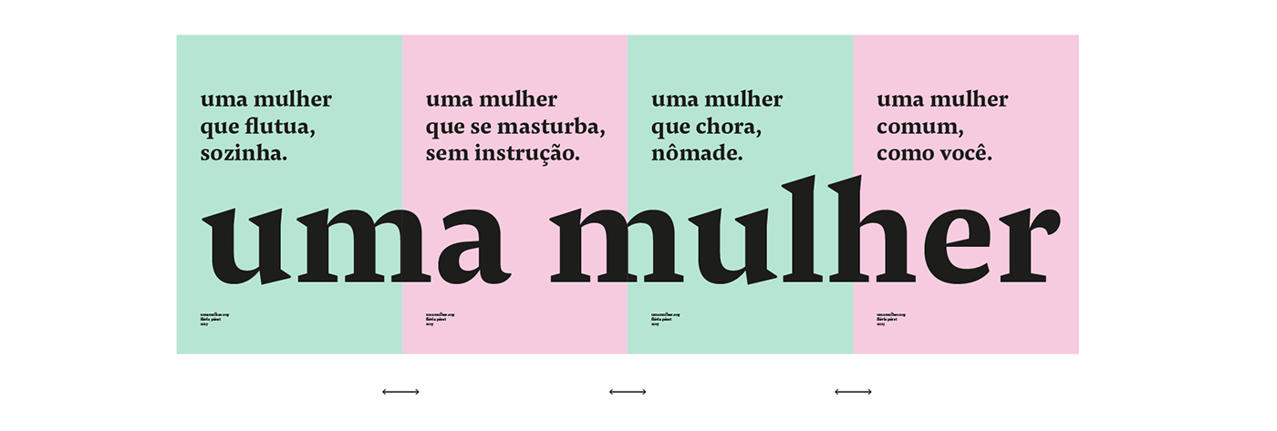
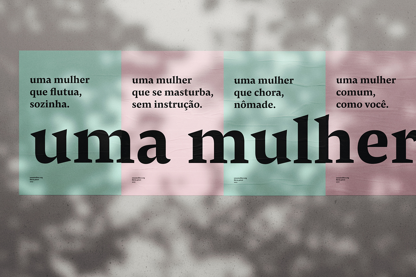
Uma mulher, de Flávia Péret, é um poema de quarenta estrofes, cada uma delas composta por três versos de até sessenta caracteres, todos iniciados pelas palavras "uma mulher". A ideia de unidade, contida no próprio título, se contrasta com as possibilidades de variação: a anáfora dá ao texto um sentido de enumeração, o aspecto de uma lista.
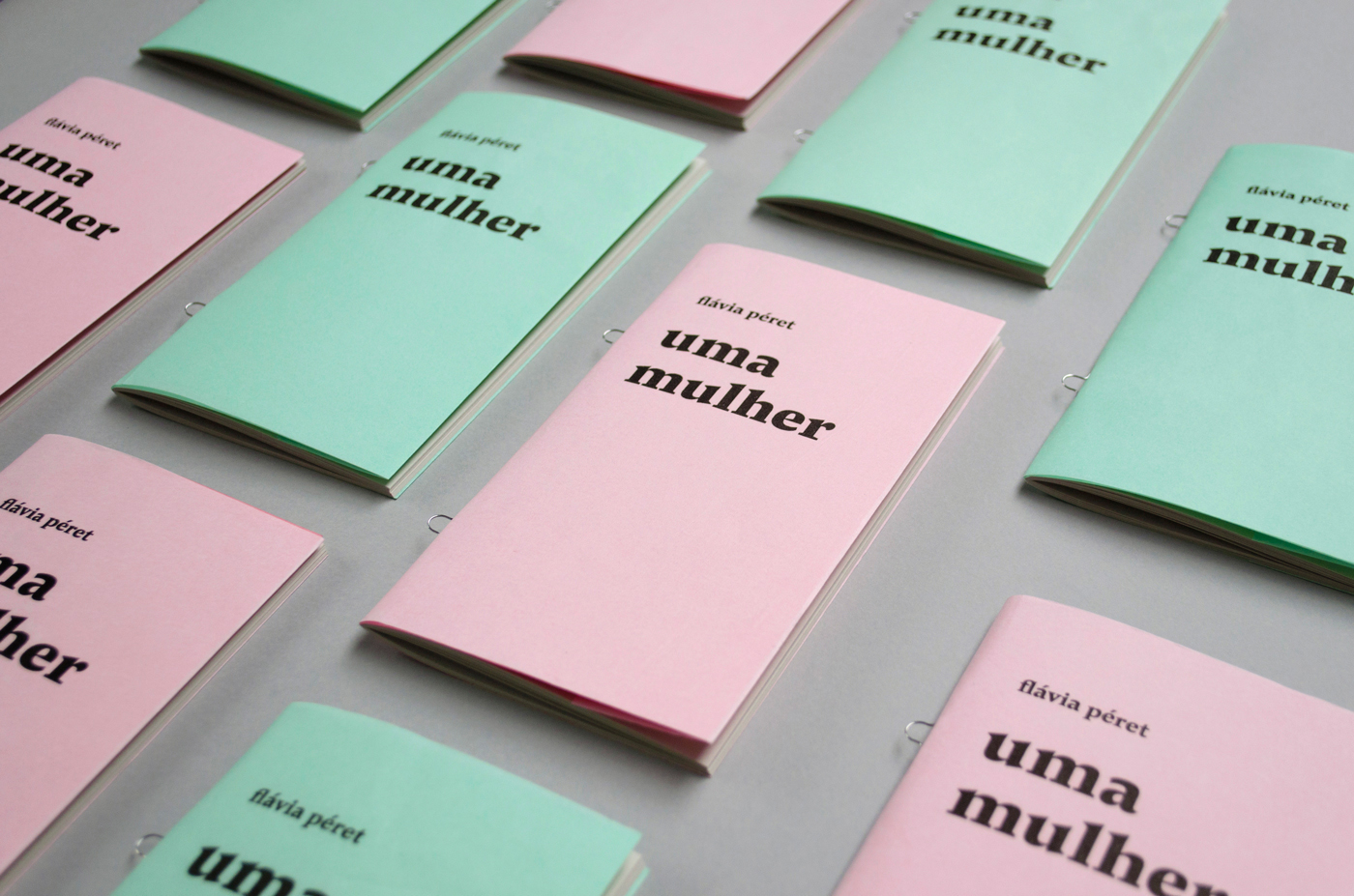
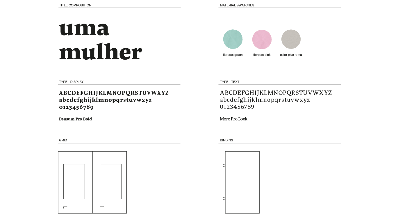
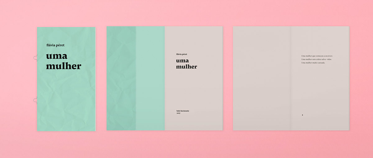
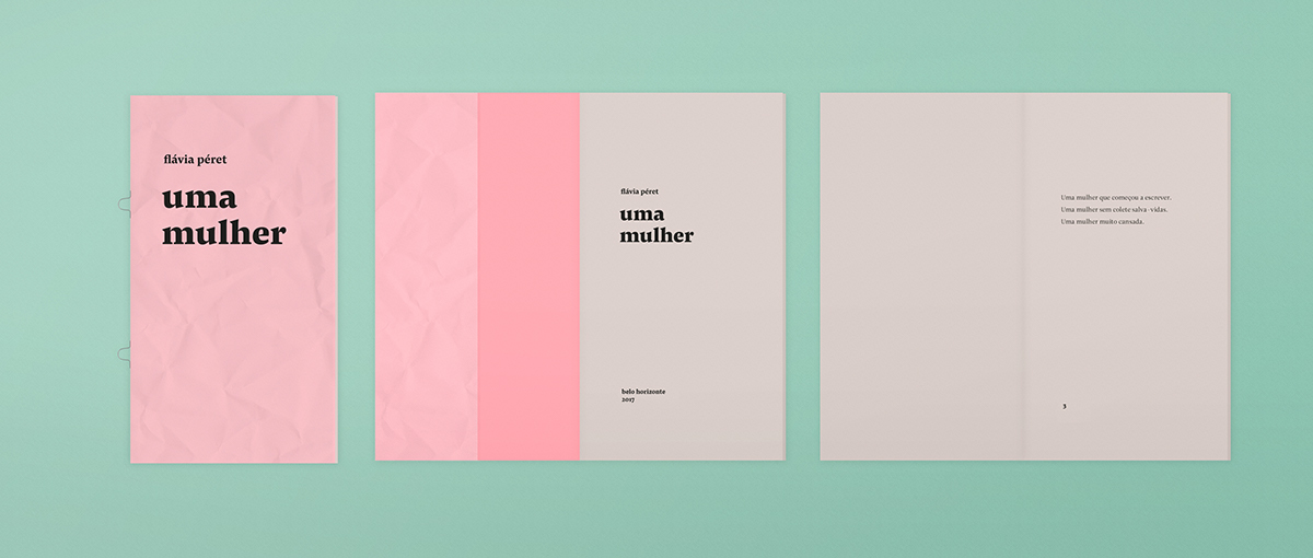
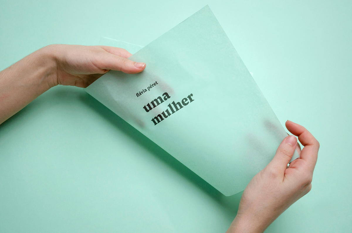
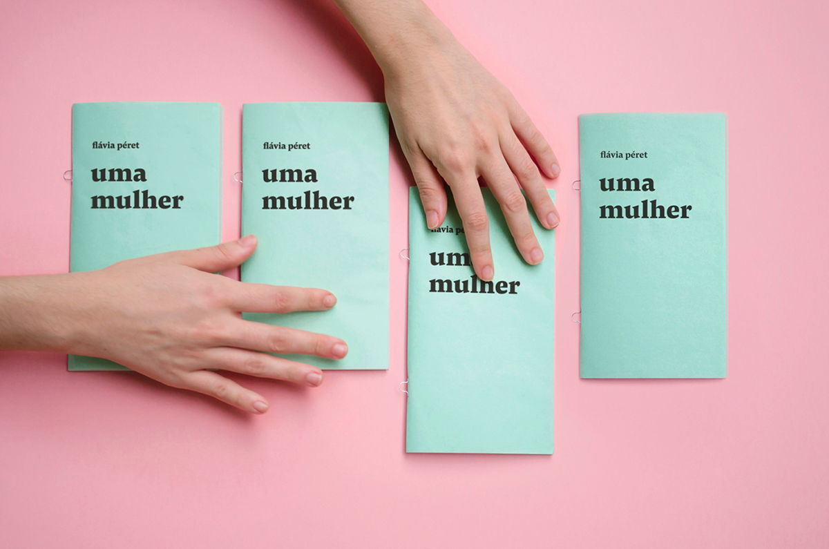
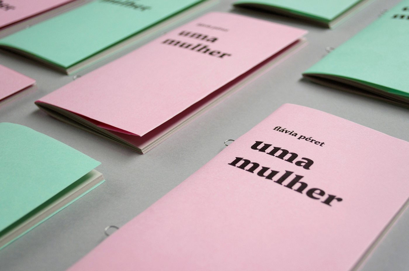
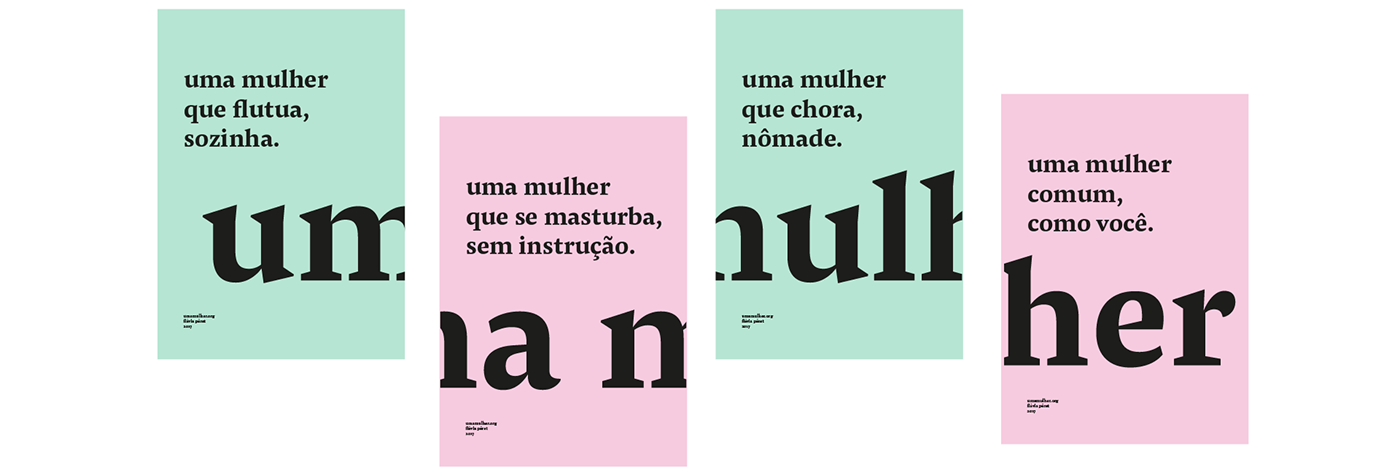
O gesto mecânico da repetição orientou a escolha dos acabamentos do livro: a encadernação das páginas foi feita em grampo ômega – um grampo metálico, de aparência industrial. Já o embate entre unidade e variação estimulou a produção de dois modelos de capa, – uma verde e a outra rosa – a partir da mesma estrutura tipográfica. Impressas em Flor Post (similar ao papel seda), as capas são translúcidas e suaves ao toque. Ao mesmo tempo, sua baixa gramatura faz com que rapidamente sejam marcadas pelo manuseio, gerando uma textura acidentada que tensiona a delicadeza inicial do objeto.
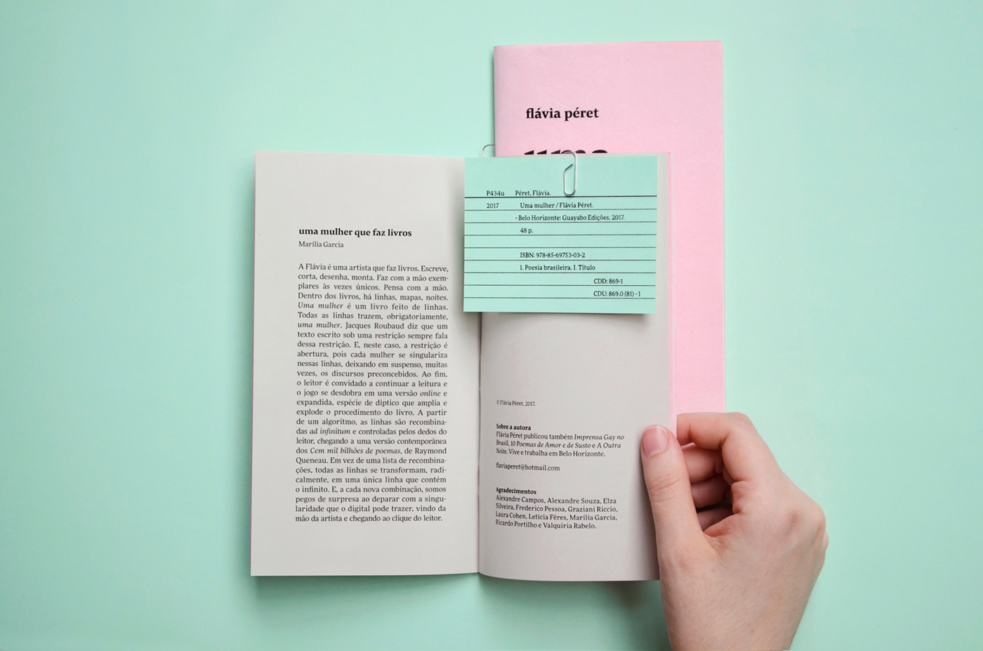
A metalinguagem é outro importante aspecto. Assim como a escrita se volta para sua própria linguagem, o design da publicação também faz referências ao universo gráfico. A ficha catalográfica, por exemplo, foi impressa à parte e anexada manualmente a cada exemplar com um clips de papel, se assemelhando a um cartão de biblioteca. Ao se atentar para cada um desses detalhes, o projeto gráfico buscou explorar as qualidades materiais enquanto camadas de sentido.
"Uma mulher" ("A woman", in Brazilian Portuguese) is a poem of forty stanzas, each one composed of three verses of up to sixty characters, all of them started by the words "a woman.” The idea of unity, contained in the title itself, contrasts with the possibilities of variation: the anaphora gives to the text a sense of enumeration, or the appearance of a list.
The mechanical gesture of repetition guided the design of the book: loop staples were used to bind the pages, evoking an industrial look. Also, the chock between unity and variation motivated the production of two cover models (one green and the other one pink) with the same typographic structure. Printed in Flor Post (very similar to tissue paper), the covers are translucent and soft to the touch. At the same time, their low paper weight makes them easily crumpled by the reader, creating a rough texture that breaks the initial delicacy.
The metalanguage is another important aspect of the project. Since the poem remarks on its own language and process of composition, the book design itself also points out the graphic universe. The bibliographic record, for instance, was printed separately from the pages and, then, manually attached to each copy with a paper clip, getting very close to the aspect of an actual library card. With all of these features, the intent was to explore the materials’ properties as layers of meaning.


III. POSTER
Fotos do lançamento: Estratégias Narrativas (esq.) e A Banca (centro e dir.)


Peça seu exemplar em fb.com/estudioguayabo/shop


