
Role
Redesign the entire app from scratch, create new sections and make the UI hybrid between Android and iOS products.
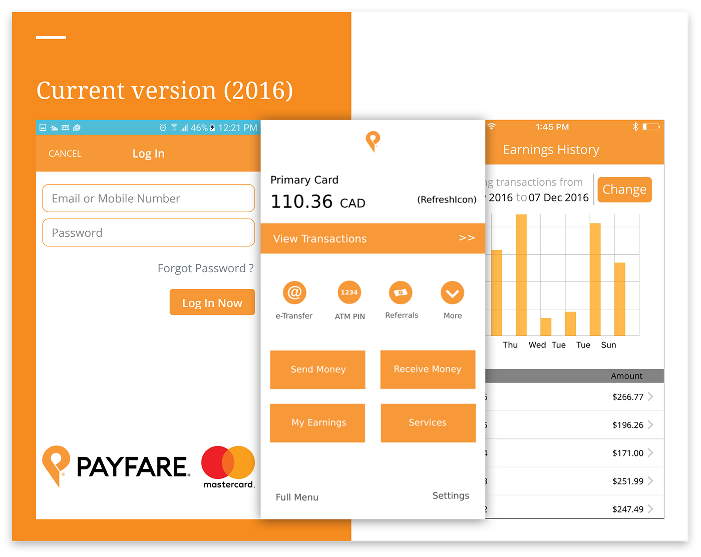
Problems with the current version
Outdated interface, because of the excessive use of black the user was feeling the UI heavy, poor chose of fonts and contrast and content all over the place with no information architecture.

Design decisions
We've started the work by the most simple sections of the app to define the new UI: pre-login, login, activate a card, and dashboard. References gave from the client was: Mogo, GoBank, and Active Hours apps.

Solutions we found
To make a more modern look and taking all the references, we decided to go with rounded buttons, white background, the top bar less heavy and amount of negative space to keep the UI cleaner and lighter.
Use of native components was indicated to keep the performance and speed, and not to overload the user's side and use fewer data.

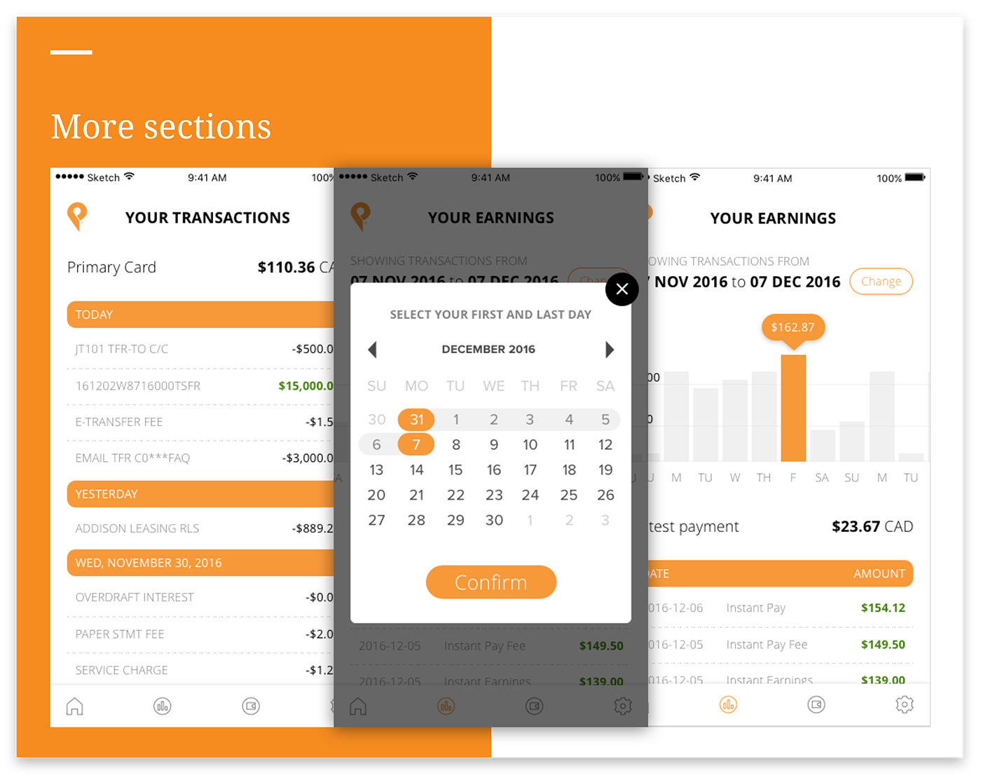
After party
To finish the job here, the client asked a couple more designs just for the dashboard. The stakeholders wanted to see how different the app could be without putting a lot of images or elements within the UI.


