Taking America’s Temperature
Tracking fevers across the US in an interactive map.
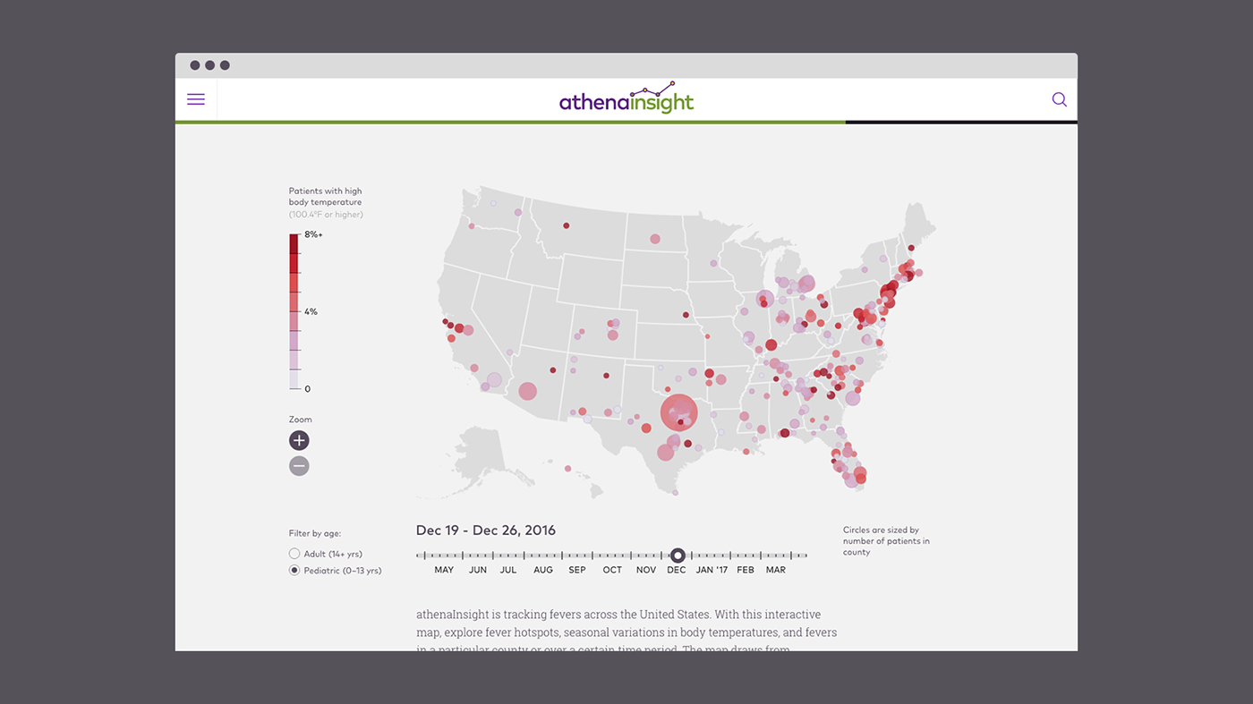
Have you ever wondered what time of year you’re most likely to get a fever? What about the region of the country that tends have more feverish people than others? Do kids really get sick more often than grown-ups? We teamed up with athenaInsight to create an interactive data visualization that takes on these questions.
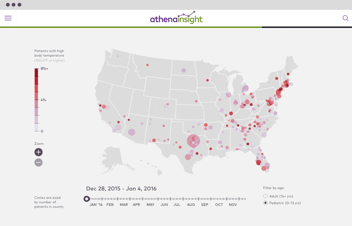
The fever tracker is our second interactive data visualization created for athenaInsight. It allows users to see fever rates across the nation week-by-week. The circles are measured by county size and average fever rate.


The visualization is fully interactive even on small mobile devices, allowing healthcare professional access to crucial data insights on-the-go.
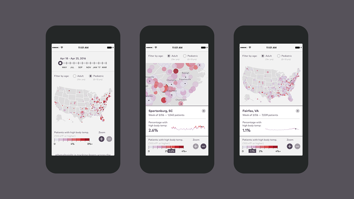


Visit athenaInsight to interact with the visualization yourself. And keep checking in, because the data will be updated regularly!

