


In the Summer of 2015, i was asked to completely redesign and then continue on as Art Director of Memphis Parent magazine. The result won "Best Redesign" in the 2016 Parent Media Association Awards.
Branding
My focus was creating a brighter, more fun and engaging look, adding some extra polish and flair. Memphis Parent is a magazine FOR parents but i wanted it to visually express creativity, something i think is important for raising kids.
Logo
The first thing i decided to work on was the mark. Contemporary Media, Inc. has many trademark publications so it was important to not only set Memphis Parent apart among other parenting magazines, but also in-house. I used the typeface Miasto.

Covers

The magazine was defined to be made for Memphians and i felt it was important to lean more toward local faces. Budget was a concern such that a great deal of stock photography was being used, which only aided in distancing the magazine from the community, so i decided to make a point of every cover being a child or family from Memphis.


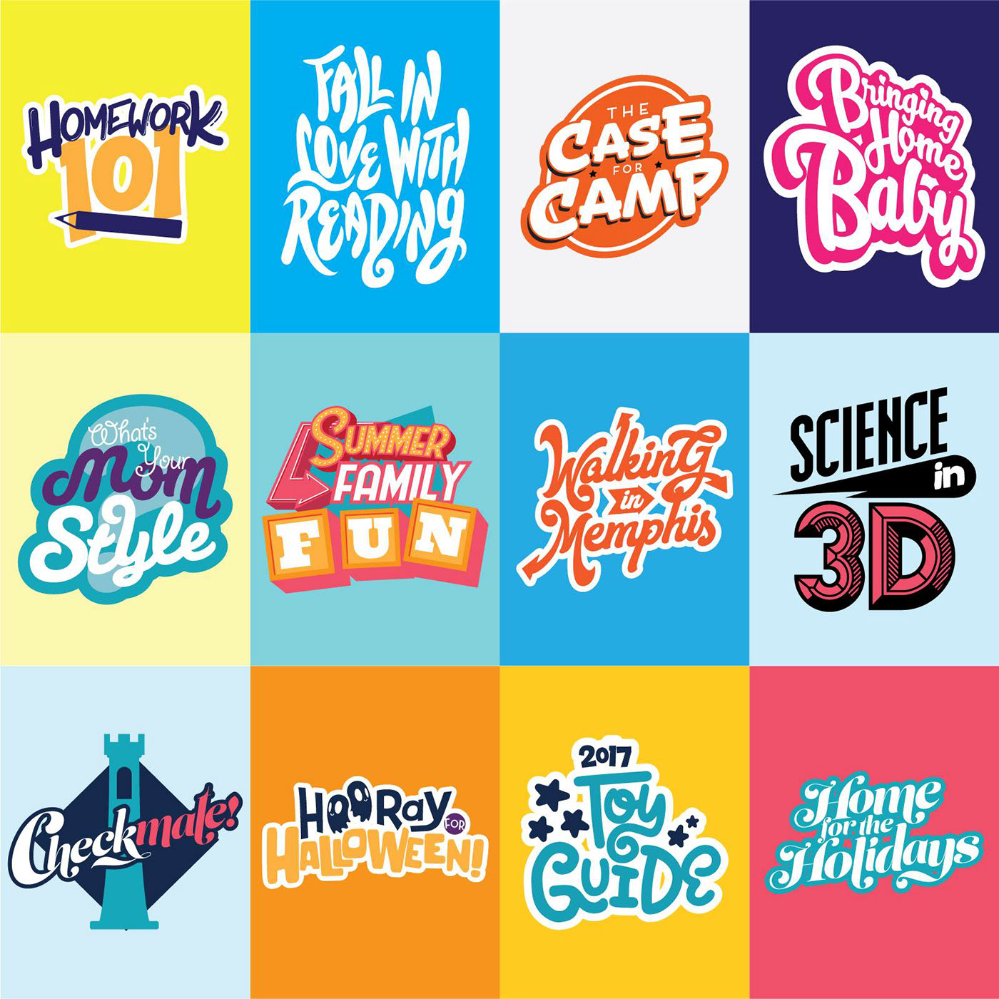
Now entering its 3rd year, the looks continue to be refreshed, organizing issues into collections.

Layout
The first mission was to do some housekeeping. While i wanted the spirit of the magazine to be fun, it was important to have structure which was missing.


Photography


Illustration


