
Defining the Challenge
I've always been a passionate writer and storyteller. My preferred mediums are screenwriting and keeping a journal. While writing has become easier than ever thanks to smartphones and PCs, it still scares people. Common sentiments include “I’m a terrible writer,” "I don't have anything to write about!," or “It’s a waste of time in my industry.” I designed and built Rittio to solve this by empowering users to build a daily writing habit. Rittio focuses on helping users track growth, providing a simple and fun user experience for daily writing, and maintaining a completely secure writing environment.

See your writing metrics on both the document level and overall!
From initial concept to designing the launch-ready product, I was responsible for every step of this project. I collaborated with my talented dev team to bring life to Rittio, and launched it as a product in February 2017. I intend to support, improve, and continue growing the product organically in the coming months and years!

Gathering Information
Before creating a single screen, I spent 6 months (Summer 2015 - January 2016) testing other available platforms. The "daily journaling" space is not crowded, but does have some incumbent players. I interviewed 50+ potential users to across multiple demographics to better understand what shortcomings they saw in the space, and to define a "wishlist" of desired features. In January 2016, I commissioned the creation of a low cost (<300 USD) prototype which I dubbed "CoolPen." Coolpen was built by a freelance dev named Ivan Reif using Javascript, and was a simple way for me to play with the features I had seen in other platforms. Other than providing a basic written overview of the concept, I let Ivan make all design and development decisions.

Screenshot of CoolPen. It wasn't scalable, and there was no UX work invested in the prototype. But it came together in less than 5 days, and I left the design entirely up to the developer (Ivan).
Laying Out The Plan
Based on user reactions to CoolPen, as well as my initial research, I decided that Rittio would be most applicable to the 18 to 35 year old demographic. These users tend to invest in personal growth and see the value in building skills, even if those skills are tangential to their direct line of study and/or profession. Additionally, I found most of the platforms were targeting writers in the 35 to 55 age range, and had UIs and UXs designed for these individuals. I found that potential users across all personas were most concerned with privacy and security. In addition, this group tended to value clean and simple design as opposed to feature overload.

Onboarding screen from launch version
Creating the Rittio Identity
I wanted the brand to reflect a modern yet simple image, while retaining a visual minimal aesthetic. I wanted a simple color palette which didn't distract users from the platform's primary purpose: writing.
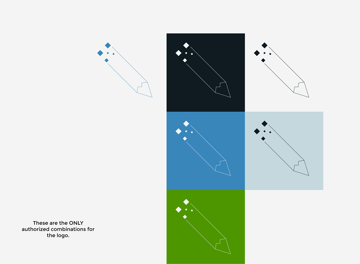
The use of muted primary colors and simple geometries helped me convey a sense of modern calm to my users. While I was partial to an iteration which had "lines" running through the middle of the "pen" shape, market testing showed that users preferred a version without those flourishes.
Building the Platform
Armed with a thorough understanding of the competitive landscape, user needs, and a firm set of design guideposts for this product, I started creating screens for version 1.0 of Rittio. The primary screens were the "Home" screen, the "Composer" screen, and the "View Statistics" screen. I wanted users to spend greater than 80% of their time on the "Composer" screen -- therefore, I made the primary call to action "Start Writing!" I emphasized this action by contrasting its colors against the toolbar. The button is also persistent on every screen within the application.

Note how the green "Start Writing" button contrasts against the black toolbar. When scanning the page, it is literally "front and center" at all times! Also, the badges shown above were a placeholder image and are NOT original work.

Statistics and Badges were also given a high priority, both in terms of positioning and emphasis. Statistics were simple, and presented the most relevant information to users in a bold and easy to understand format. Hovering over any of the stats gives users more insights into that particular category of statistics.
The badges were designed by a very talented Thai artist named Rubina who was recommended by a mutual friend. I loved her simple yet playful artistic style, and she seemed to "get" the style and aesthetic of the product. Her work was top notch, and the badges she created are a phenomenal motivation for users!
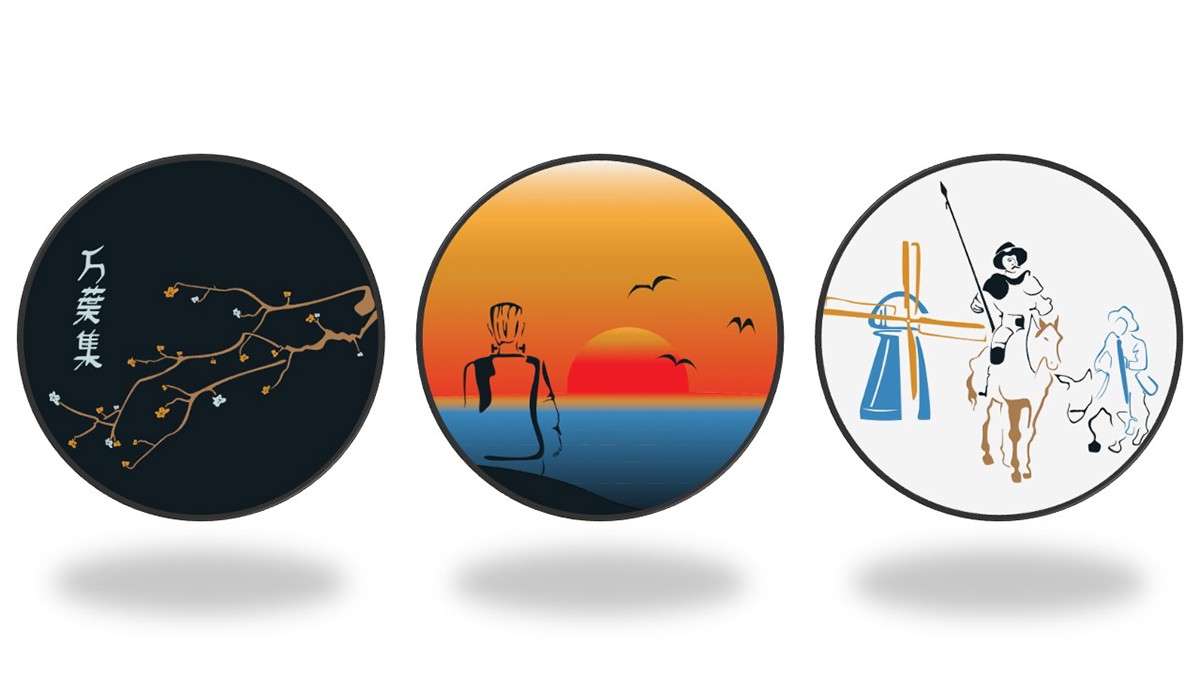
A few of the badges users can unlock, designed by Rubina!
The overwhelming majority of potential users reported using a desktop or laptop computer for most of their writing. Therefore, the initial focus of Rittio was on the browser-based desktop experience. However, in order to promote user retention and give users the ability to write and access writing on the go (especially in case they needed to maintain their streak), the desktop experience had to be adapted for mobile platforms as well. The biggest usability challenge on mobile was simplifying the statistics so that users could still access them without being overwhelmed.

A few of the screens adapted for mobile. Note the different colored toolbar in the composer -- this is a feature on both Desktop and Mobile which allows you to "dim" the toolbar while writing! While i think that the primary experience (i.e. the composer screen) is strong on mobile, I would like to rethink several elements on the home screen and settings screen in version 2.0.
Launching Rittio
Rittio launched in February 2017, and is available at https://rittio.com. The initial feedback was overwhelmingly positive; users praised the simple minimalist style of the platform, found statistics and badges to be a great motivator to continue using the platform, and enjoyed the overall user experience. The major criticism was with the "table" style presentation of past documents. Personally, I hate tables as they are clunky and over-power a screen. I included this feature because users emphasized the ability to be able to go back and sort/find past writing. However, I should have drilled deeper into that requirement, as it is now clear that the only criteria users wanted to sort by was "date written."
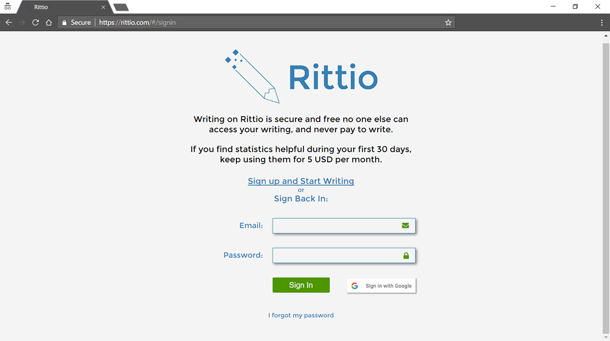
Rittio in action. Visit https://rittio.com to sign up and try it out today!
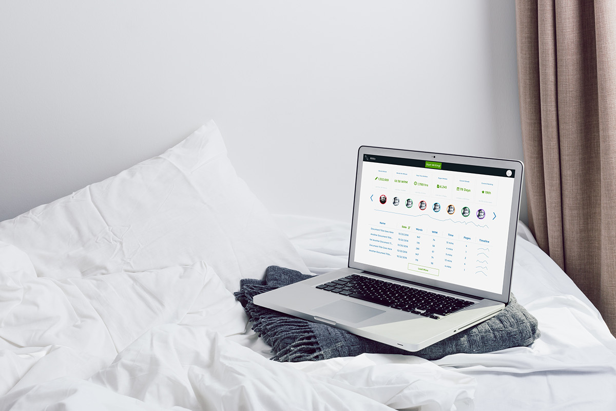
Rittio is always best when viewed in full screen (F11 on most browsers).
Final Thoughts and the Future of Rittio
I have already started planning for version 2.0 (preview shown below). The major change would replace the table with a chronologically sorted list of past writing. Additionally, I intend to implement monetization which would give users access to the full platform for 30 days, after which they can choose to keep Statistics and Badges by paying 5 USD per month. However, writing on the platform will always be free for everyone, forever!

High-fidelity mockup showing the proposed changes for version 2.0. Note the simplified table and the inclusion of monetization features.
I was very pleased with the simplicity of the launch version. Current active users (as of April 2017) seem to log into the platform daily, and write an average of 200 words a day. I sincerely hope that Rittio helps people build and maintain a strong writing habit, and I look forward to continuing to grow the user base!


