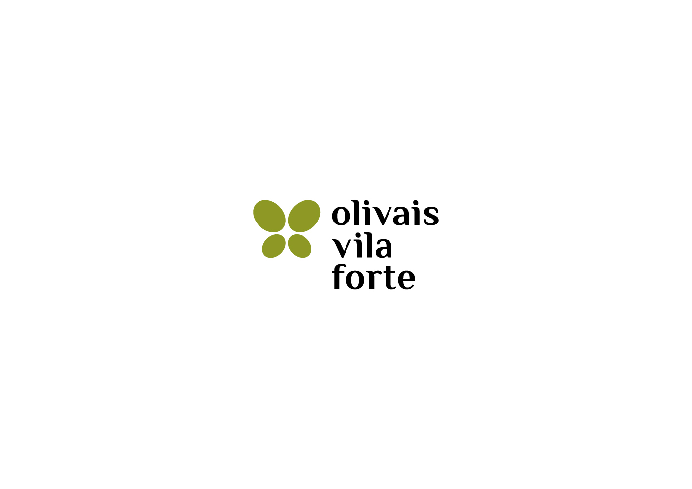
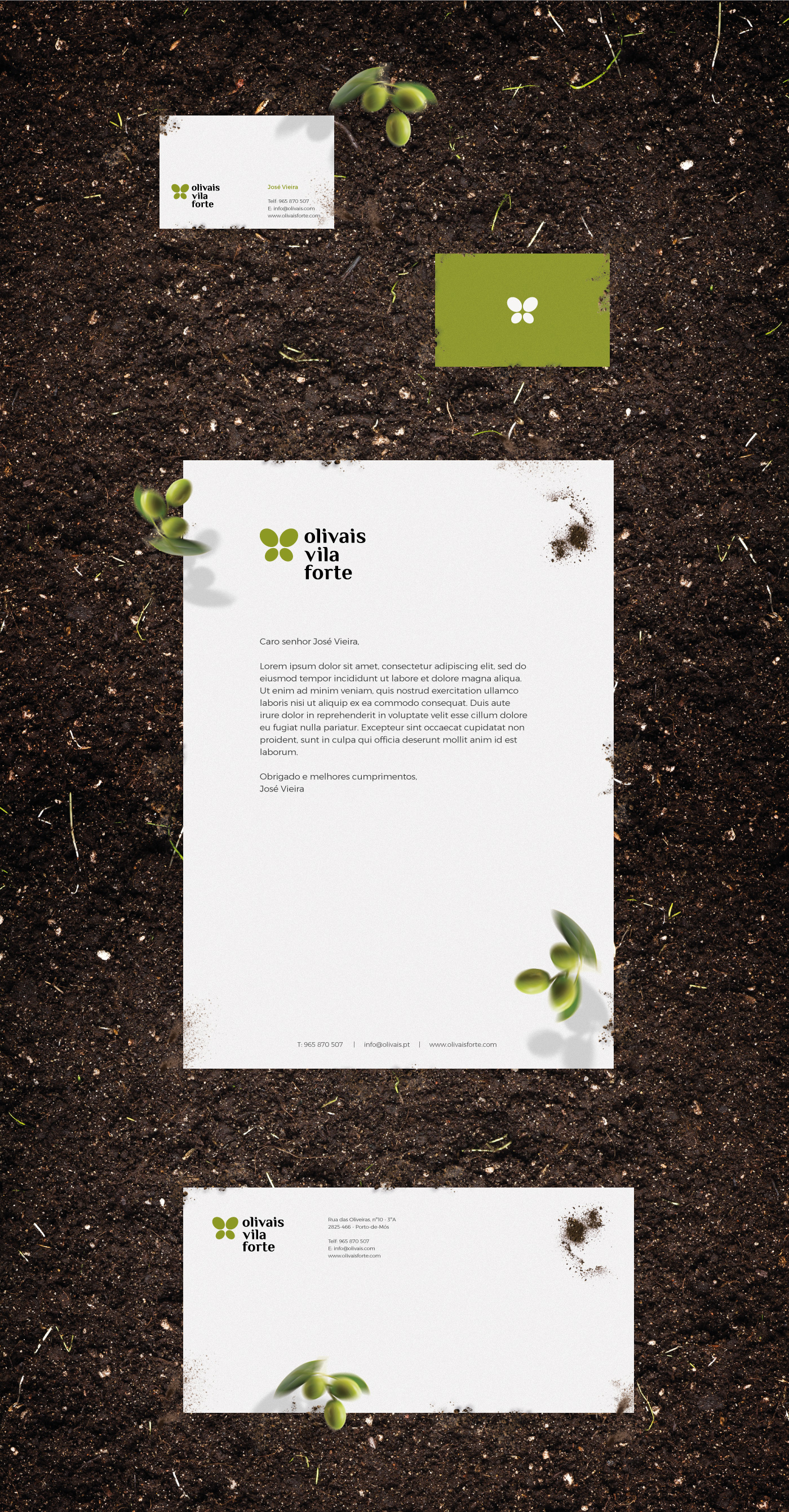
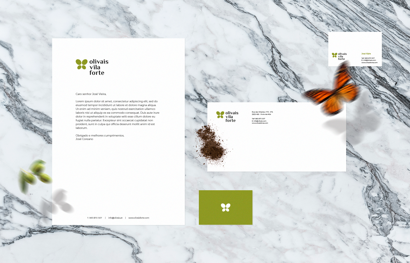
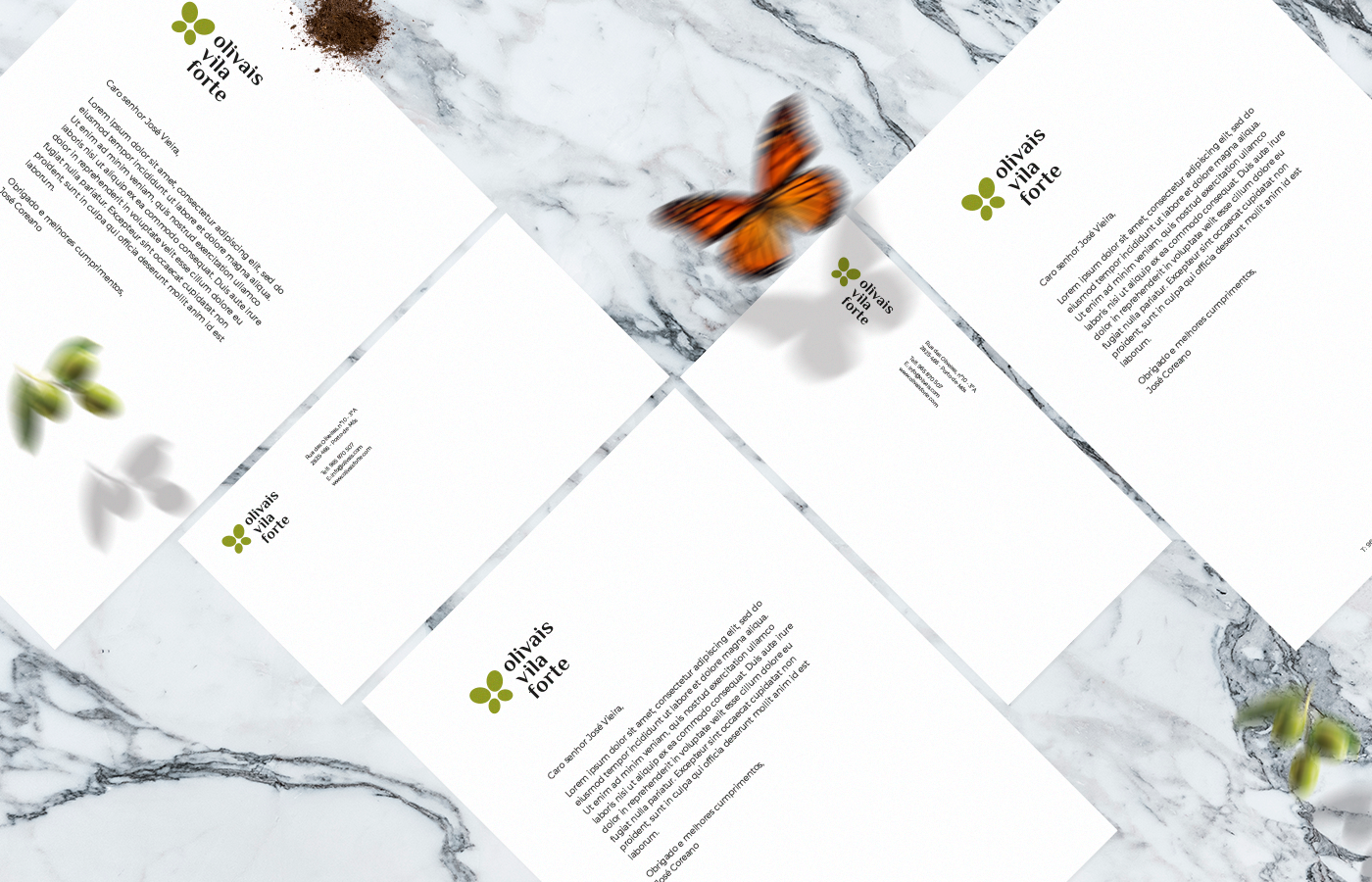
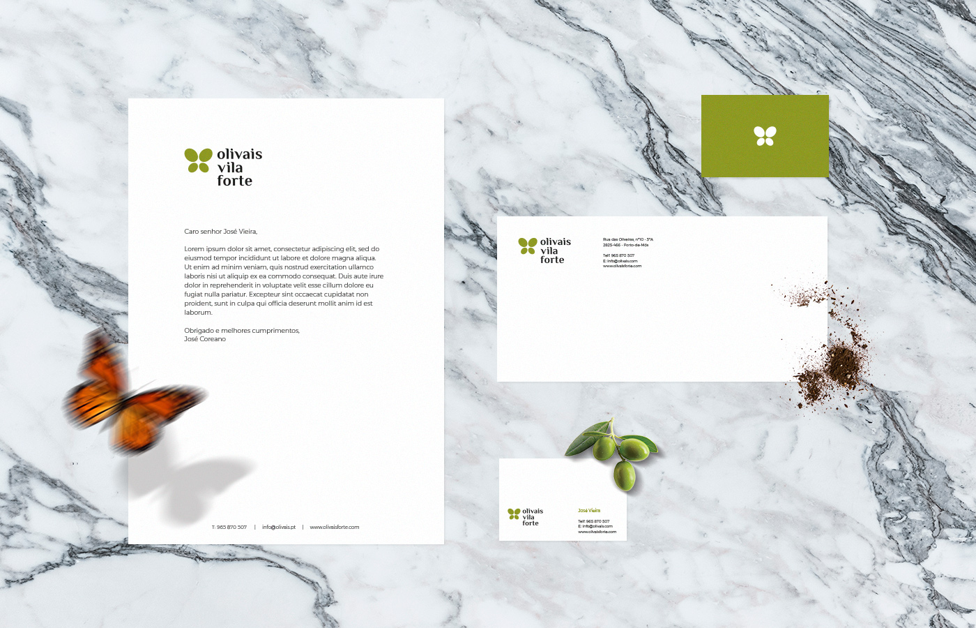
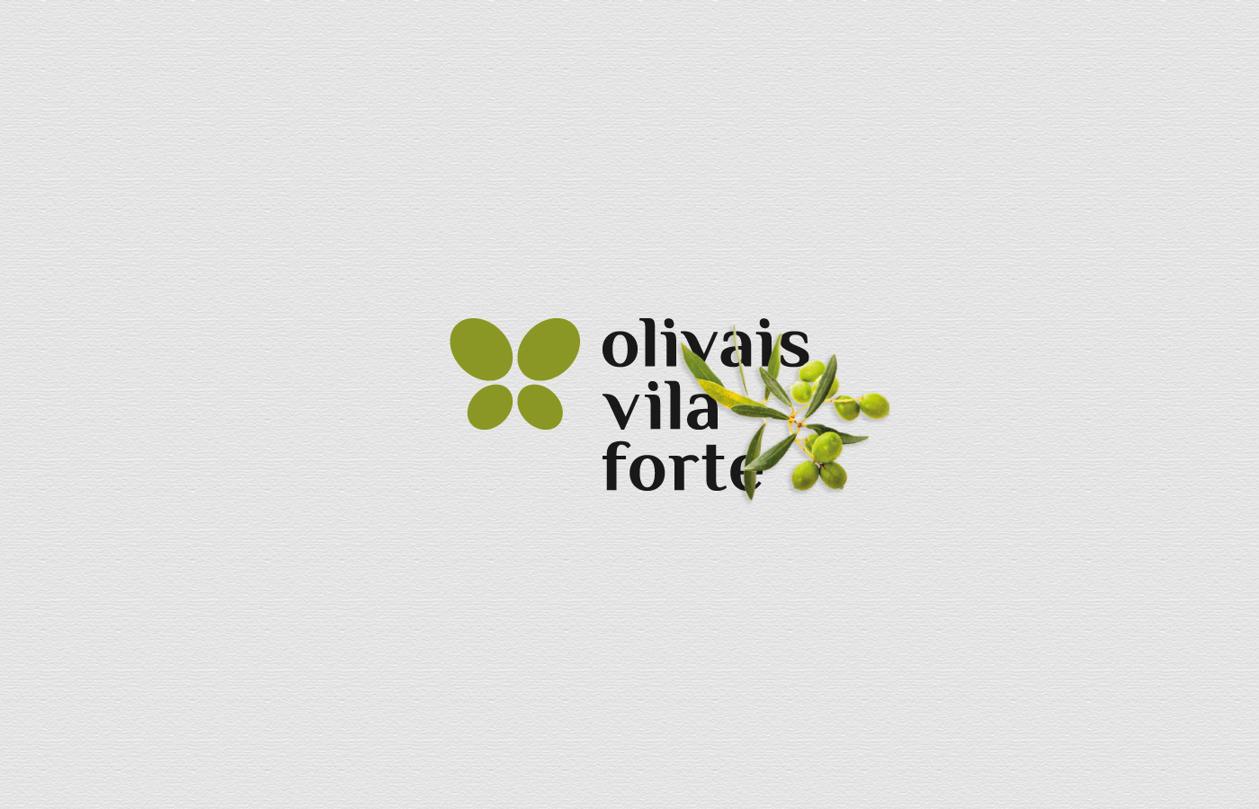
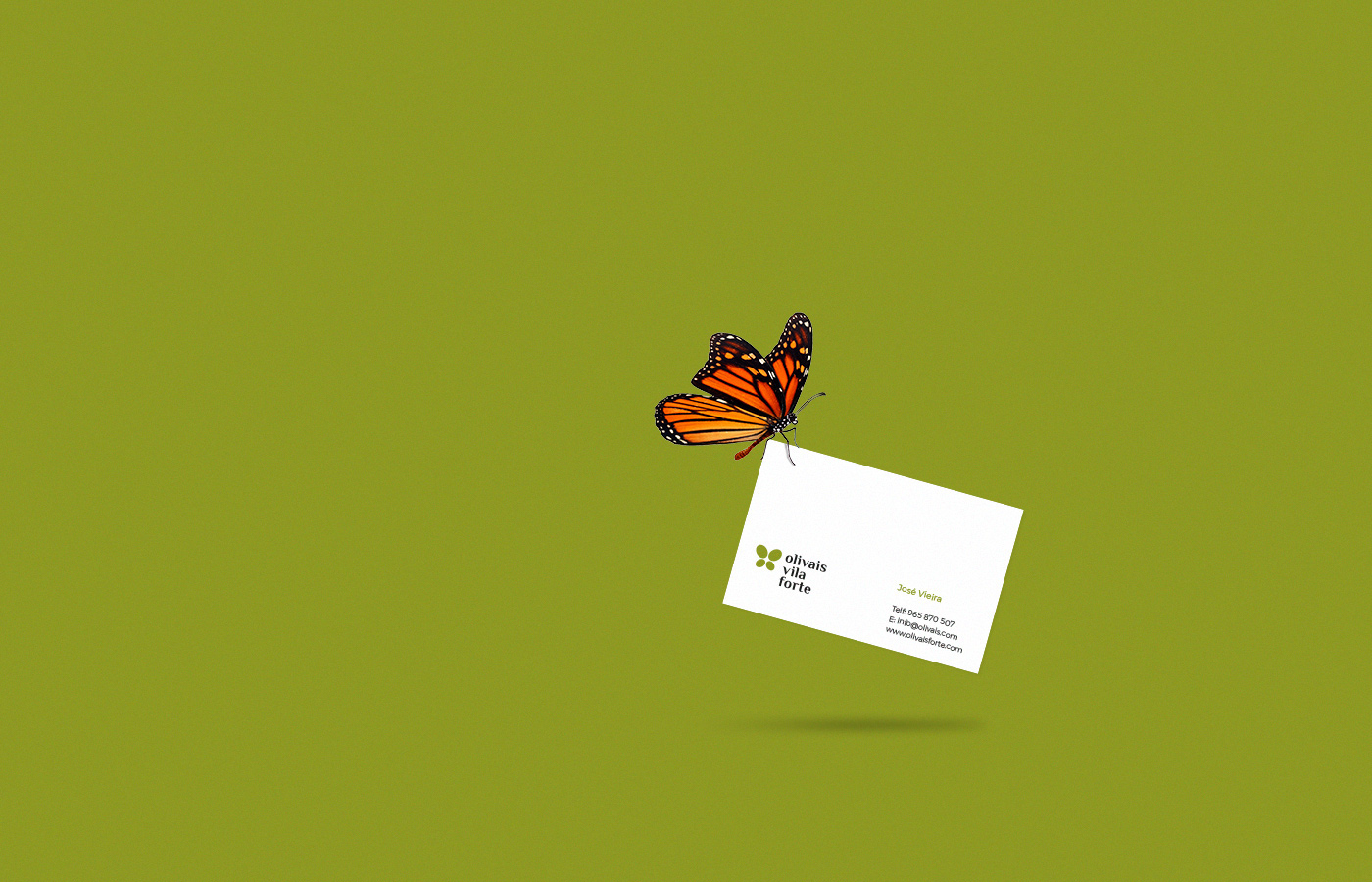
Olivais Vila Forte
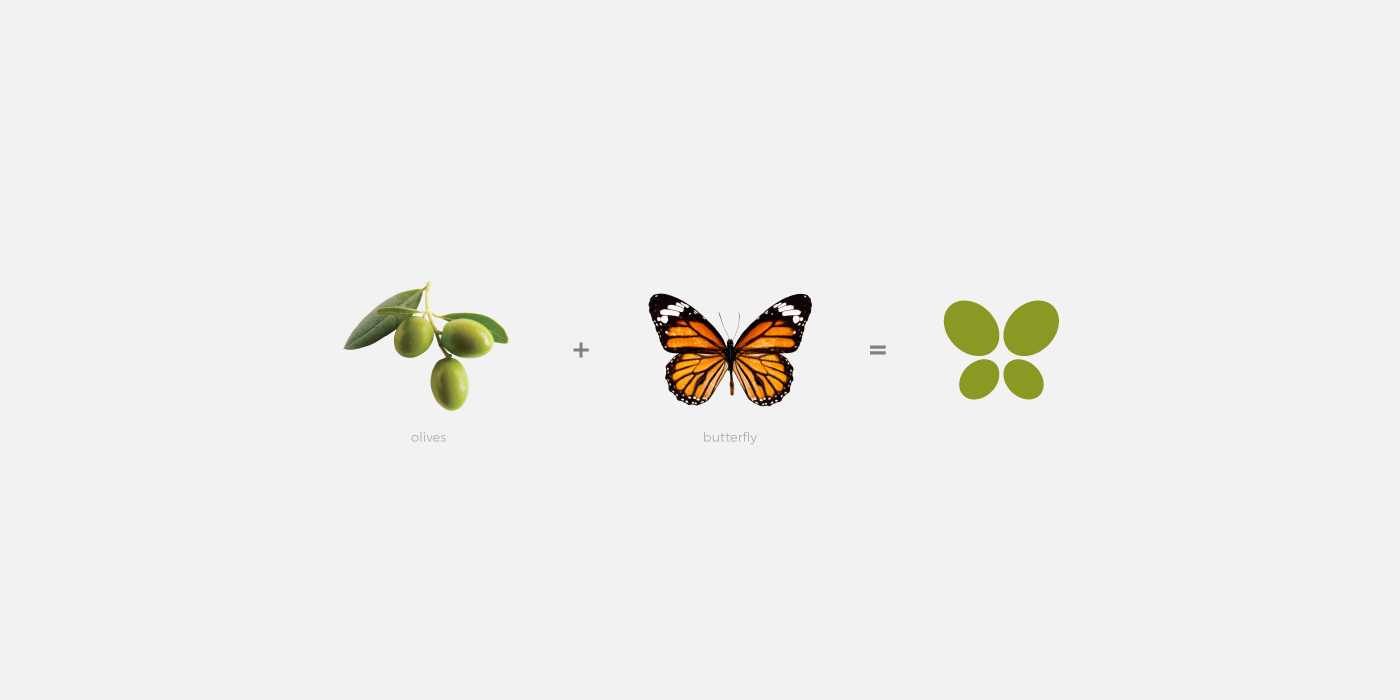
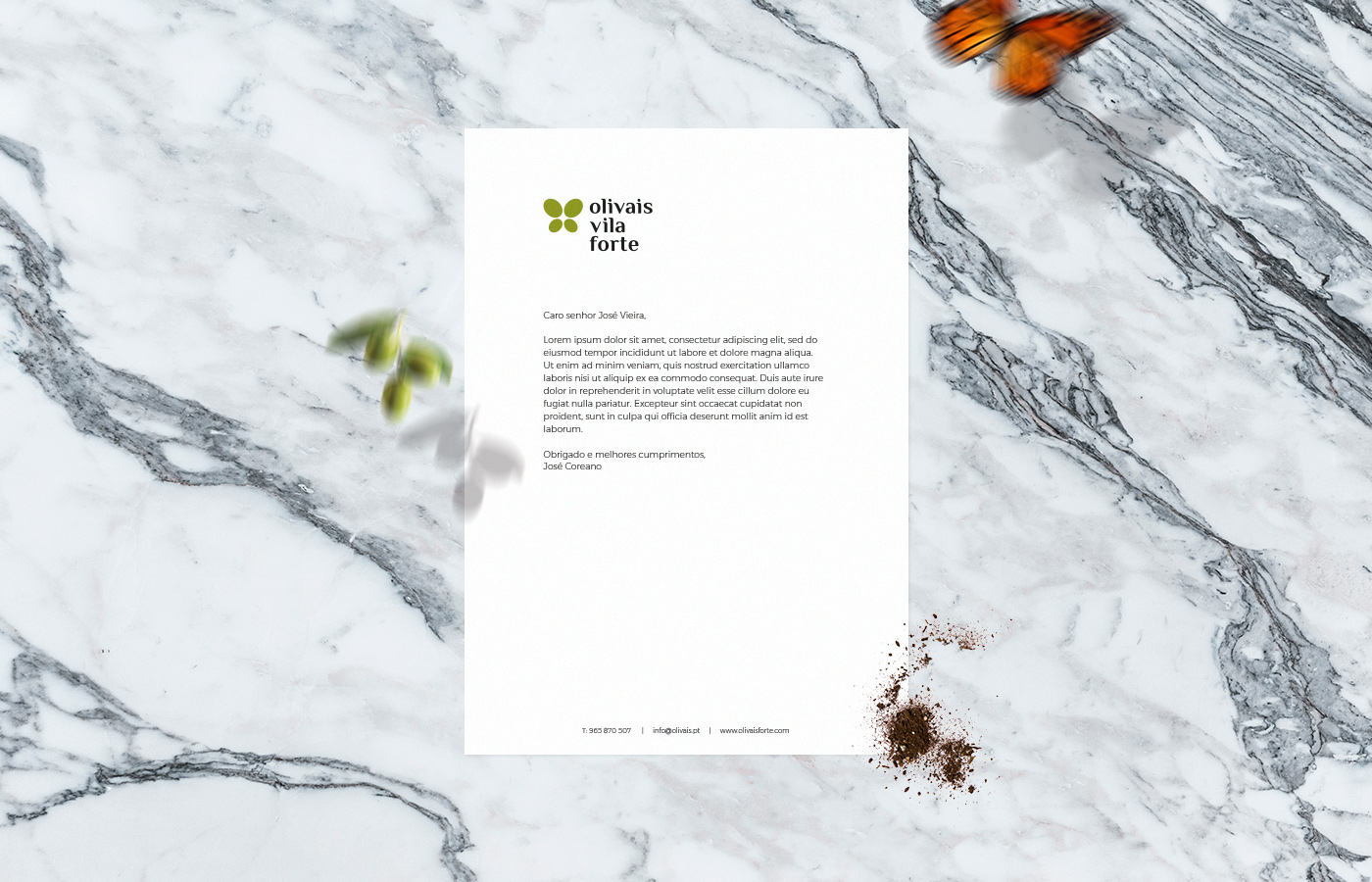
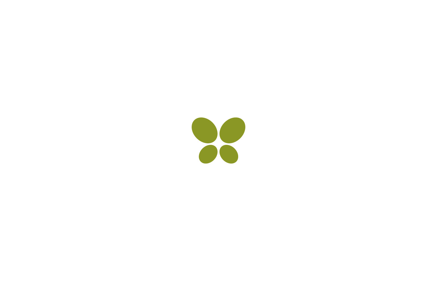
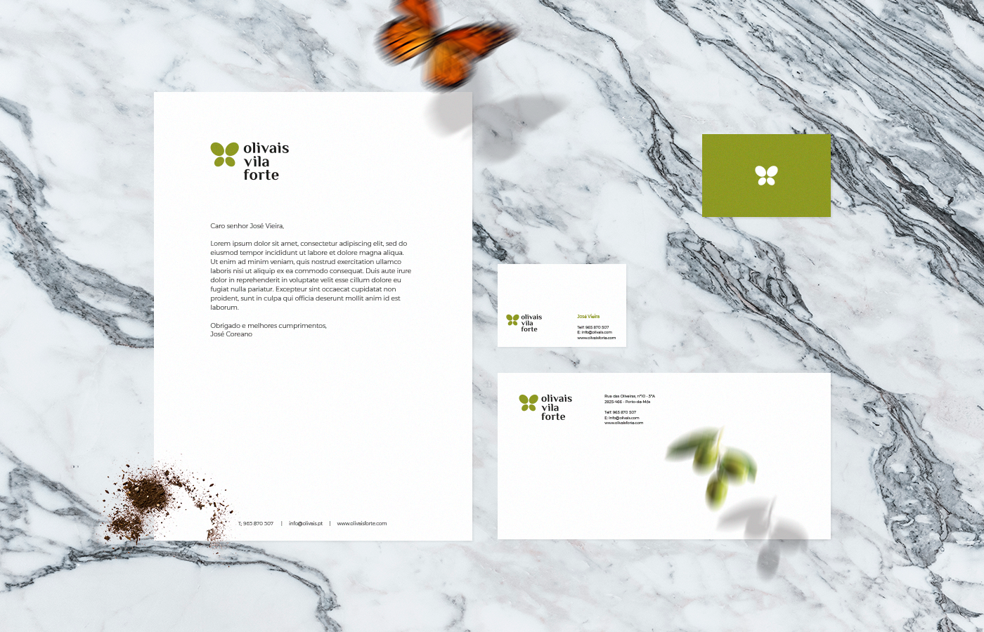
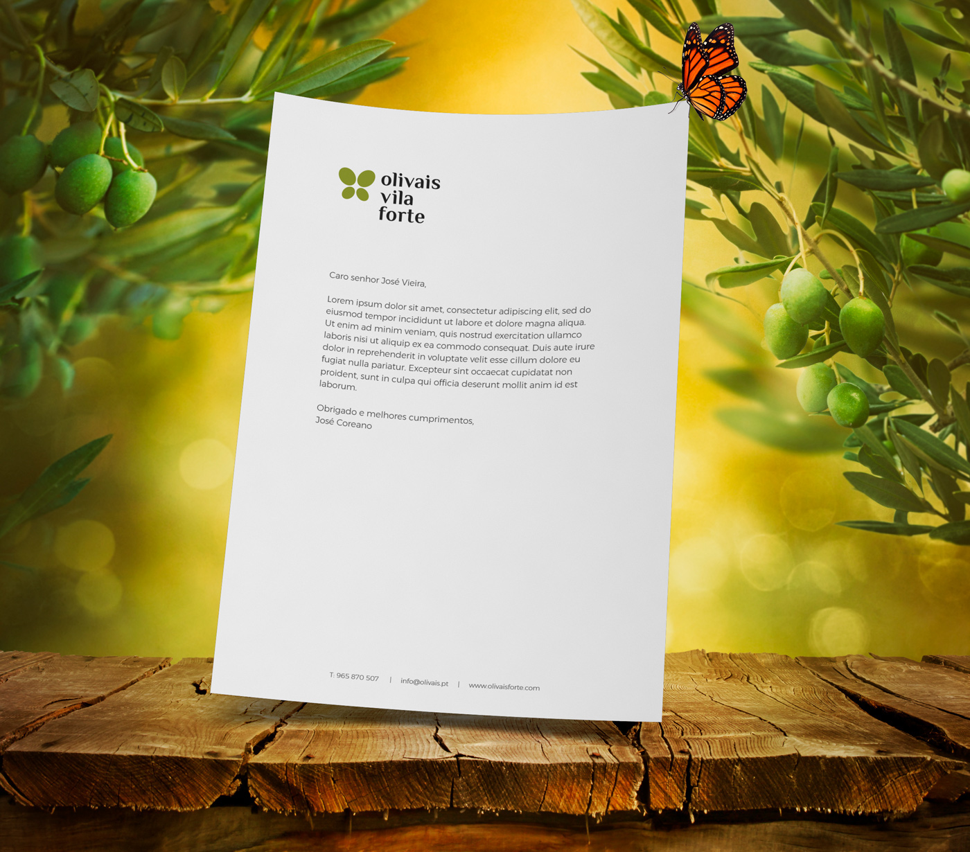
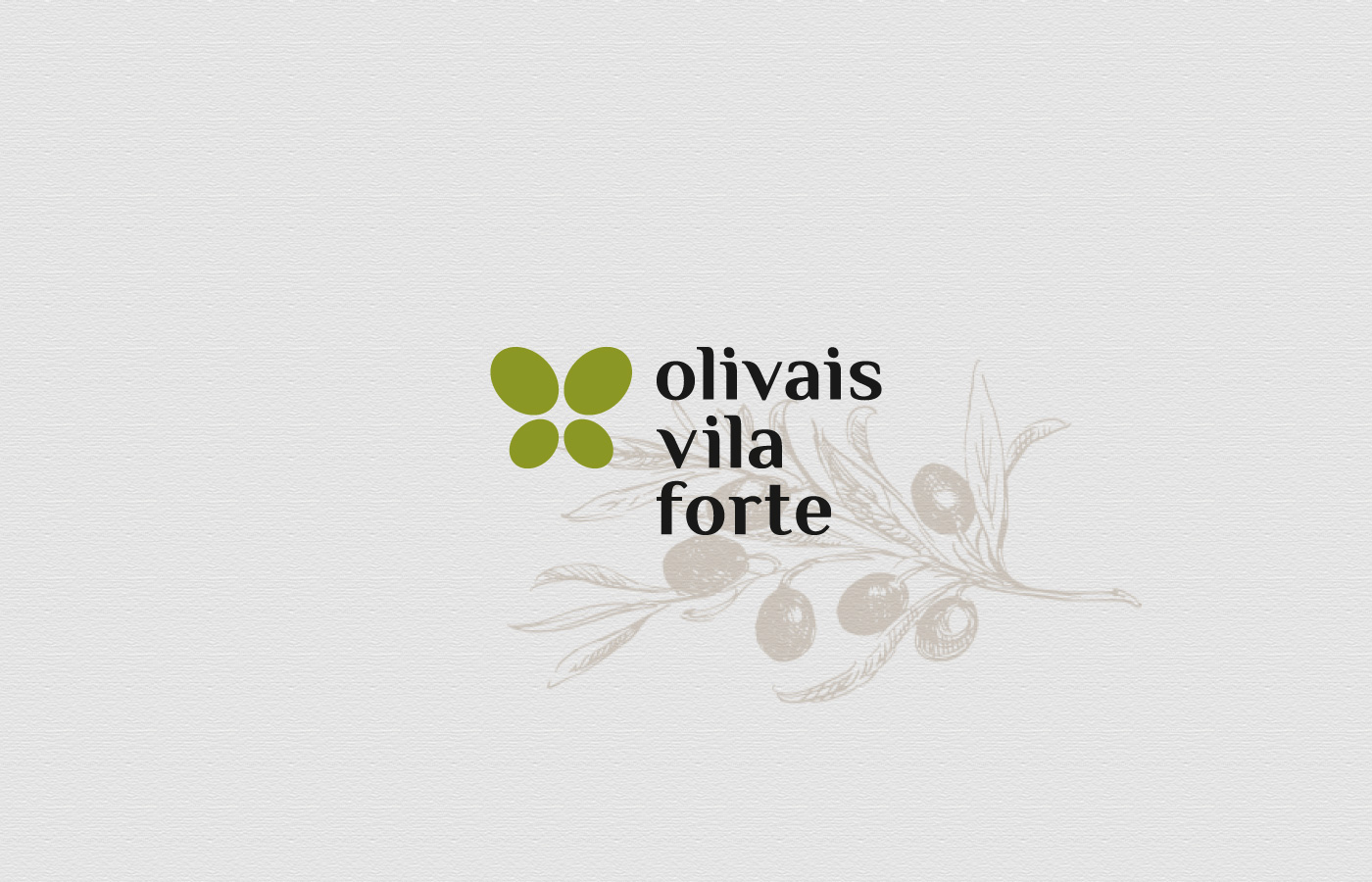
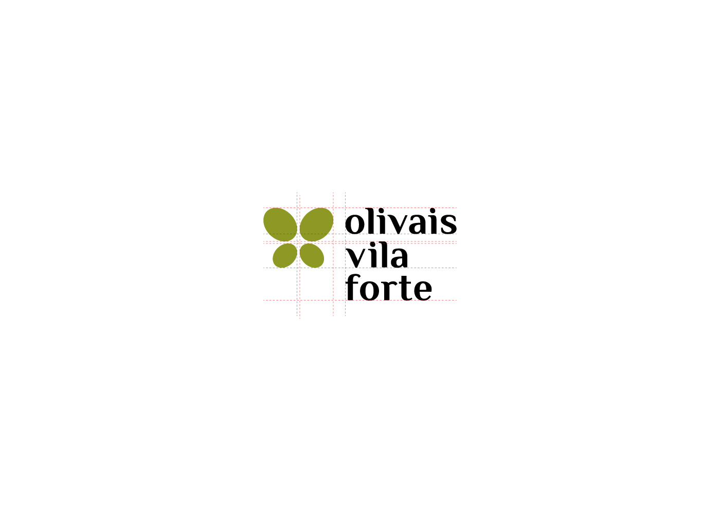
The client wanted a butterfly present in the logo to suggest the presence of insects in his olive groves, which are a sign of healthy environment practice, meaning chemical products are not present in olive groves.
Challenge:
Create a simple symbol that unifies a butterfly and olives, visually communicating healthy olive groves.
The typography suggests quality and decades of experience in the work field.

Brand design by: Pedro Almeida
Contact: pedro.workdesign@gmail.com
Contact: pedro.workdesign@gmail.com