I was inspired to do a quick interface design for what I imagine Amazon's Alexa Command Center might look like while playing a song from Spotify.
I always tend to work from dark to light, and I'm a huge advocate for providing both light and dark interface themes. From the UX perspective, it is essential that Alexa as a product integrates seamlessly with many other products, therefore I find that time and schedule-oriented environmental features, seen in products such as F.lux, Home, and the Phillip's Hue lightbulbs, are indispensable to Alexa's inevitable and widespread use.


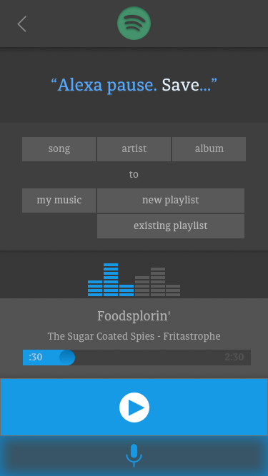
Below is an alternate layout. After realizing that the [scrubbing / fast forward / rewind] functions on the pause/play interface were redundant, I removed them and placed a simple pause/play button next to the mic at the bottom of the screen. I think this is a little more intuitive, and everything that you can/should interface with in this environment is within your thumb's reach.
So, this is a screen where you can voice activate the functions: play, pause, skip, previous, next, and a variety of "add to" or "save to" functions.
The only touch-based functions are pause/play for usability, and a mic for forced/jumpstarted voice recording (as opposed to, or in advance of "Alexa, [command]").
This is not an interface where you build playlists, browse music, or perform any of the other functions that Spotify enables you to do within their app. Rather, it's a streamlined integration for voice-activated features while performing other motor functions (driving, jogging, etc.)
Primary draws:
- Autofill-like suggested commands
- Clear, accessible and easy to use
- Clean, yet more "soft" than "crisp"; more appealing to sense of touch
- Material design buttons, thin-cut pressed foam interface