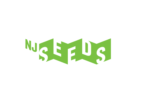
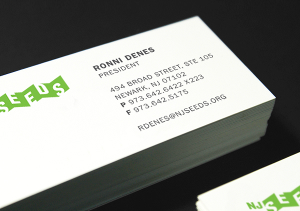
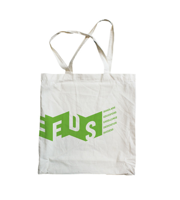
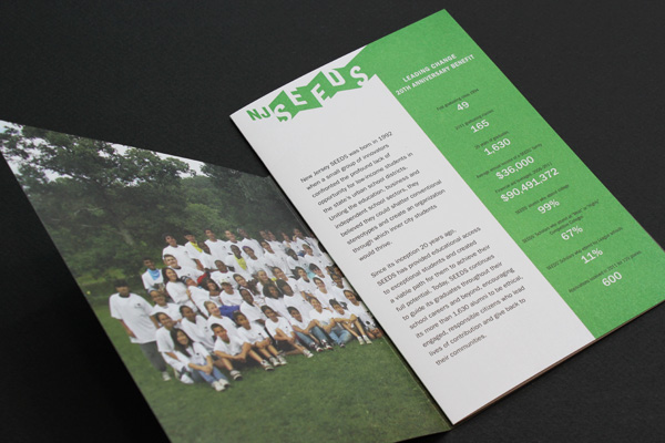
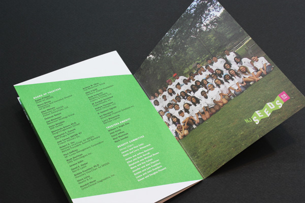
NJ SEEDS (Scholars, Educators, Excellence, Dedication, Success)
New Jersey Seeds is a wonderful nonprofit organization that helps prepare motivated, high-achieving,
low-income students for admission to private schools and colleges across the country.
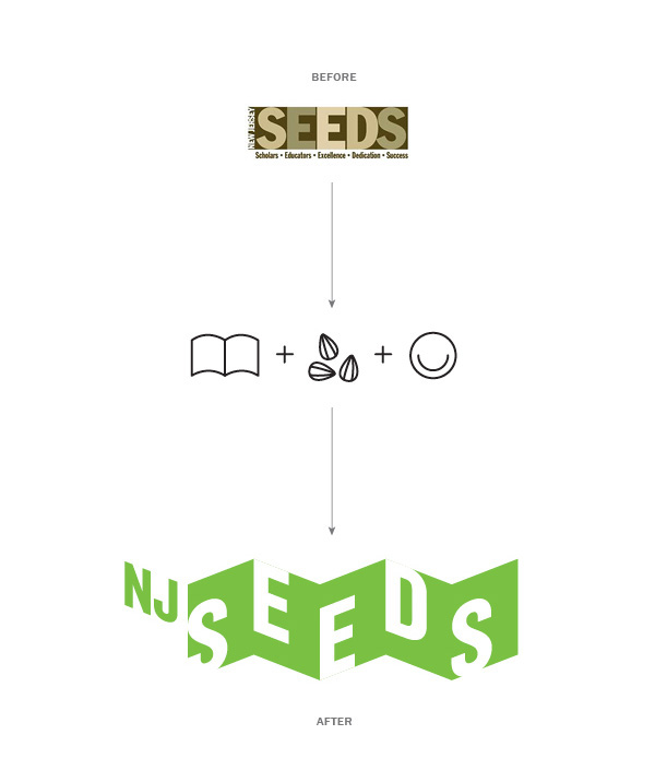
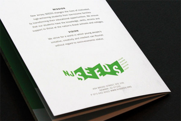
The rather subdued camouflage colors of the original logo no longer represented the organization’s meaning and its mission. In the new logo design, a bright green immediately changes the logo’s look and feel, reflecting youth, growth and hope. The design has the potential to continue expanding the folded shape to represent the opening of new chapters for students in NJ SEEDS and also reflect the organization’s forward-looking mindset.
The geometric form illustrates the shape of opened books and alludes to the idea of education. Rather than perfectly sitting inside, the five letters of the acronym break out of the geometric form, creating a more active, vibrant and playful logo to better represent the motivated and high-achieving students of NJ SEEDS.
The geometric form illustrates the shape of opened books and alludes to the idea of education. Rather than perfectly sitting inside, the five letters of the acronym break out of the geometric form, creating a more active, vibrant and playful logo to better represent the motivated and high-achieving students of NJ SEEDS.


NJ SEEDS 20TH YEAR Leading Change Benefit Invitation / New Logo Launching


Please visit NJ SEEDS webiste here to learn about the organization.
T H A N K Y O U


