
I gave advice to Cafe Obscura about how to communicate better with the community with the better use of design and text. I made a whole new brand identity so that the design and fonts better suited to the brand. I also made a design for a social calendar for the owner to focus best on what's to come and get more sense in what and when to share.
FONTS
I chose different fonts because I wanted them to suit the brand and look more professionally and tougher. I used the Canaro for normal texts in 2 different thicknesses (light and semi-bold) and for some quotes or other things that could use some attention, I chose the font Dirrrty. These fonts collaborate well and are stunning together!

LOGO DESIGN
I chose a really clean logo with only black and white because of the wishes of the client and because it suited best with the brand. Little bit of history, the camera obscura was the first camera that was made. It was a box with a hole in it. The box of the O has to envision the hole of the camera obscura.
I chose a really clean logo with only black and white because of the wishes of the client and because it suited best with the brand. Little bit of history, the camera obscura was the first camera that was made. It was a box with a hole in it. The box of the O has to envision the hole of the camera obscura.

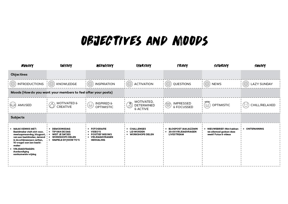
PLANNING
I made a planning for social media. This has objectives and moods so that you don't lose track on what and when to share something. I took into account what the brand was all about and that was to obtain a loyal community.
I made a planning for social media. This has objectives and moods so that you don't lose track on what and when to share something. I took into account what the brand was all about and that was to obtain a loyal community.

BRAND IDENTITY
I made some business cards and flyers. The business card has a die cut on the O which represents the hole of the camera obscura again.
I made some business cards and flyers. The business card has a die cut on the O which represents the hole of the camera obscura again.


SOCIAL MEDIA
I made a lot of social media images
I made a lot of social media images


THE PROMISE
The promise of Cafe Obscura is "Get to know image makers".
The promise of Cafe Obscura is "Get to know image makers".


