
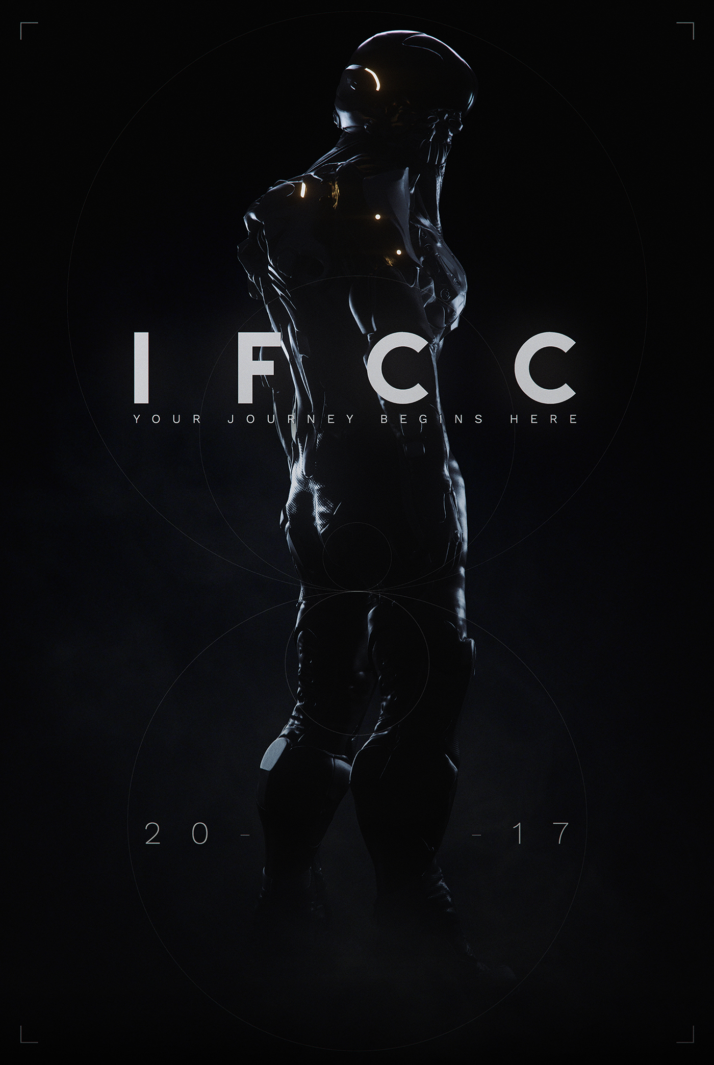
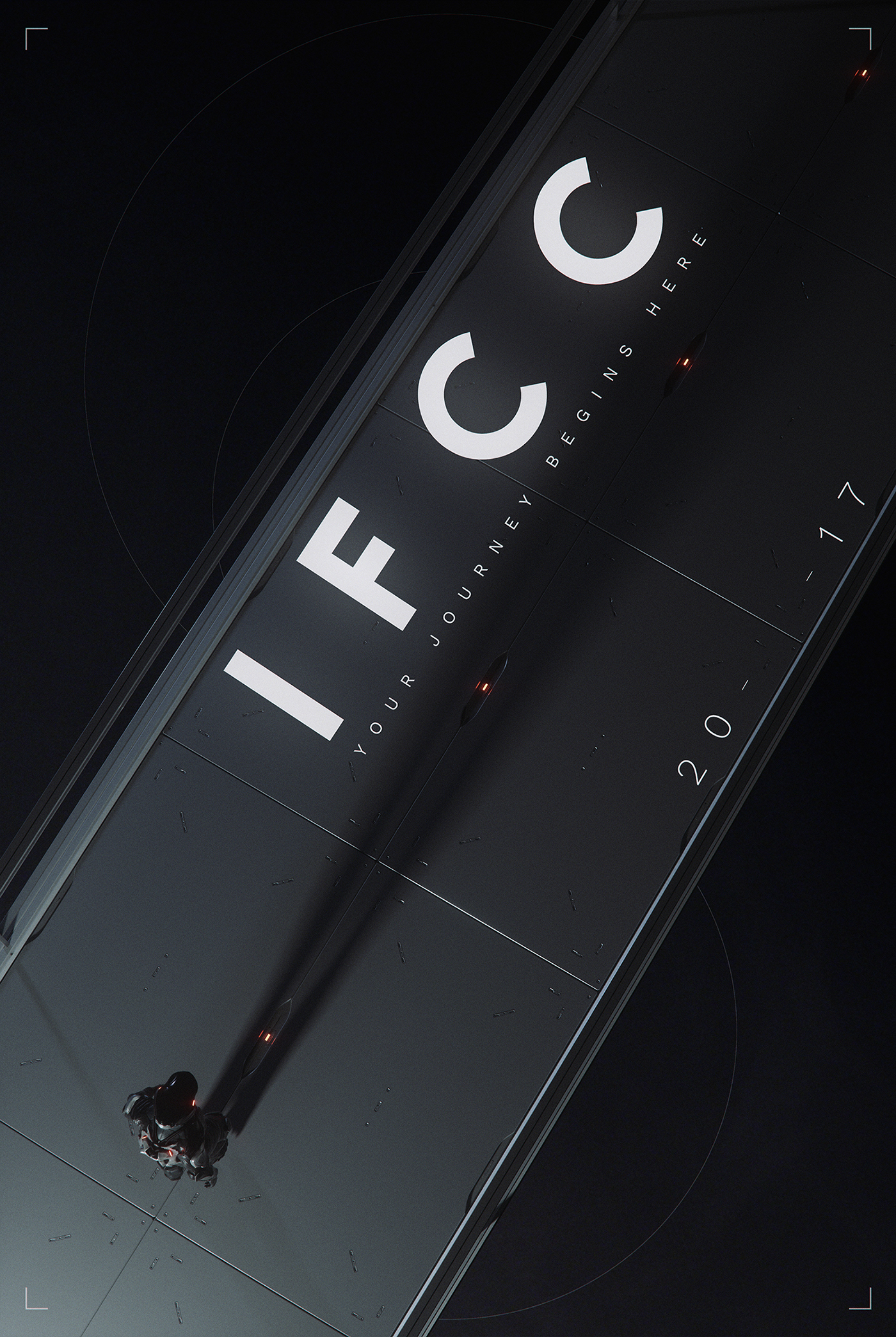
Main Titles for the IFCC 2017 Concept Art Conference. An extremely ambitious project, only made possible by the collaboration between close friends, and the passion for what we do. The Film takes you on a metaphorical Journey towards self-discovery.
Credits:
Direction/Animation - Sava Živković
Music/Sound Design - Iz Svemira
Story - Sava Živković, Nebojša Jež, Milan NIkolić
Concept Art - Milan NIkolić
Character Artist - Mihailo Radošević
Vehicle Artist - Nenad Merzel
Graphic Design - Nebojša Jež
Motion Capture - Take One
Special Thanks to Sitni Sati and Allegorithimic
Tools: 3ds Max, Octane Render, FumeFx, Substance Painter, Zbrush, Quixel Suite, Worldmachine, Adobe Suite
CONCEPT
From its concept all the way to execution, the IFCC titles were a massive undertaking. We were lucky enough that our last year's Twitch: Loadout project provided us with the chance of presenting at the IFCC 2017. But we saw a unique opportunity, one where we could explore our creativity and collaboration even further. Therefore we pitched the idea of creating the Main Titles for IFCC 2017 and to our delight, the organizers said yes.
IFCC or the Independent Festival of Creative Communication is, at its core, a concept art conference. Having this in mind we wanted to stray away from the "typical" motion graphics title sequence and create something with a strong connection to the concept art world. Upon many iterations we decided not only to create something that's story driven, but to treat the entire title sequence as a short film.
As this was to be our very first story driven short film, we wanted to stick to the proven methods and relied heavily on the teachings of Joseph Campbell, focusing particularly on The Hero's Journey and combining it with the Sci Fi setting for our film. There were many ideas for the core concept, ranging from "Birth of the Idea" to "Creative Journey" and "Self Discovery", all of which are pivotal and relatable, not only to concept artist, but to people in general.
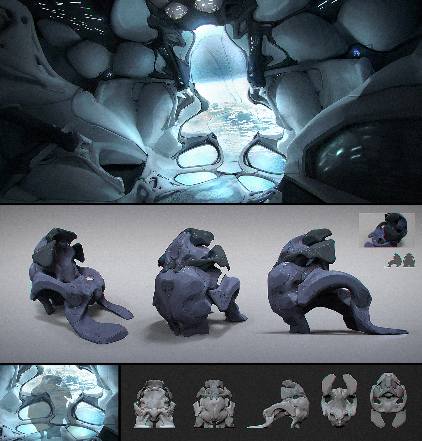
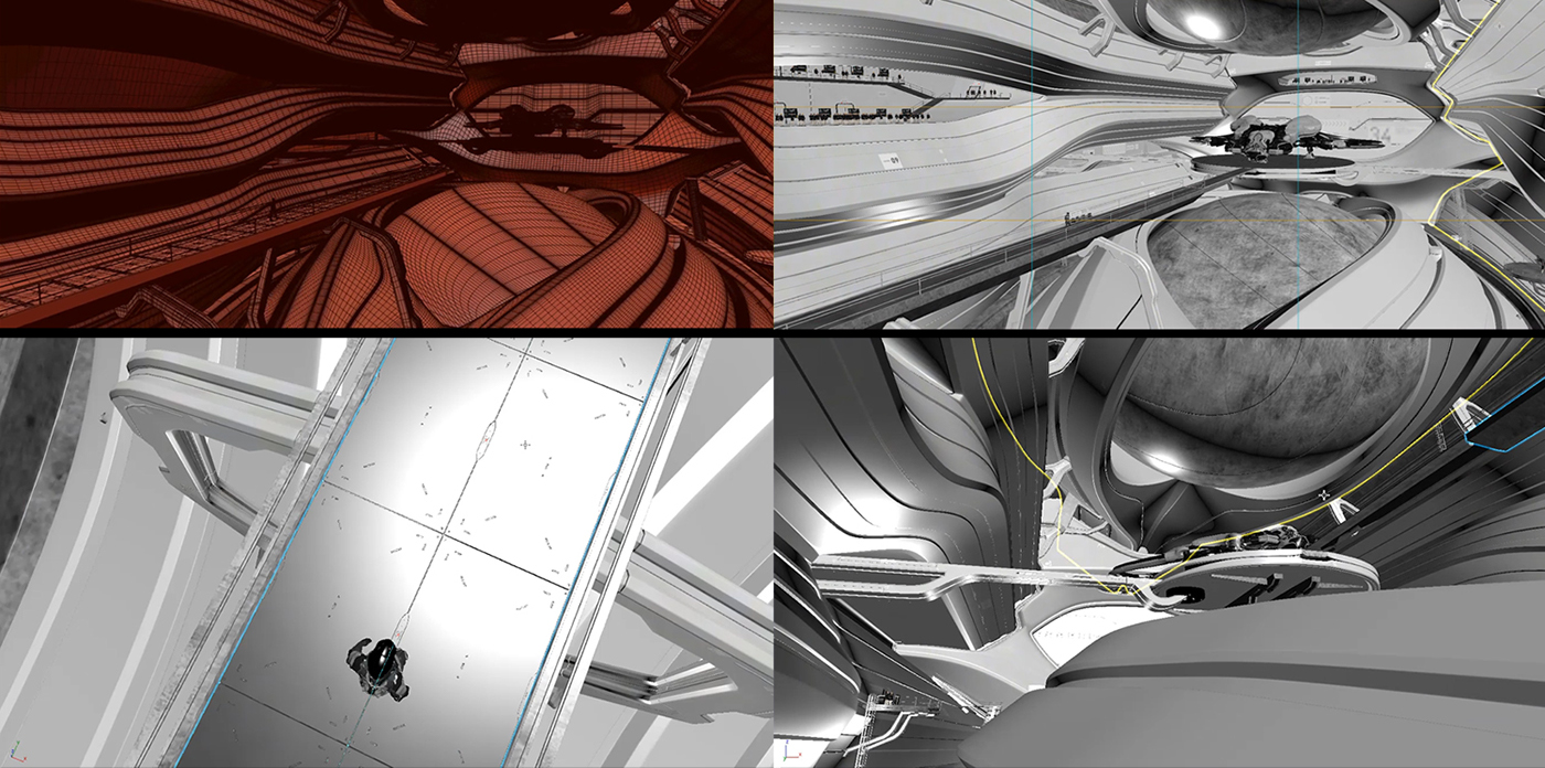
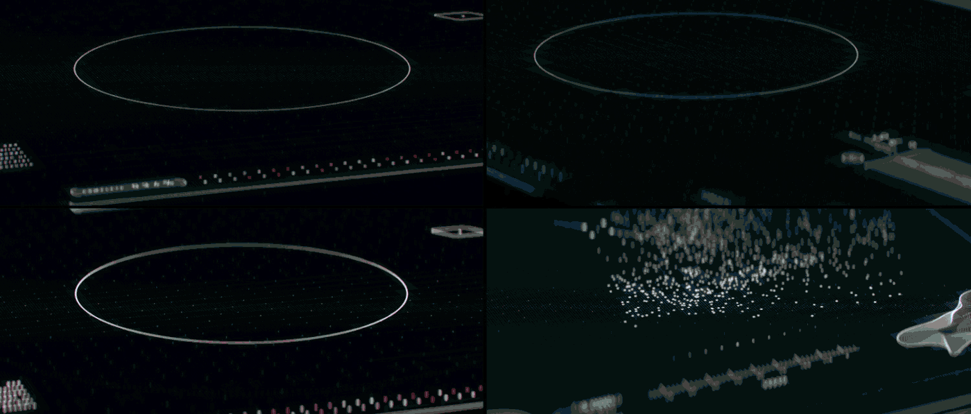
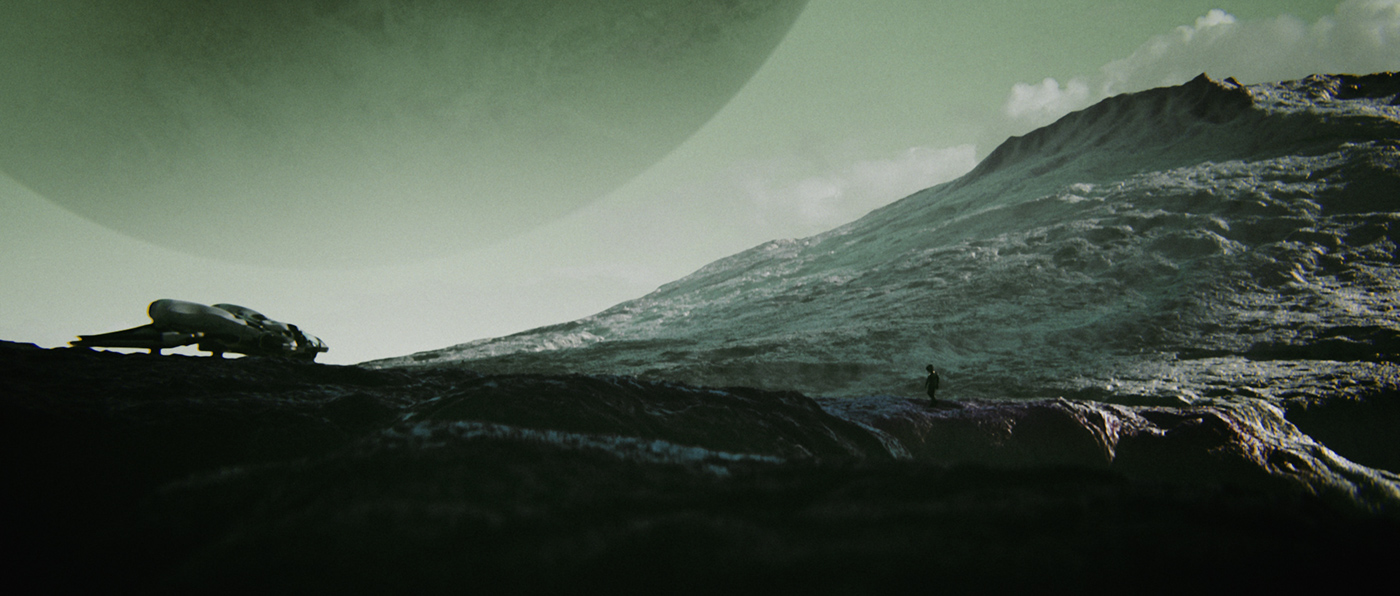
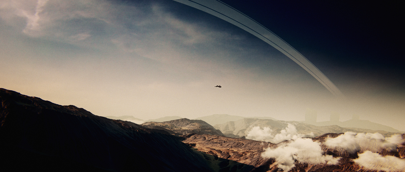
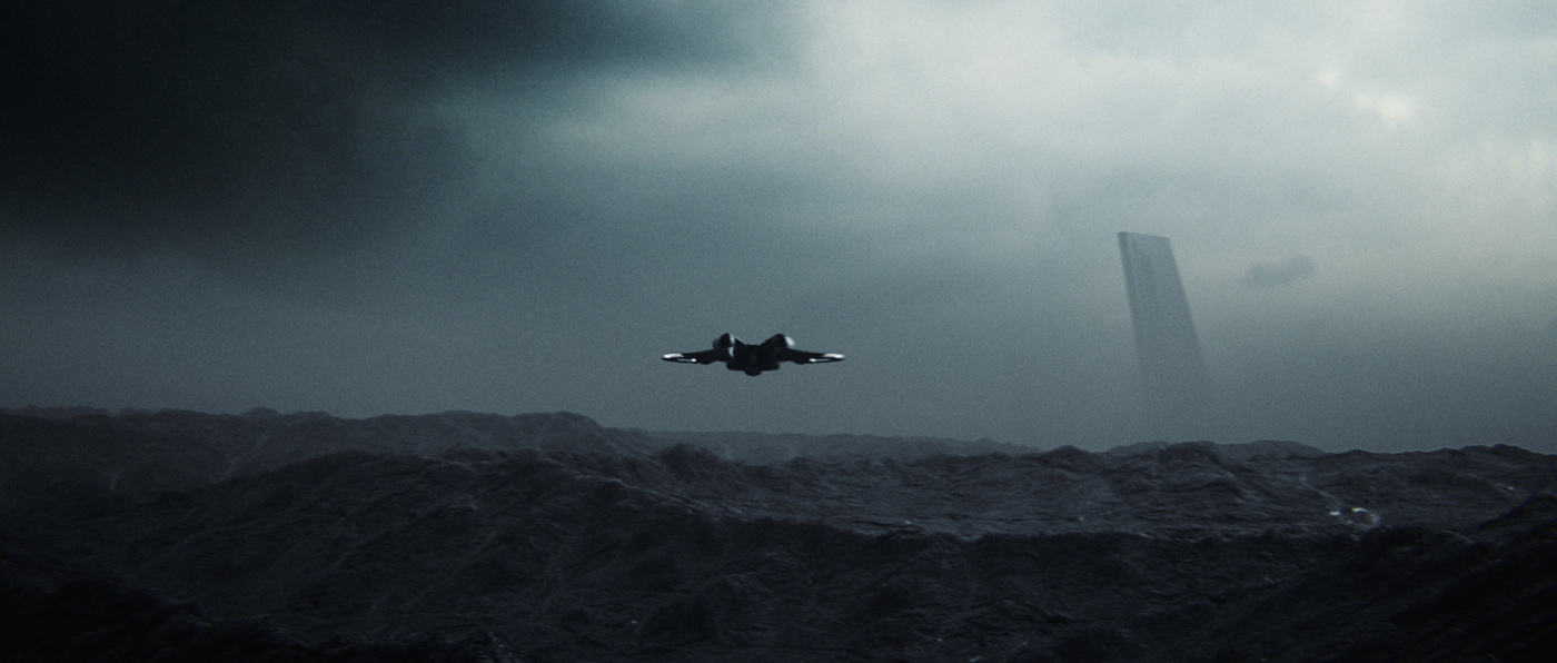
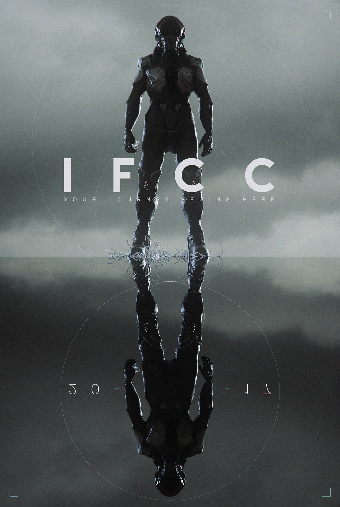
Staying in the Sci Fi setting, we made a decision to avoid space imagery and instead use interdimensional travel as our means of exploration, thus only focusing on the landscape scenery, as a throwback to the myths of the old. As the hero's journey story structure is cyclical, we used the circular imagery all throughout the film, as represented in the alien artifact our character seeks, the vessel's UI, and the hangar platform, serving as the last transition between the ordinary and the extraordinary world.
PRODUCTION
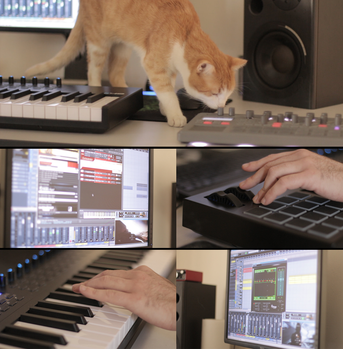
As our concept got finalized we moved into the production stage, a monumental task in itself. Even though the Film was produced mostly in our spare time, we wanted to adopt the proven methods of many professional studios, and run the various elements of production in parallel to one another. Beneath you can see our production pipeline and each team member's responsibilities.

CONCEPT ART
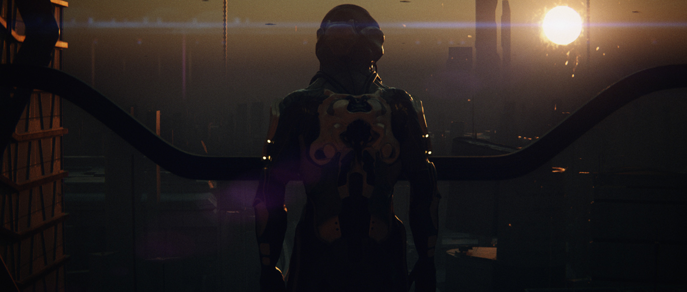
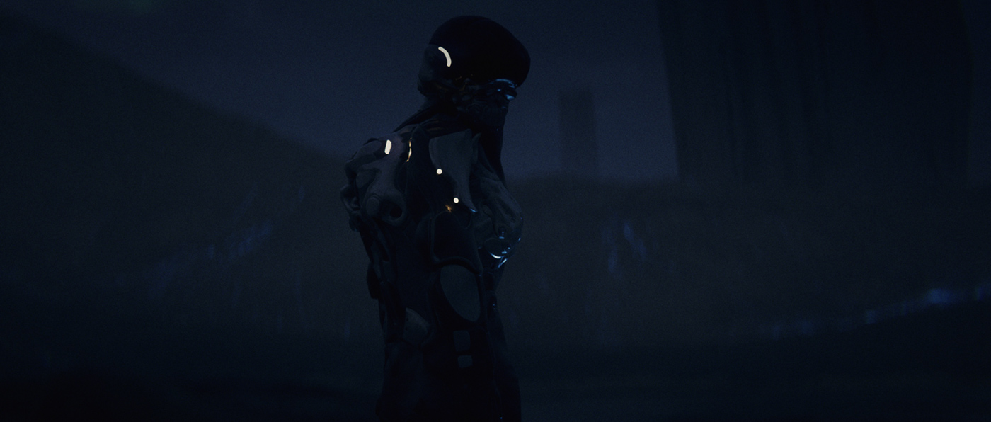
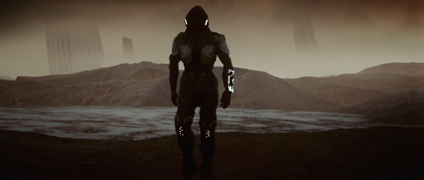
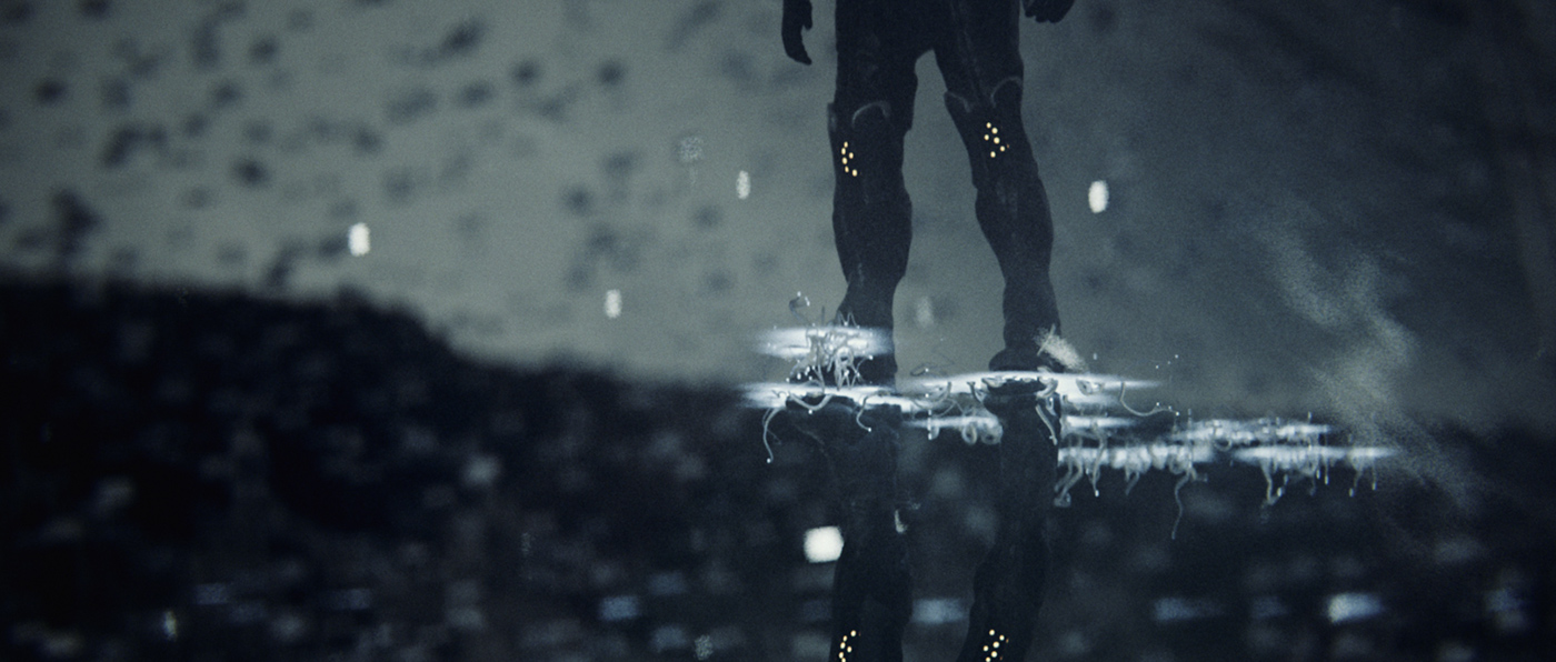
One of the first and most important stages was designing our main Character and his vessel on this journey. Milan Nikolić once again infused his specific design sensibilities into the character and vehicle design, creating familiarity of an astronaut and an explorer, but packaged in his own visually distinct way.
Milan used all the various techniques for creating the concepts, from traditional sketching, to sculpting in Zbrush and over painting in Photoshop. The Zbrush concept sculpts were particularly useful as they provided a great starting point for the final asset creation.
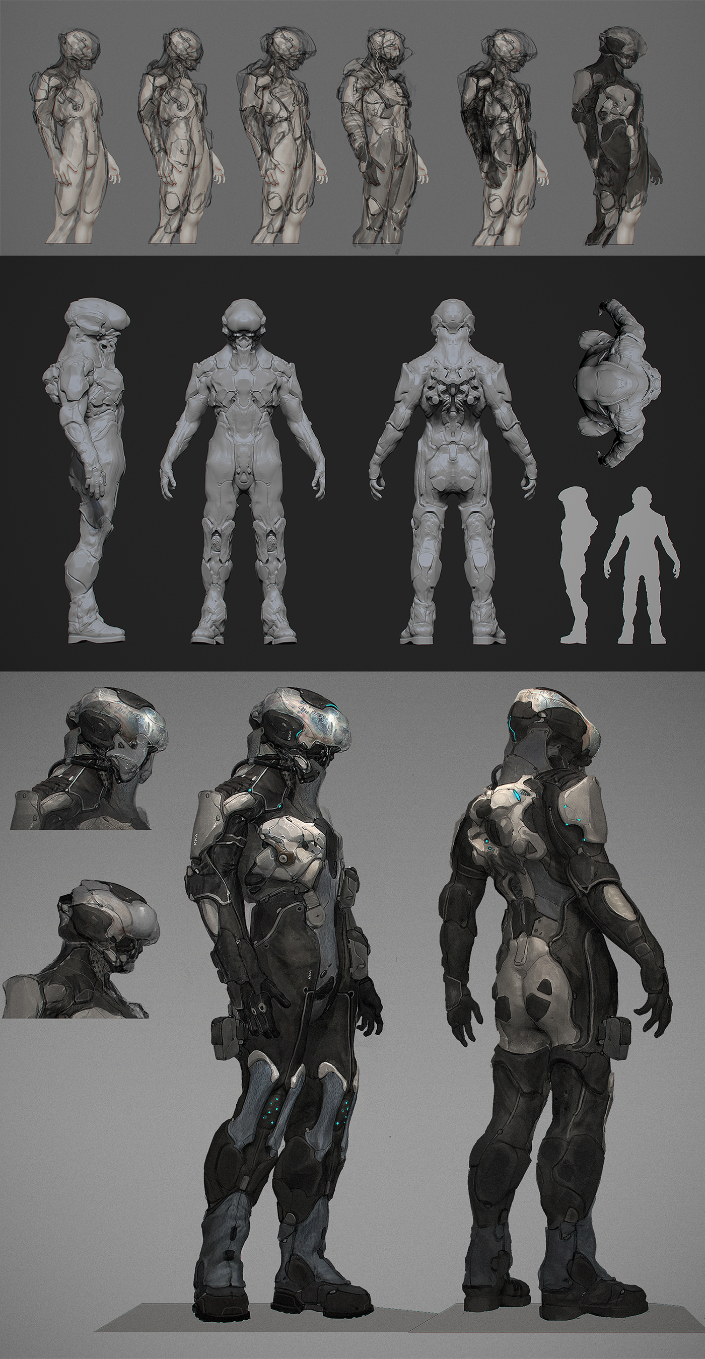

CHARACTER ASSET
The character asset was considered as the main asset in the film, it's our main hero and the element that guides us through the story. Therefore it needed the most attention and care as the whole film would be centered around it. Thankfully our good friend and an amazing 3d artist Mihailo Radošević rose up to the occasion and dedicated his time to completing this task.
Mihailo used 3ds Max to create the model, starting off with re-topology of Milan's concept sculpt. This was a huge timesaver as the overall proportion and most of the detail were there, it just needed to be translated into a proper sub-d model for animation, a task easier said than done.
The model was unwrapped into 4 UV sets and exported to Zbrush where the finishing detail pass was added. For the texturing, Mihailo used Substance Painter and was able to easily iterate between the different stages of textures.


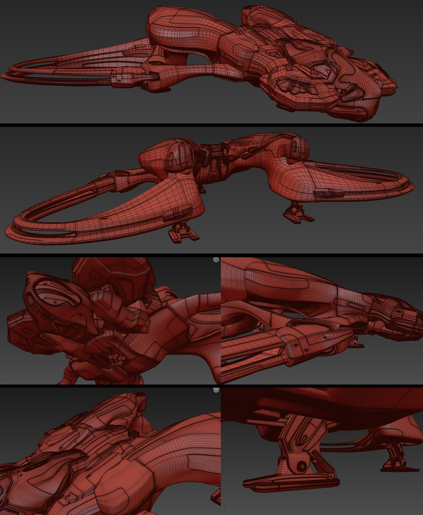
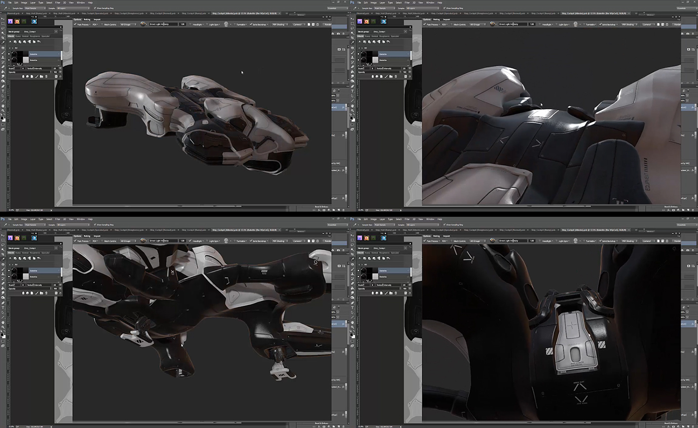
VEHICLE ASSET
The vehicle asset was a bit easier to tackle since it's mostly hard surface modeling, a familiar task for our long time friend and industrial designer Nenad Merzel. The workflow for the vehicle is the same as for the character, the only exception being the detail pass in Zbrush.
The texturing process here differs as well but only in the choice of software. Nenad used Quixel Suite for the two texture variations of the vehicle, the clean version, and the dirty and damaged version.
ENVIRONMENTS
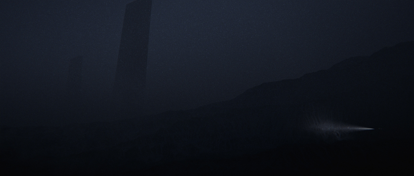
As our film's starting point we wanted to portray a dying cityscape, engulfed with thick smog, telling us we have to leave this place, or find a cure for it. The cityscape was created by combining custom buildings mixed with some premade assets from video copilot, all scattered via forest pack.

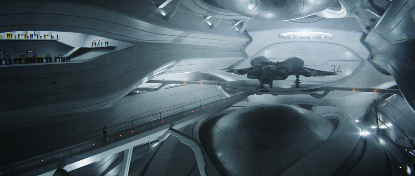
We were heavily inspired by the architectural style of the late Zaha Hadid and we wanted to pay homage to this amazing architect in our hangar scene. Some of the architects among you might recognize the point of inspiration.
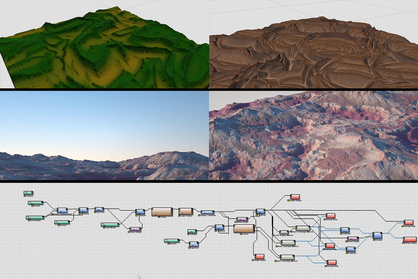
Having our focus on the landscapes rather than space imagery meant we had to produce a lot of environment variations, and being that we had limited time we opted for the procedural terrain generation via Worldmachine. Taking inspiration from various quarries and geometric shapes, our environments got progressively more abstract as we journeyed into further dimensions.
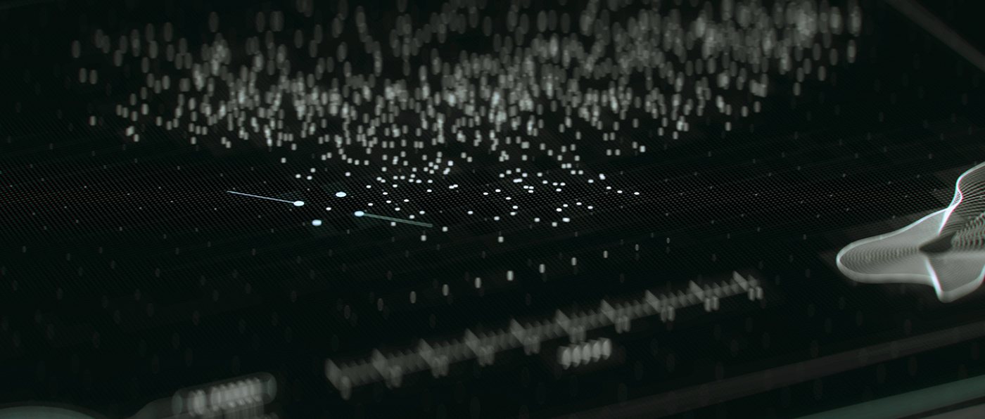
UI AS A STORYTELLING DEVICE
Relying solely on conveying our story through visuals we had to come up with a story device that would provide us with some information but without uttering a single word. Enter the ship's user interface, a responsibility of our friend and graphic designer Nebojša Jež.
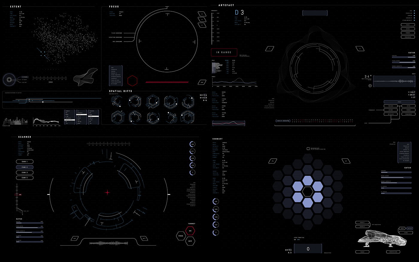
The two main elements were the interdimensional jump counter and the artifact scanner. The jump counter provided us with the conflict, a timeframe in which our character needed to complete his task. We treated the technology in such a way that our character had a set timeframe to explore each dimension before the ship would automatically make the jump into the next one, adding the sense of urgency.
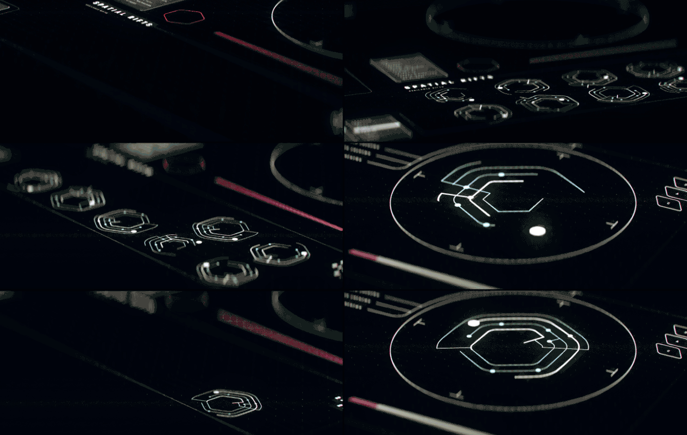
The artifact scanner provided the goal for our character. It's something he seeks, but has a very hard time finding before it appears to him in his most dire moment. Again, dealing with themes of deadlines and finding one’s inner voice.
TYPOGRAPHY
Early in the production we have decided to adopt an old anamorphic film look, harkening back to the films of our childhood, which informed the use of type for this project. Avoiding complex animations, the best fit as we saw it, was to use a simple film fade for the titles themselves, bringing the whole piece into a celluloid era of filmmaking.
We have experimented with quite a few different approaches to type animation, but have eventually settled on the initial, simplest idea.

MOTION CAPTURE
Once again we had a great pleasure of working with the amazing people at Take One, a motion capture studio based right here in Belgrade. Character animation is still an unknown territory for us and the biggest hurdle to handle, but as soon as Take One was on board we knew we were in good hands.
We received access to their MoCap facilities in order to capture the required data, which was handled by our friend Kristina Antić. Every move our character had to make was planned for ahead of time, and our storyboard was used as a reference all throughout the shoot.
Afterwards the team at TakeOne processed the raw motion data and refined the files with keyframe animation where needed, providing us with the final production ready files.

SCORE
As one of the most important aspects of any film, the music and sound for this project were the most integral elements for conveying emotion and setting the tone. One of the unique aspects of this project was the fact that Iz Svemira collaborated on crafting the story, resulting in his deep immersion in the film from the very start of the project.
Starting at the emotional core for the whole piece, Iz created a theme for our main character. To achieve this, his focus was to arrange the instruments so that each one represents central development in the story; the piano is the character, the horns are his relationship with the world around him, the strings section represents his emotional journey, and the synths the goal of his pursuit.
Once the theme was in place, it evolved into the rest of the score, following the story progression from its basic form in the beginning, through doubts and challenges, all the way to the climactic ending sequence and our character’s self-discovery.
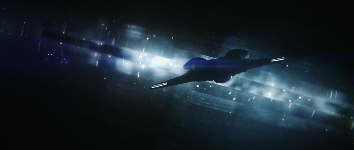
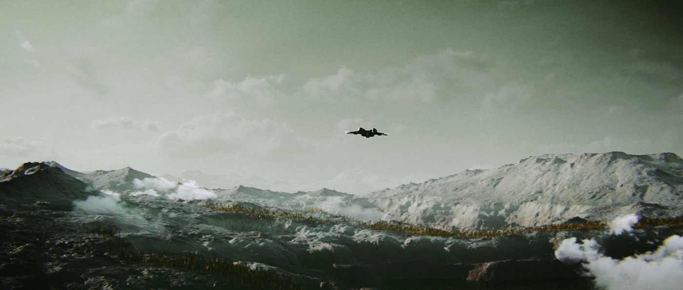
FINAL STILLS


POSTERS
DOWNLOAD Free High Res Posters
RESOURCES AND LINKS
We would like to thank every single artist who has been kind enough to devote their time and help in bringing this project to life, as well as our families and friends for their support along the way.
Also once again a very special thanks to Sitni Sati and Allegorithmic for their generosity with providing the software licenses for this project, as well as numerous creatives out there that inspire and push us every day.
The team will be giving a presentation about the making of this project in May at IFCC, so if you're by any chance interested in this or many other amazing lectures feel free to drop by.
Links:
For additional bts follow me on Instagram


