3D Typography – Studies in Rendering
This project is a set of test renderings I did in Cinema 4D and Photoshop to experiment further with 3D typography. I have made those over a few months as I was travelling. I found my inspiration in traditional typographic work, some going as far back as 19th century traditional french sign painters. I have included relevant references below as well as a short description of technical challenges I faced in achieving particular styles.
English typography with ideograph looking glyphs
This first image is a card that I have created for my team at Adobe to capture one of our 'team agreements'. I wanted to do something elegant, cary the message and not feel overly corporate. I chose the Nihon font because it is beautiful and it requires a little effort to actually decypher the text. If you can't figure out what this says, you are in good company, few people can! The text is "Assume Good Intentions" (read top to bottom, left to right).
This first rendering did not create a particular challenge, most of the work was done in Cinema 4D, the texturing and final image fine tuning in Photoshop.

Film-Noir #1 – Block letters
This next rendering is inspired by this work by Lorenzo's typographic work. I worked to find a good way in the combination of Cinema 4D and Photoshop to create the right texturing. I used Sketch and Toon to render the 3D letters in Cinema 4D.
The text reads 'Be Content', one of my important personal reminders.

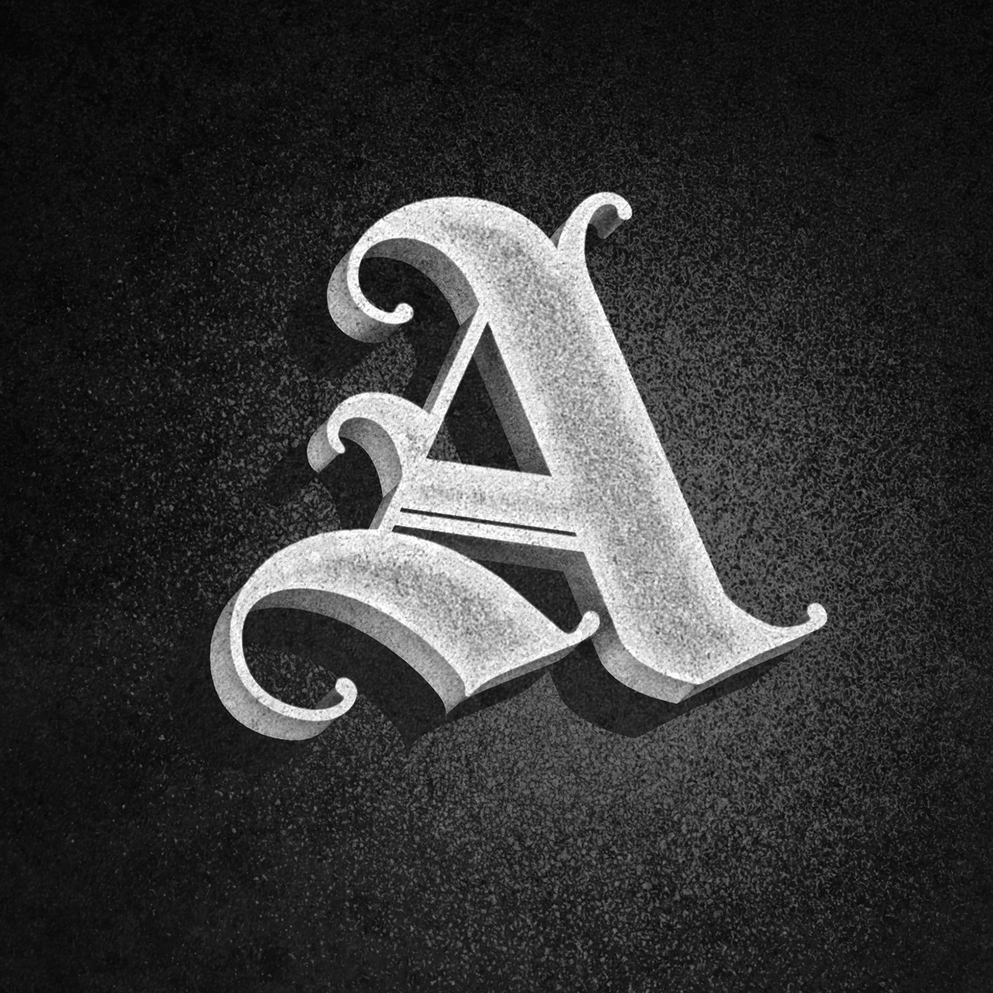
Film Noir #2 – Shading, Shading, Shading
In this study, I was admiring the work of Gustavo Mancini and contemplating how to create a shader that would give look similar to the work on some of his impressive lettering work.
After a lot of poking around in the powerful Cinema4D shaders, I discovered that combining the spline shader in a layers shader allowed me to create an effect pretty close to what I was looking for. See below for some more details and screenshots.


The Layer shader is used to render the font cap of the 3D letter. It is a combination of a noise shader for the texture along with two spline shaders which can use an input spline or a glyph or text (see next image).

The spline shader provides a way to use a curve or a glyph / text to texture an object. Here, the spline shader is set to match the geometry of the front cap of the "A" letter. The controls allowed me to essentially stroke and blur the rendered text and combine it with the base noise texture used in the parent layer shader.
Learnings from the past – The work of N. Glaise, Modeles de Lettres.
The next two compositions are an attempt to reproduce the look and style of the N. Glaise's work which I have admired because of its diversity, and boldness. Here are the two examples I was trying to emulate, centuries appart, using a 3D creative tool instead of the brushes, paint and technology of that time.

For both of these images, the challenge was to wrestle with the sketch and toon shader to create the desired effect. While this was a lot of trial and error, I got a lot of satisfaction in getting to the point where the combination of the sketch and toon rendering and photoshop texturing got a result pretty close to what I was trying to reproduce, as illustrated below.

This second example was used for thank you cards that our team sends to users who go out of their ways to provide great feedback to the XD team (my job at Adobe is to manage engineering for the XD team).

Stroking text in 3D
For this last card, I was inspired by the beautiful work of Tyrsamisu on Instagram. I am not sure how that work is created, but one of the techniques used is an interesting effect you see in many 3D typographic compositions, where the stroke around the text is 3D in the sense the stroke on overlapping parts of a glyph appears as you would expect naturally. It turns out it was not easy to create when using a 3D tool and I experimented with multiple techniques that involved either modifying the elevation of the letters relative to each other (e.g., see the stroke between the "e" and the "a" in "Year": this was done by slightly pushing the 'e' away from the 'a', vertically) or by selecting the specific edges to be stroked (e.g., see the stroke in the end of the capital 'O' in "One": that was accomplished by creating more edges in the top polygons that make the 'O' and excluding some from the stroking operation).
This rendering was made to celebrate the one year anniversary of the XD team releasing its first public beta in March 2016.


