


ART DIRECTION
DESIGN
ANIMATION
TECHNICAL DIRECTION
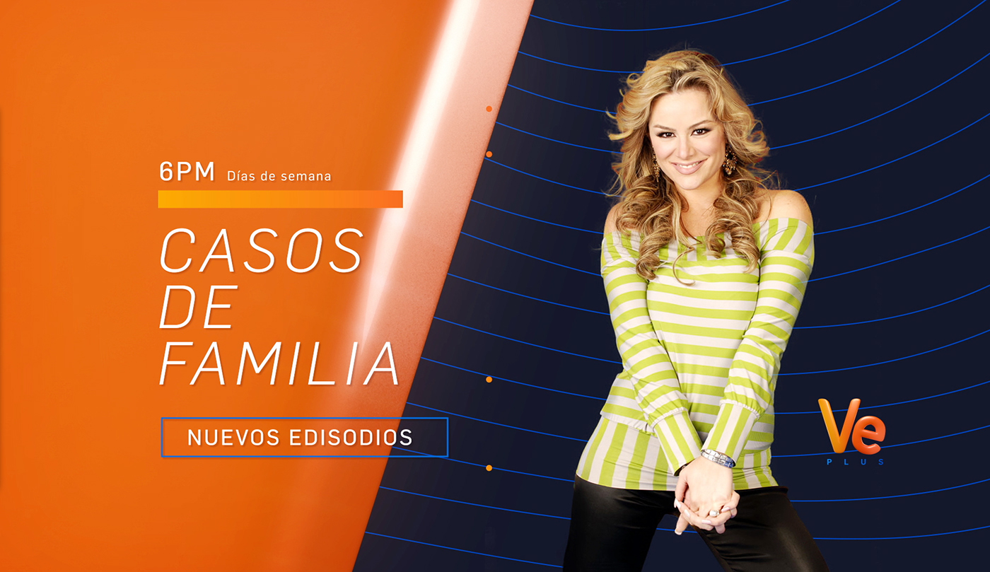
VEPLUS REBRAND 2017
CLIENT: CISNEROS MEDIA
STUDIO: VIEWPOINT CREATIVE
I left Venezuela, moved to Boston and ironically from Boston at Viewpoint Creative, rebranded a Venezuelan network, a Latin-American demographic I am all too familiar with. This class is what in the US the politically correctly call the "working" class, I felt at home like I was back in my studio in Venezuela. This socio-economic group demographic is often underestimated, therefore it is not offered the best quality of design, but good composition, use of color and semiotics are appealing to all without distinction of socioeconomic or cultural status, this was an argument that I had used throughout my whole career in Latin America to very positive effects. Fearing that this underestimation would affect the end result I put my self deep into the mind of our demographic and thought about how they like to be treated,
"We are young and feel young, are hard working, honest and do not have time for abstractions or elitism. In touch with reality, we aspire to see color and beauty in the quotidian. We take things lightly and like to have fun and laugh. Treat us with respect. Believe in our ability. We make or break trends. We are the base of the socio-economic structure."


Logo frame
Transitional Element
EndPage
When Producer Sam Rundbaken and myself spoke with the client we concluded that we wanted a strong symbol with geometric weight that functioned almost as signage, but included pop patterns and vibrant colors hat would reference the tropics.
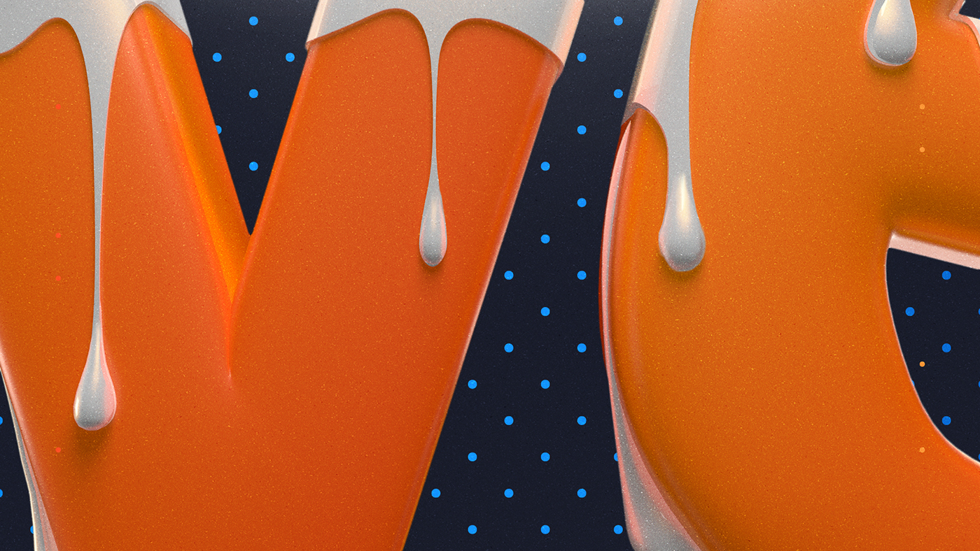
In the end this did not work out, the client was more inclined to something that I can only describe using the Spanish word "Empalagoso" there is really not a word for it in English, it is kind of a feeling of overt sweetness that almost makes you sick of the sweetness. We also hit on concepts such as lusciousness, sensuality, comfort, trashy and stickiness. It was easy to find ourselves in a conceptual maelstrom but Sam and I came together to discuss different ideas. We referenced social media trends, such as nail art, graffiti, makeup and on the spot started sending the client our references. We were headed in the right direction and then catastrophe. Like a wrench in our creative engine the client had a goal that conflicted with the proven Logo creation process. The Client before even seeing any of our sketches wanted to see the logo in 3d with what we call a "treatment". This isn't logo creating this is type treatment. This is not how you design a logo.
After moving past the rigidness of the standard process and just started playing with polygons and sculpting in Cinema4d. I made some drippings and played with textures. We started on the final step of a logo process and arrived at exactly what we all wanted and had fun in the process.

Basic Brand Guidlines


3d Process in Cinema4d


