Concept
Residential complex Sportivniy Park (Sport Park) is a new project of the development and construction company ASK. It is planned to build 13 multiple dwellings with comfortable training areas in the territory.
Sportivniy Park motivates young people to lead a healthy life. The dwellers and their friends can go in for sports absolutely free.
Main target
We decided to create an identity based on the unique features of Sport Park. The identity had to transmit such brand values as ecology and active rest.

Current task
To build up a bright and lively logotype. It was necessary to represent the brand philosophy and show all the opportunities of Sport Park.

Logo
is composed of letters S and P decorated with graphic icons which symbolize different advantages of the complex: park areas, training zones, highly developed infrastructure and transport availability. We’ve also designed an alphabet to communicate with the target audience.

Font
In opposition to complex logotype we use simpler font Pragmatica. The font blends with the logotype due to its neutral outlines. Pragmatica is suitable for main text, for small point size font as well as for large point size headings.

Colour palette
consists of vivid and juicy colours.

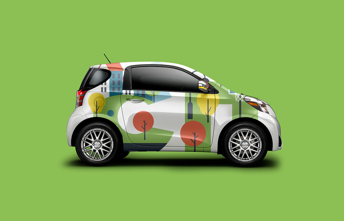
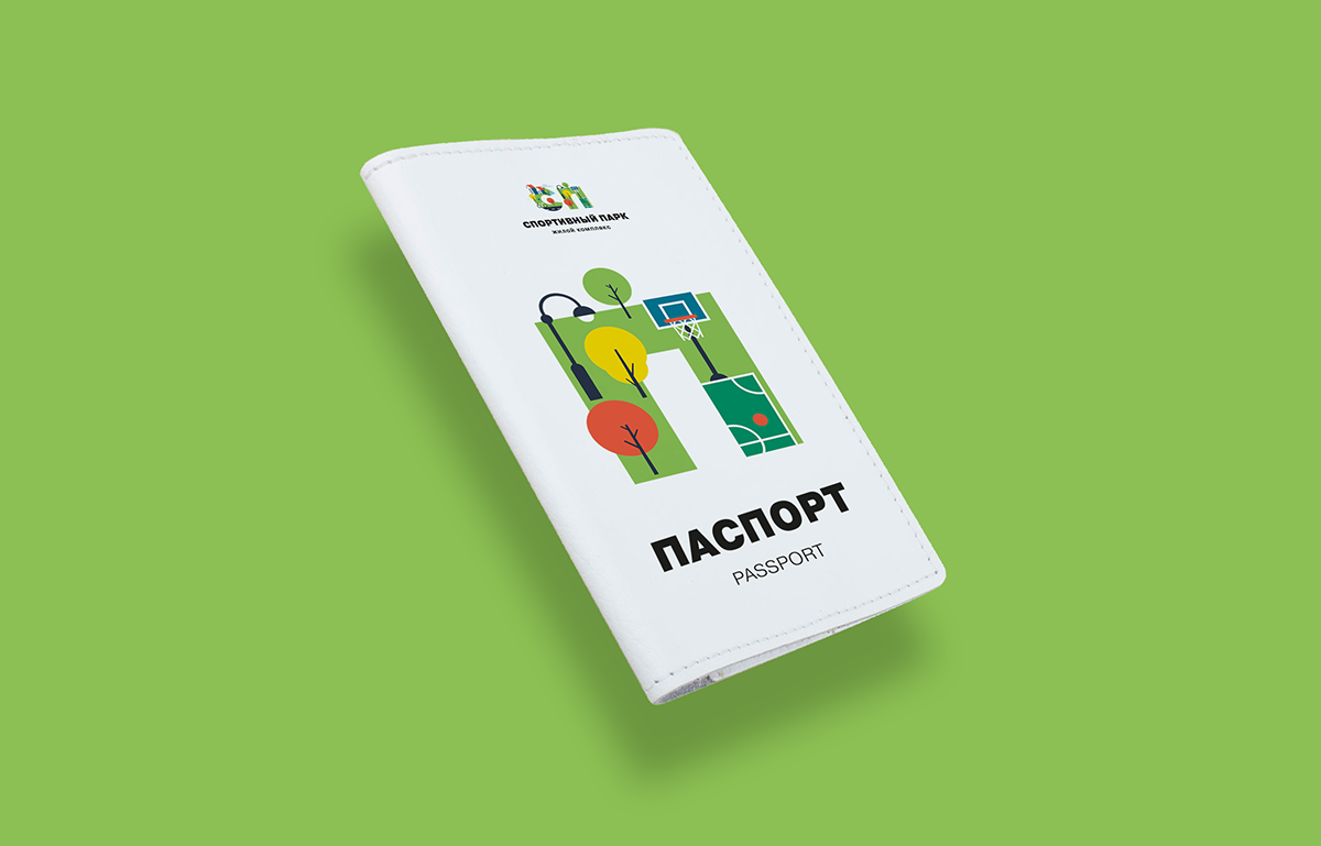
Graphic elements
We’ve drawn an icon set and made a pattern in firm colors. We’ve also designed an alphabet to communicate with the target audience.


The result
Dynamic, flexible and ingenious identity, which attracts attention of the potential customers and stands out against competitors.