naming and branding for
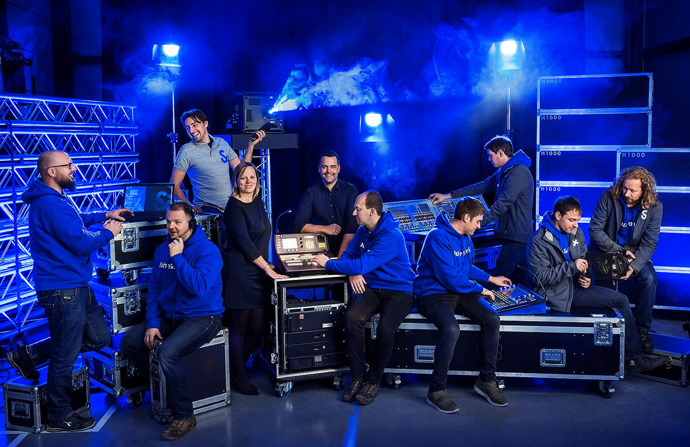
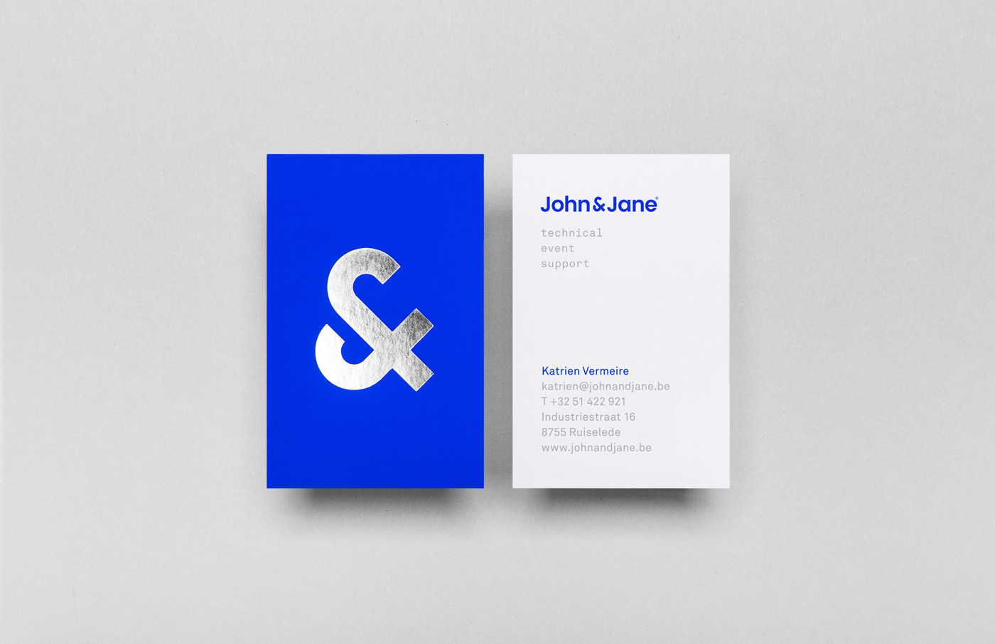
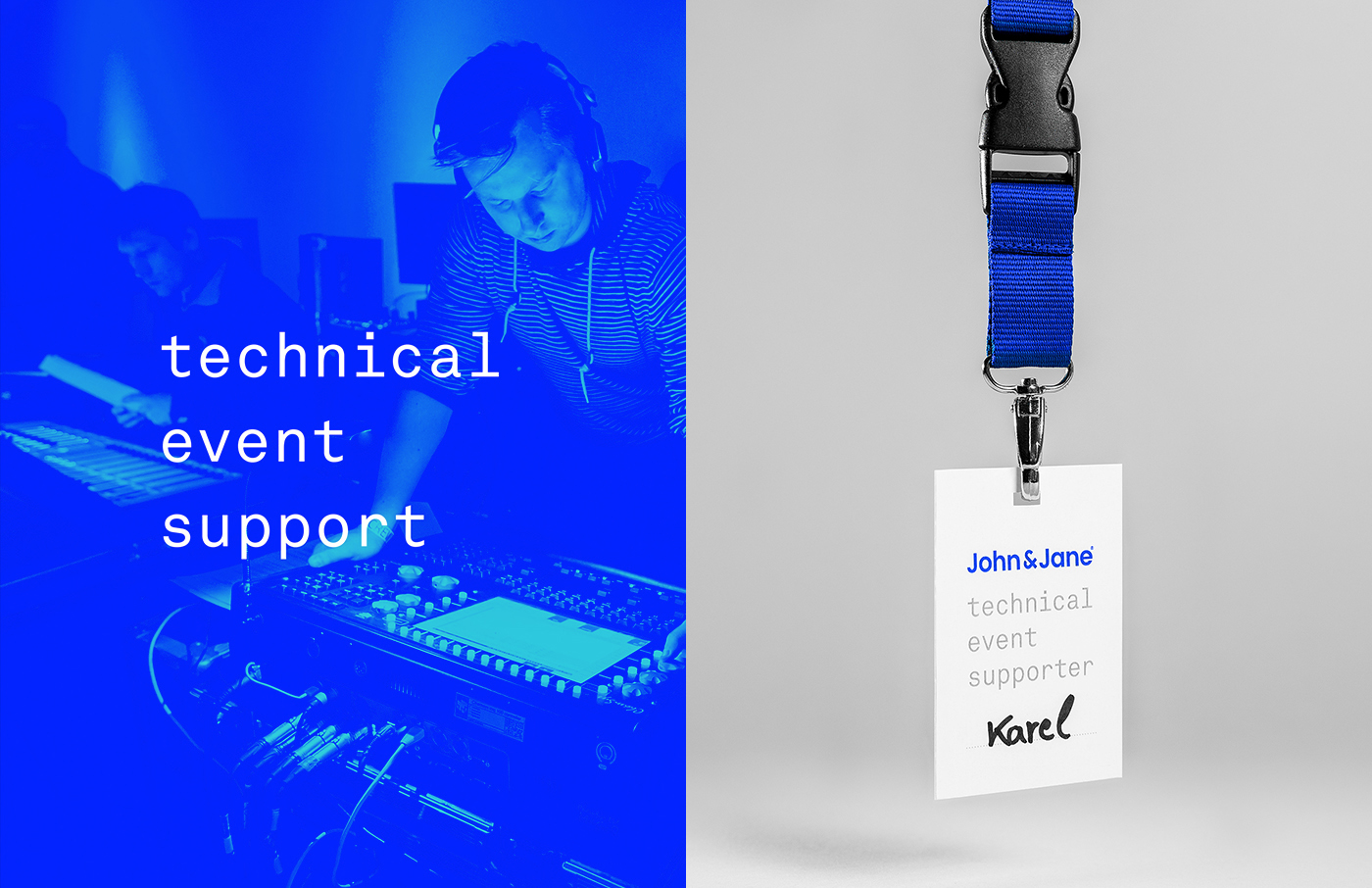
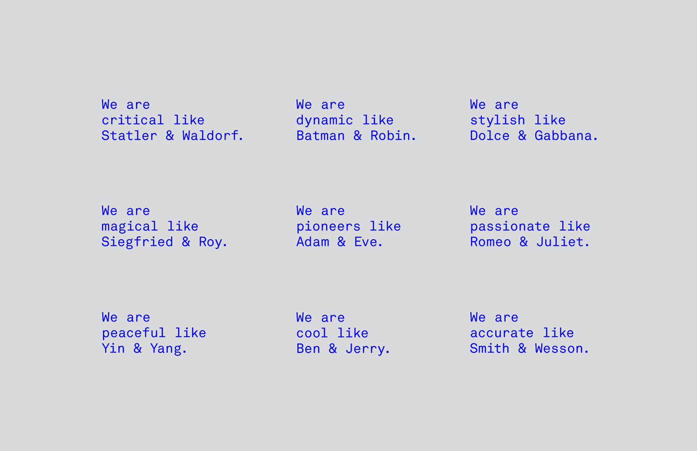
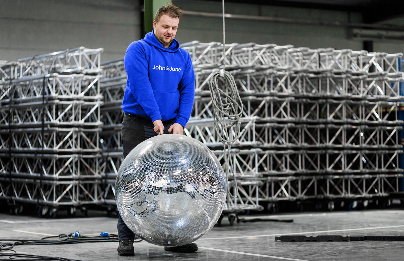
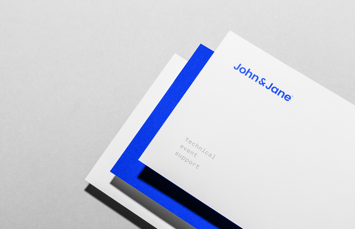
John & Jane - technical event supportThe strength of John & Jane is the cooperation of all the team members that stay without a name or a face to the end client. The members work together as Batman & Robin did, they are passionate as Romeo & Juliette, elegant as Fred & Ginger ... and they still make a difference. The baseline of John & Jane 'Technical event support' explains everything and they need that clarification. Just as their sister company Deltarent in Ruiselede does with theirs: 'Audiovisual rental'. But where Deltarent only does rentals in light, sound and video equipment, John & Jane takes things one step further. They are taking care of the techniques, organisation, planning, setup of wedding parties, fairs, shows, theatre performances, concerts and countless other small or big events.
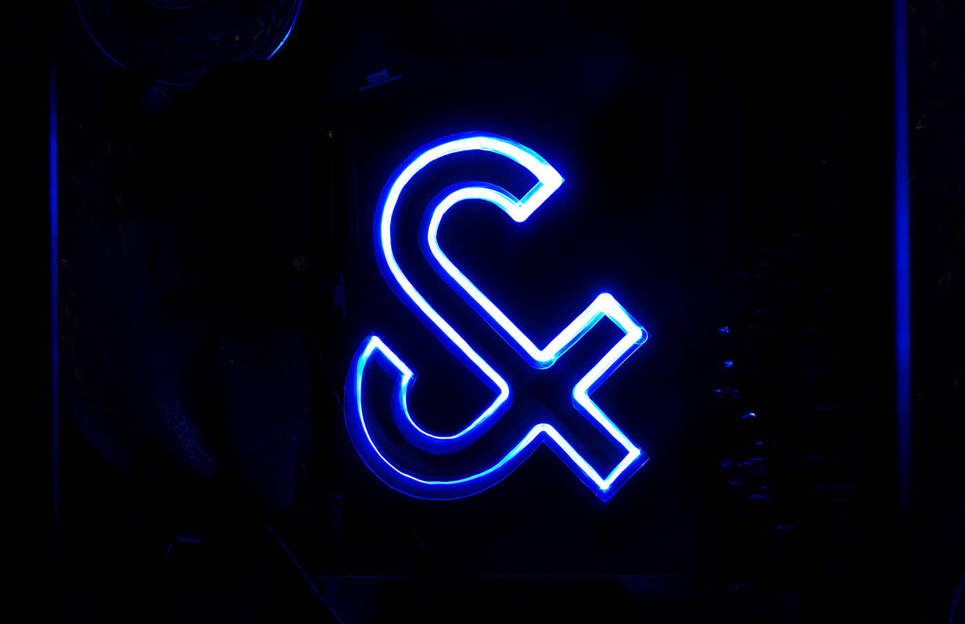
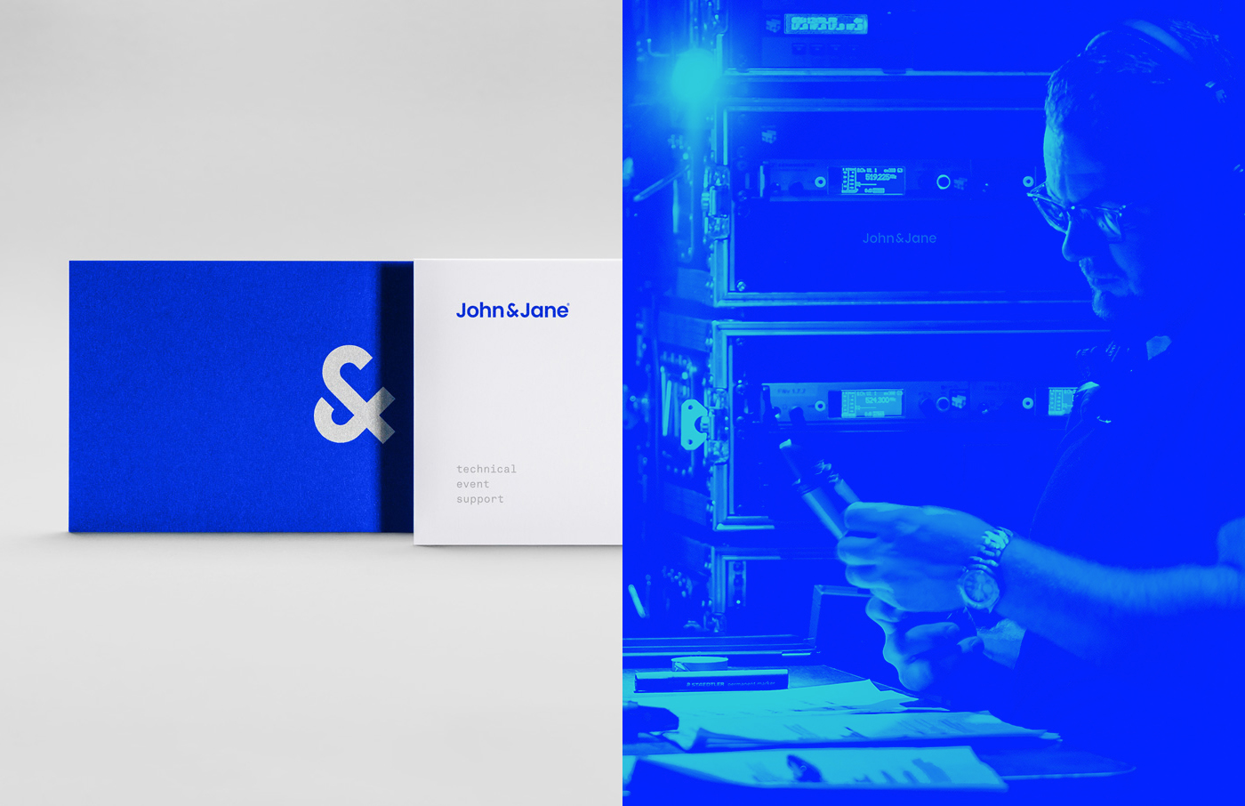
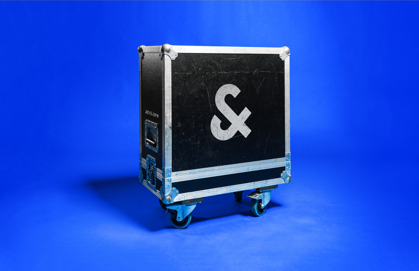
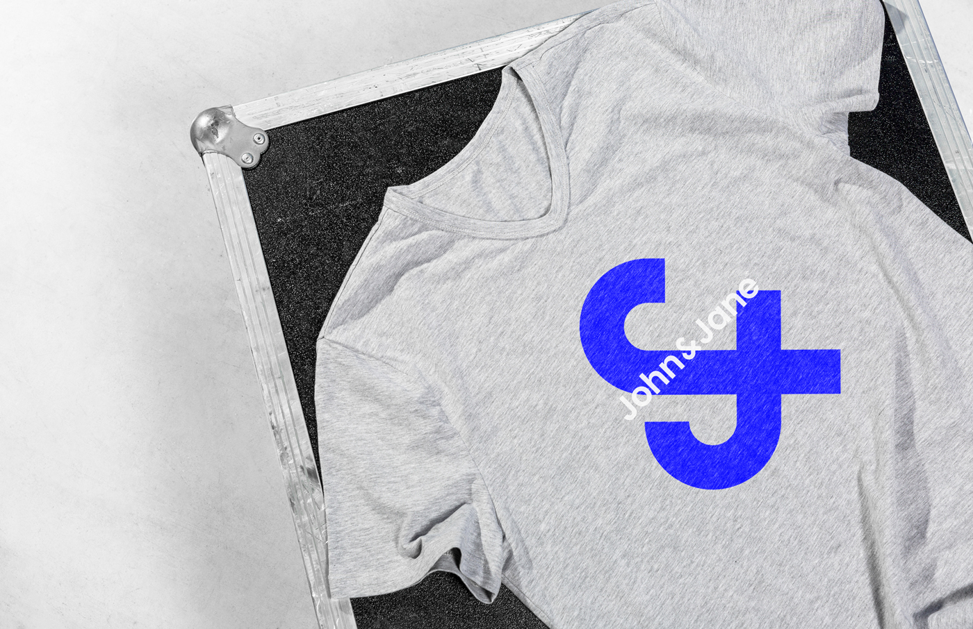
The new brand is energetic, dynamic ... quite like John & Jane is! The ambience comes from the electric blue, the sparkling silver and the dynamic symbol ... quite fitting for John & Jane. The continuation of these elements in all their offline as well as online communication makes John & Jane a strong and likeable brand, ready for to take on the future.
Branding by skinn branding agency