


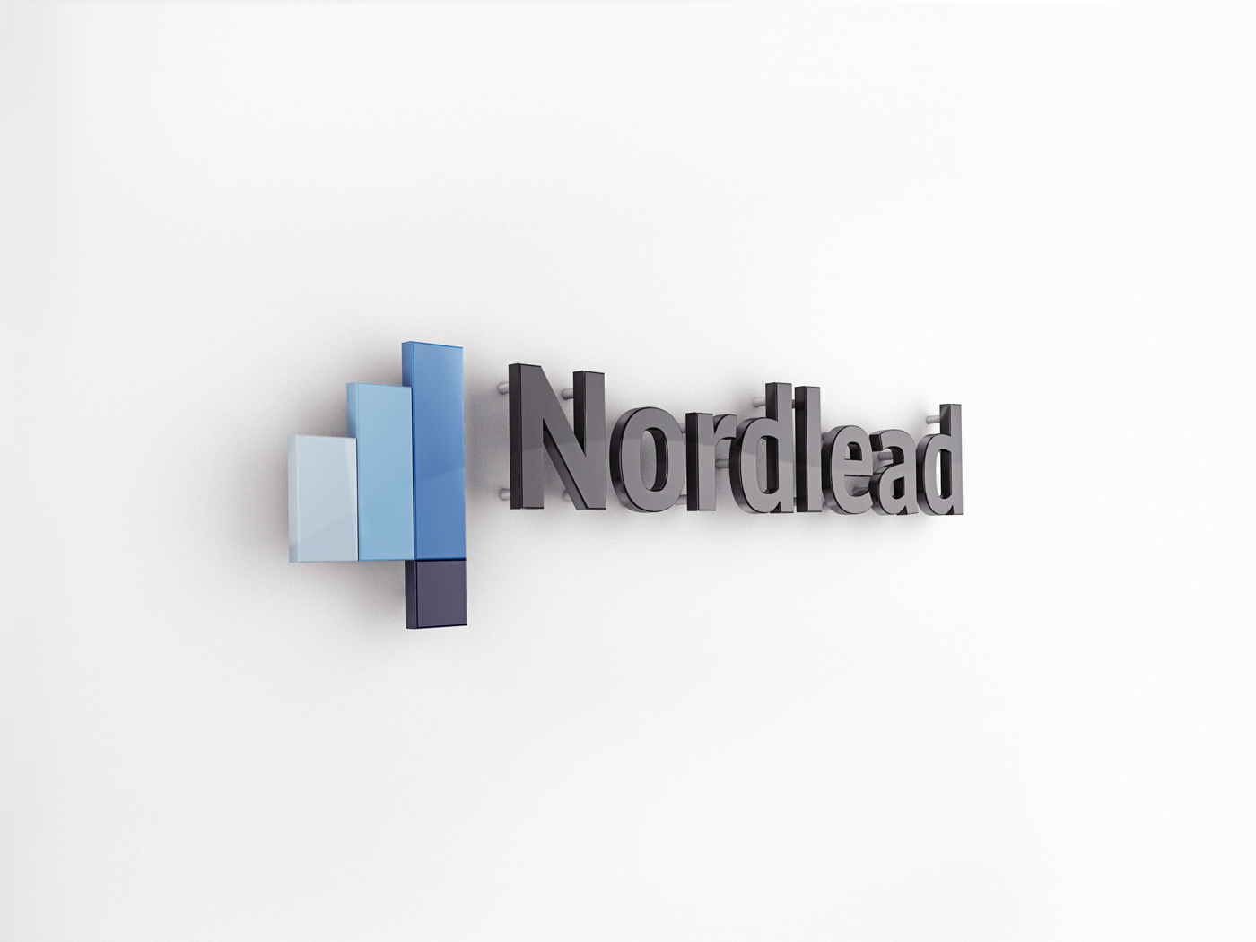
NORDLEAD COPORATE
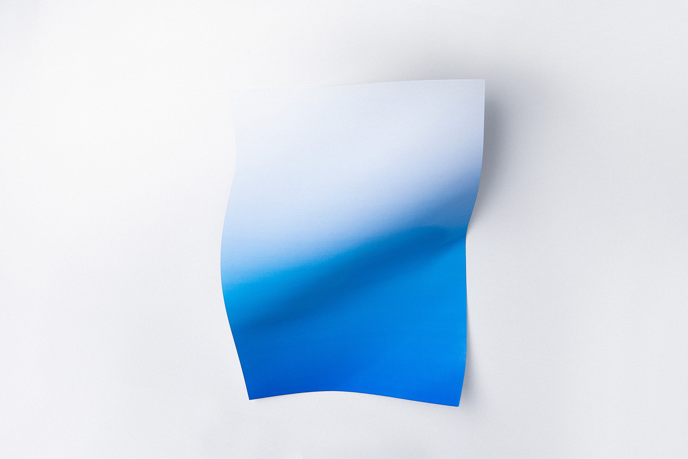
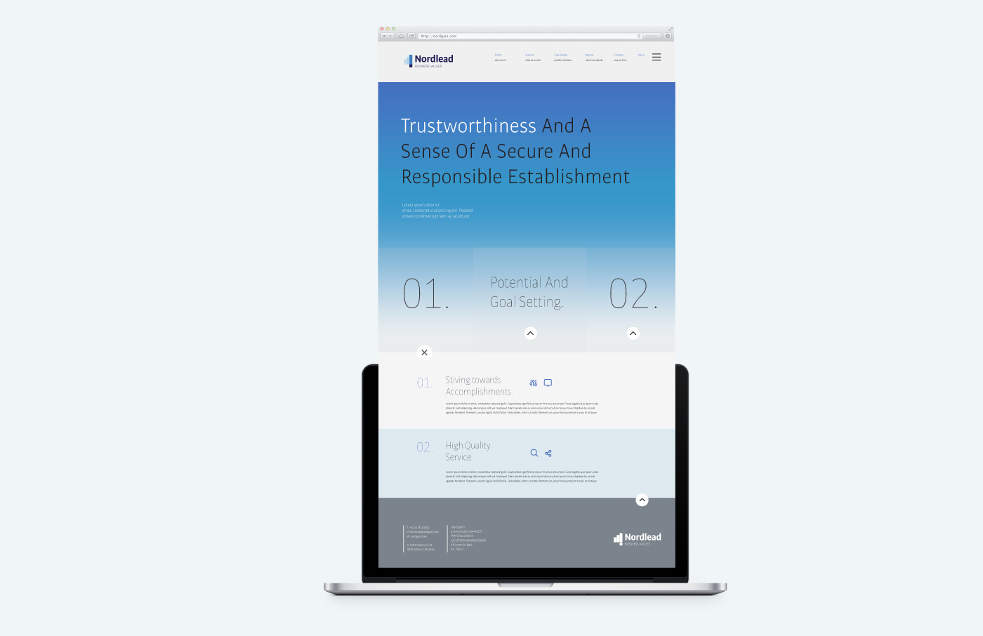
The main goal in establishing Nordlead graphic identity is to make the brand feel flexible, modern and professional. Colour gradient is based on the idea of never ending growth, the desire of reaching desired goals and stiving towards accomplishments.
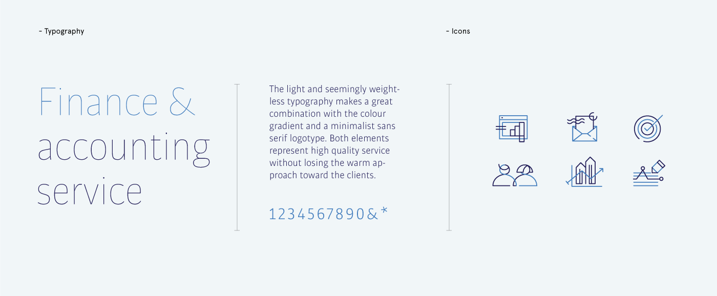
The choice of blue colour represents trustworthiness and a sense of a secure and responsible establishment. The light and seemingly weightless typography makes a great combination with the colour gradient and a minimalist sans serif logotype. Both elements represent high quality service without losing the warm approach toward the clients.
DELIVERABLE: CORPORATE IDENTITY SYSTEM / WEB DESIGN /
-
2016
© &ANDSTUDIO


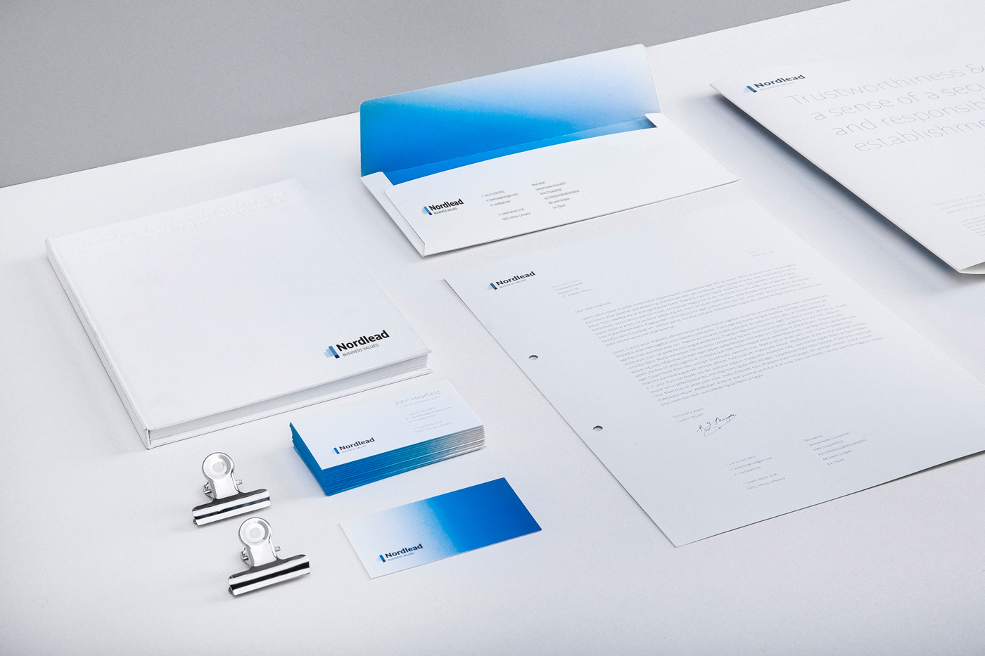


NORLEAD COPORATE IDENTITY
CLIENT: NORDLEAD CORPORATE / BRANDING: ANDSTUDIO / PHOTOS BY: MARTYNA JOVAISAITE


