
Defining The Challenge
The Open Observatory of Network Interference (OONI) is an initiative launched by the Tor project to help detect and report on surveillance and traffic manipulation throughout the world. Through the use of the free ooniprobe, OONI empowers users to detect and report on censorship events within their networks. OONI contracted me to re-think the user experience for their web and mobile platforms, and to create new user interfaces to support the overhauled user experience. They wanted to make the platform more accessible to non-technical users, and re-vamp the onboarding process to better educate users about the risks associated with collecting measurements. Risk education was especially important to this project, given that many countries have a history of prosecuting anti-surveillance activists.
Gathering Information
The first step to understanding how the UI and UX could be meaningfully improved was to audit the existing web and mobile UI and UX. To do this, I captured screenshots from the current builds of both products, and provided screen-level suggestions for improving usability. Also, in order to maintain the existing OONI brand, I worked with the team to consolidate all brand assets into a single guide.

Example of the web UI audit. I captured live screenshots of the existing product, and then annotated the screens with my suggestions.

Given the text-heavy nature of the tool, establishing an identity guide was key to building a consistent user experience. The colors, fonts, and logos had been chosen by previous designers; however, I chose the styles and assigned their uses.
Laying Out The Plan
After presenting my top findings and recommendations, I created initial mockups for rapid user testing. Working with members of OONI, I interviewed existing users to better understand areas for improvement. This information was compiled into user personas, which helped us hone in on a target user. I also collected feedback on my initial mockups, which directly informed future iterations.
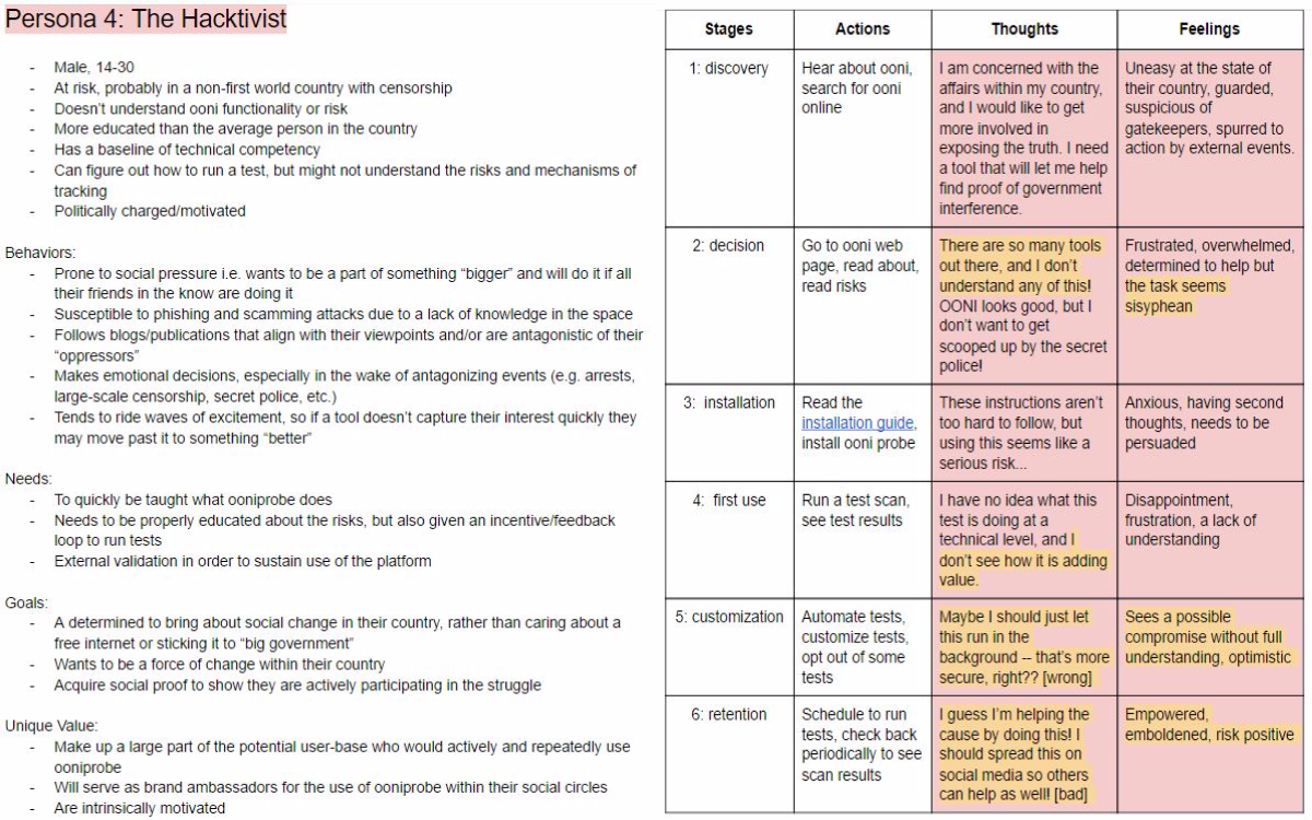
Based on my interviews, I segmented users into 4 personas. For each persona, I worked with the OONI team to create journey maps, outlining how each persona interacts with the tool (HUGE thanks to Linda and Maria for their help here!).
Creation
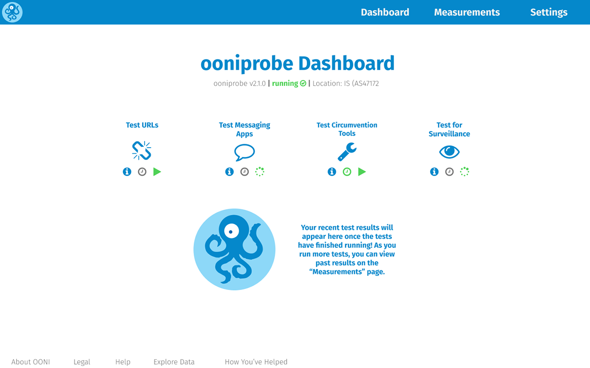
I started with the web platform, as this was the primary platform. The biggest challenges here were accommodating all the risk disclosure information in the onboarding screens, and consolidating several previously disparate functions into a single dashboard. The risk disclosure was verbose, and my solution was to overhaul this copy and streamline it. I also used icons and visuals cues to guide the user, and to improve the user friendliness of the interface. Features were taken out of modals and toolbars, and placed into the dashboard and page footers.
For the mobile platform, I aimed to translate the improved onboarding experience, streamlined copy, and guiding visuals from the web re-design, while leveraging the unique features and interactions of mobile platforms. The main dashboard was de-cluttered and re-designed to drive towards a clear call to action (i.e. "run a test). Consistency was key, and my proposed UI was quite conservative. Rather than going for a unique user experience, I focused on using familiar patterns (e.g. hamburger navigation menu, simple buttons, micro-interactions) in a meaningful way.
For the mobile platform, I aimed to translate the improved onboarding experience, streamlined copy, and guiding visuals from the web re-design, while leveraging the unique features and interactions of mobile platforms. The main dashboard was de-cluttered and re-designed to drive towards a clear call to action (i.e. "run a test). Consistency was key, and my proposed UI was quite conservative. Rather than going for a unique user experience, I focused on using familiar patterns (e.g. hamburger navigation menu, simple buttons, micro-interactions) in a meaningful way.

Old version on left, my re-design on the right. Re-doing the copy, and using better visuals were key to increasing usability.

Old version on left, my re-design on the right. Once again, less words and more visuals = easier to for user to understand.
Final Thoughts
This was a lightning fast project, and ran less than 4 weeks. However, thanks to the very talented OONI team, we were able to achieve a lot in a short period of time. Initial user reactions show that the re-designed web and mobile UIs are a significant improvement over the previous versions. Risk education and collection of informed consent has been improved through the use of better copy and a more straightforward quiz. However, there is still a lot of room for improvement. Viewing reports on both platforms is still messy, and I would want to update the designs to accommodate additional features (such as logs) which were added to the product during implementation. Overall, this was a very satisfying project to work on, and really pushed me to apply all my UX design skills in a very short period of time.
To read OONI's thoughts on this project and review the project journal, please visit: https://trac.torproject.org/projects/tor/wiki/doc/UX/OoniUiDesign


