F O R L U Z A P P
C L I E N T
Forluz is the largest pension fund in Minas Gerais. Having more than 40 years of activity, it is among the eight largest representatives of its sector in Brazil, with financial assets that are currently totaling the amount of R$13 billion. It is a non-profit entity, maintained by its employees and by the contribution of the companies that sponsor its retirement plans. Forluz stood out as a pioneer among institutions that seek to prepare their employees for a healthy financial future. Nowadays, the Foundation has about 22,000 participants and its main objective is to offer social protection to each one of them and to their families, through the payment of retirement supplements.
C H A L L E N G E
Easily attend the thousands of fund participants through the foundation's first app made for pensioners and other people assisted. Deliver an elegant and simple solution that caters to a high social class audience in advanced age.

U S E R S
The users of the app have an unusual age profile considering the common users of the Internet. We’re talking about a company that manages pensioners' accounts. 55% of them are over 56 years old, mostly with higher education. The app is also made viable due to the fact that 65% of these consumers have smartphone. Users with a significant amount of resources applied to the pension fund would enjoy more functionality through the app.

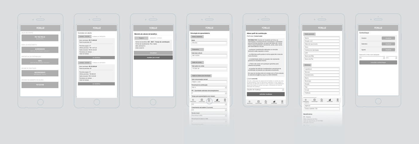
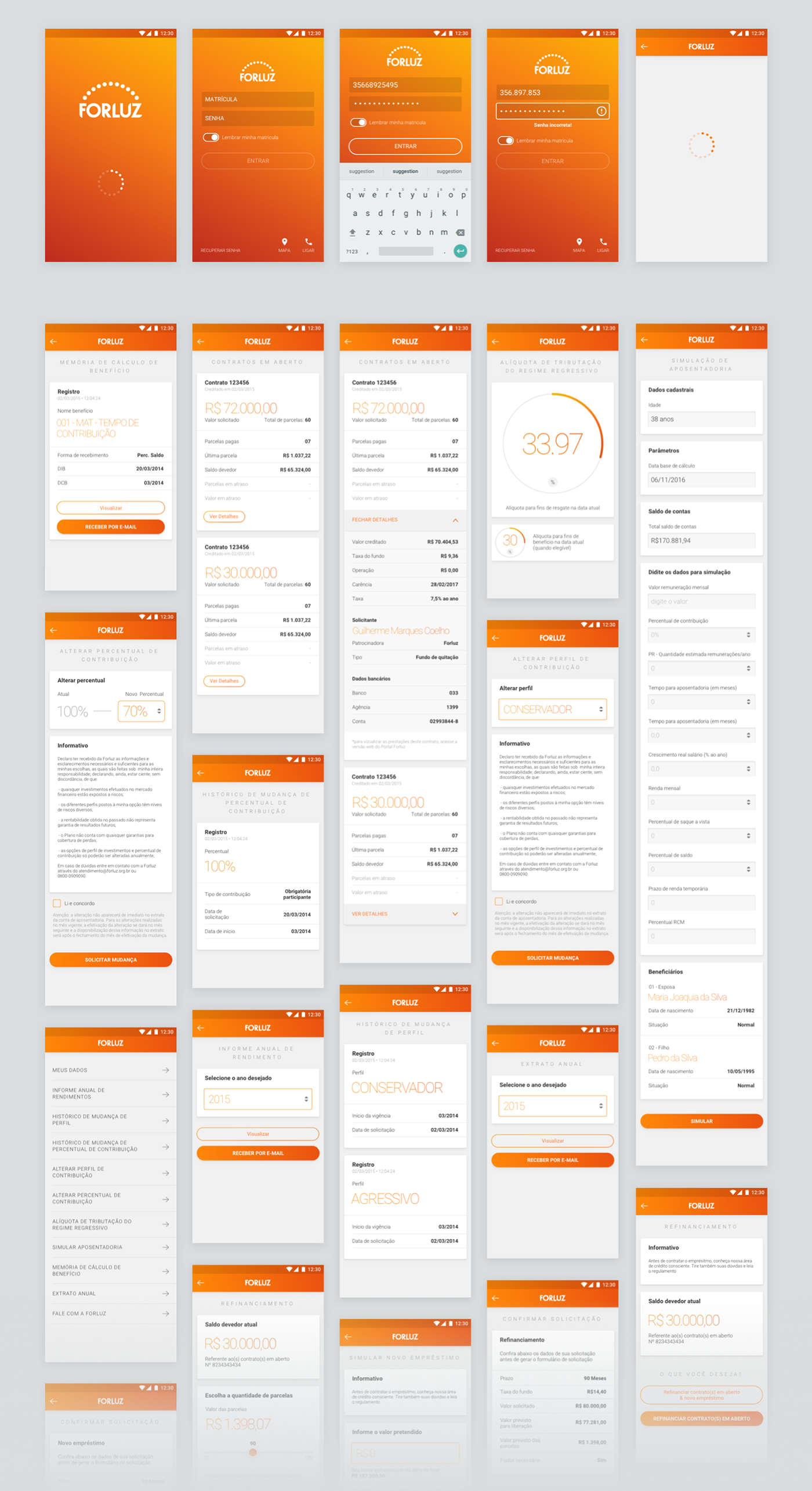
P R O J E C T C O N S T R U C T I O N
Guided by a requirements document, we seek to maintain the same mental model of navigation already existing in the site. We apply the best practices of mobile usability, privileging the information and resources most used by the participants. Dense tables were converted into contextual charts. We removed the less used information from the mobile version and left it available only in the desktop version.
U I S O L U T I O N
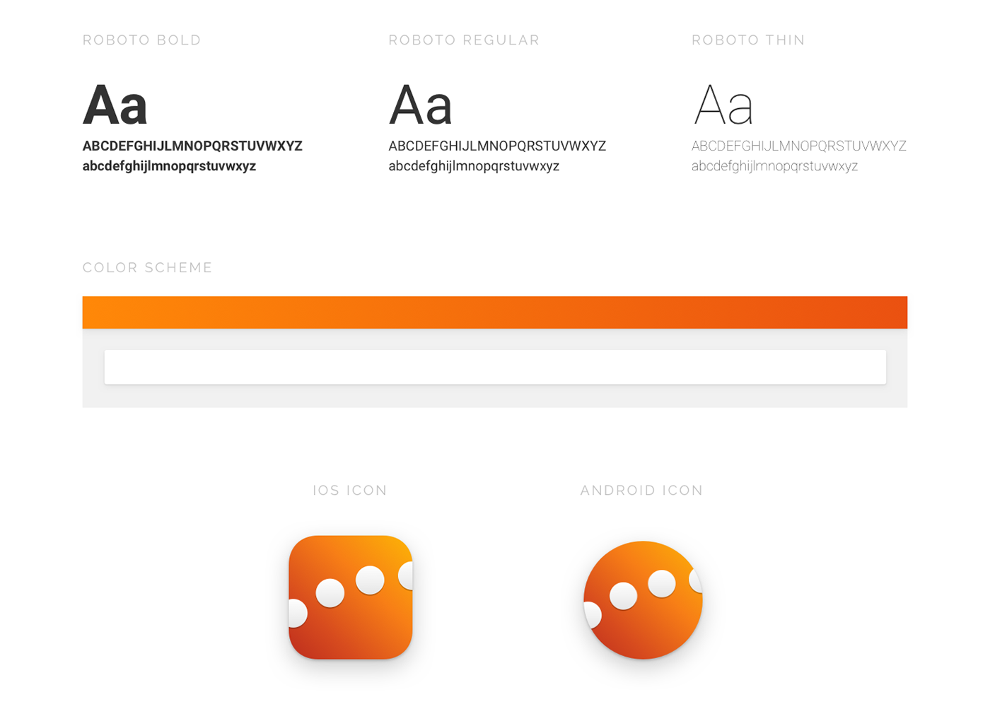
It was necessary to be extremely clear on all the information that we wanted to transmit, avoiding very small texts and highlighting the most important information on each screen. The color used was the orange that was already being used in the original visual communication of the brand. Roboto was used as the default font, because it was primarily an android native app.
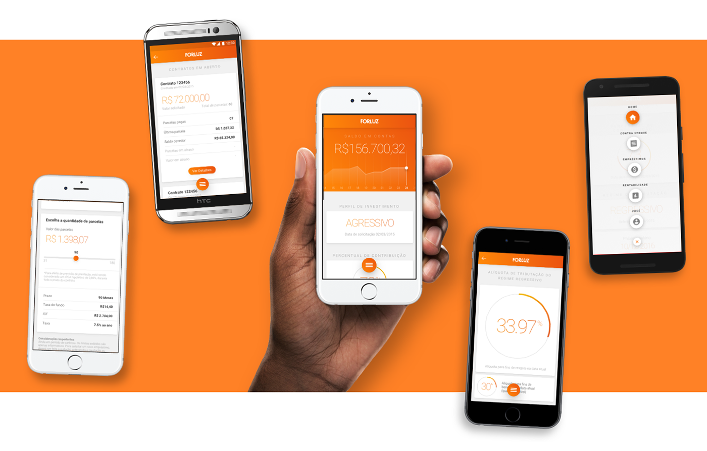
H O M E S C R E E N
The initial home screen has a small detail of each of the main items of the app. It contains a very direct solution with information such as value in account and investment model.

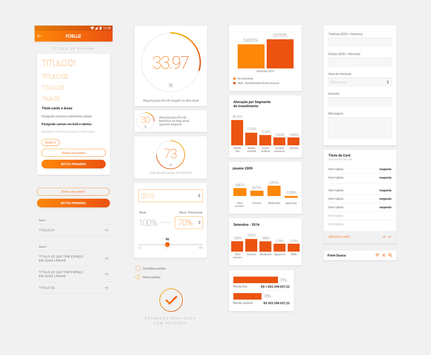
C O M P O N E N T S
In order to seek for consistency in the visual solution, we’ve made a pattern of elements as a guide for the creation of the the various pages of the app, making its development easier.