The design of previous Bank of America PAC Campaign materials was virtually indistinguishable from any other associate communication—i.e., a big photo of earnest-looking employees + heavy text + bank logo.
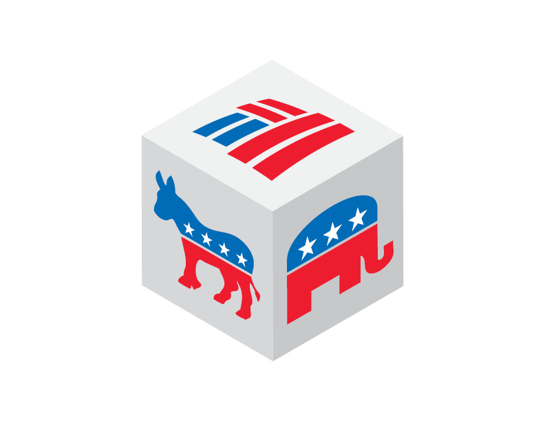
Creating an icon that married the bank’s identity with the symbols of the two major political parties made visual and intellectual sense. Even though brand guidelines forbid any manipulation of the Flagscape (i.e., no skewing to match the perspective of the cube), the symbol holds together visually and quickly telegraphs the subject matter.
Brand wasn’t on board at first, but the client loved the concept and lobbied heavily for the campaign. In a year of layoffs and dismal economic news, the program came very close to reaching its $1.2 million goal.
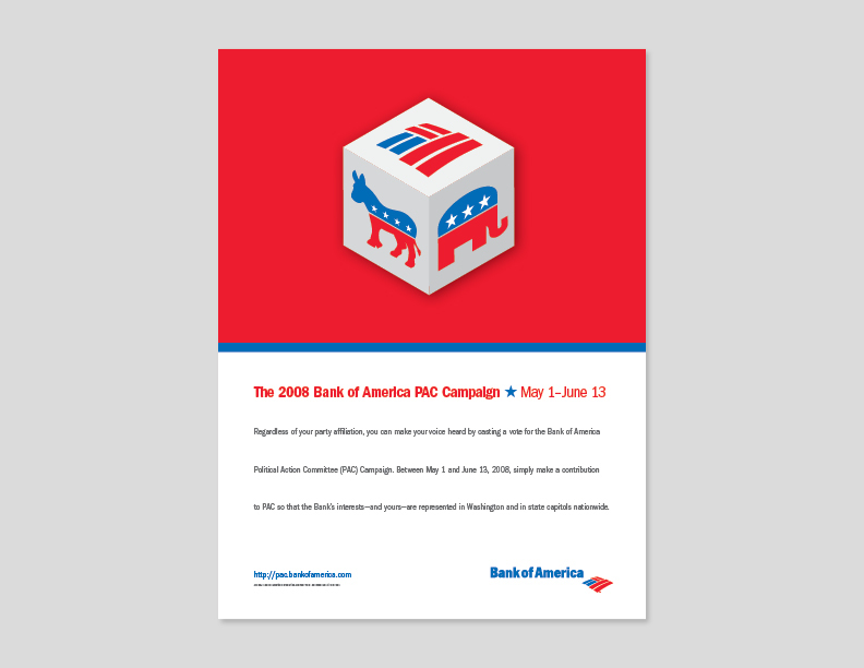
Poster
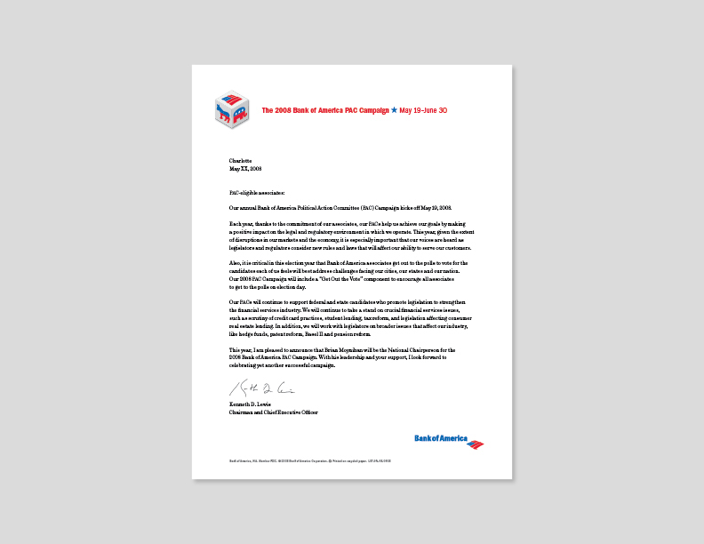
Letter
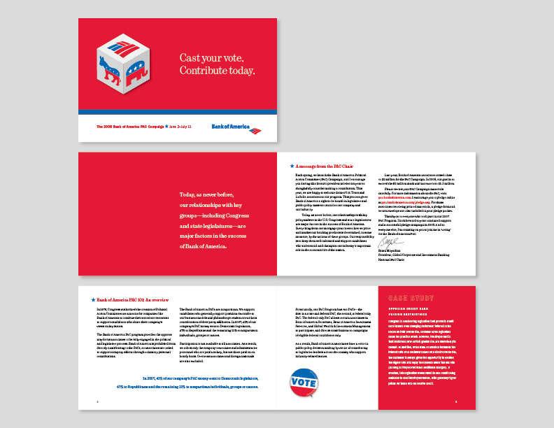
Associates' Brochure
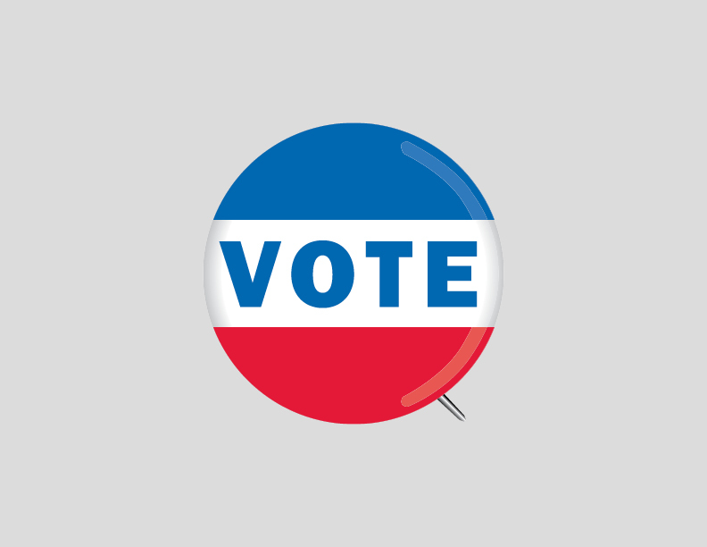
Custom illustration of VOTE pin. Actual pins were created as part of the campaign.
Leadership Brochure
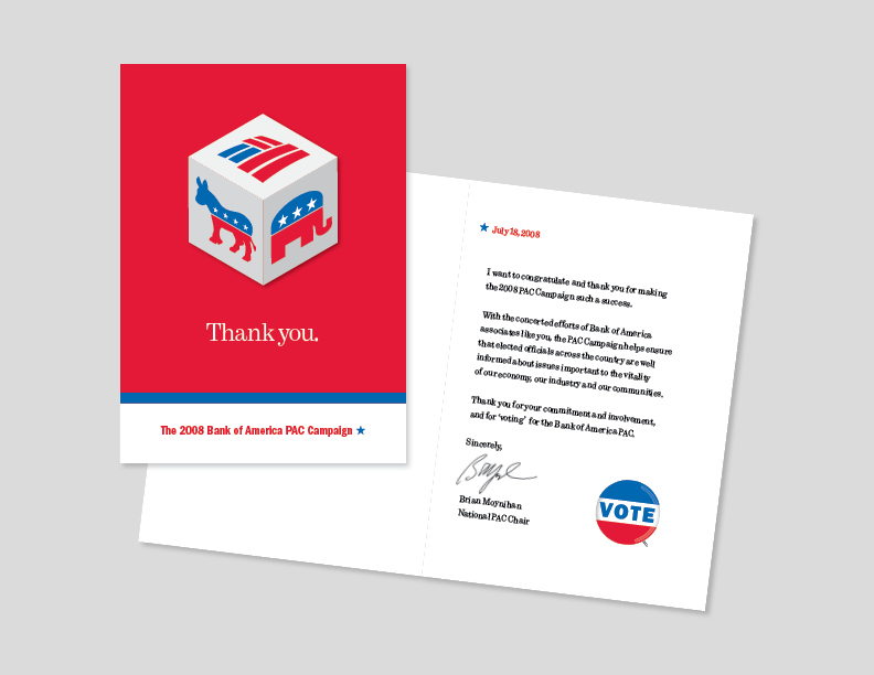
Thank You Card


