I was hired on by System76 as the first and only in-house design creative right as the company was on the cusp of rapid and explosive growth. My first project was designing the company's brand from the ground up; the CEO was looking to refine and elevate the brand identity in order to create greater visibility and reputability. On my first day, I was shown into a conference room filled with new art supplies and told to "go crazy."
I desired a warmth for System76's brand that would set it apart from other tech companies and competitors' brands. System76 was (and is) a small company of passionate, nerdy innovators and its customer base was (and is) more of the same and continues to feel that System76 is their brand. At the same time, the company was seeking to grow its visibility and approachability to the average consumer. There needed to be a balance between "we're still your company" and "we're the next big thing."
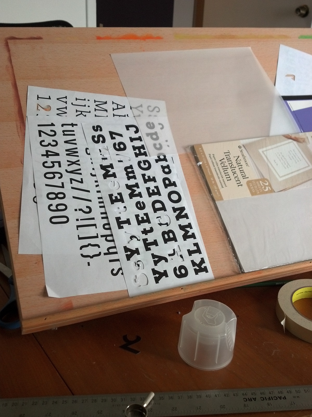
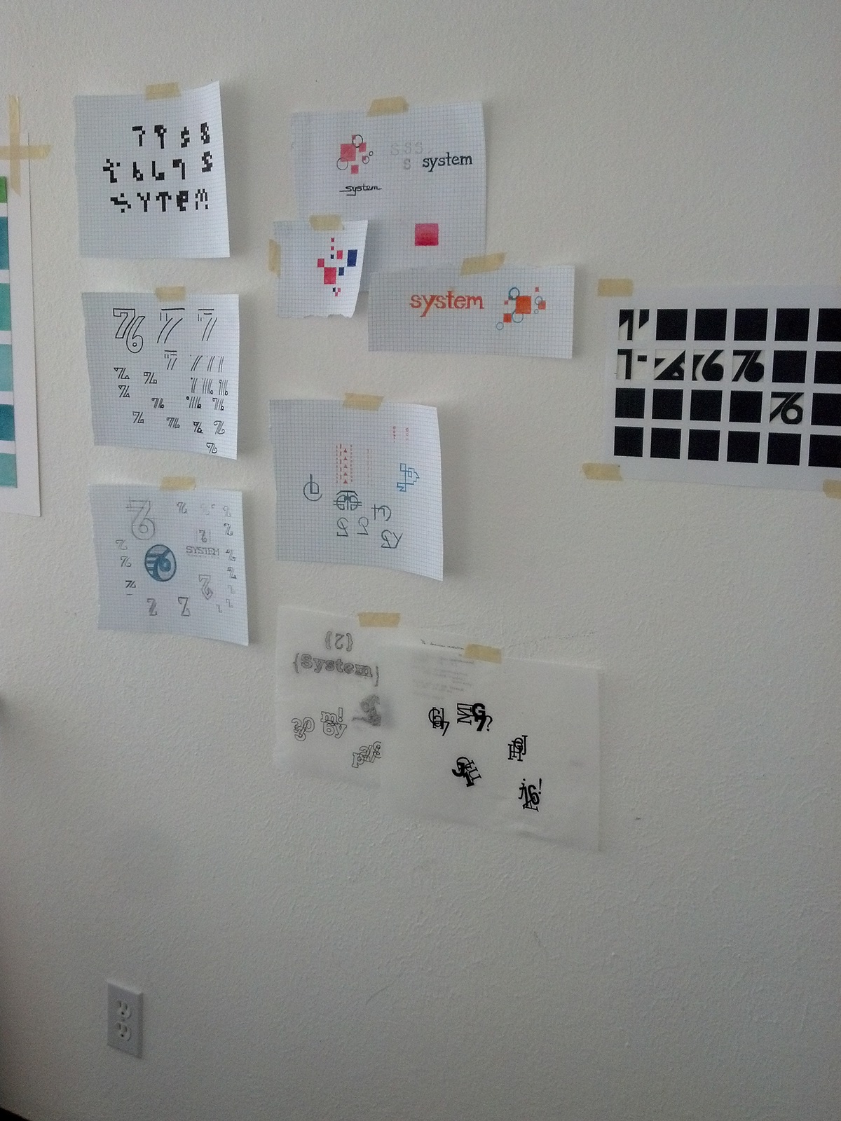
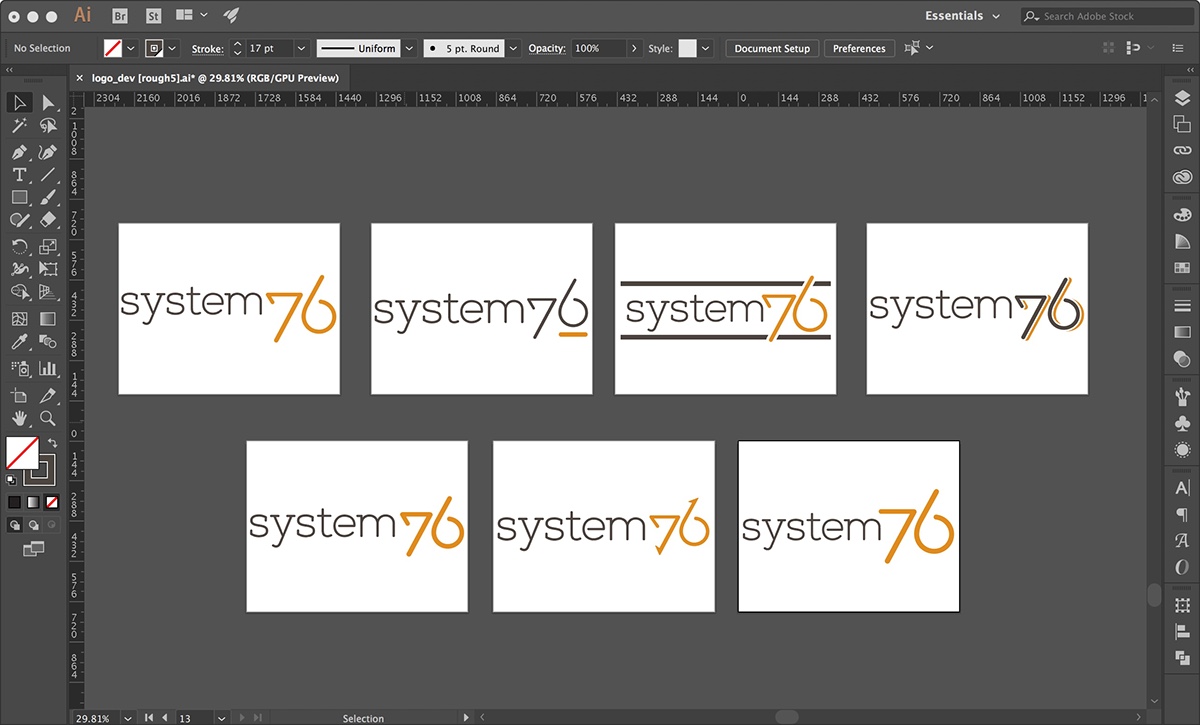
My CEO wanted a logotype (rather than a stand-alone logo mark or combination, co-dependent logo mark + logotype), something that would concisely capture the company's self-definition. To me, this meant rounder, more open letterforms. A thin weight of a slab serif typeface (Nexa Slab) eventually became the basis of the custom logotype; thin lines for elegance, geometric anatomy for modernity and openness, slab serifs to communicate stability and structure, and rounded edges for a friendlier personality.
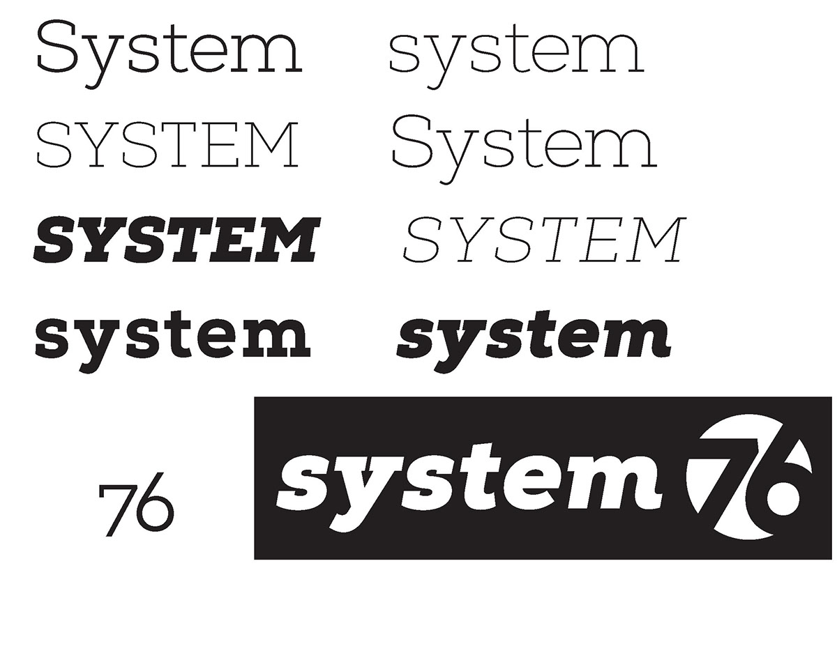
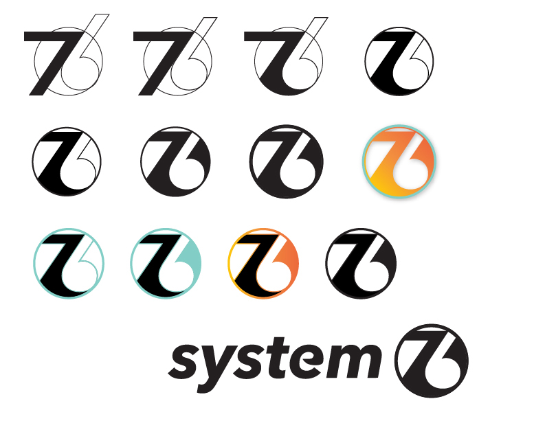
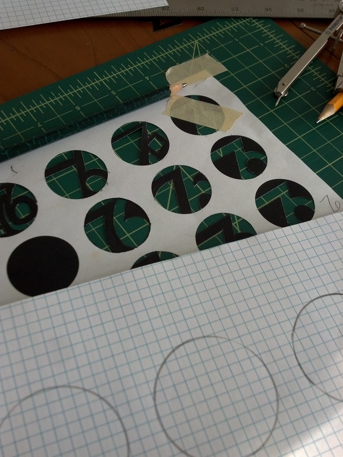
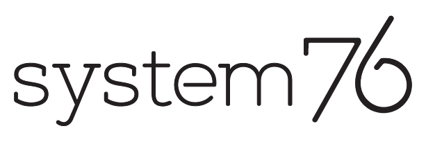
There are no counters in the logotype so that 1) no spaces are encircled or enclosed in order to maintain a feeling of freedom, which is one of our core brand ideas and the epicenter of the open source community, and 2) if and when cost and production allow, the logo can be easily cut from the lid of a laptop and backlit without accounting for difficult shapes. Though the "76" took quite a few more phases of refinement, the "system" type stayed consistent through all later stages of development.

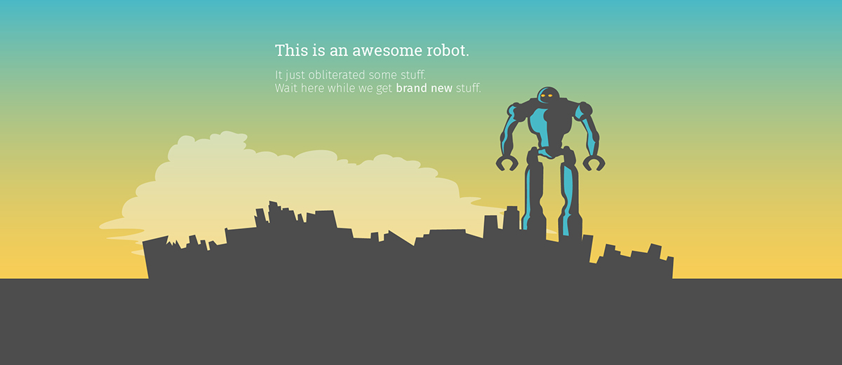
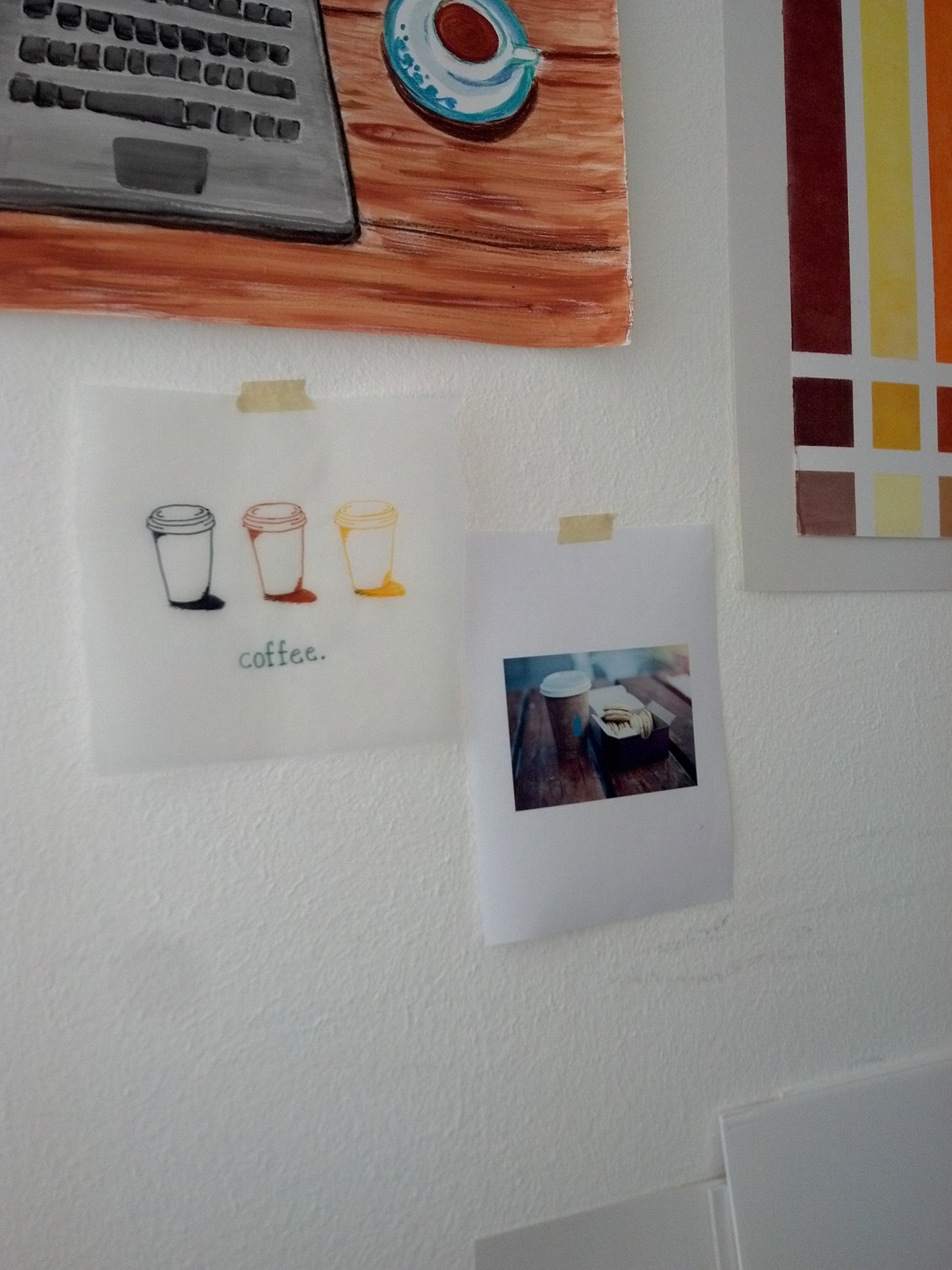
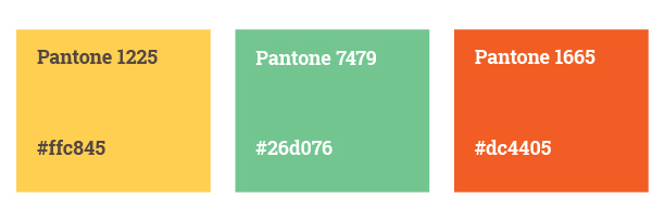
For the new color palette, my starting inspiration was cafe imagery, from which I pulled neutral tones for a potential foundation color, autumn hues, and bright, contrasting accent colors to build a range of possible color palettes. Eventually, the CEO and I decided on orange as the primary company color; both warm and assertive, orange was picked specifically to contradict tech industries and communities' widespread use of blue and other cool colors. The orange underline was added not only to be an element of warmth and assertiveness but also as a subtle visual of support, structure, and to reference the blinking cursor seen next to a terminal input prompt.
A muted turquoise became our secondary brand color and warm grey our brand neutral. Tertiary swatches of green, yellow, and red were set for our online UX needs and the brand has just recently grown to incorporate sub brands, like Revolutionist76.

To fill out the rest of our identity, I needed to generate a brand voice that was friendly, tongue-in-cheek, self-aware, and down to earth: the unpretentious, alt-hipster version of a major tech conglomerate. This was the simplest part of developing the brand; a combination of dry wit, well-timed pop culture references, and hammy, awkward overconfidence (see Social Media posts) was the truest voice for the company's personality and writing it came easily because that's me already. For better or worse, the brand voice is my voice, but one that resonates widely. After all, there's a reason each of us was hired and a reason our customers like us.
It was simply a matter of owning who we are. And that's the brand.