

Video: Interface Design & Exhibition
Data visualization, user interface & interactions designed by me.
UI Development: Asst. Prof. Alan Price (The Ohio State University), assisted by Alice Grishchenko (MFA in Design)
UI developed in Unity game engine. Sketches: Adobe Illustrator & Tableau Desktop
Dataset taken from: Pax for Peace Organization
Zwijnenburg, W. & Kristine Pas, T. “Amidst the Debris, A Desktop Study on the Environmental and Public Health Impact of Syria’s Conflict.” Pax for Peace. N.p., Oct. 2015. Web.
User Interface Design

User interface design & display environment

PROCESS
For the Autumn 2016 Semester Project, I want to focus on the representation of the 5 years of Change in Syria. My aim is to investigate the visualization of change in time and create a comparative tool to show the catastrophic damage in this country. The topic might be differ but I want to keep the focus on ‘Change’.
After I contacted to professors from OSU Geography Department, I got a couple of source and topic recommendations, which helped me to focus on a specific area, Syria. Firstly, Syria is a war area. The war started in 2011 and a catastrophic damage has occurred in the country. Therefore, the comparisons of the landscape images and visualizing the data will show the tremendous effects of the war. This might create an awareness for the people, who are interested in environmental effects of this war. Also, since the war is ongoing, the data is limited right now. It is not possible to get a full data set or analysis of the current event. The benefit of this, the visualization can be used to enlighten the environmental issues and used by other experts. But since the data is limited, it is not possible to reach a full reliable source, there are lots of limitations on data sets. Therefore I decided to focus on 2 reports that are published by … in August 2016. The analysis shares a couple of analysis of the data sets, using and highlighting the importance of satellite imagery that’s used by experts to analyze the amount of damage.
Considering the time and scope of the project I want to start with the data that I pulled from the article. The four major cities highlighted in the article, analyzing those 4 with satellite maps and comparing the dataset of environmental damage in the area is my first step. Later on, if available, I can add more details (if necessary).
First organization sketches

Moving forward, I improve the design and try make little changes or start from the beginning to add or change the details.
Infographics Data
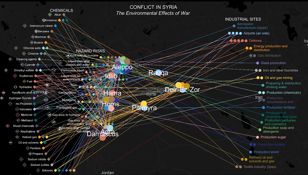
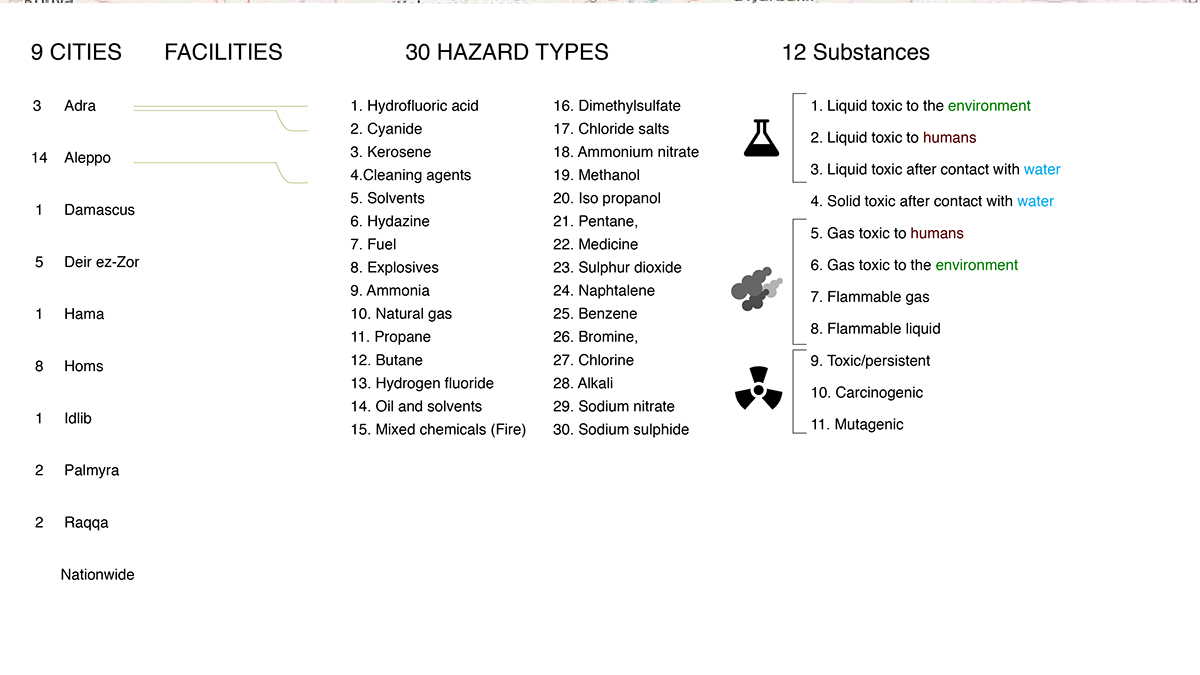
First of all I categorized the variables on the table and numerated every single element. That helps to prioritize the variable categorizations and the total number of list elements to deal with. All of them represent different type of elements and they are listed multiple times on the table. Therefore they are going to be displayed multiple times. However, rather then duplicating the category, I aim to display the connections by layering the information interactivity. Touchscreen will have a great role in this process.
Here is a chart version of the data that shows the quantification of each variable. http://www.databasic.io/en/wtfcsv/results/5824c7dde81767000a038ef5/sheets/0?submit=true
POPULATION DATA BETWEEN 2004 TO PRESENT
Unfortunately, finding the reliable population data is not possible. The last record of Census population data is from 2004. Ongoing war makes it hard to find all kinds of reliable data. But my main focus is on visualizing and communicating the data, while I try to find reliable resources, I admit that it is not possible to find all of them %100 true.
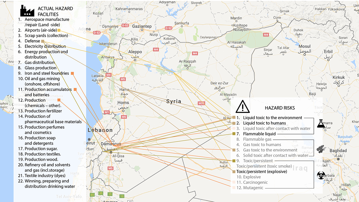
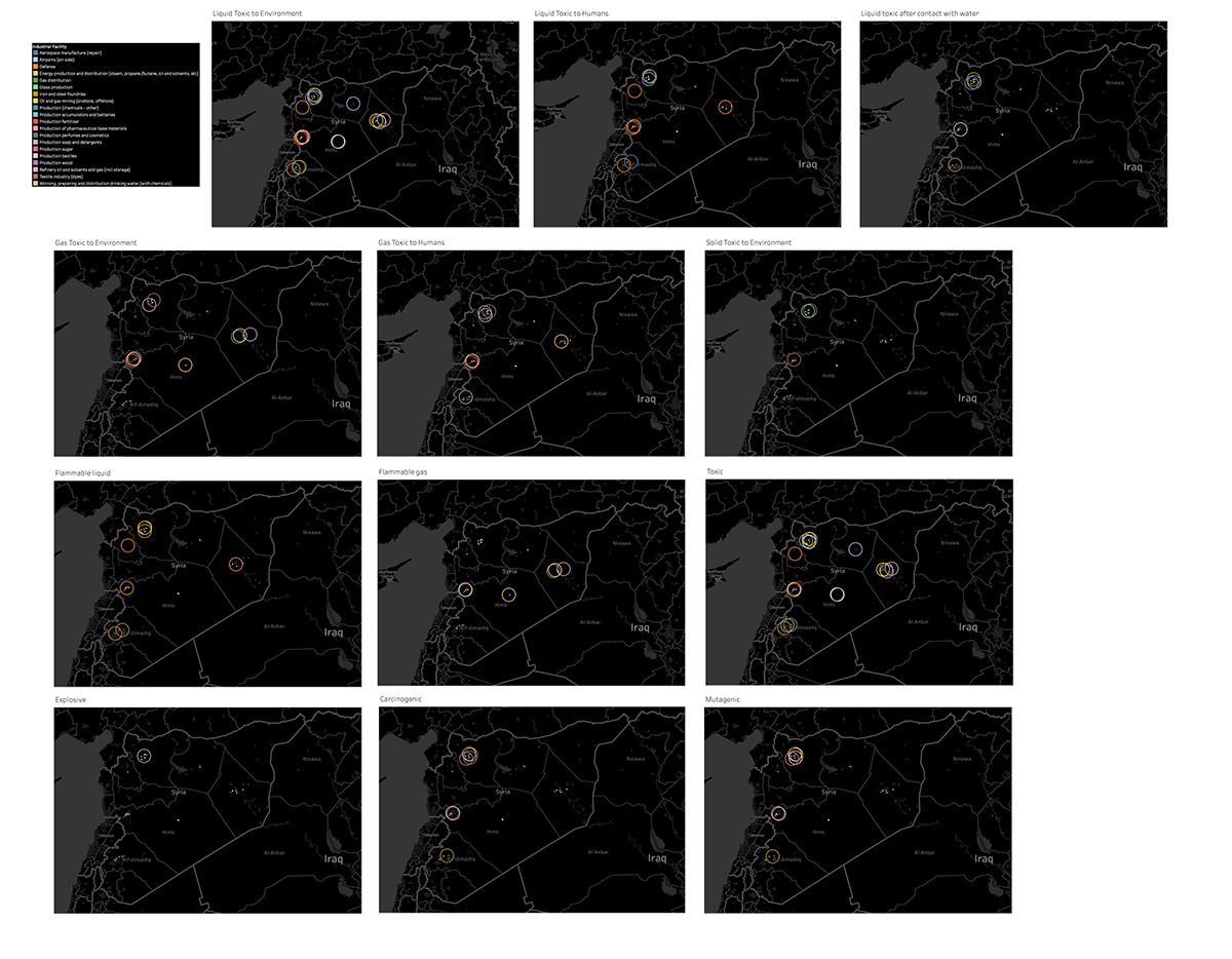
After organizing the table, simplifying, brainstorming, eliminating, and sketching processes helped me understand various ways to focus on the data. I learned to use Tableau information design software in order to display my data in various visual ways. Visualizing the data in a country map helped me to see the distribution of industrial sites, hazard risks and chemicals in cities. From there, I had an idea about the bigger picture. Hazards that cause the danger in multiple cities, or the most common environmental effects of danger and so forth. For example, Aleppo and Homs are the most damaged cities. Defense manufacturing sites are the most common hazardous sites, seen in 5 different cities.
To quantify the information, I generated different charts and infographics. Those graphics help to show the area and risk of damage. Therefore, I have a guide to consider the main focus and design choices. Initially I tried to simplify the data to make it more understandable to the end user, maybe more than it should be. Analysis helped me accept that the data is not simple, moreover the effects of the war are decidedly not simple. I realized that first of all I need to show how complex the effects truly are. Also, since I am working with a touchscreen for the first time, I have a chance to work with complexity in a different way. I want to push the limits and see how users react to it with the end point of using layering to show the pieces of information separately.
As a designer I aim to show a little piece of information about the war from the environmental point of view. The report I created along with the infographics show that war creates long term impacts outside of destroying nations and lands. In addition to catastrophic effects of destroying buildings and nations, war is used to damage the country using it’s own resources. Put simply, Syria’s largest industrial resources have become a danger for the population and environment.
Visualization Sketches & Drafts


Useful Websites
wikimapia.org
Satellite Imagery Analysis Examples
Reports
Zwijnenburg, Wim, and Kristine Pas, Te. “Amidst the Debris, A Desktop Study on the Environmental and Public Health Impact of Syria’s Conflict.” Pax for Peace. N.p., Oct. 2015. Web
Population Data
http://www.internal-displacement.org/globalreport2016/ (Spotlight Syria section)


