Maak 1st Exhibition
Art Direction and Branding
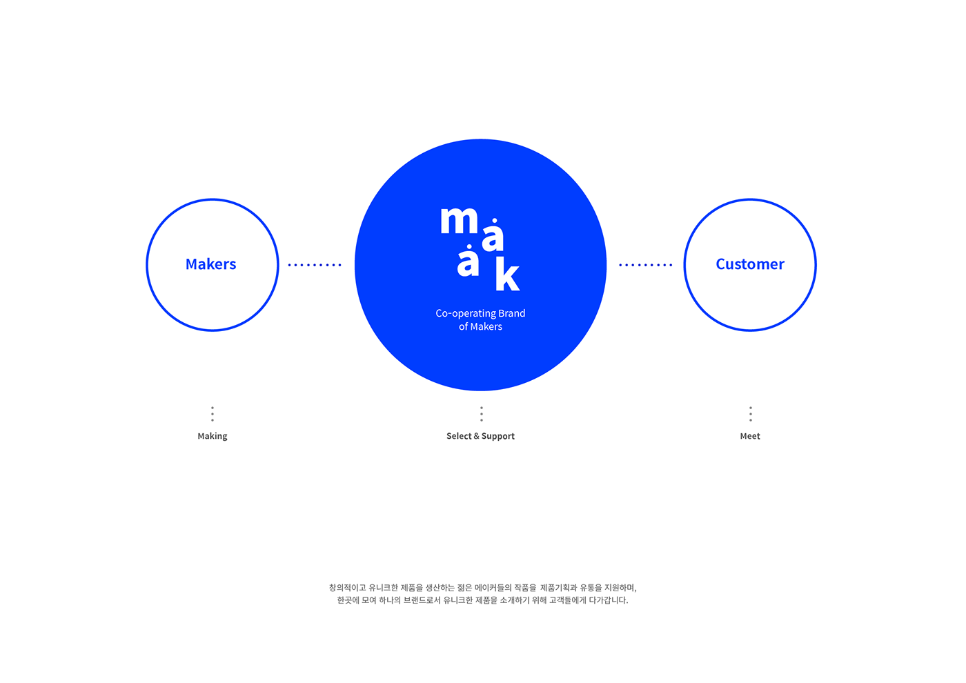
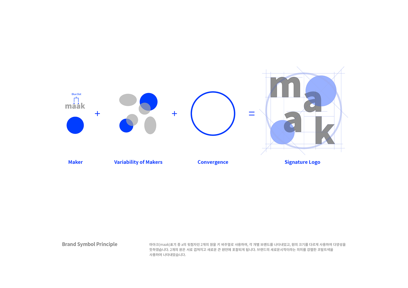
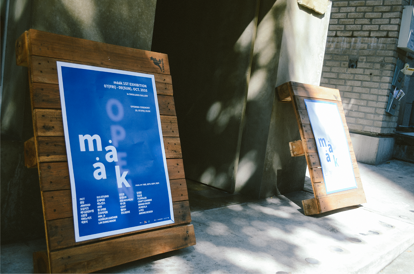
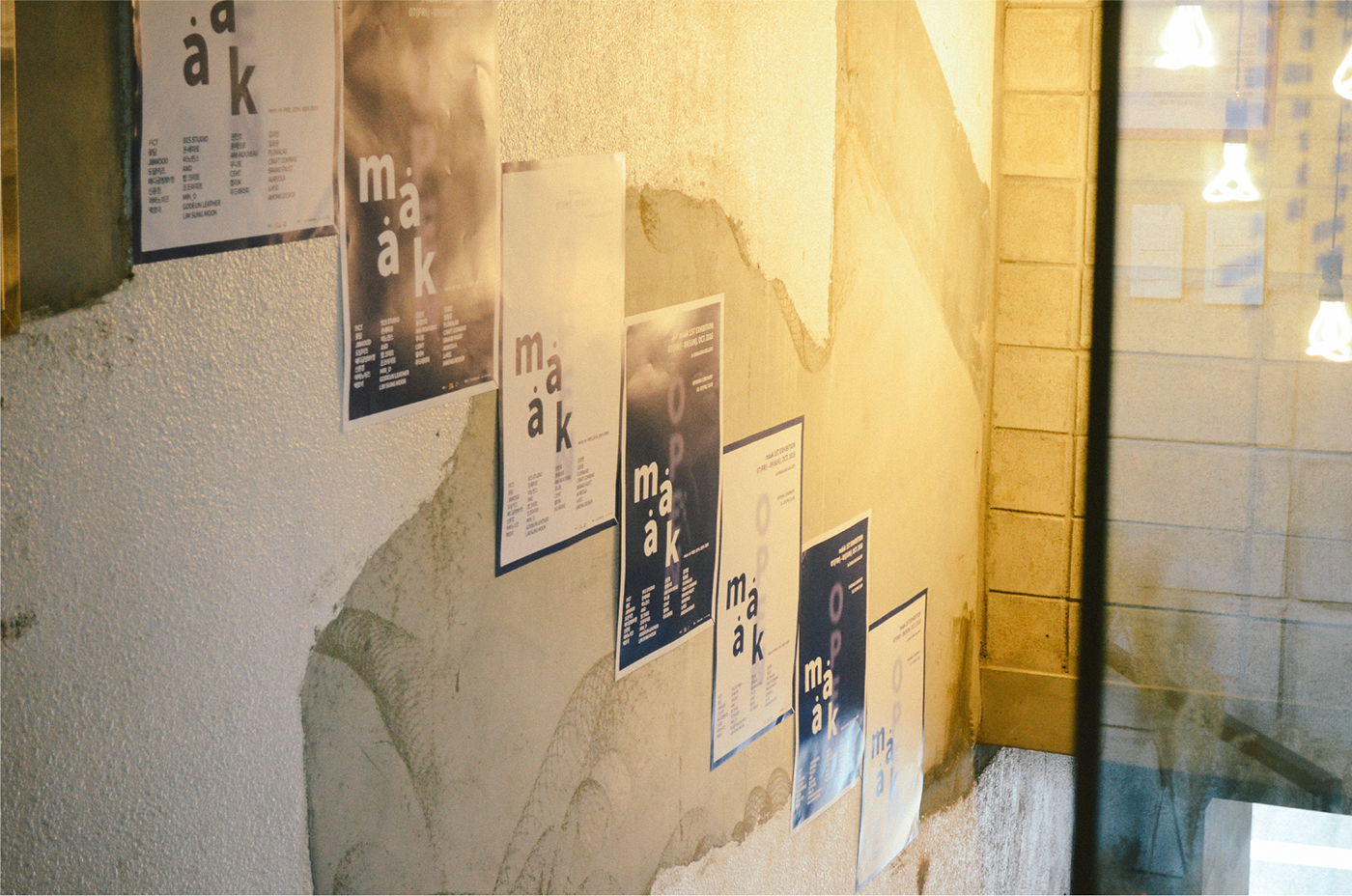
Maak is a Dutch word for 'make'. It is an exhibition branding that uses the accent points of Maak's two words. Maak, an exhibition for emerging brands, selected blue as the key-visual of exhibition branding, which means beginning and creation.
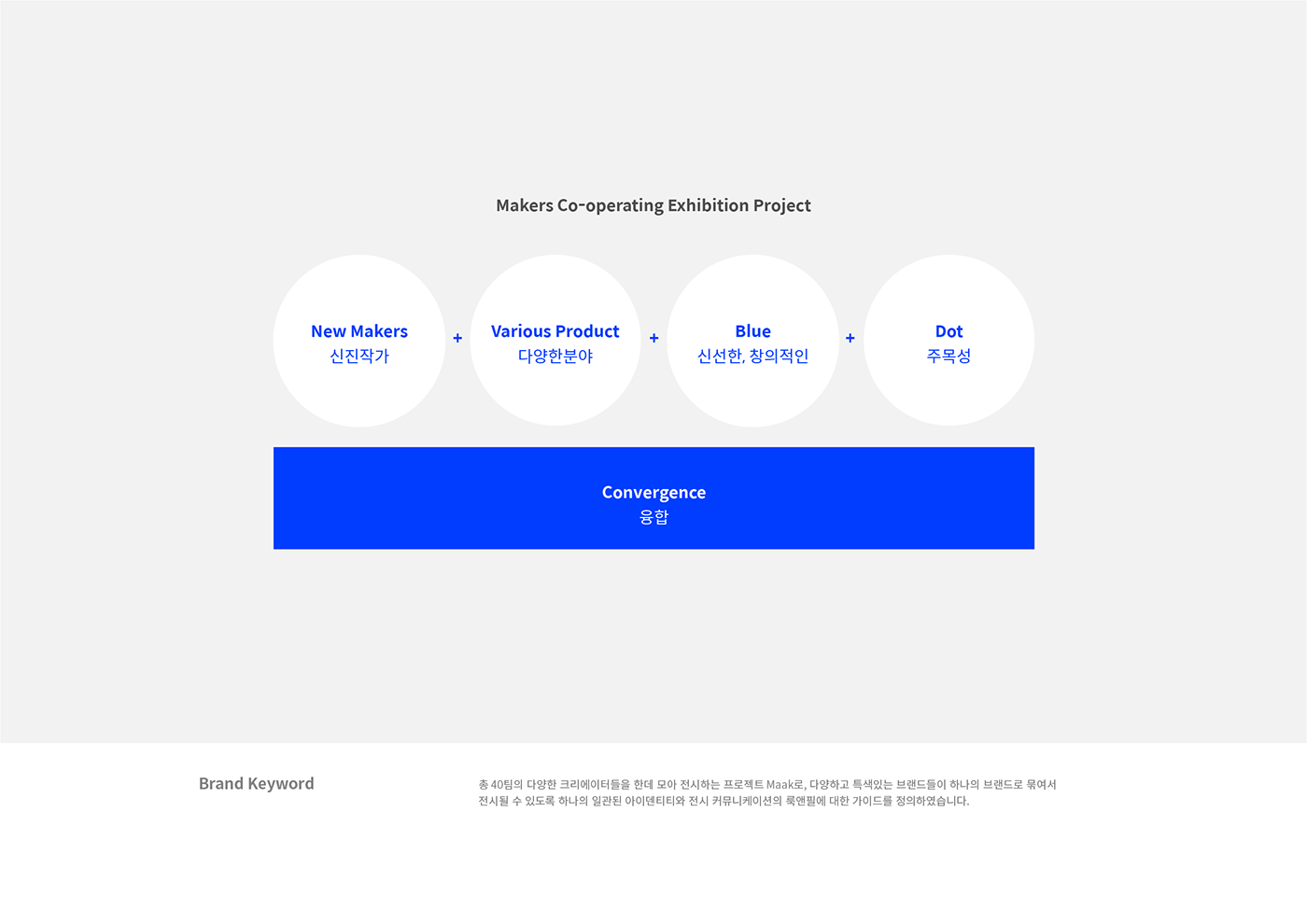
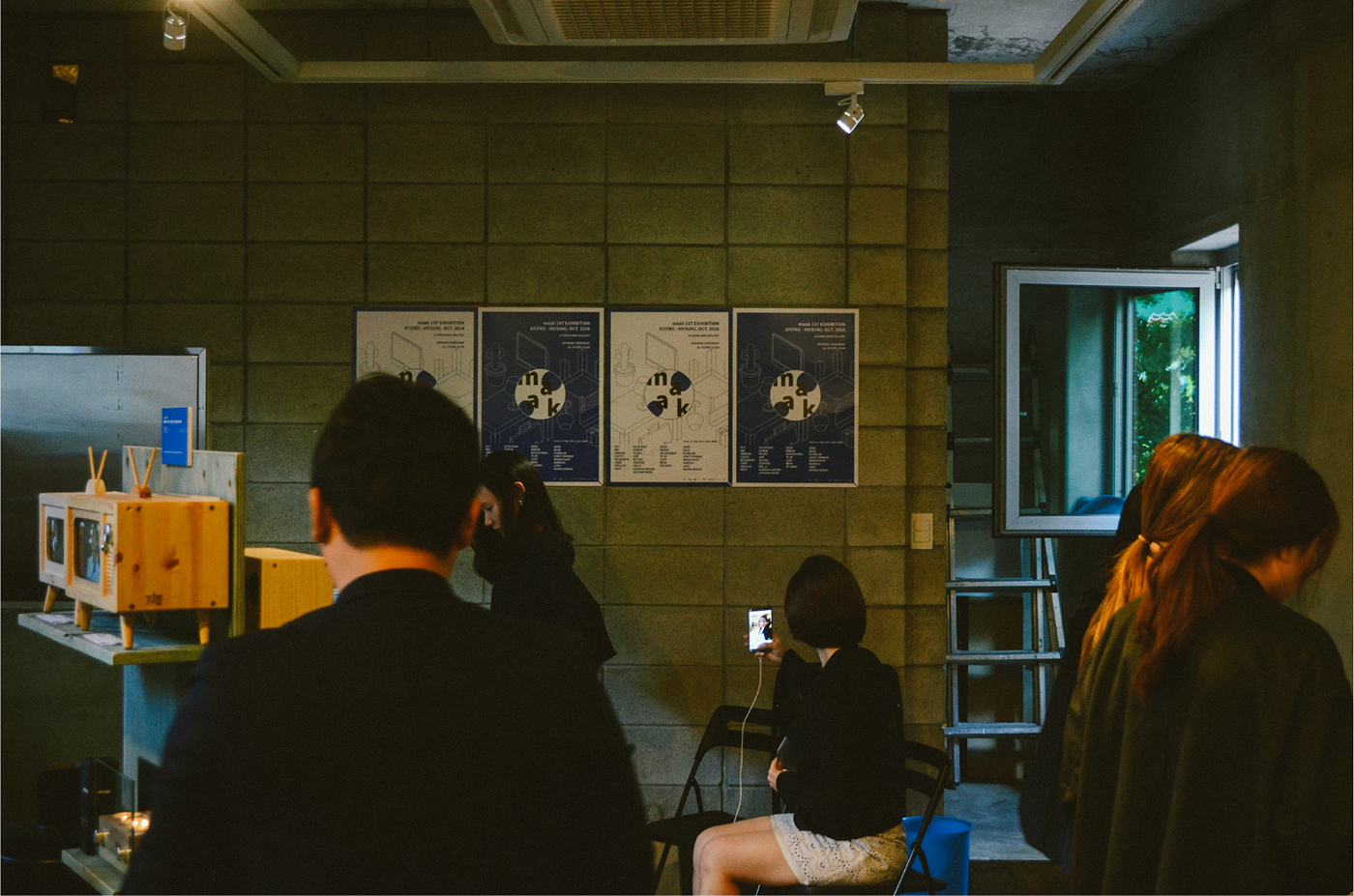
We designed six categories of pictograms and used them in catalogs and display graphics for each category.
We designed six categories of pictograms and used them in catalogs and display graphics for each category.
Exhibition Branding / Art directing
designer : Jungho Lee / henry Jeong
client : d.nomade


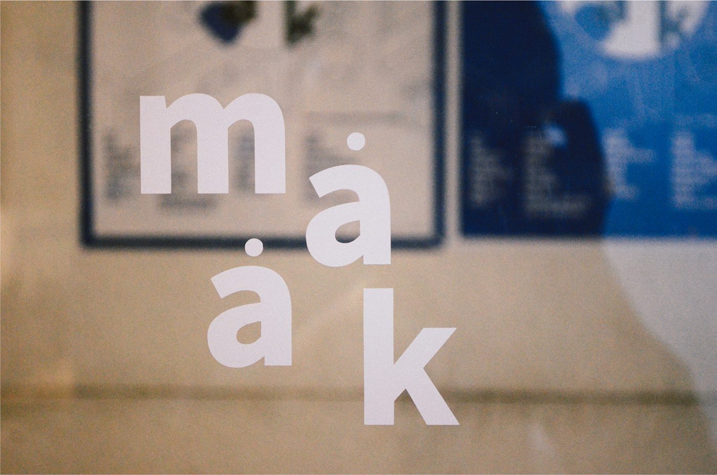
BRAND LOGO


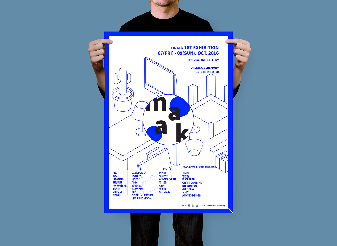

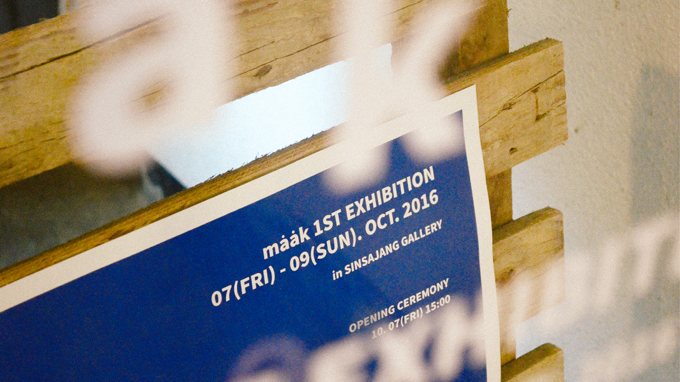
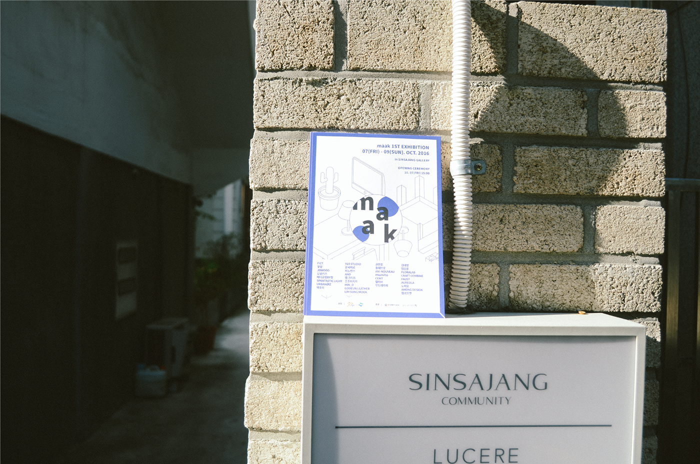
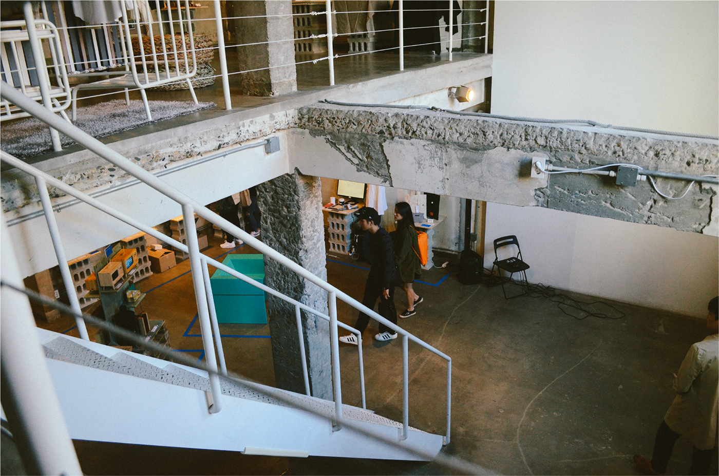
First Exhibition 2016 - @SINSAJANG,Seoul, Korea


Thank you for watching!
\
a-mong@naver.com
Please check out my friends' work.