


KAZAKHSTAN'S
PREMIUM BEER
☼
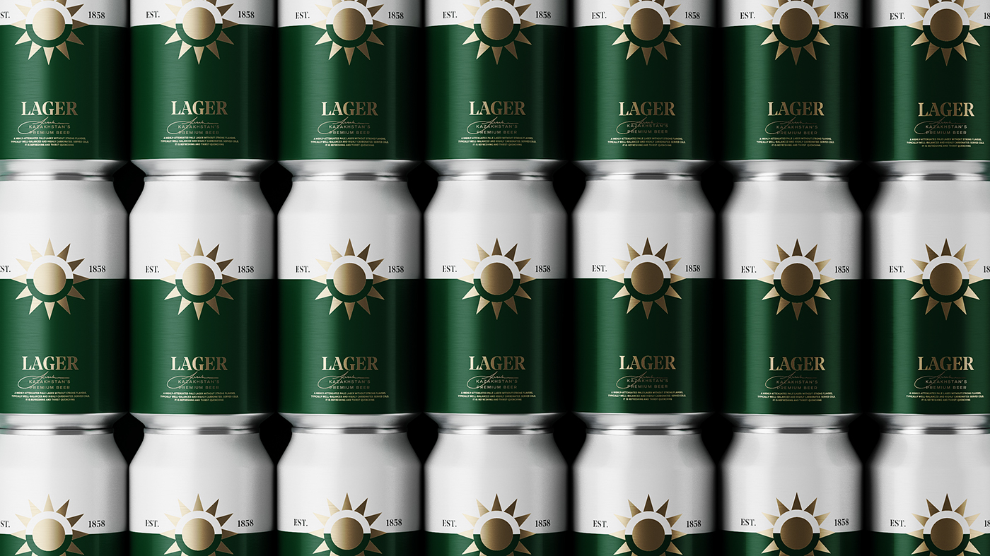
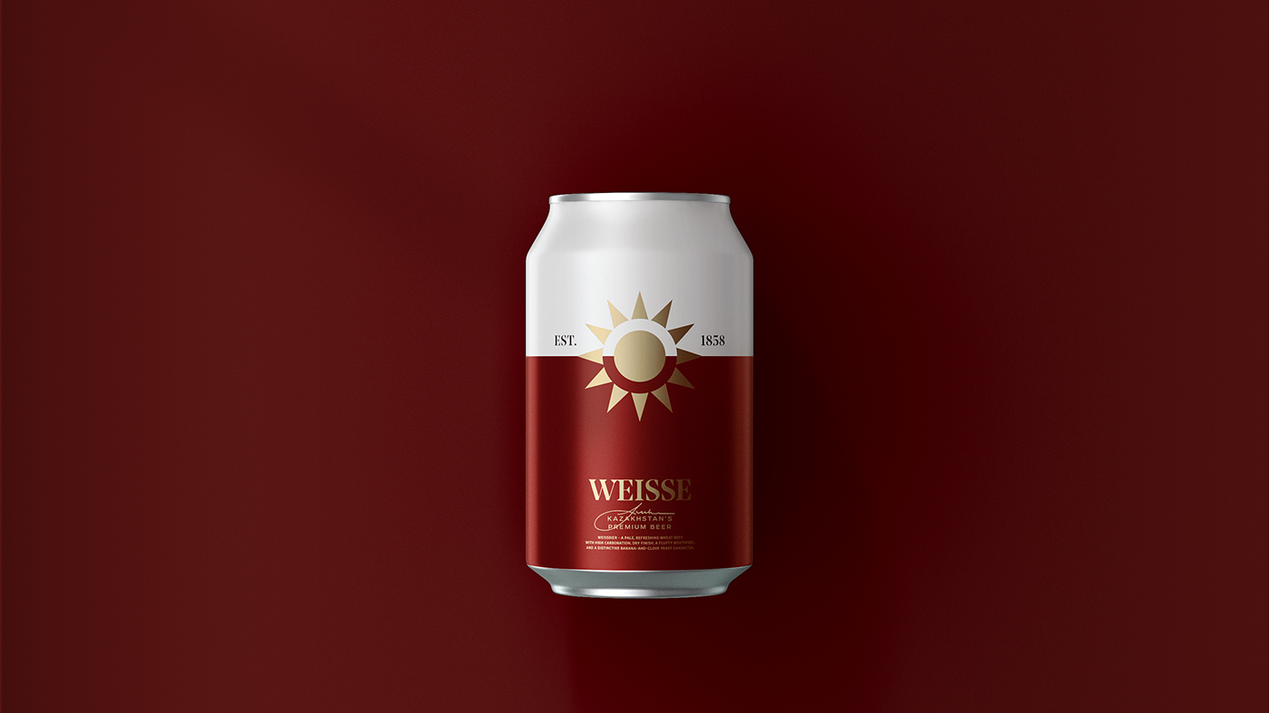
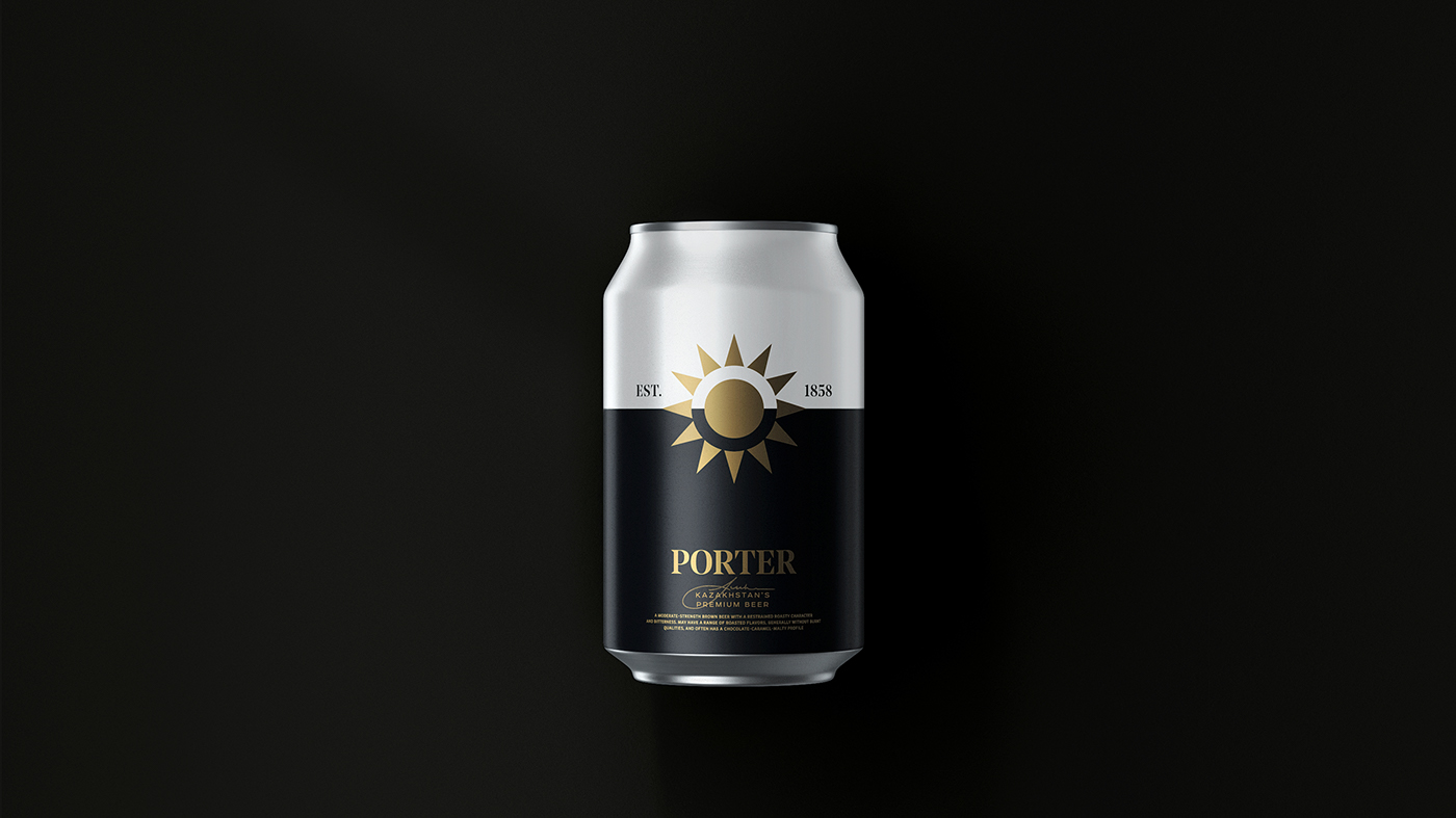
We have created a new packaging concept for Kazakhstan's premium beer “Pivzavod No.1”. Our goal was to bind national identity adding some modern European design. Besides that we decided to leave aside the name “Pivzavod No.1” and talk about the foundation date of the brewery and beer styles. The key element for the case is the simple and well understood symbol – the sun which is main flag element of Kazakhstan. The sun associates with ripe hops and golden tone of the beer.

The outlines of sunshine rays match the outlines of typography used on packaging.


☼
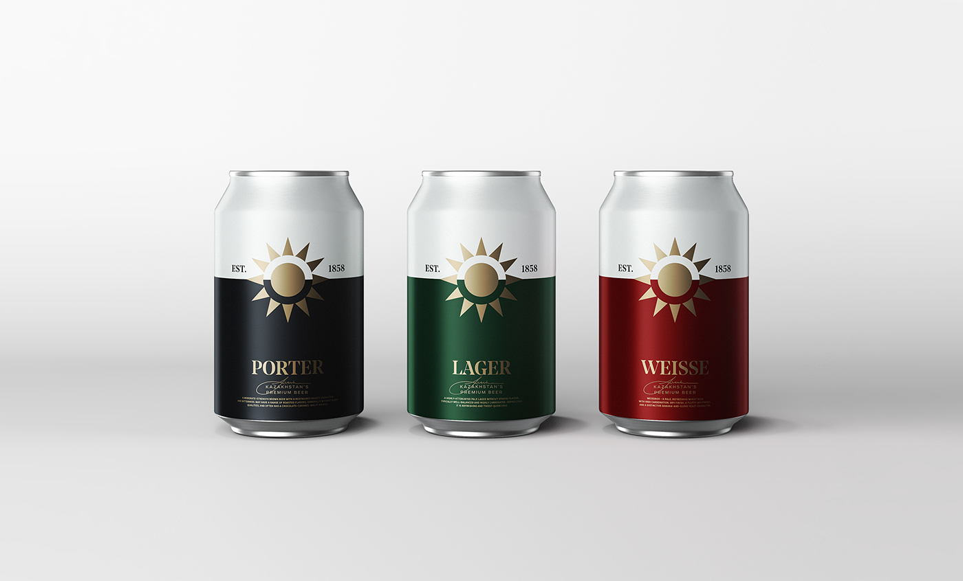
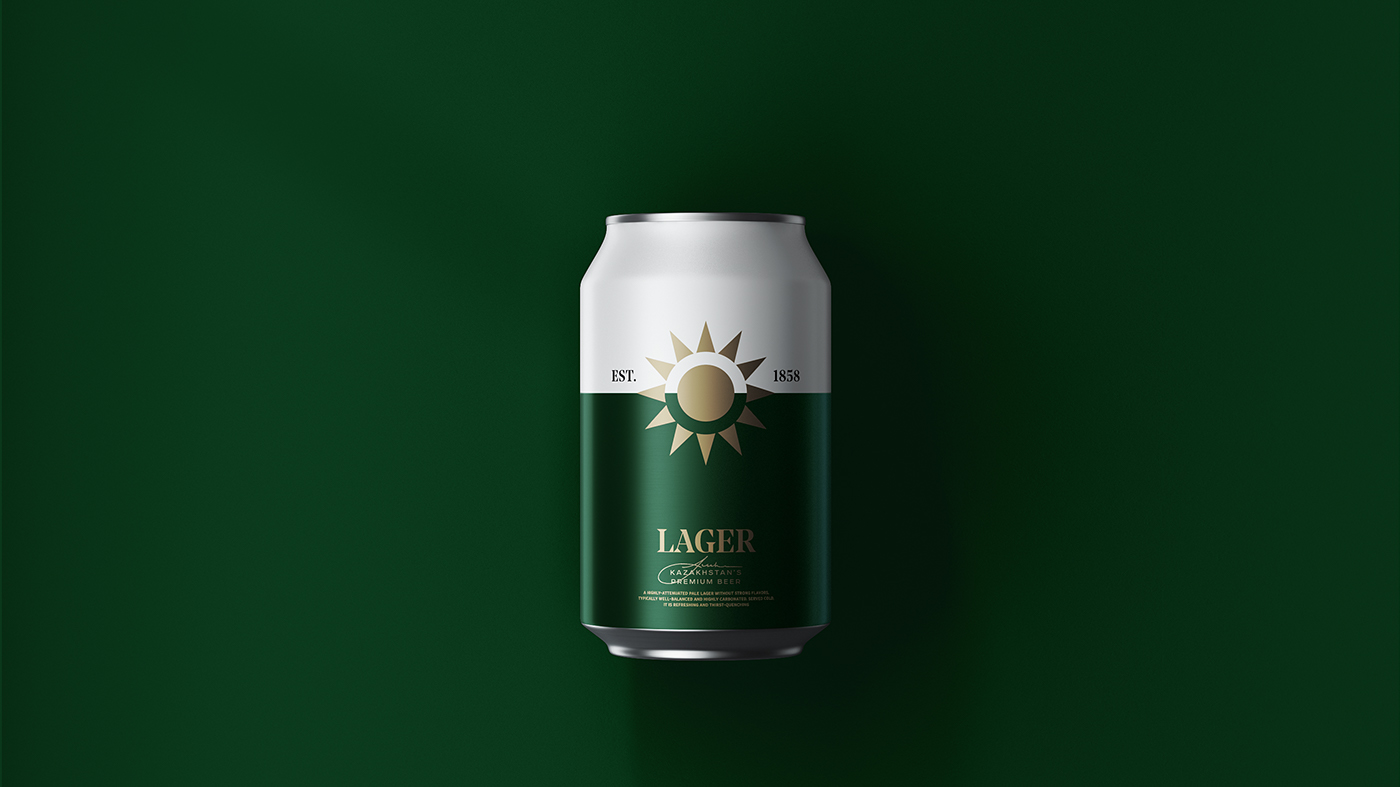
The sun was placed on nominal horizon dividing the can in two parts.
We have put only foundation date of the brewery on the upper part
to accentuate on key elements.


☼
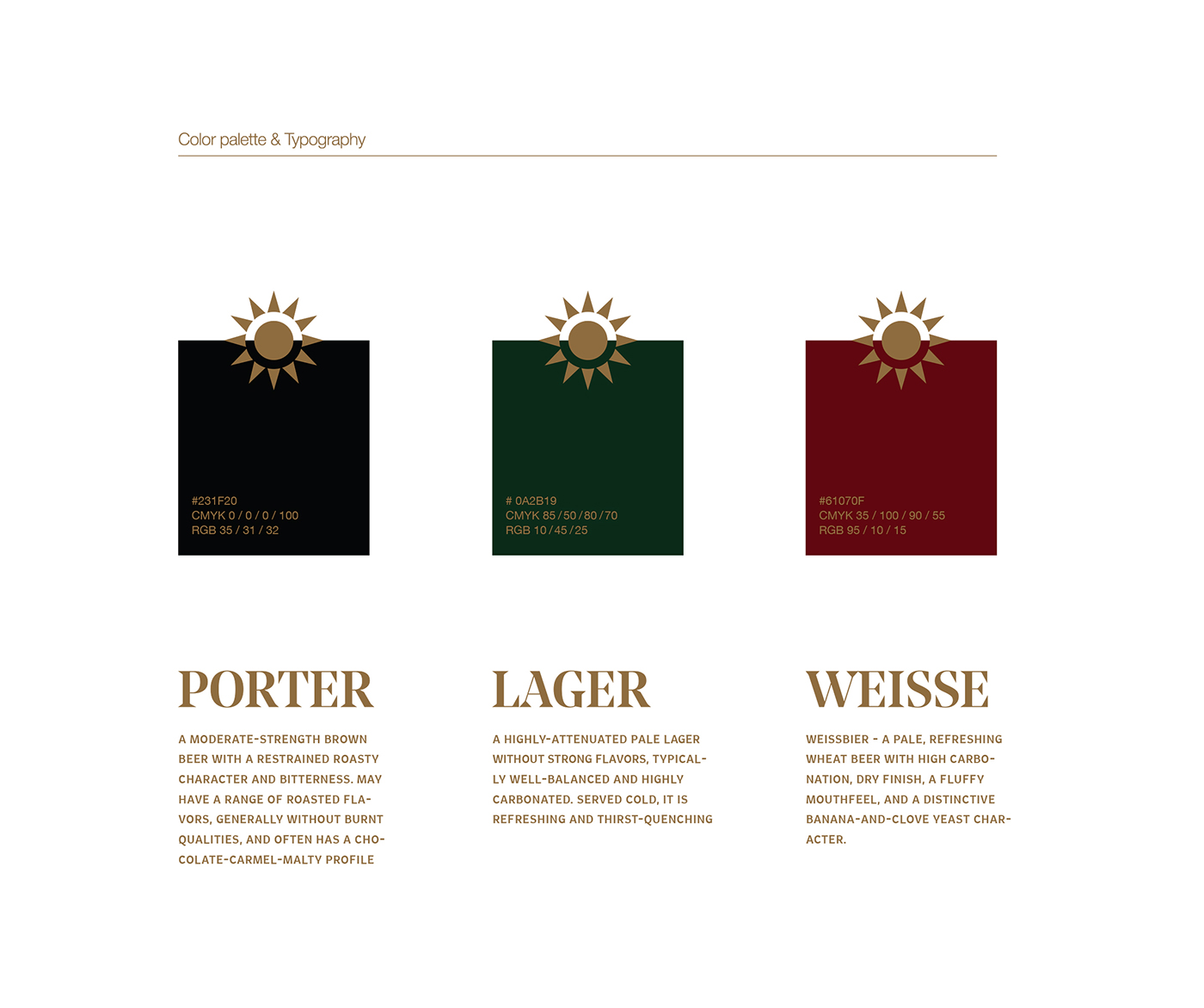
The lower part shows the beer style in
different colors. We used well known for Kazakh people
colors to emphasize on national identity and make
them proud of the national product.


☼
The signature of brewery owner is
used on packaging emphasizing his own responsibility
for product quality and his being close to clients.


Credentials:
Graphic Design & Art Direction — Andriy Muzichka
3D Modeling & Rendering — Oleksandr Shestakovych
Graphic Design & Art Direction — Andriy Muzichka
3D Modeling & Rendering — Oleksandr Shestakovych


