NGRS
Visual Identity
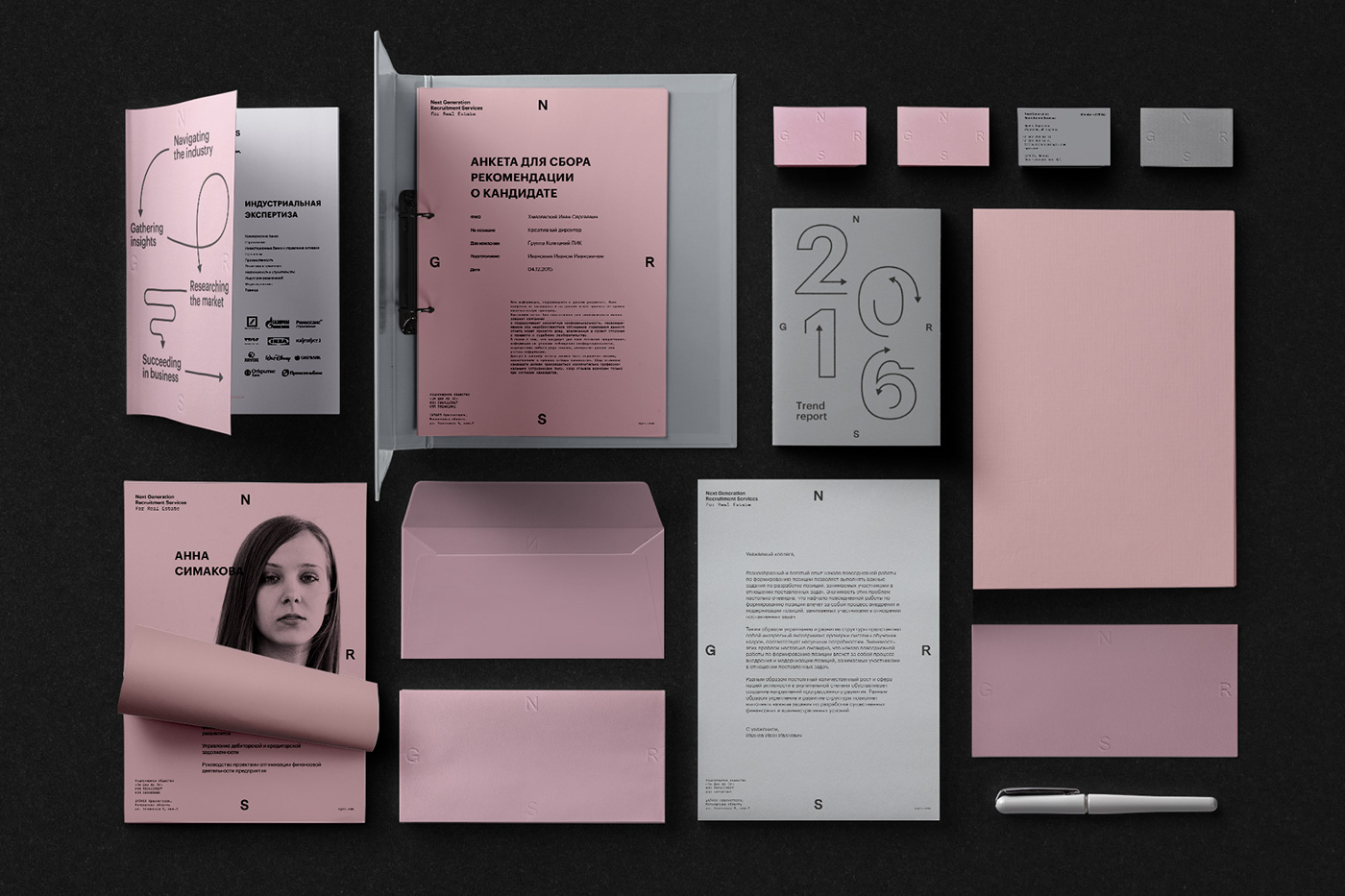
NGRS is a recruitment firm, scouting top management for companies in various industries. We were approached to redesign the existing logo and create a visual identity for the business.
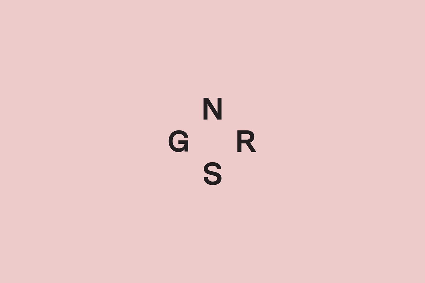
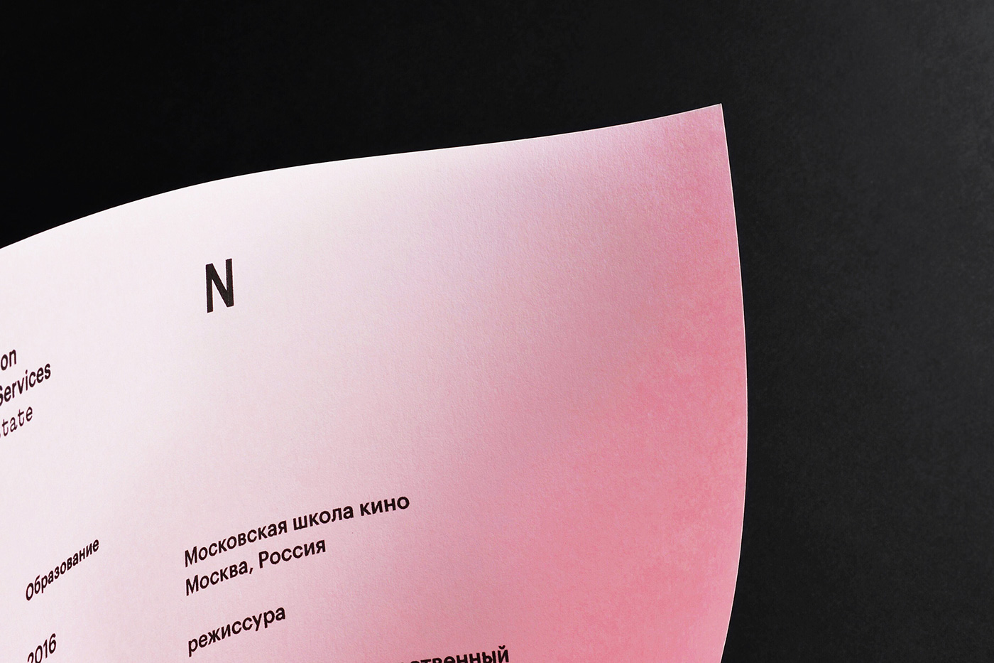
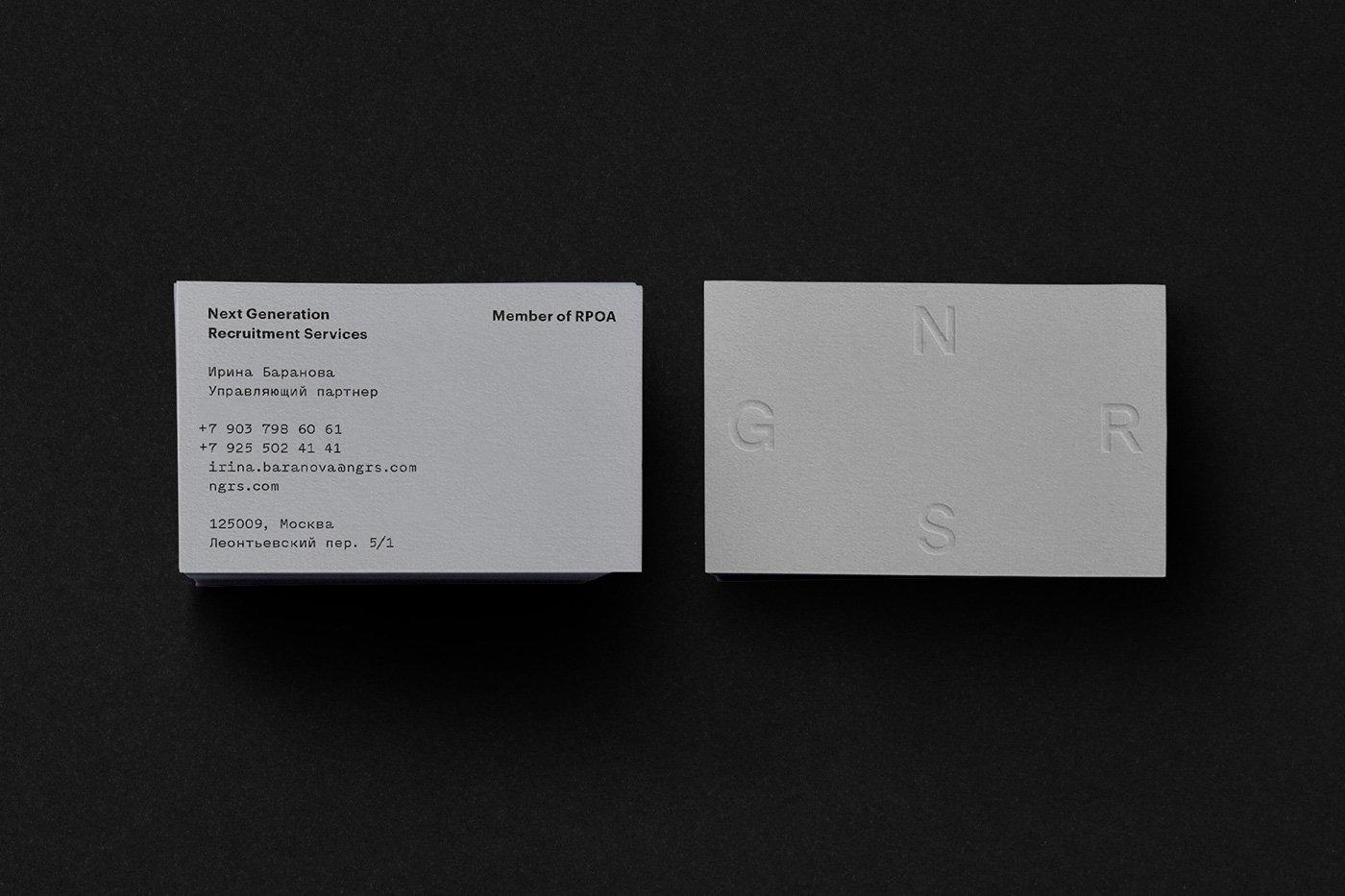
The logo is our take on a humble compass. It represents the ability of a great recruiter to search and to look in the right places, to avoid problems and find the best solution. As most of the company's staff are women we chose pink as a primary colour, which coincided with pink being used extensively in freshly designed interior of the Moscow office.
To balance out the candy pink colour we chose a very utilitarian sans serif typeface and designed a rigid grid to make all the communications look serious & professional. We payed extra attention to laying out all the documentation & created clear hierarchies to make every document easy to read.


Interior design by Crosby Studios
Interior photos by Evgeny Evgrafov
Case photos by Nastya Chamkina
Interior photos by Evgeny Evgrafov
Case photos by Nastya Chamkina

