

Balance Water Company
Re-branding and Packaging
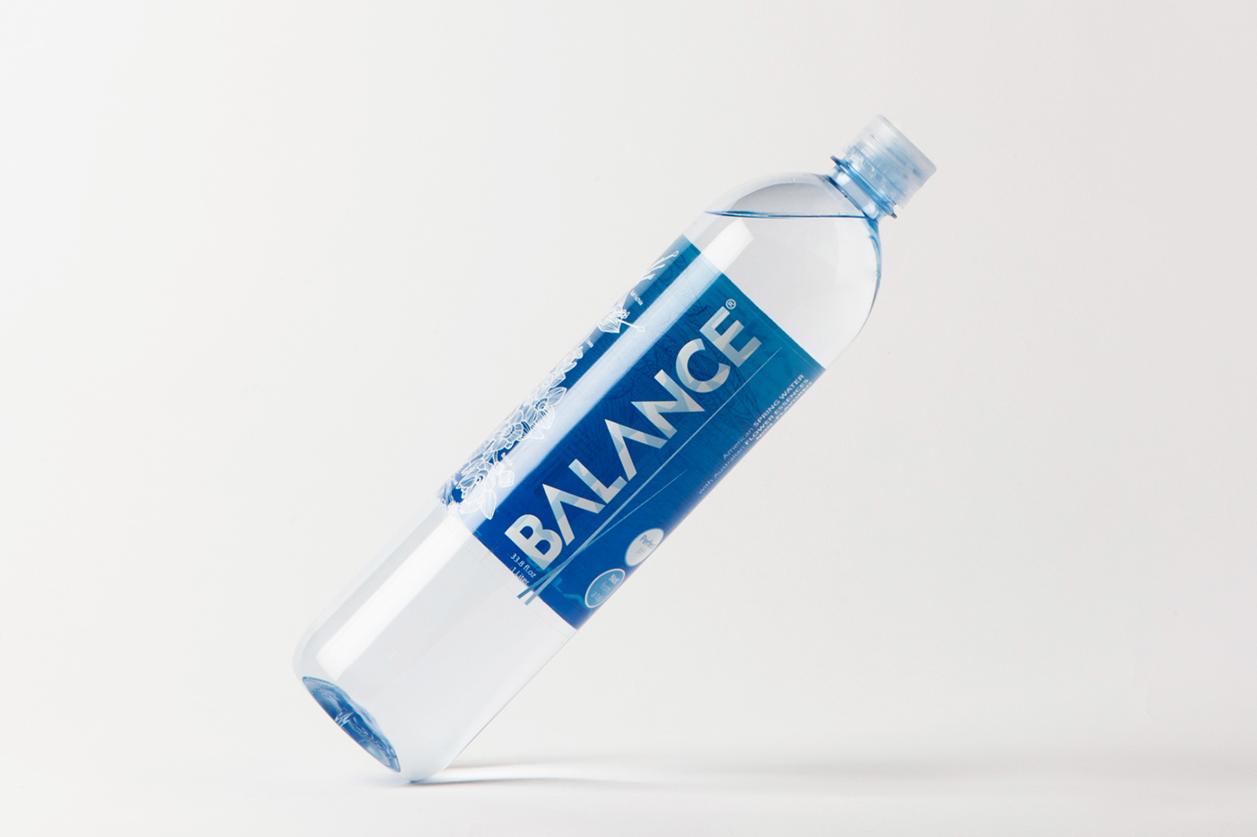
In 2016 Balance asked us to give a new look to the brand and make it more visibile on the market shelves. Martin our client, gave us a nice source of inspiration talking about the colors he had seen on a trip to the Canadian glaciers.
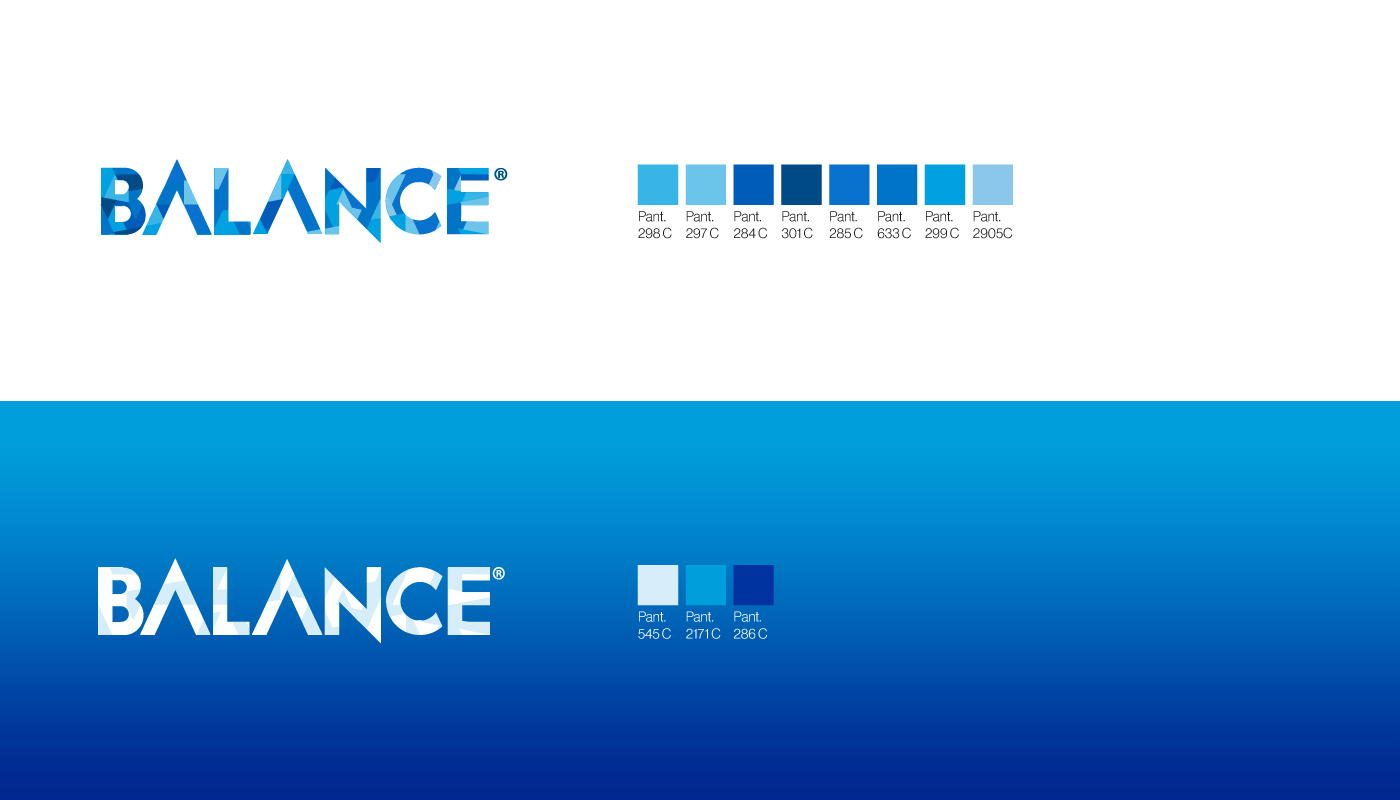
"The brand identity is based on a geometrical grid and a modular system, such combination together with the rhythmic movement of the color elements works for the brand recognizability. The brand name is divided into separated elements proportioned between them.
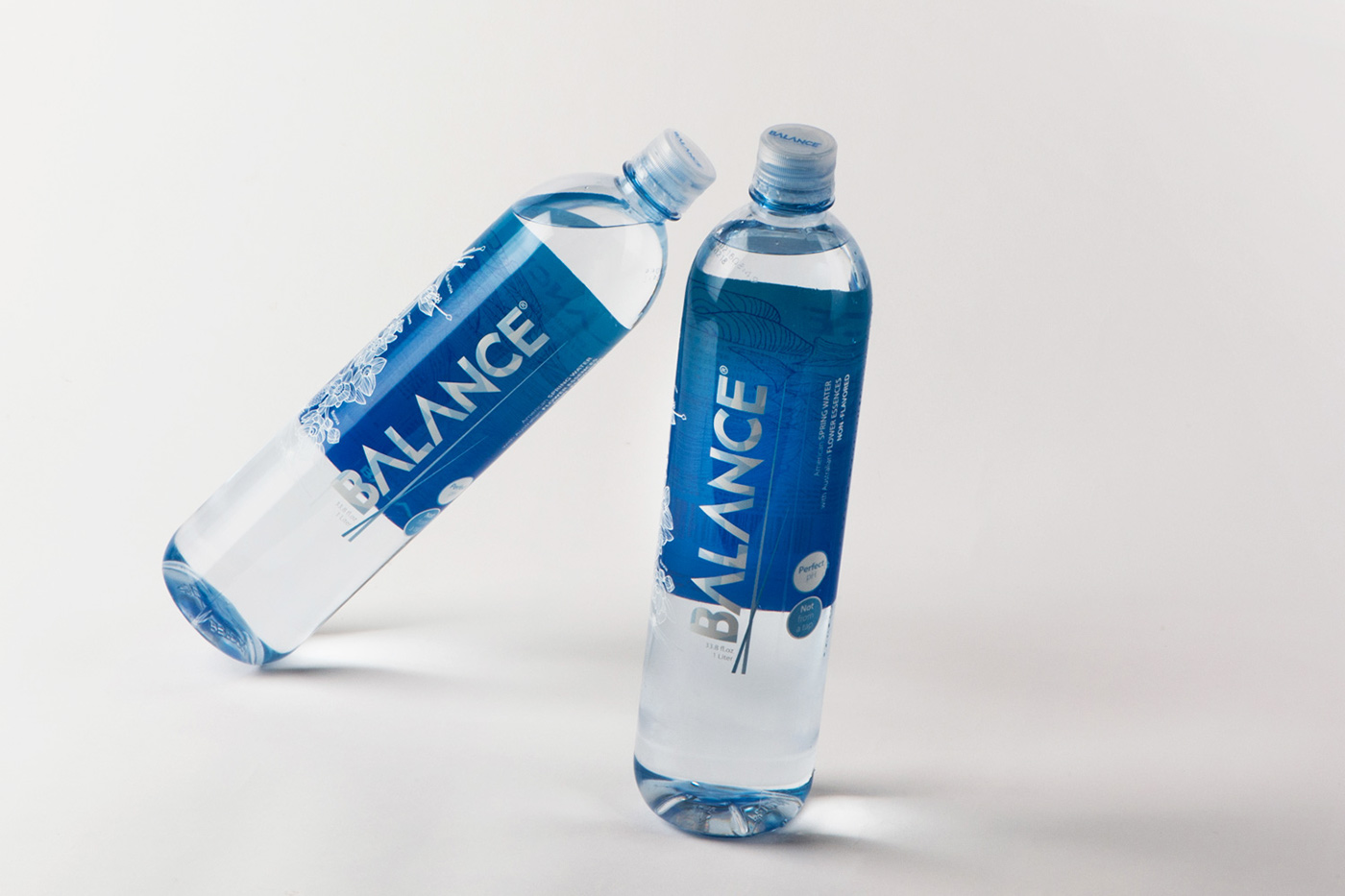
We have hand drawn the flowers on the side and in the inside back panel which we wanted to look like an embroidery."
We have hand drawn the flowers on the side and in the inside back panel which we wanted to look like an embroidery."
Presented on PACKAGINGOFTHEWORLD.COM


FORM FOLLOWS INFORMATION
Balance (definition)
a situation in which different elements are equal or in the correct proportions.
synonyms:
fairness, justice, impartiality, egalitarianism, equal opportunity;
parity, equity, equilibrium, evenness, symmetry, equipoise, correspondence, uniformity, equality, equivalence, similarity, levelness, parallelism, comparability.


New York Fashion Week, 2016
Shine Oct 2016, New York

Key Foods store, Brooklyn NY
Creative Agency → Graphic opera
Art Director → Leonardo Lenchig and Ettore Concetti
Art Director → Leonardo Lenchig and Ettore Concetti
Design → Leonardo Lenchig and Ettore Concetti
Inspiration → Martin Chalk
Still Photos → Carlo Sclauzero
Project Type → Produced, Commercial Work
Client → Balance Water company (Martin Chalk)
Location → New York, New York, USA
Packaging Contents → Water
Packaging Materials → 2 mil clear Polypropylene, Permanent acrylic adhesive, .92 PET Liner with a UV gloss window varnish
Project Type → Produced, Commercial Work
Client → Balance Water company (Martin Chalk)
Location → New York, New York, USA
Packaging Contents → Water
Packaging Materials → 2 mil clear Polypropylene, Permanent acrylic adhesive, .92 PET Liner with a UV gloss window varnish


