Eisenstein's Monster
This book was a real treat to lay out, because it included such a wide variety of prose styles. Nearly every chapter required a different sort of presentation, all coming together like patchwork.

The cover is meant to reflect the convergence aspect of the book. The radial pattern is made up of many smaller symbols that have meaning in the story.

The title page.

Section openers.

Chapter openers. Strikethrough is used in several sections of the book.

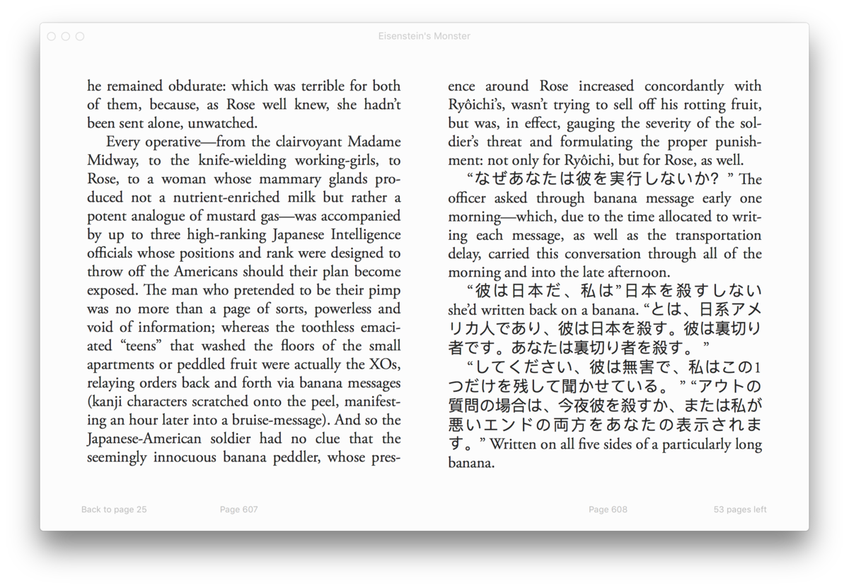
One of the chapters in the book required text in Japanese.

And another used nested blockquotes for style.

Footnotes exist in many chapters, and some are very structured and complex.

A late chapter is formatted like a log or journal, and I made a number of adjustments to reflect that style.

For the same chapter, we had a need for inline geometric shapes, so I created a custom symbol font for that purpose.

And it included a few tables, and other elements that are more common for non-fiction than fiction.

Toward the end of the book, a number of shorter pieces are assembled, and they've got a variety of formatting styles as well. This is an extended dialogue.

And here we've got a transition into something like a script format.

This is a text-only interpretation of the pages of a comic book. It also includes nested footnotes.

More heavy use of strike-through.
I really enjoyed finding creative and mostly semantic ways to create all of these different styles, while trying to make design decisions that can work for ebook as well wherever possible:

Eisenstein’s Monster is available on Amazon in print and ebook.