

To impress emotionally. I think that was the primary consideration when I started planning and defining the problem. To give new meaning to the object, elevate it from the level of a simple, subordinate device - to approximate the wine in terms of prestige - and to associate a ritual with which I complement the system of wine consumption habits.
My goal was to design a corkscrew which highlights the opening act. Conswquently I distanced myself from easing the process. The longer the opening of the bottle lasts, the greater emphasis it recieves. For this, the twist and pull corkscrew is ideal.
However, for my objects to achieve the desired goal, I had to further develop the idea. In order for it to bear more relevance for the user, and to last more than a few minutes, I concluded that it should leave some kind of trace. I considered the involvement of the possibility of writing to be the most effective for this goal.

I concluded that between the winery and the literature there are many points of connection. Both concepts are very significant regarding our cultural lives, and they serve the purpose to preserve or further enhance some kind of a value for posterity. And as the winery's device is the corkscrew, so is the literature's the pen.
The pen is not considered simply a tool, it has become a symbol. So it carries in itself that which is my goal with the corkscrew.
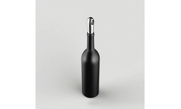
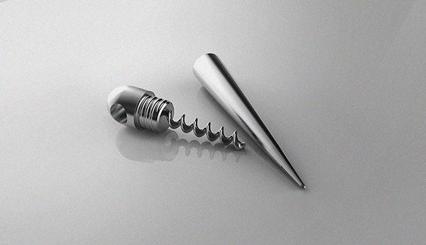
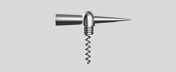
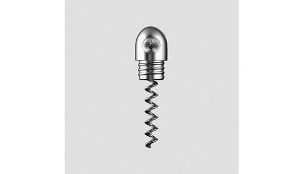
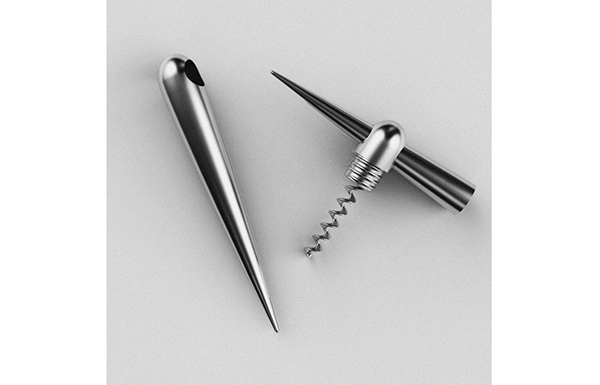
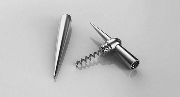
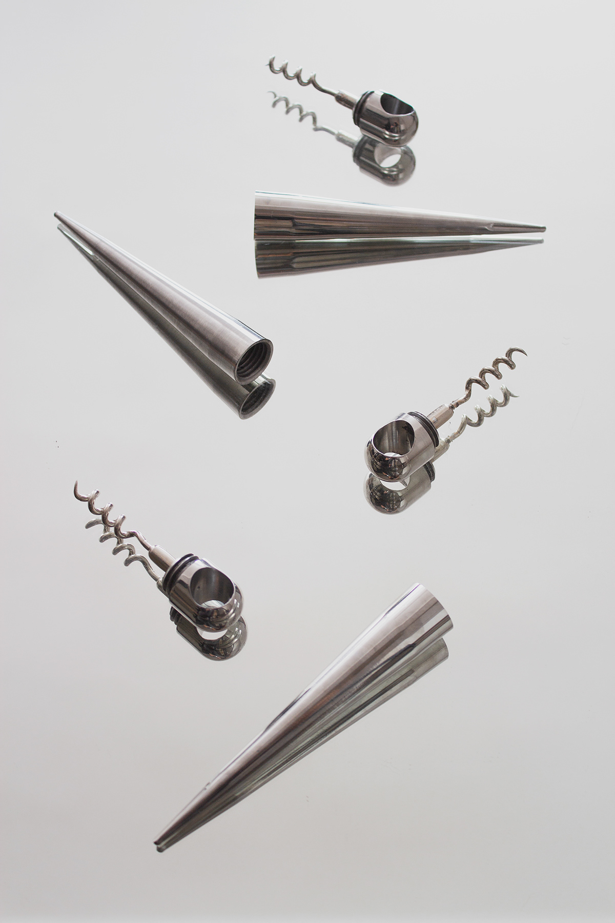
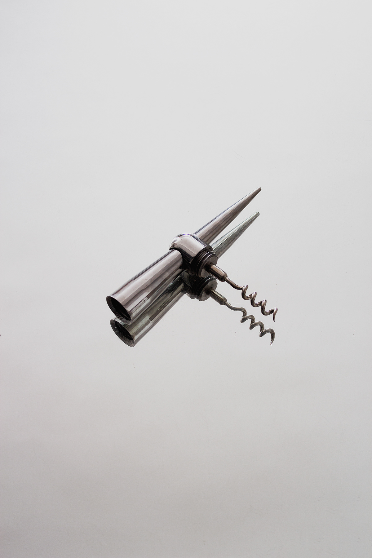
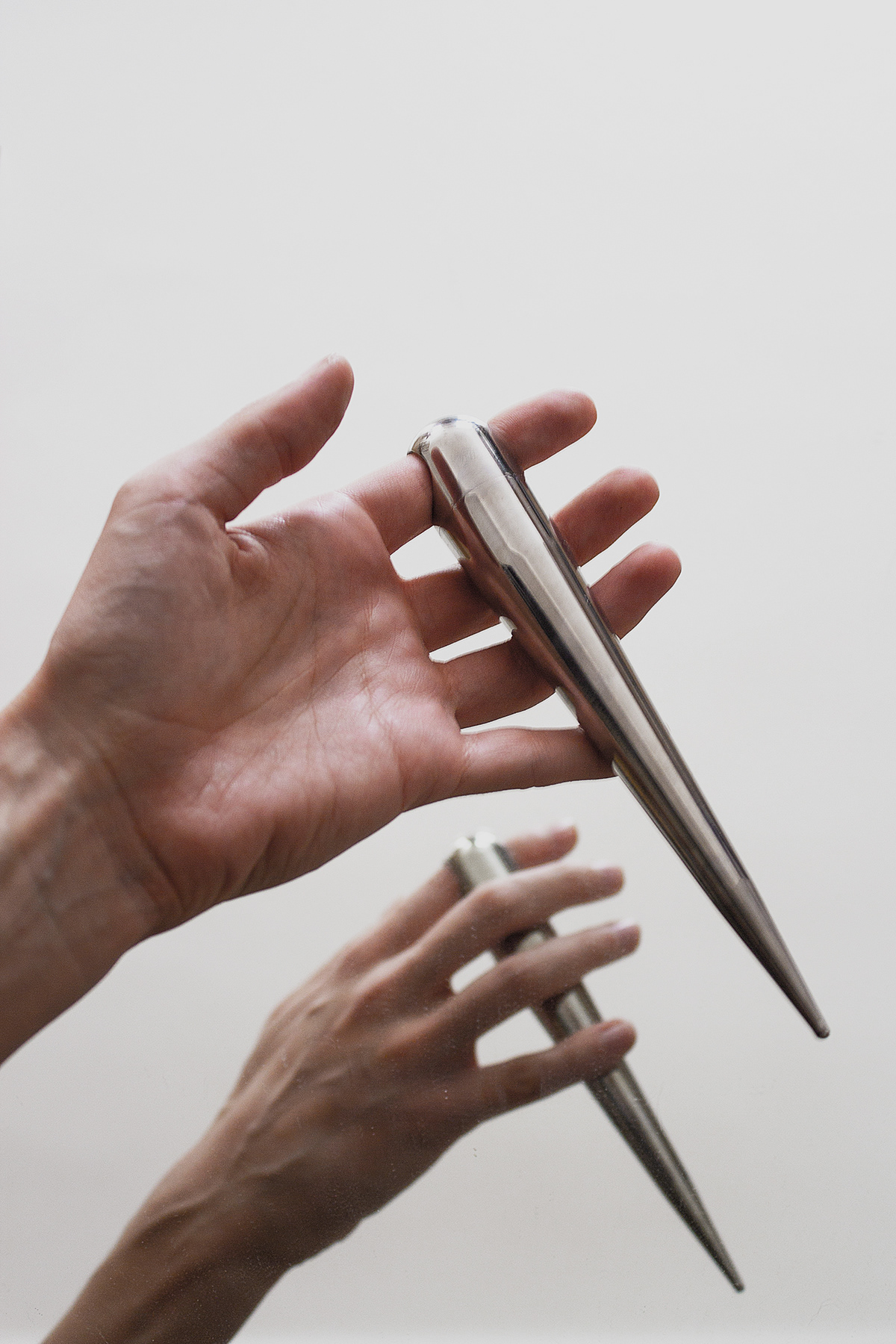
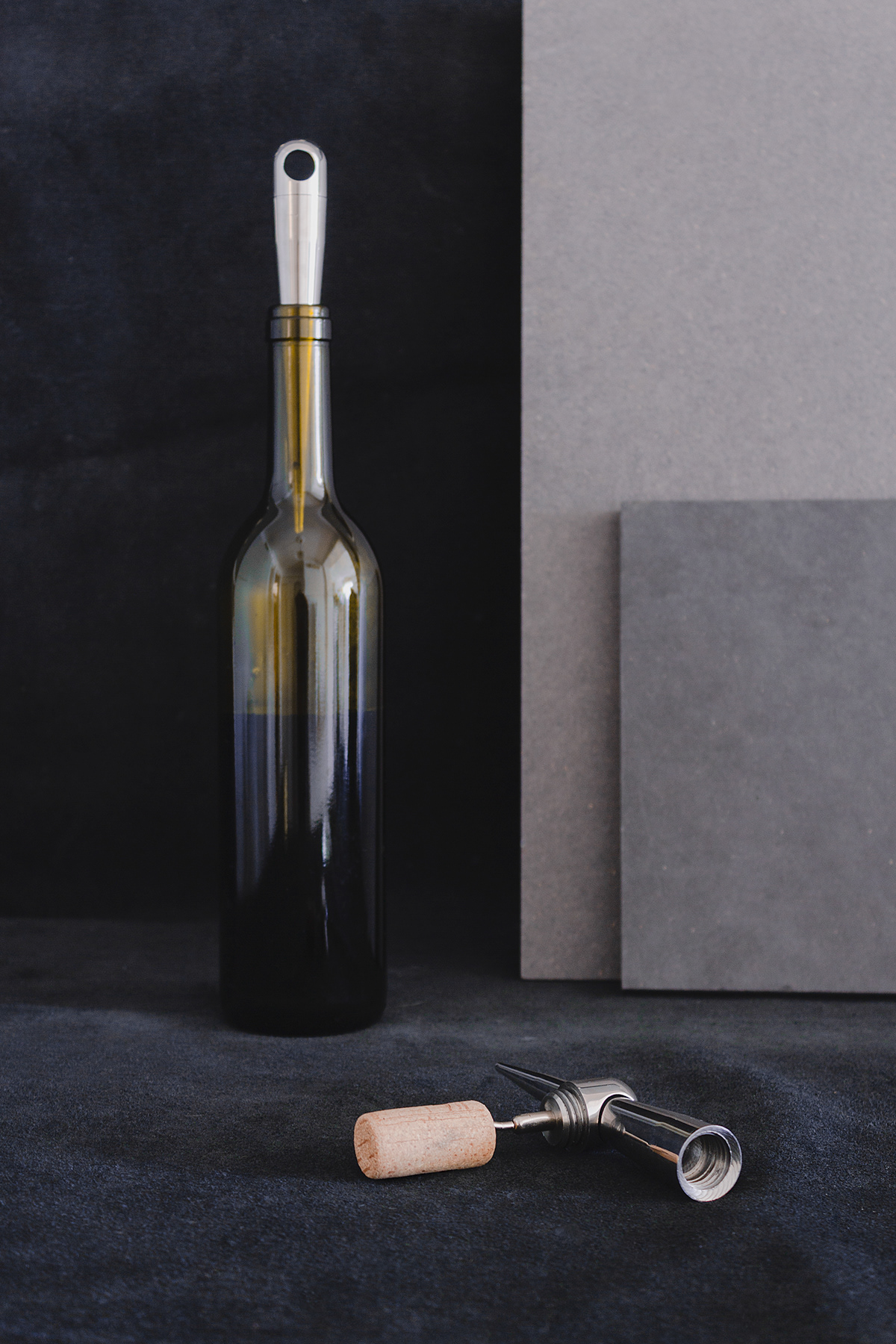
Alone the combination of the two things I did not find sufficiently suggestive, startling. My plan was to make the corkscrew extend out to the largest possible functional area, so that thanks to its shape it shall also replace the cork, if it is placed in the neck of the bottle. This gave rise to the idea that one could write even with the wine.
Yes, but what?
As it turned out, keeping a wine diary is an existing concept, and many people take this opportunity too. Actually, it is this kind of extreme wine enthusiast for whom I can make this ritual more sophisticated, so that they would not just simply note down when and what kind of wine they consumed, they do it with the wine itself.
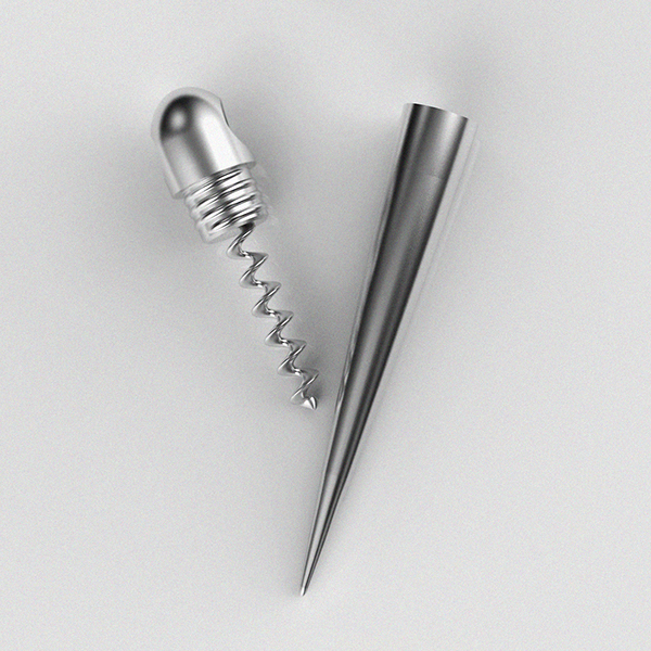
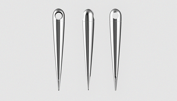
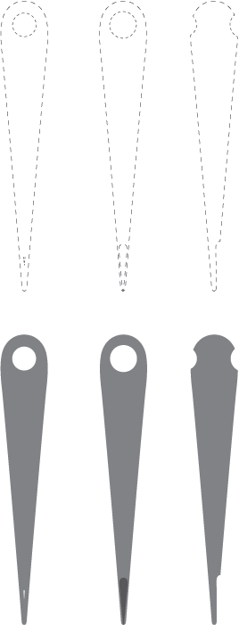
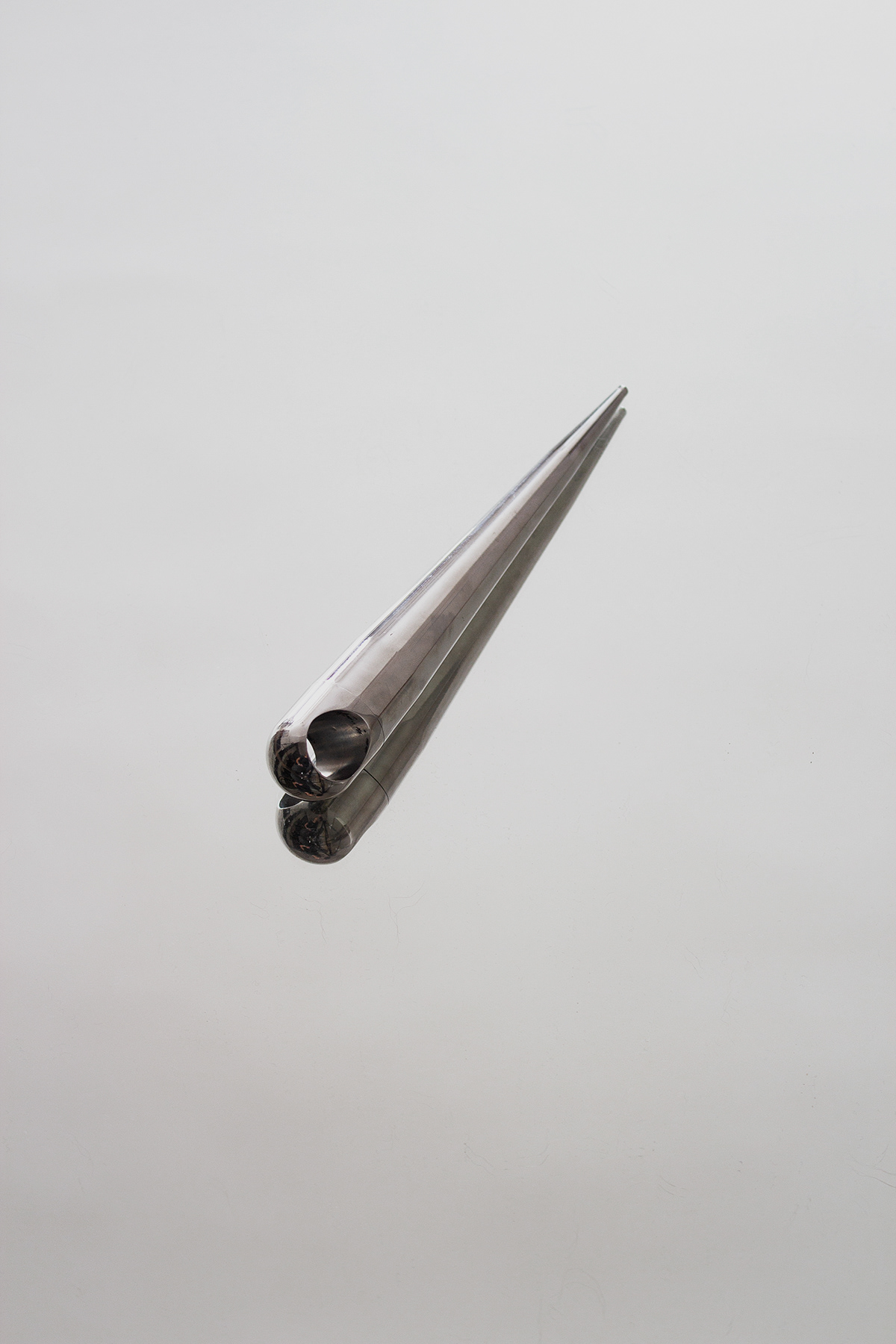
With regard to form, I tried to be as simple as possible. To be suitable functionally and ergonomically, several measures were fixed, so the cone-like form was given. Since the groove in the tip of the dip pen contains a drop of fluid, I liked the idea that this phenomenon - which determines the mood of the object - would reecho in form. Thus I arrived at the static, elongated drop shape. In the end, the whole corkscrew is built up out of this motif, as the unity of the object, the internal curve of the tip of the pen - a drop negative - and also the opening of the tip.


prototype
wine writer

Consultant: Pál Koós
Softwares: Rhino 3D, Keyshot 5.0, Photshop CS6, Illustrator CS6, Premiere CS6
Designed, modelled & rendered by Annabella Hevesi
2014