Logo Development
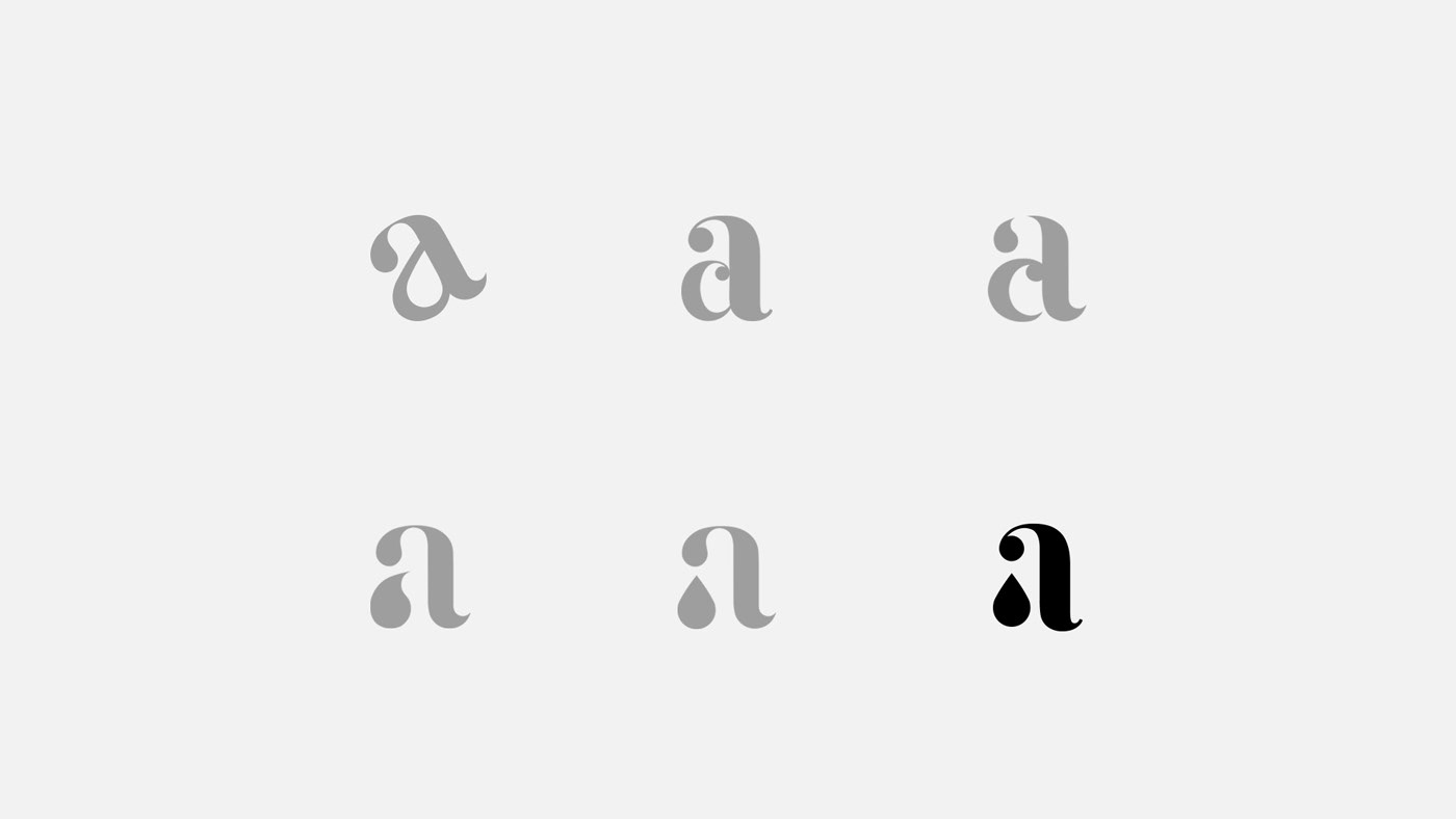
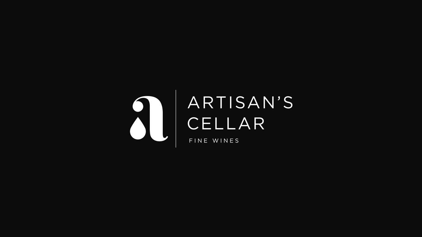
Our team drafted hundreds of logos during development, and ultimately landed on one that represented both the idea of the wine coming from a tap, but also the artisans themselves. The icon is a modern “a,” with a wine droplet as the bowl and a simple sans serif font for the wordmark. The deliberate, more utilitarian font choice was meant to help draw more focus to the icon.


Branding Process
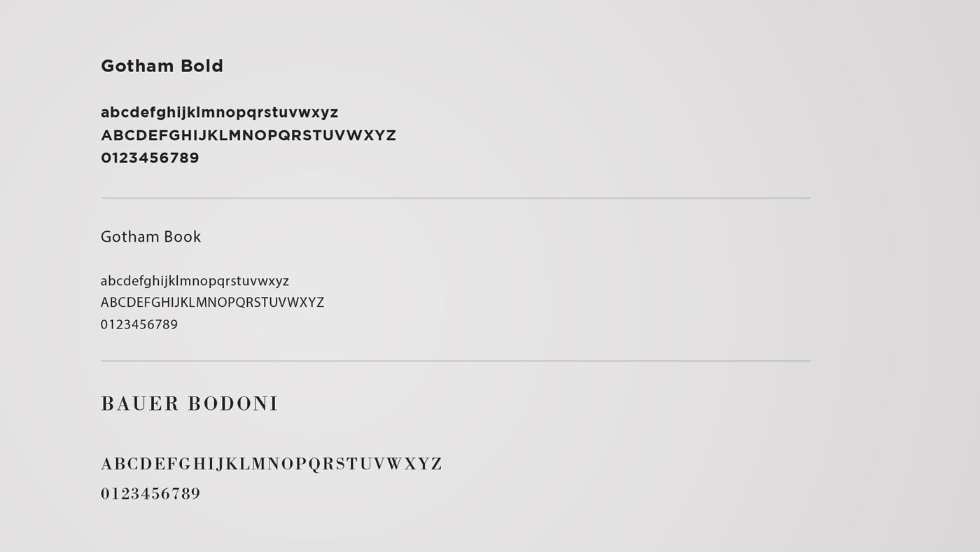
The brand was developed using minimal color and imagery to maintain focus on the simplicity and elegance of the logo structure. The brand goal was to represent the wine artisans in a modern, clean structure. Color was intentionally omitted from the core identity and only used in photographs on the website. This distinction was detailed in our comprehensive brand guidelines documents provided to the client. Additionally, our team created a letterpress business card, letterhead, and envelope to capture the brand’s beauty and simplicity.


Website
The website was designed to reflect the modern, simplistic approach to the brand. The only instance of color within the whole brand appears in photography on the website. To compliment the minimalist layout of the website, we designed effects and interactions in every corner, leaving no part of the website feeling static.