I joined the NAPA Board as Director of Technology when NAPA was still not a decade old in its existence. In addition to revamping the website, I took added initiative to standardize the organization's external communication by creating its first iteration of a style guide. While I have expertise in creating such documents through Adobe InDesign, the majority of the NAPA Board relies on the Google Apps ecosystem to do the bulk of their work, so I aimed to create a style guide given the design constraints of Google Docs. The entire process from ideation to release took around 20 hours of work spread across two weeks of iterative feedback from members of the NAPA Board. Here I will walk through my design process, providing rationale for the different stylistic decisions I committed in the making of the style guide.

As illustrated above, I wanted to employ a horizontal landscape for the document so that I could instantly signal that this document was going to be a drastic departure from the typical monotony of previous NAPA documents. I separated the table of contents into cells of a 1x5 transparent grid, intentionally serrating the left gridlines of each cell to connect the major heading element with the corresponding page number located at the lower left corner of the cell. Playing around the margins of the document, I pushed the gold borders to bleed past the edge to demarcate pagination.

In the second page of the style guide, I conveyed my design philosophy for the organization by explaining the importance of a cohesive visual identity and providing examples of the voice and tone of the organization. I contrast specific adjectives against each other provide an explanatory level of abstraction that situates NAPA's place across various spectra.
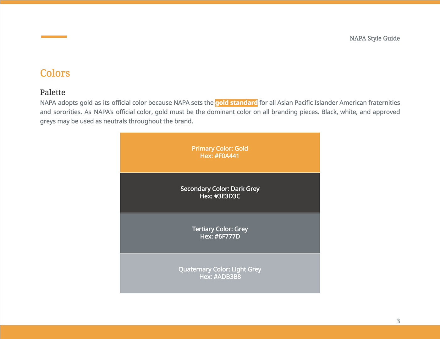
As NAPA is an advocacy organization comprising of 18 constituent fraternities and sororities (at the time of this writing) with their own respective colors, I chose gold to be the official color of NAPA for two reasons: (1) gold was relatively unused among the various colors for insignia among NAPA's 18 constituent organizations, and (2) it evoked a "gold" standard for prospective organizations looking to join NAPA. It is worth noting that in numerous Asian Pacific Islander Desi American subcultures (i.e., Chinese), the colors red (good fortune) and green (health) are widely used. I referenced the Adobe color wheel to find a visually appealing color of gold (#F0A441) and completed a color pallet consisting of neutral greys.

Next I provided guidelines for how different elements such as the NAPA block (for internal documents) or wordmark (for external communication) should be used. Credit goes to Kevina Lee for designing the NAPA logo (illustrated above) with 18 leaves—coincidentally congruent to the number of organizations currently affiliated with NAPA. Considering that NAPA may decide to expand its network to include more organizations, we may need to update the NAPA logo again for a more timeless and balanced design.

I'm a huge typography nerd! Among the entire style guide, this was my favorite page to design and write. I chose the typeface Noto not only because it was a free Google Font that was available to use in Google Docs, but also for its whimsical history in relation to tofu as described in the style guide rationale. Given that NAPA is an organization with a culturally-driven mission, I wanted to make sure the font I chose for the organization could render in a number of the most widely used Asian fonts (Hindi, Japanese, Korean, etc.) as well as the Greek alphabet for abbreviating NAPA-affiliated fraternities and sororities. Using the previously established color pallet, I respectively rotated the color scheme of the title, subtitle, heading 1 to dark grey, light grey, gold. I cycle this pattern again for heading 2, normal text, and emphasis.

In addition to outlining email signatures, I also provided download links for ancillary brand collateral I have designed for NAPA. Because I was given no design specifications at the start of this project, I sought to make the most of my unfettered decision-making process while explicitly explaining my design rationale in the document. This style guide is intended to be a living, breathing document as I anticipate making annual revisions that reflect the growth and progress of the organization.

