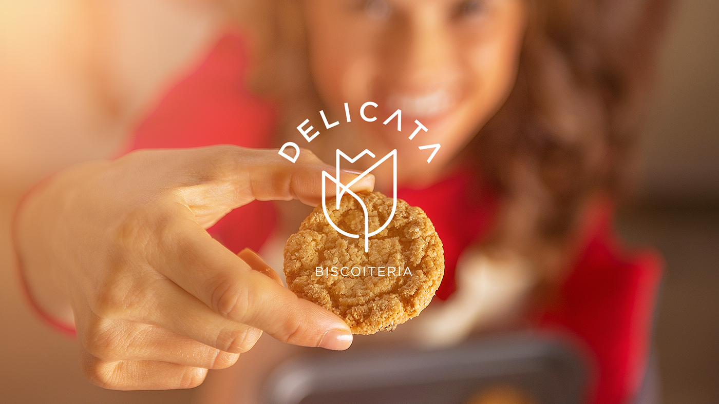
With full professional experience acquired along more than ten years dedicated to make and sell fine handmade biscuits, the Delicata Biscoiteria wants to grow the business in a structured way within its already known market, but without losing its essence and homemade characteristics.
The adoption of a new visual signature marks the beginning of a new cycle, in search of the desired development.

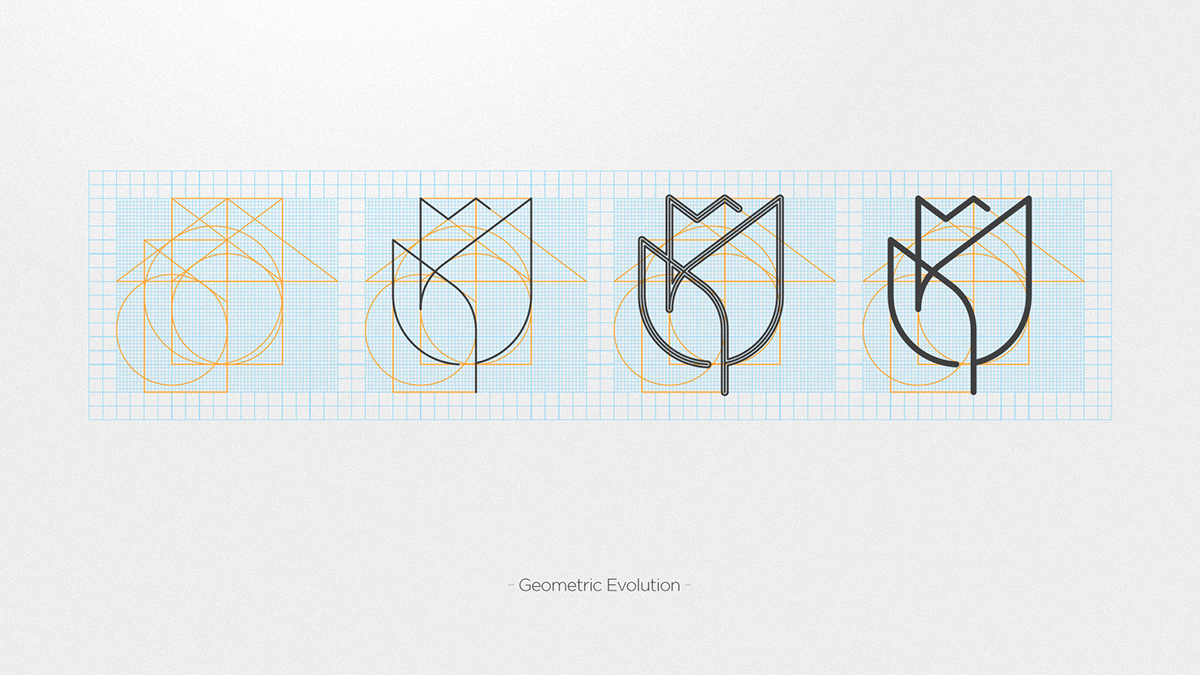


The flower, the symbol chosen as the brand main’s element, is full of meanings:
It’s directly related to the feminine gender, that is the brand's main public;
It’s a natural element, making a connection with the product’s characteristics;
It’s a great gift, that surprises and pleases;
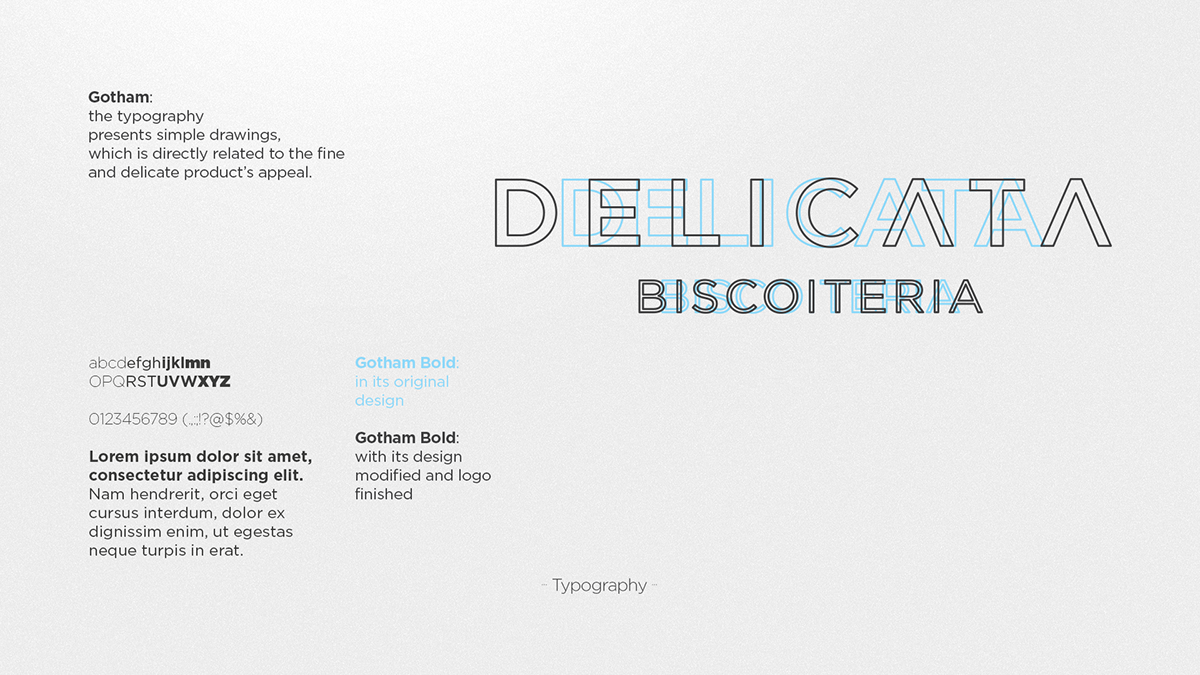
It presents simple drawings and sober colors, which communicates the fine and delicate product’s appeal.