


A turn in the tide.
A change of course in identity isn't necessarily bad.
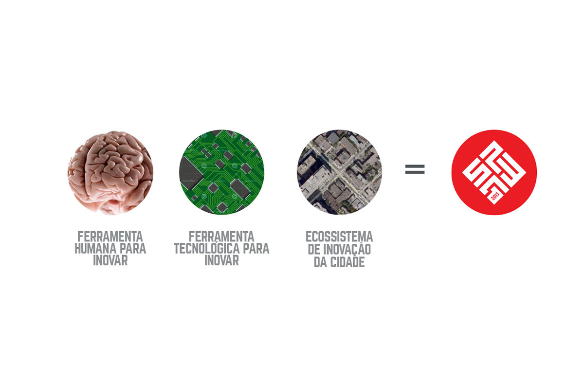
As you see here, below this section the logo and visual identity has taken a drastic change in colors and simplicity. Although it was the client decision and demanding, I don't think that was too bad at all. But I like the first one (above) way much better.
As you see here, below this section the logo and visual identity has taken a drastic change in colors and simplicity. Although it was the client decision and demanding, I don't think that was too bad at all. But I like the first one (above) way much better.


If you may, I'd love to hear your oppinion on the comments below. What version of this logo do you like most?
Thank you very much.


