One site for four season
These specific graphic elements were designed to give a different look for each touristic season. Malcesine needed a tool to address tourist having the best experience through the right choice of informations.

A lot of effort has been spent to design a clear and very usable navigation bar.

The creation process included a big amount of hours designing the Information Architecture, the User experience and last but not least the Graphic User Interface and crafted graphic icons.
Travellers use mobile phones
(because, you know, they are on the move)

Handcrafted User Experience
Delivering the most curated design of the user interface for the better experience in each navigation bar and filter system

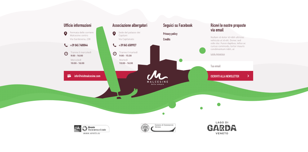
Illustrations organize the space for informations in an engaging way even in the footer sections and strongly recall the image of the town. All the colors and patterns season-related in the website and change with the switch of the season.