
PAN TO KOME
Branding
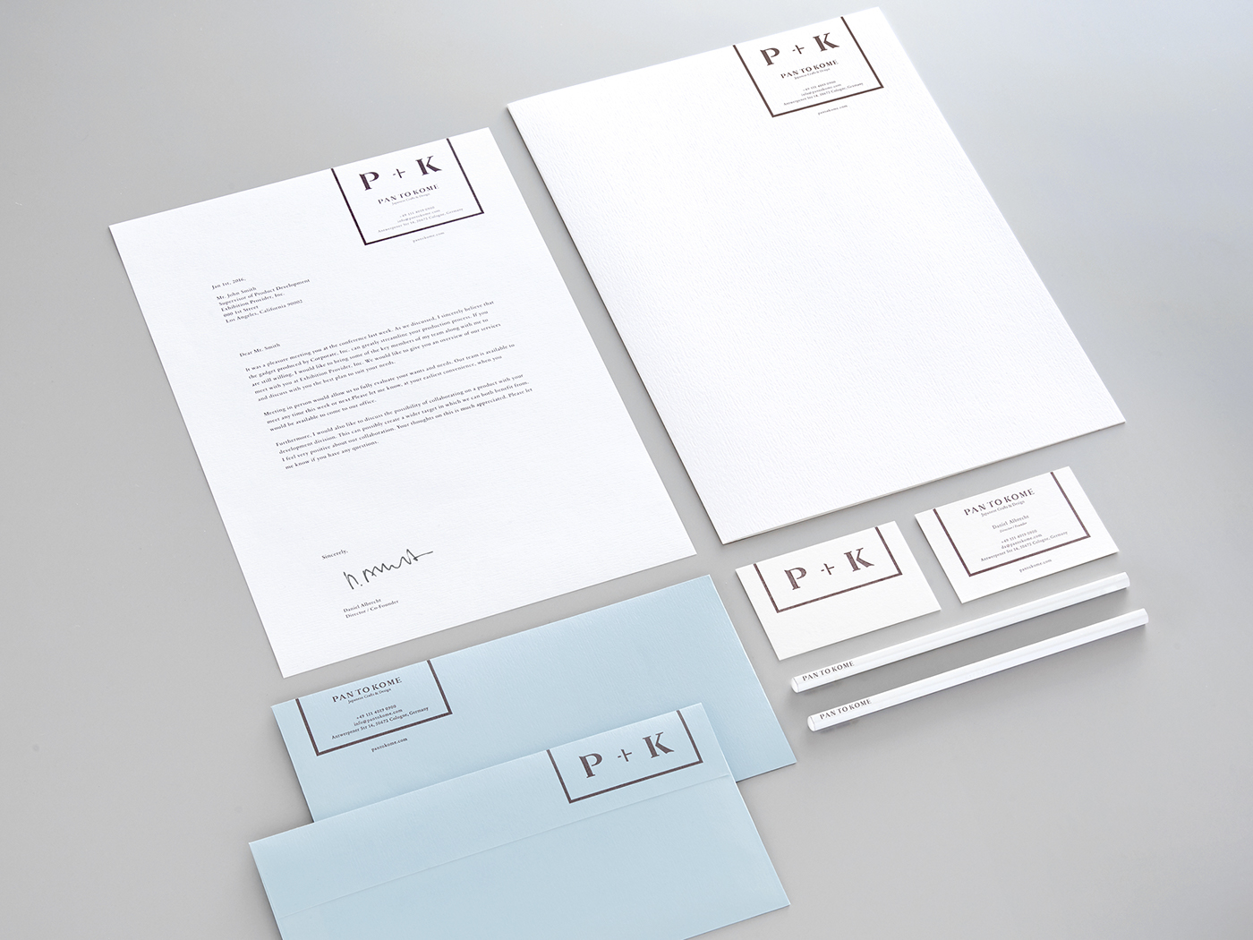
PAN TO KOME is an online media platform featuring Japanese craft products, run by photographer/publisher duo based in Cologn, Germany. Its main objective is to promote craft makers from Japan to people of Europe. It features a wide range of crafts from traditional pieces to innovative designs, as well as everyday products.
Branding
PAN TO KOME is an online media platform featuring Japanese craft products, run by photographer/publisher duo based in Cologn, Germany. Its main objective is to promote craft makers from Japan to people of Europe. It features a wide range of crafts from traditional pieces to innovative designs, as well as everyday products.
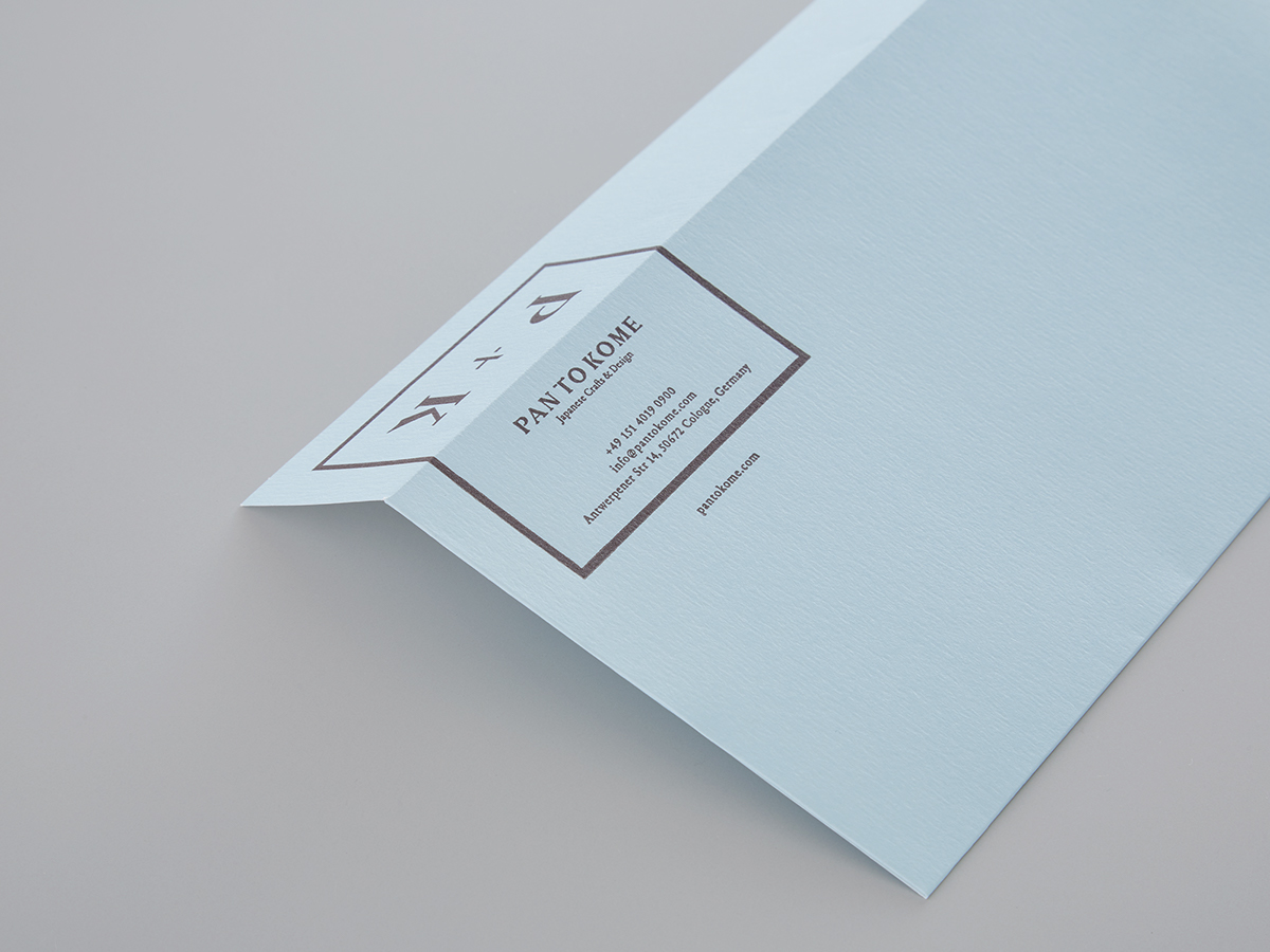
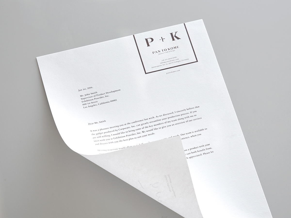
Regarding the brand identity:
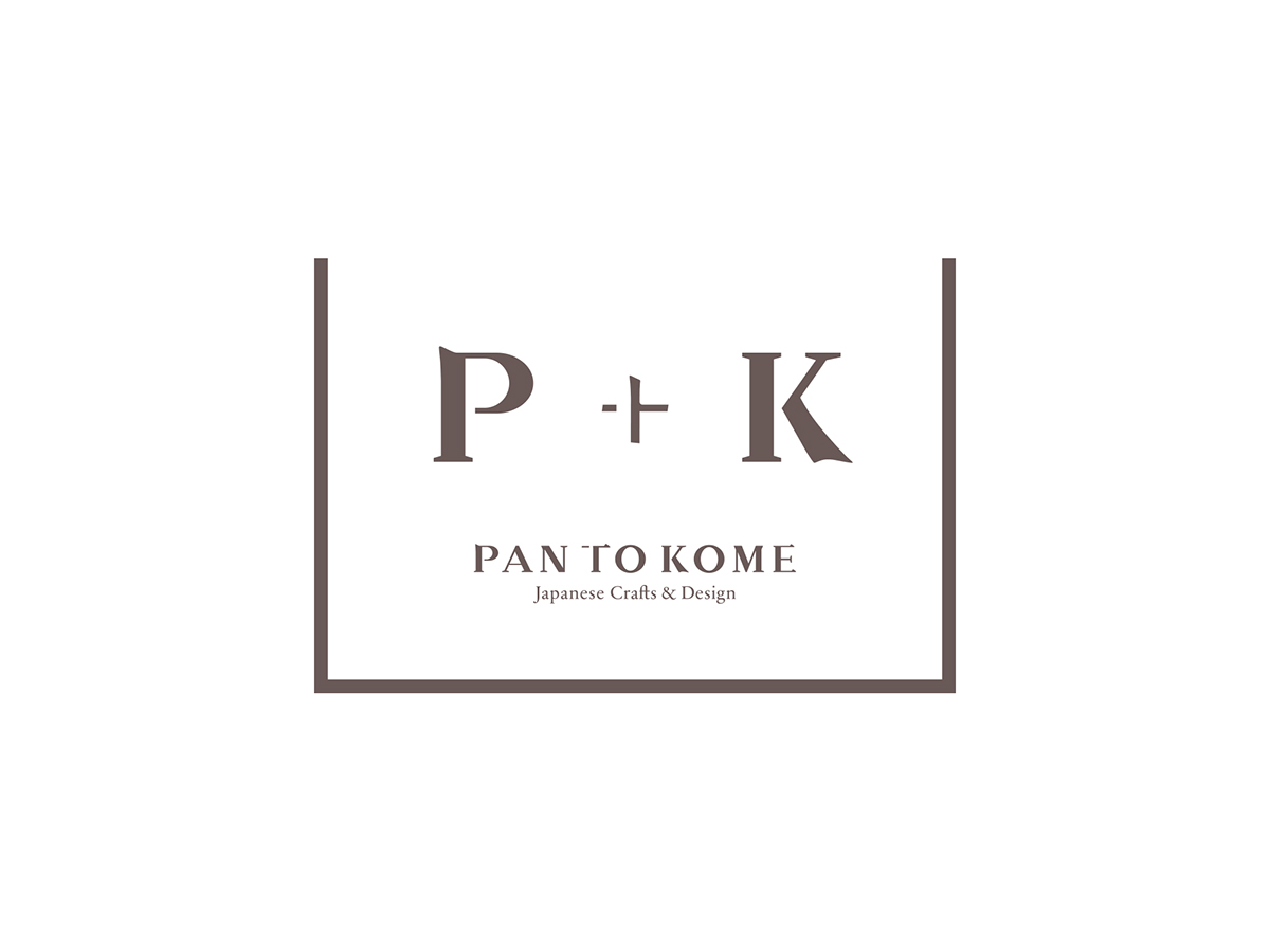
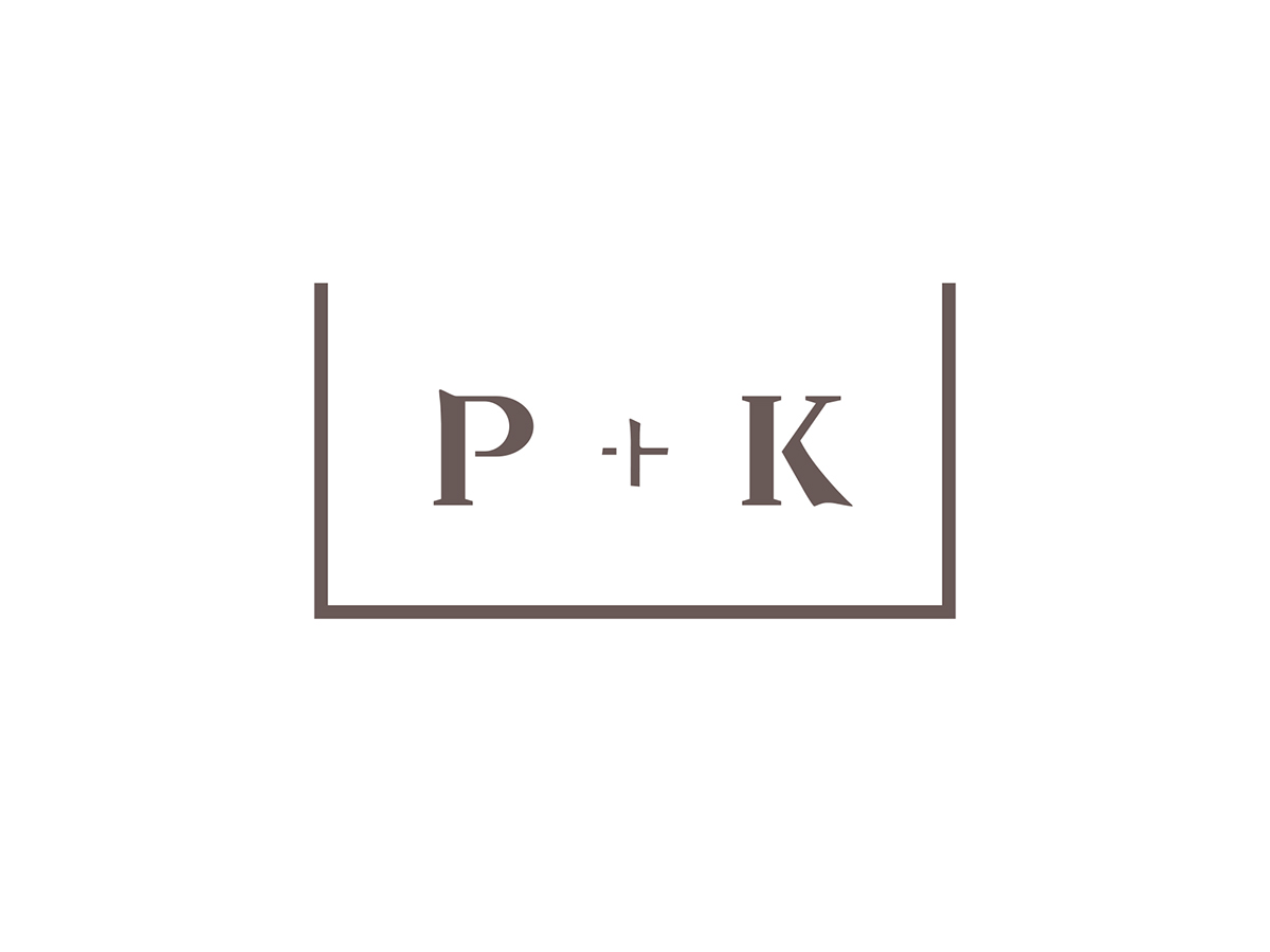
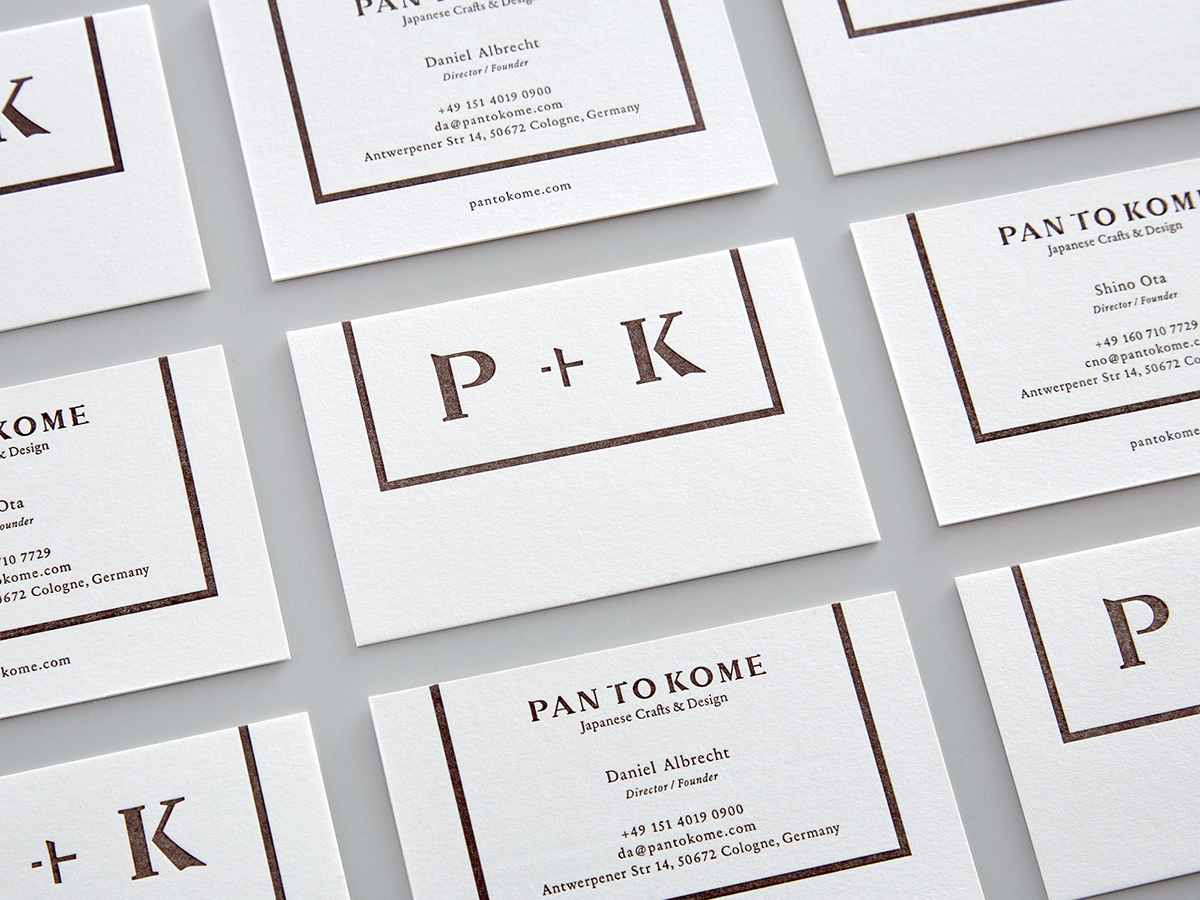
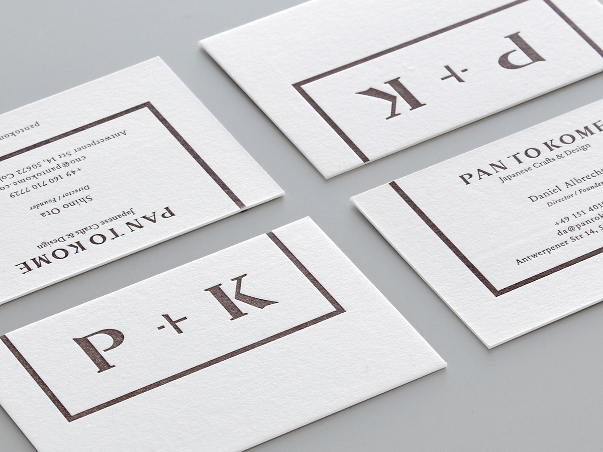
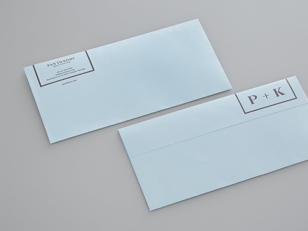
I incorporated the brand concept “to connect” using the symbol “+” in a graphical way, binding “PAN (Europe)” and “KOME (Japan)”.
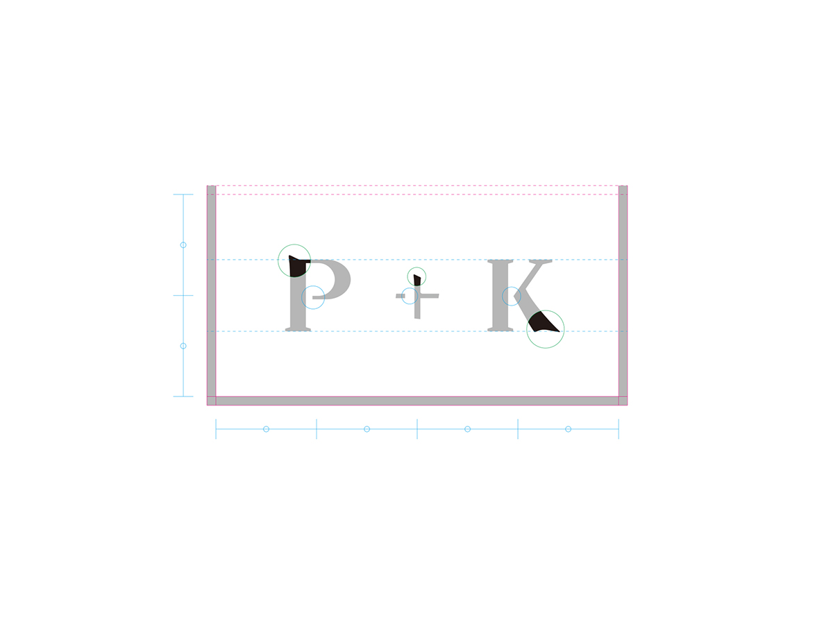
Regarding the logo mark:
This logo expresses the initials “P” and “K” as a motif as the target (Europeans) most likely will not be able to read the brand name correctly, since the “TO” is a Japanese word that means “connect”, not an English word. In addition, the outside frame portrays a dish, which also expresses the concept; a platform that connects crafts, craftsmen’s stories, and different cultures.
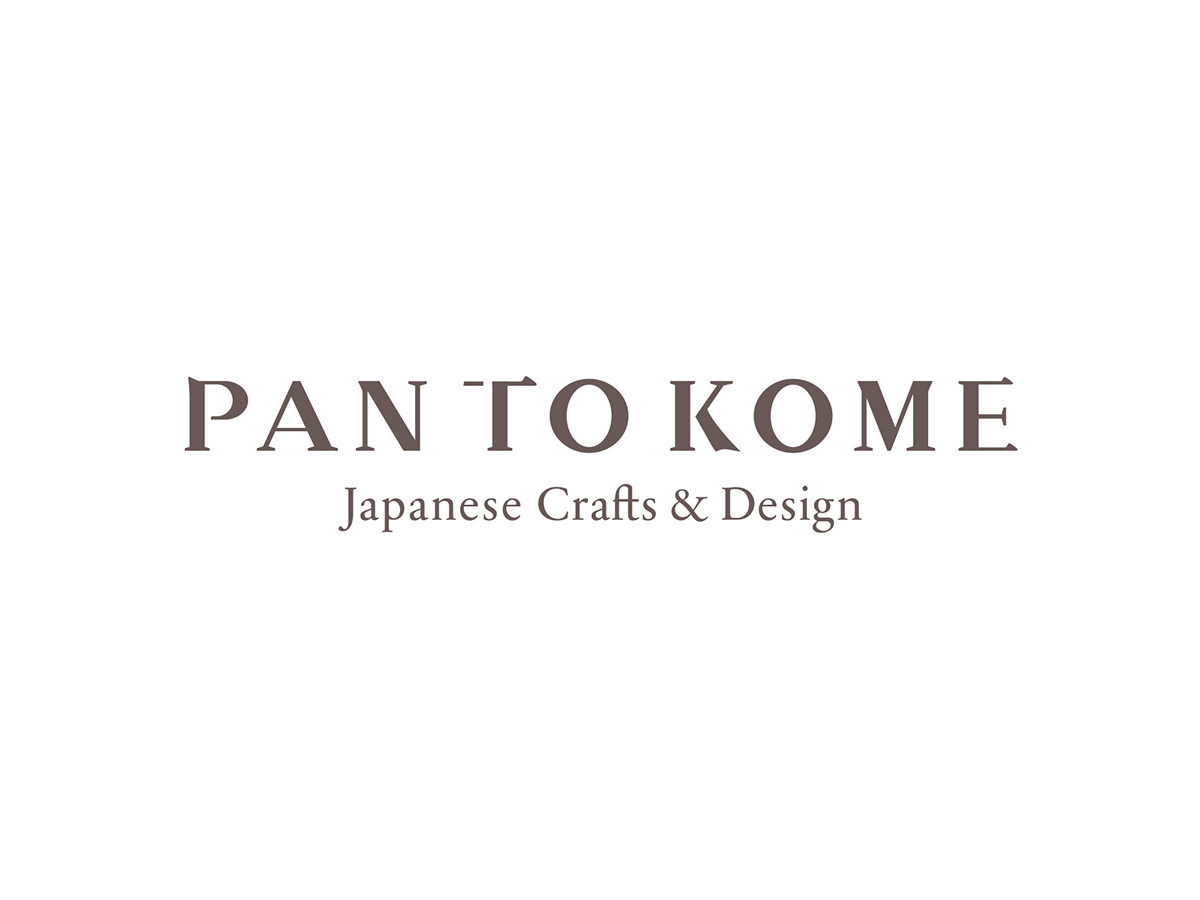
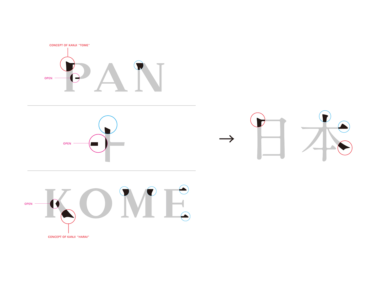
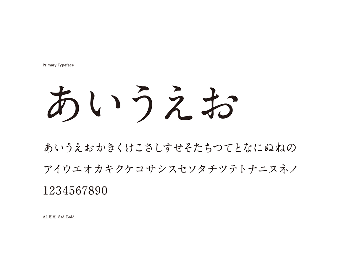
Regarding the logotype:
The logotype is composed of elements from Japanese charaters. I incorporated the “tome” and “harai” to where serif can be applied.
This also illustrates the link between Japan and Europe.
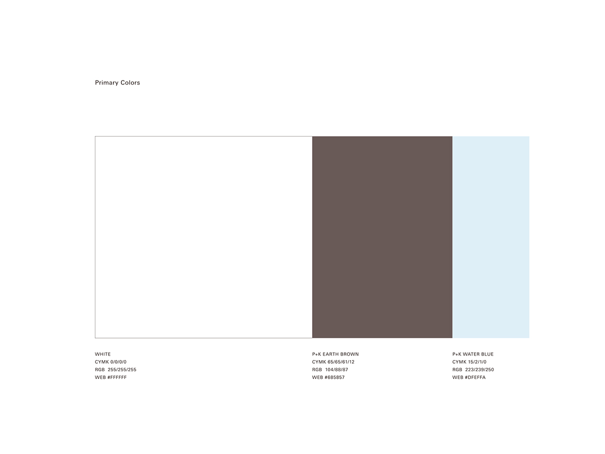
I chose the primary colours “Water Blue” and “Earth Brown”, with respect to Japanese craftsman’s philosophy that fine crafts require fine water and soil.
This is a gift from nature, which is unique to Japanese climate.