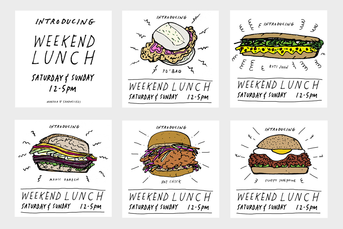
Over a two year period, Martha evolved from a refined, New American restaurant, to a neighborhood staple serving quirky American & Asian comfort food and cocktails. In 2015, it was time for a visual refresh. The logotype and icons were redrawn by hand and an emphasis was placed on bespoke illustration rather than archival images. Sticking with a quasi-superstitious theme, we adopted the Maneki Neko (Lucky Cat) to replace St. Martha on the menus, and developed playful ingredient-inspired illustrations to adorn the menus, postcards, and social media images. The supporting typeface for Martha's written communication is a friendly, monospaced font that has enough personality to compliment the boldly defined line in the illustration, but still remain unassuming and utilitarian.