Church and State Wines
Signature Series
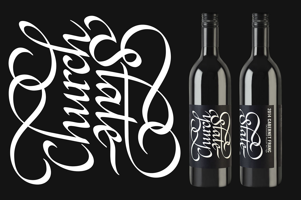
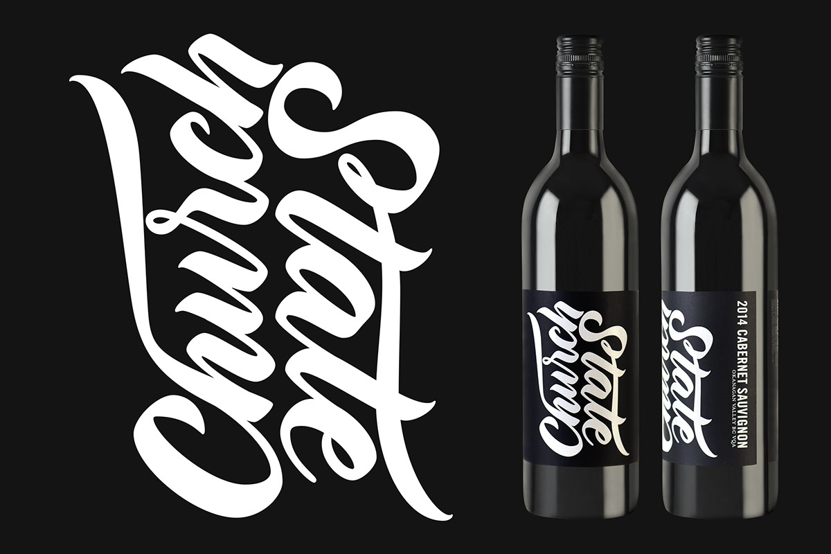
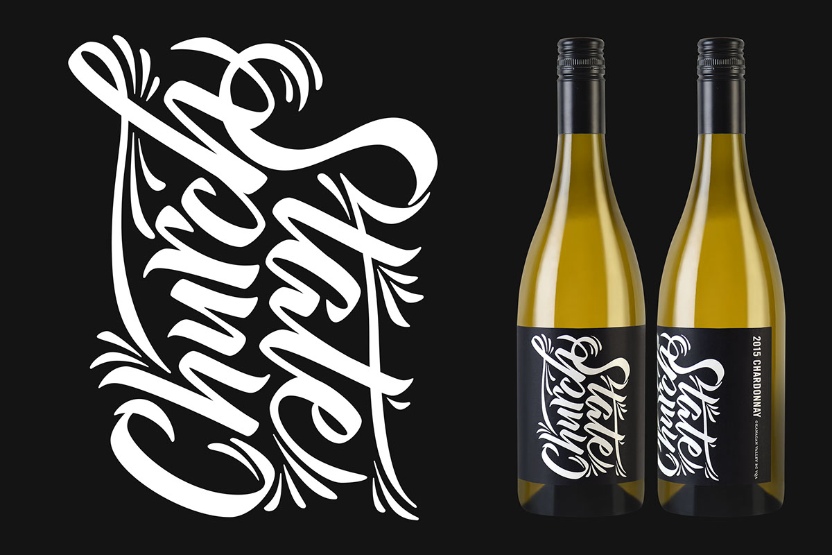
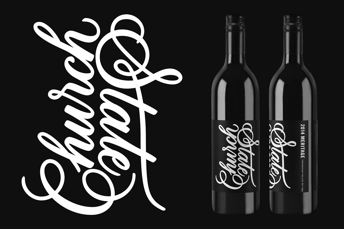
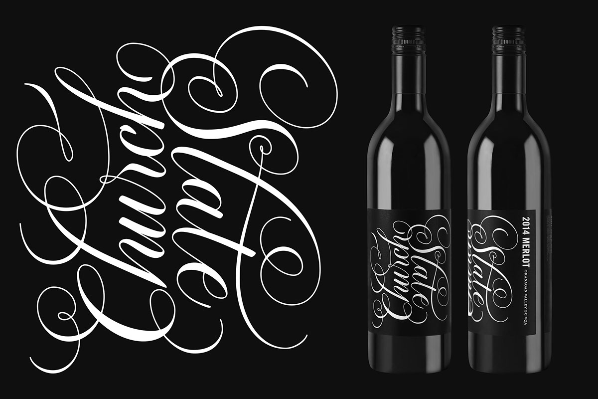
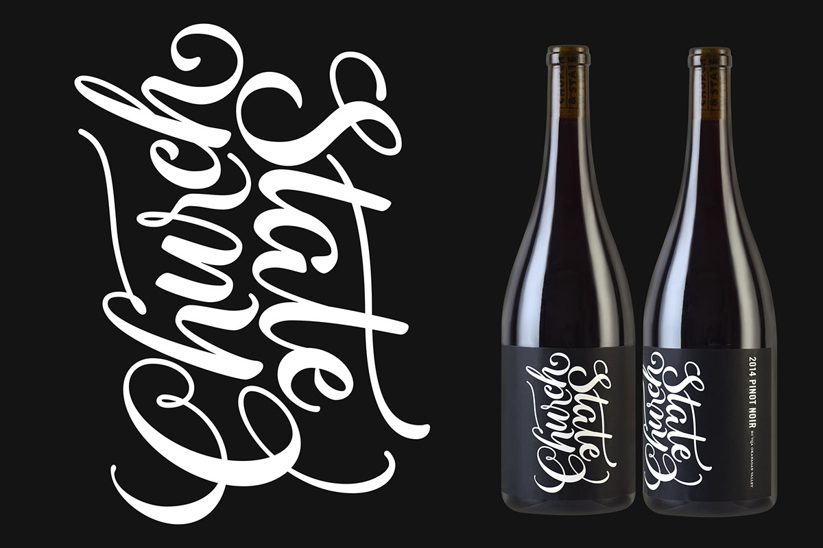
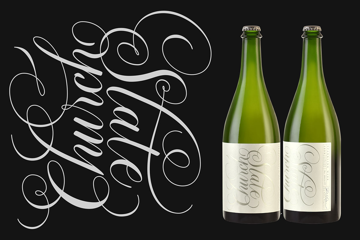
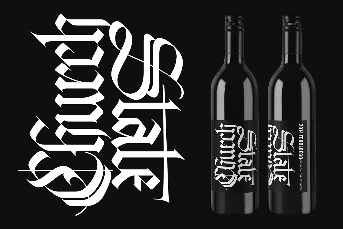
When Brandever, a design studio from Vancouver, was creating a series of labels for the Canadian winery ‘Church and State’, they approached me with an intriguing proposal:
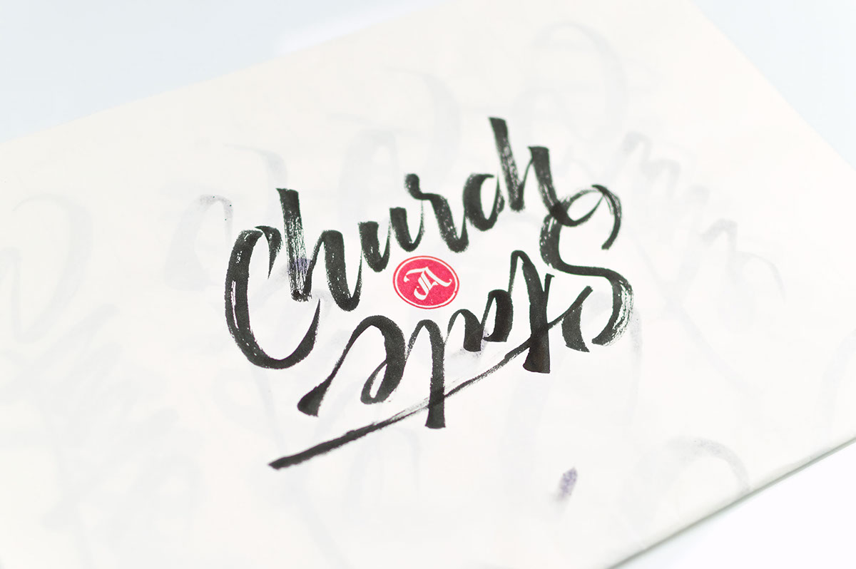
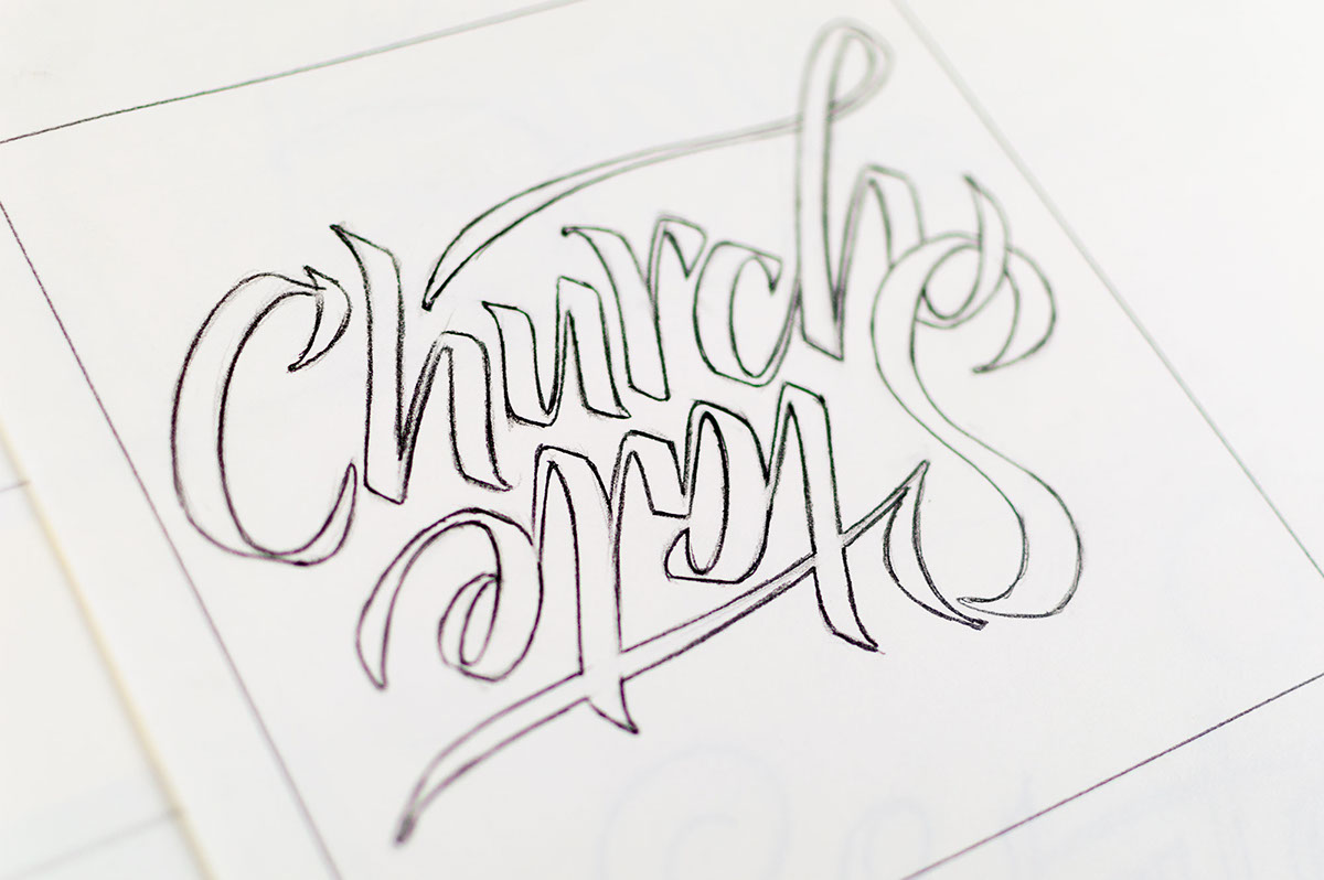
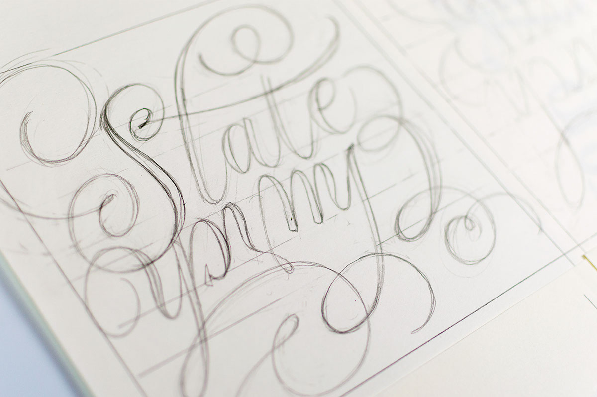
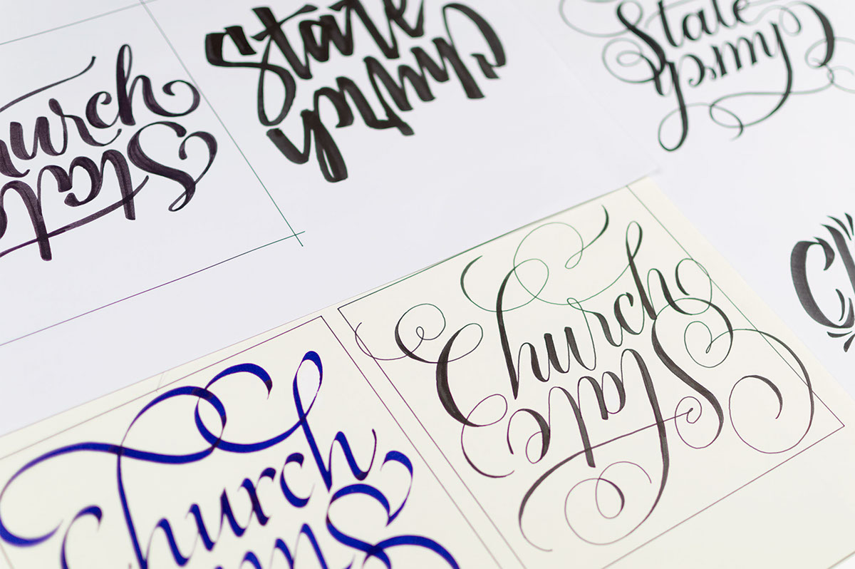
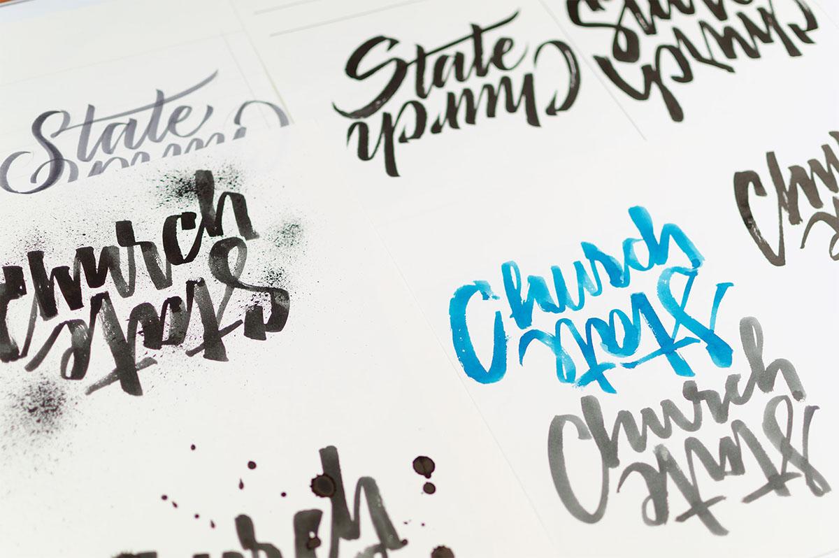
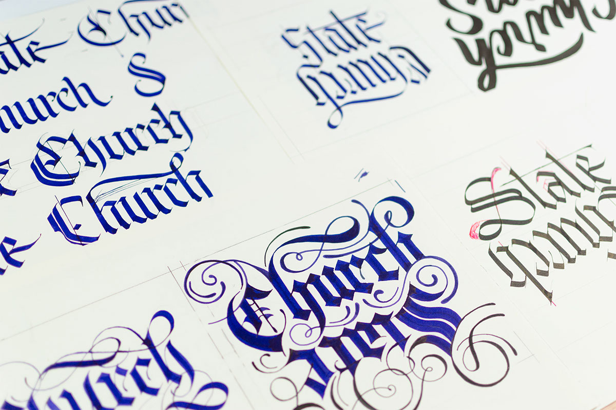
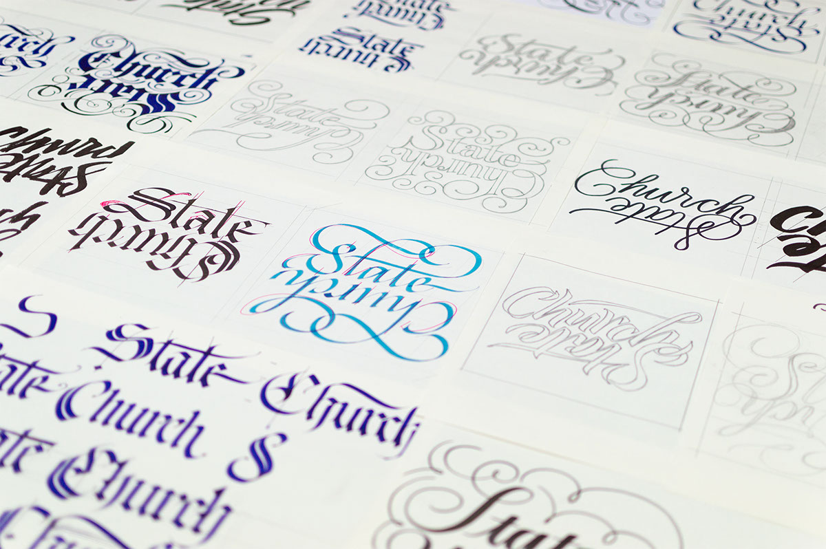
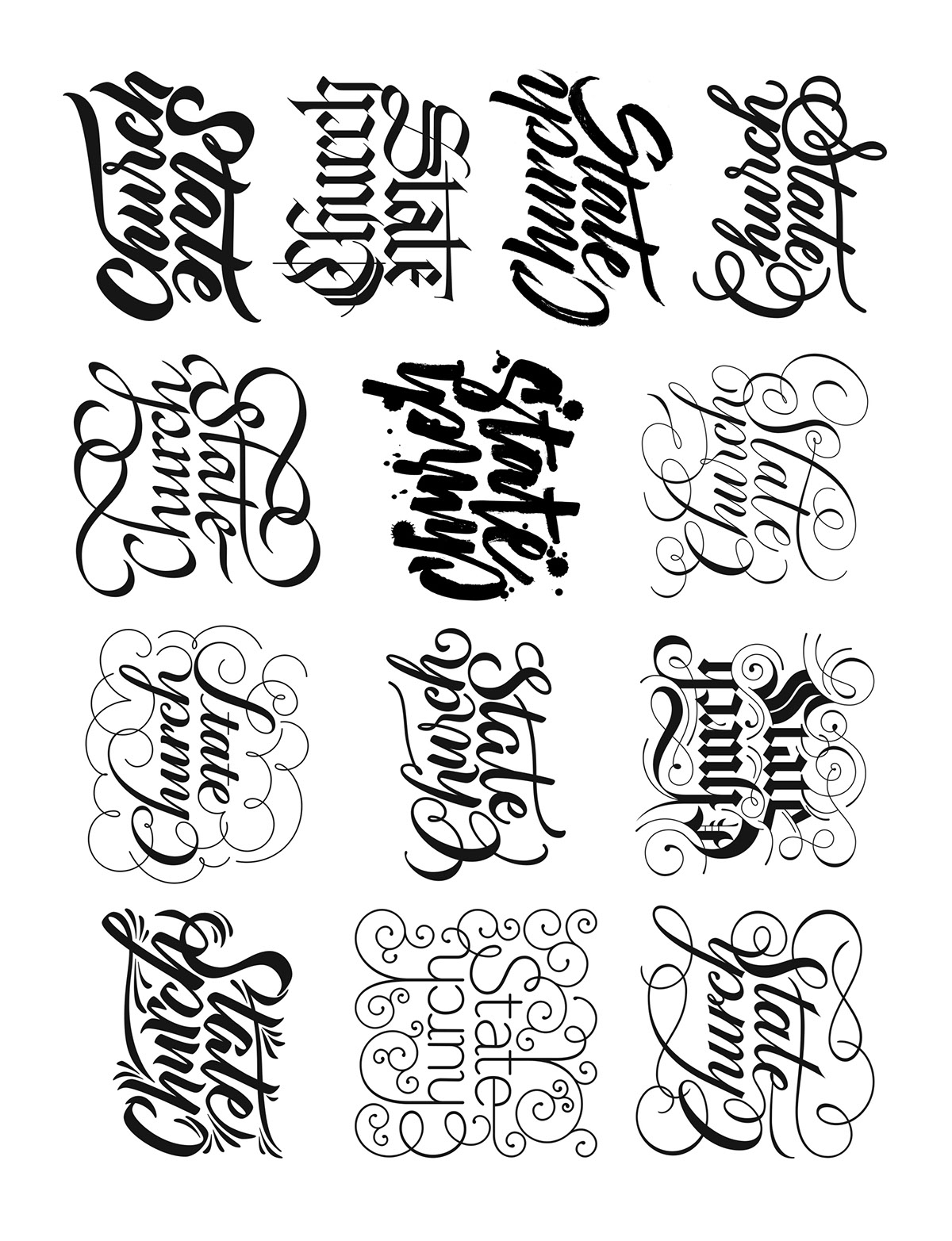
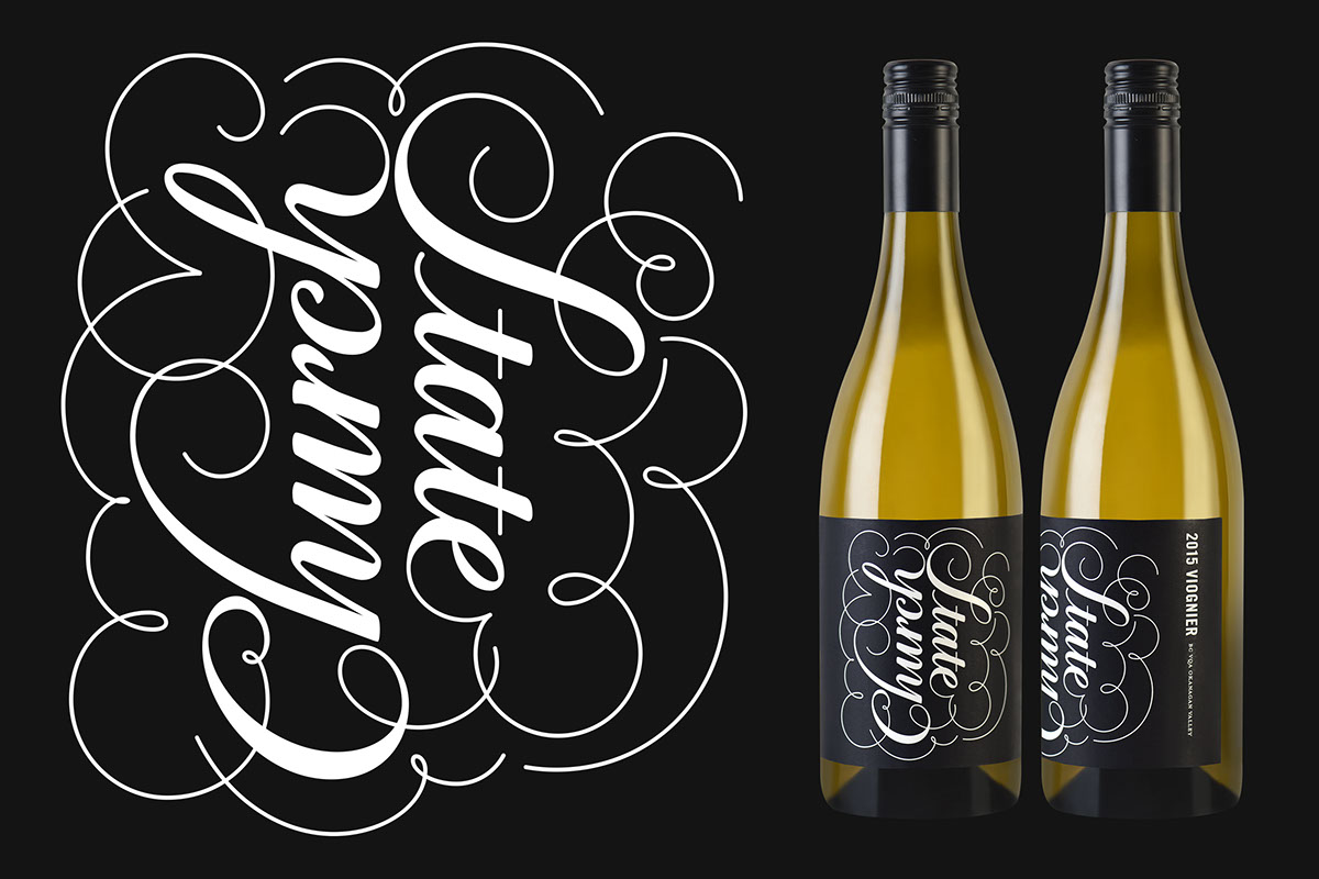
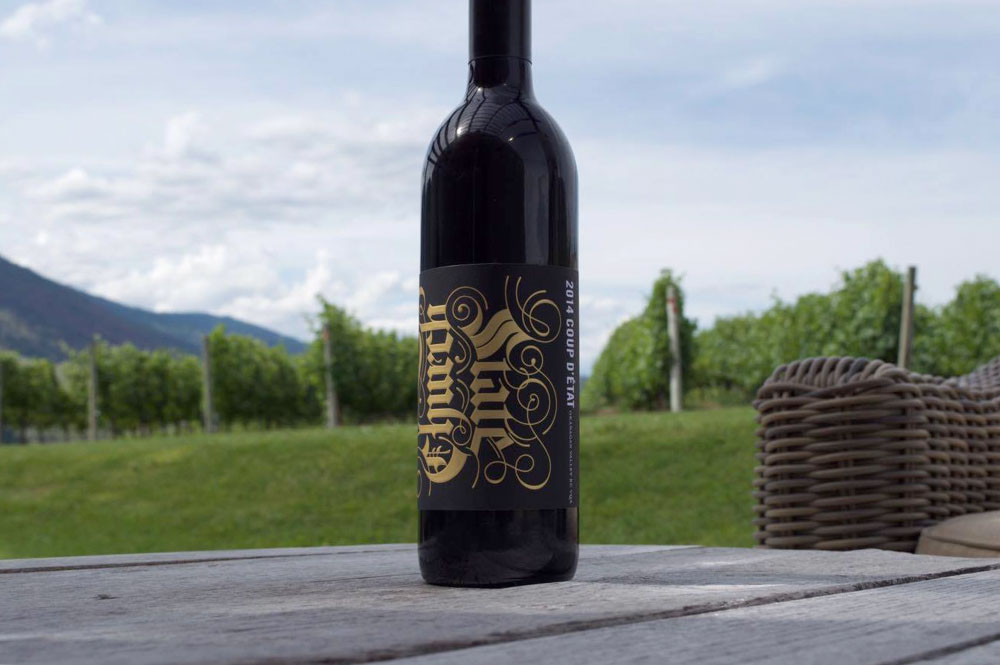
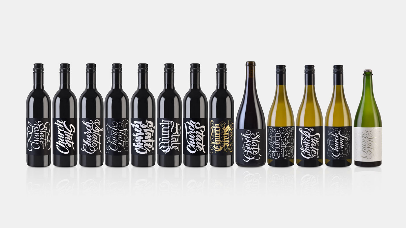
Instead of creating individual labels for each wine variety, we would try and capture the characteristics and essence of each, through distinct lettering styles. According to Brandever: “The objective is to create a series of wines where the name ‘Church and State’ is rendered in various calligraphic styles, based on each varietal of wine. The bottles must be different enough that the varietals are easily identified when displayed as family, but similar enough for it to be clear that they are all under the same brand.”
It's such a pleasure to work with professionals like Brandever and Church and State; they fed me a meticulous briefing, helping me to find the best style for each wine, and the process was just incredible. The collaboration between the three of us was smooth, full of great give-and-take, and the entire process was really gratifying.
In an interview with John Pullen — the Marketing Director of Church & State — in Wine Trails Magazine last July. John said: “The parallels between calligraphy and penmanship, and winemaking are incredible strong. Each are built around traditional craftsmanship and incredible attention to detail. Furthermore, Alves begins each script with traditional mediums such as pen or brush, and then perfects each piece digitally, which really speaks to our winemaking philosophy of creating traditional, handcrafted wines, perfected with cutting-edge technology.” I couldn’t have said it better myself.
You can check out the results for yourself below. Enjoy!
Video by Ricardo Perini
A Brandever —um estúdio de design de Vancouver— estava criando uma série de rótulos para a vinícola canadense 'Church and State’, então eles me contataram com a seguinte proposta: Em vez de criar rótulos individuais para cada variedade de vinho, nós deveríamos tentar representar as características e essências de cada vinho através de estilos de letras distintas.
De acordo com Brandever: “O objetivo é criar uma série de vinhos, onde o nome de 'Church and State’ é exibido em vários estilos de caligrafia, com base em cada variedade de vinho. Os rótulos devem ser diferentes o suficiente para que as variedades sejam facilmente identificados quando as garrafas forem exibidas como uma família, mas semelhante o suficiente para que seja claro que eles estão todos sob a mesma marca”.
É um prazer trabalhar com profissionais como a Brandever e a Church and State Wines; eles me apresentaram um briefing detalhado, ajudando-me a encontrar o melhor estilo de letra para cada estilo de vinho, e o processo foi simplesmente incrível. A colaboração entre nós foi tranquila, com bastante trocas, e todo o processo foi muito gratificante.
John Pullen — o director de Marketing da Church and State — disse em uma entrevista para a revista Wine Trails do Canadá, em julho passado: “Os paralelos entre a caligrafia e vinificação são incrívelmente fortes. Cada um é feito com base em técnicas artesanais clássicas e enorme atenção aos detalhes. Além disso, Alves começa cada lettering com meios tradicionais, tais como caneta ou pincel, e depois aperfeiçoa cada peça digitalmente, o que realmente conversa com a nossa filosofia de vinificação de criar vinhos tradicionais, artesanais e aperfeiçoados com tecnologia de ponta.” Eu não poderia descrever isso melhor.
Confira os resultados abaixo!
Vídeo por Ricardo Perini