Evo.company – a group of projects in the field of e-commerce. It is a nutritious broth where projects are born and grow, professionals improve themself, retailers develop their business and buyers get the best service. And all these components incessantly evolve.
Idea
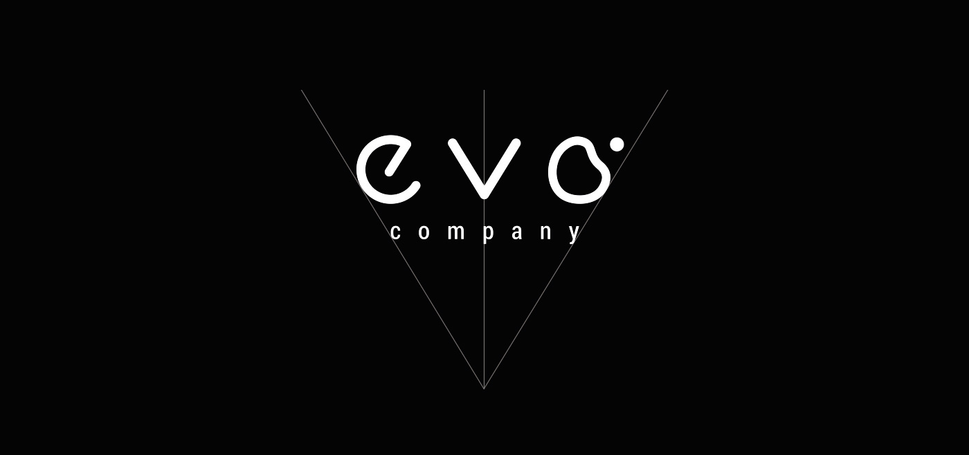
While thinking up the symbol for Evo we decided to observe the dawn of a new life. We made a peculiar notice that each time this new start has the shape of a bean. So we united this curvy shape with the technical font style.

A tiny bubble appearing next to the bean-shaped "O" just before the connection or a moment after the separation shows the dynamic process of evolution. This part of logo doesn't obey any rules – it's by notion alive and imperfect.
Style