NYSE, New York Stock Exchange
APEX • Best Redesign, 2008 • NYSE; Tabbies • Gold, Spread, 2008 • NYSE
• The publication needed a fresher look. The logo was outdated and created space problems on the cover.
• A publication of New York Stock Exchange, for leading American CEOs and shipped to biggest companies in America and top government offices.
In addition to a new logo (chosen from about 50 different ideas), the typographic solution for the cover was chosen to resemble the latest identity created for NYSE previously that year.
Tabbies • Gold, Spread, 2008 • NYSE
• All the departments in the magazine were redesigned. In the old design, departments had text running almost all the way across pages, making it hard to read, more dynamic pacing was needed.
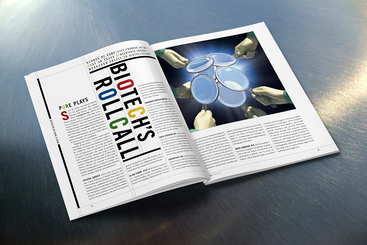
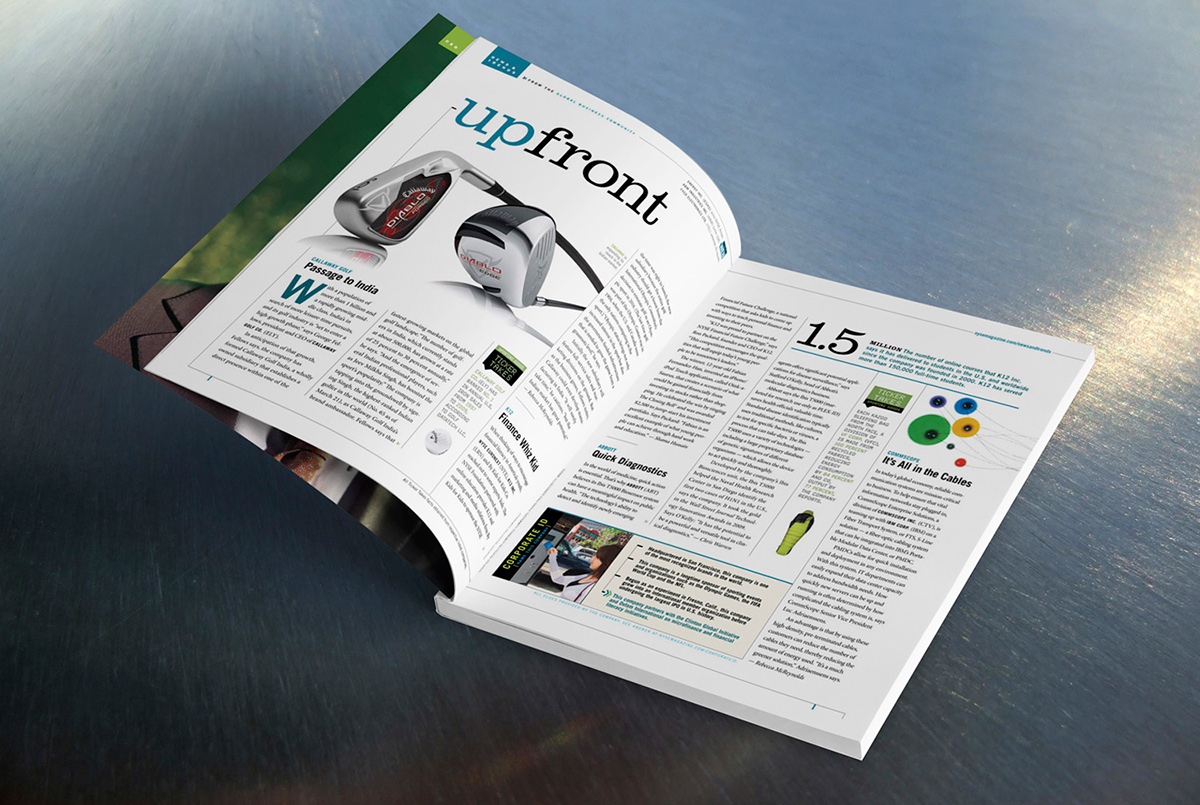
• The 3-column greed allowed for a more dynamic feel; quick facts with big numbers added interest and dimension to the pages.
• One more small column was added to allow for smaller, easier to scan articles and highlights. Every department in a new design had a color coordinated slug resembling in shape NYSE logo.
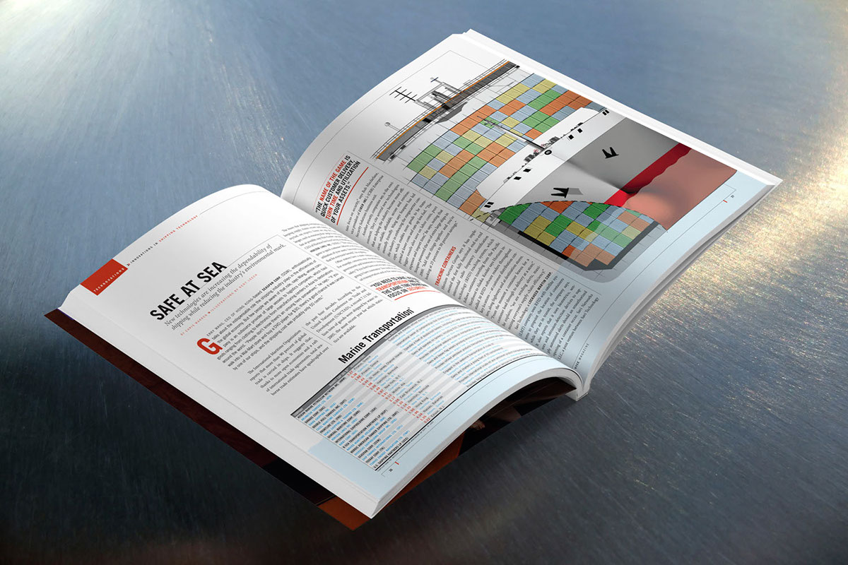
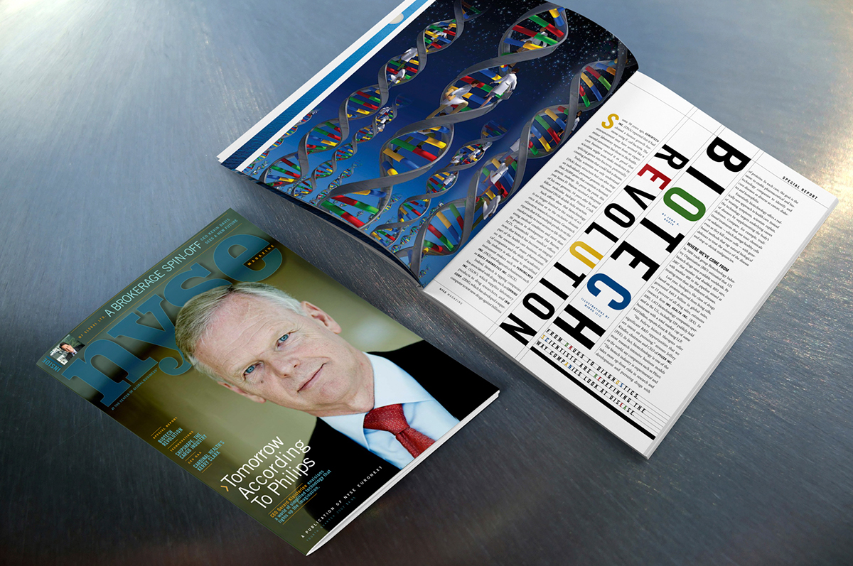
Each department was assigned its own color for the slugs and other elements to help navigation. To create a more interesting and less text heavy publication, a lot of charts and illustrations were introduced.
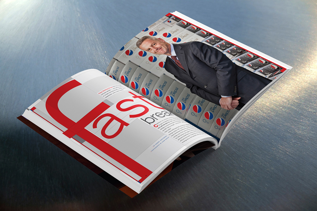
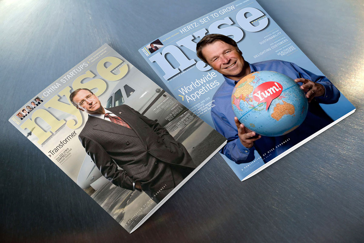
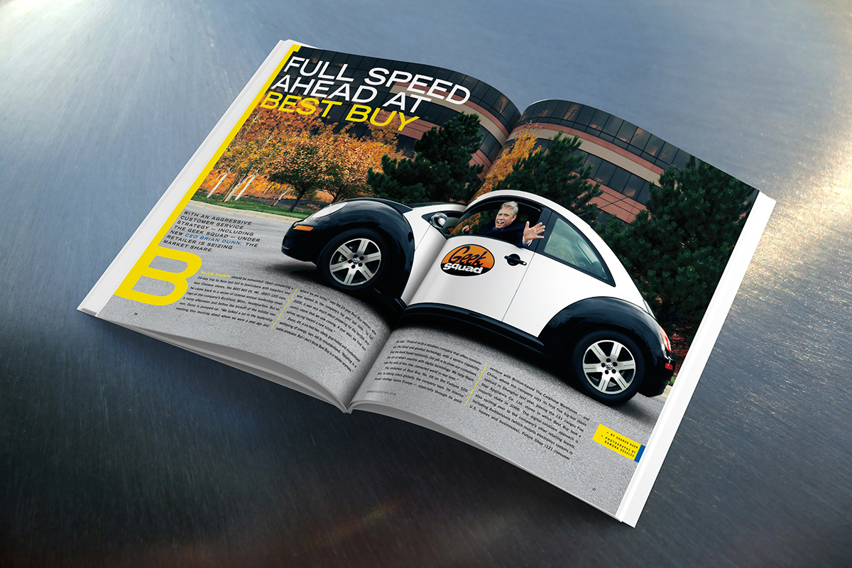
Each CEO was treated like a hero (part of magazine’s agenda is to make the companies happy to be part of NYSE). To avoid the use of logos, each design had a hint of featured company’s identity.
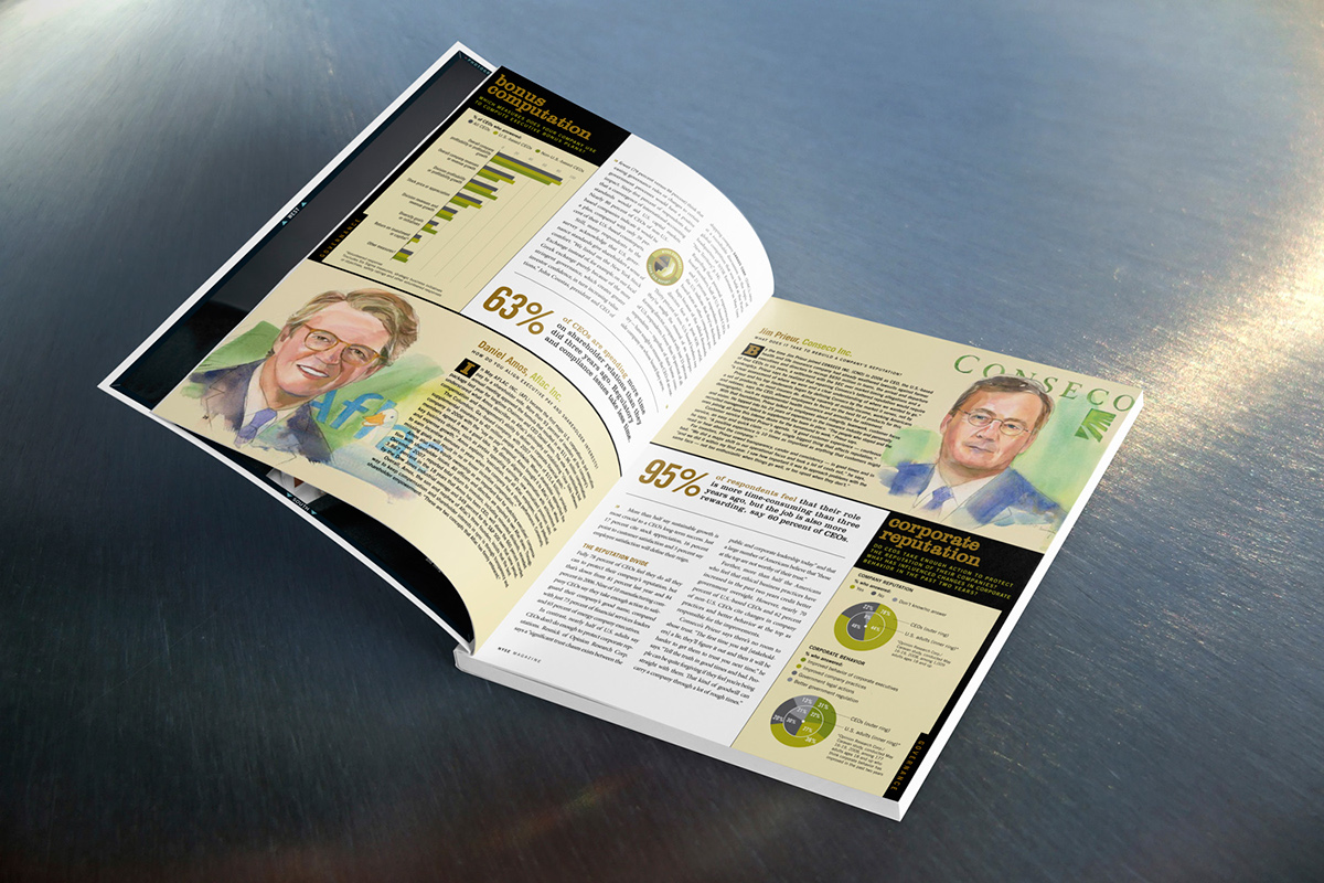
In a publication that is for CEOs and about CEOs, full of portraits of men in suites, it was a challenge to create images that are not repetitive, making illustration an integral part of visual language.
All Animals, HSUS
APEX • Best Redesign 2008 • AllAnimals
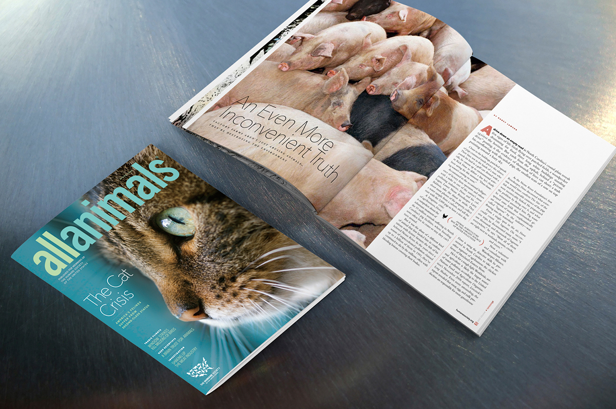
• Cover lines were added to convey HSUS messages.The type was kept small and elegant. This allowed for the big beautiful close-ups. AllAnimals is not a newsstand publication and big flashy cover lines aren’t needed.
• The publication of HSUS with a goal of bringing urgent animal protection issues to the public eye. It is mailed to HSUS supporters and is not distributed on newsstand.
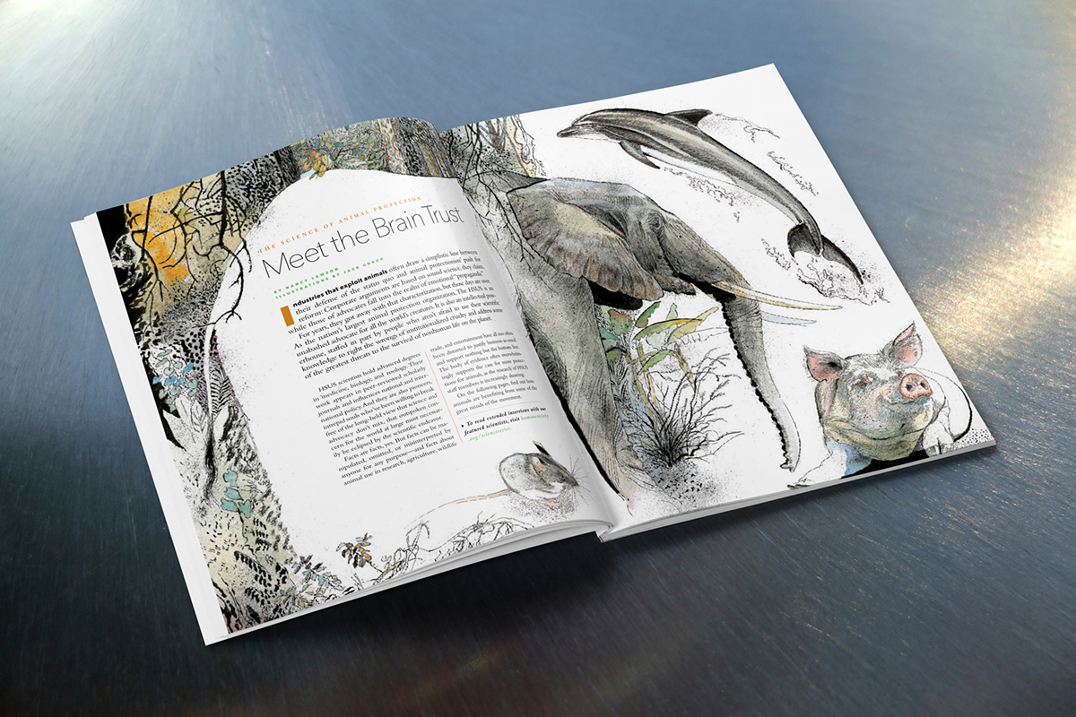
Creative use of illustration was introduced. The use of illustration, like for this story, allowed to combine supplied scientists portraits that weren’t good quality (on following pages) with dramatic images of animals they study.
Pearl • Gold, spread, 2008 • AllAnimals
We created simpler feature design, with unified typography, letting the images tell the story. This also gave the magazine easily recognizable identity, consistent from page to page.
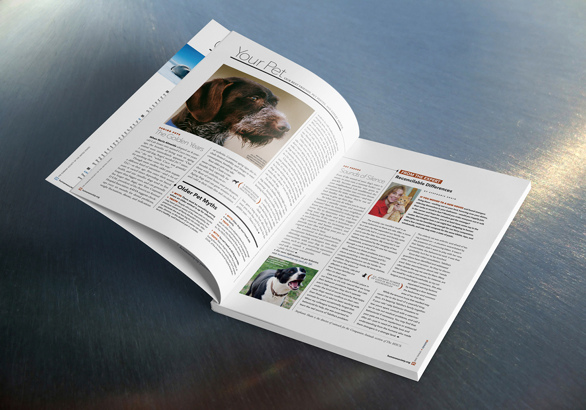
• The design was unified for all sections, be it “Your Pet”s with lots of different articles or “Local Heroes” that was a short 2 page section about wonderful people that make a difference.
• The main problem before redesign was that the old design had no structure – departments, features, and small articles were all mixed together. In addition, a lot of different typefaces were used and the magazine didn’t have it’s own identity.
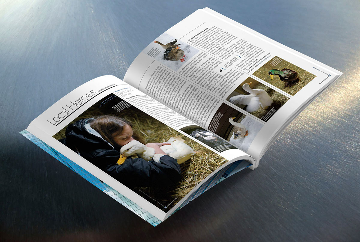
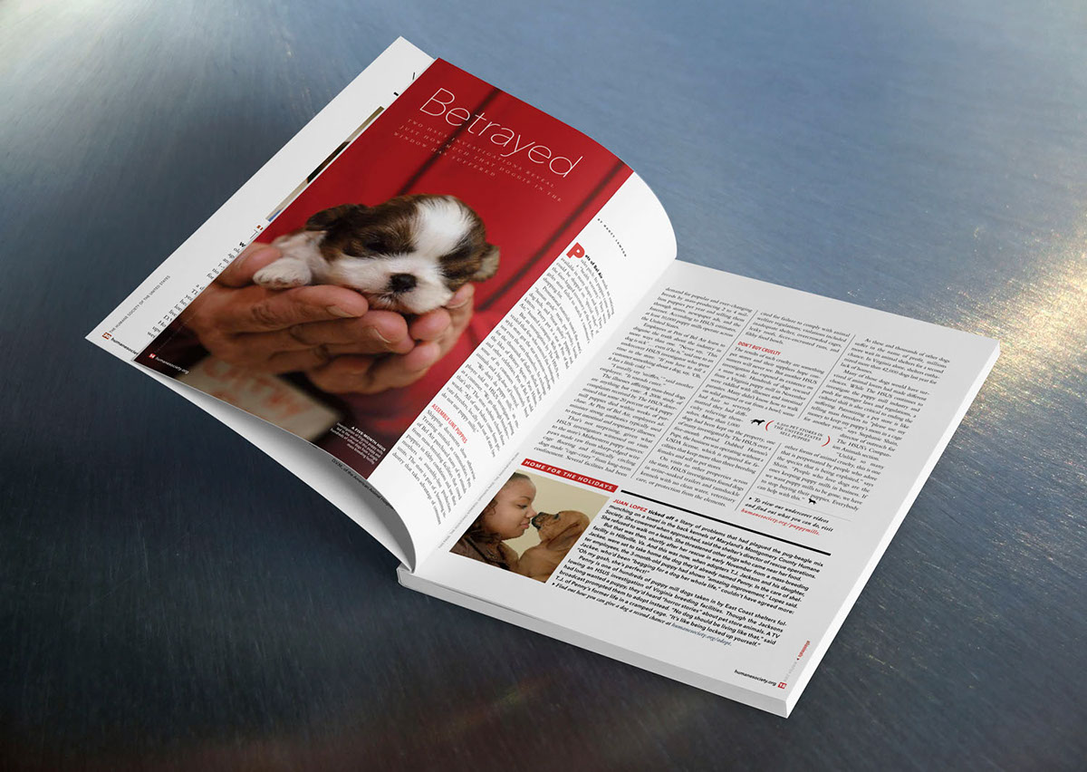
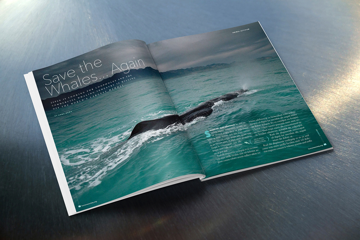
To create a strong visual and emotional impact, close-up images of animals were chosen. The issues the magazine deals with are often disturbing and the balance between horror and beauty is very important.


