


About
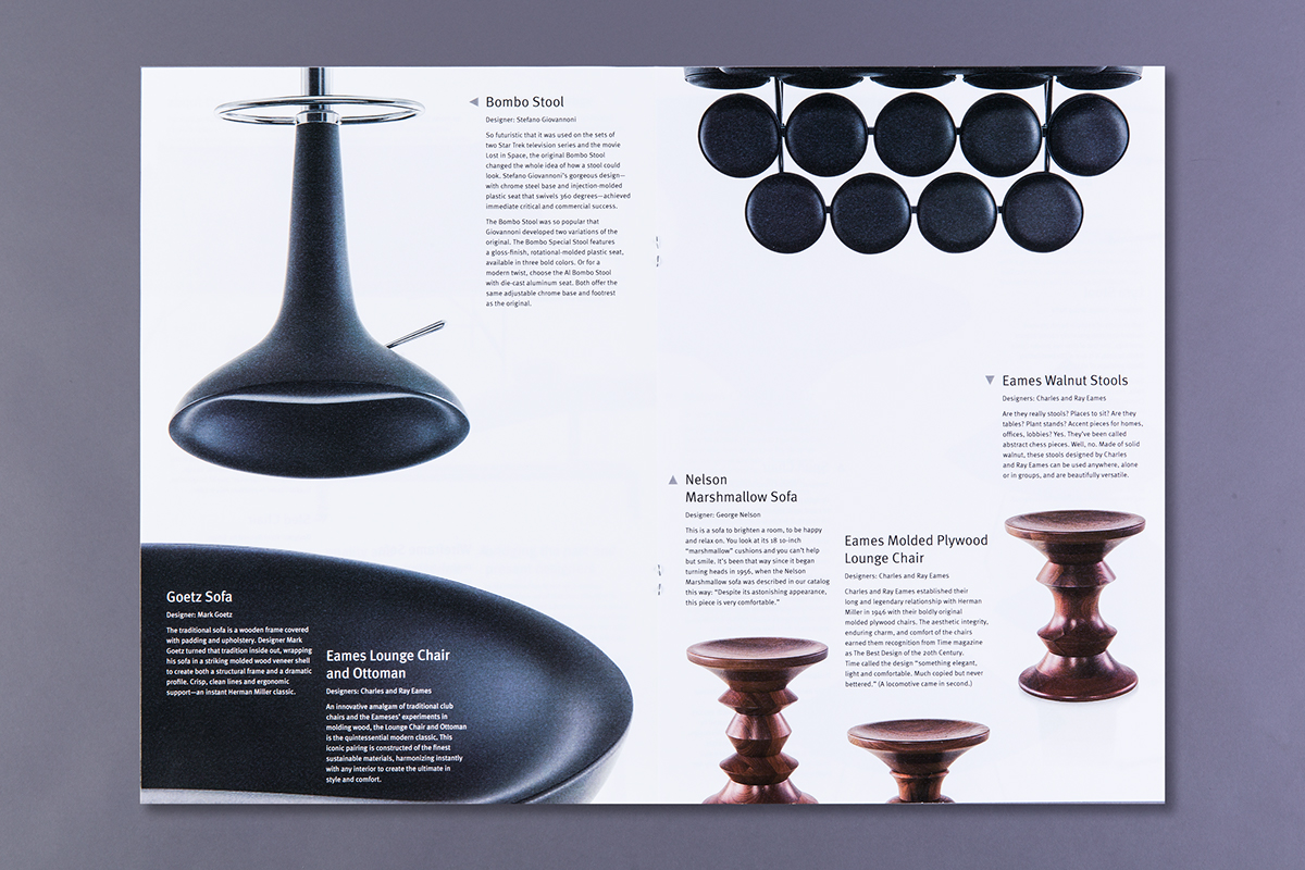
This brochure showcases a selection of furniture from the Herman Miller Collection. The objective was to explore typographic principles and hierarchy while incorporating multiple layers of visual information. Focusing on chairs, I worked first with type alone and then with image alone before integrating type and image into a unified design. Flowing columns and white space along with contrasts in scale create rhythm and movement, while strong alignments connect type and image. A secondary system of arrows links content with individual items.
8 x 11.5 inches
Typeface: Meta
Course: Understanding Typography, Fall 2014
Instructor: Dina Zaccagnini Vincent
Rhode Island School of Design, Division of Continuing Education
Graphic Design Certificate Program
photo credit: Allyson Barth and Shane Gutierrez
photo credit: Allyson Barth and Shane Gutierrez


