

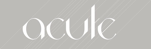
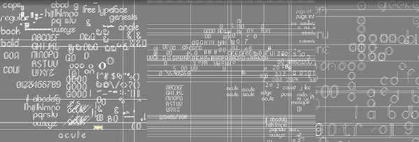
Acute is a sans serif typeface that combines geometric minimalism and playful thicknesses.
Concept
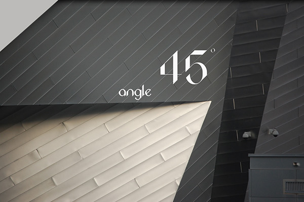
The idea came about because I wanted a typeface that would be geometrically simple but with various thicknesses and flow. The main inspiration behind this typeface is the Didot family of typefaces where the variation of thickness is used masterfully. My hope was to create a typeface that could be replicated with calligraphy flat pens using simple movements. For this I have paid attention to width of the angle. The entire family uses a 45 degree angle; that is the key to replicating the typeface with flat pen. An acute angle, also known as a sharp angle, is less than 90 degrees. The name arose from the attention given to the angle in each letter and symbol.
While developing each individual letter I have been mindful of the top right to bottom left angle cut. Following this central principle on the type has given the lettering and grouping of the letters a unified flow. It has created a vibrance and energy that runs through each individual letter and subsequently the words and the sentences.
The challenge was to follow geometric principal while fostering an organic beauty. You will be the judge of whether or not Acute creates a hybrid between these two elements.
Standards
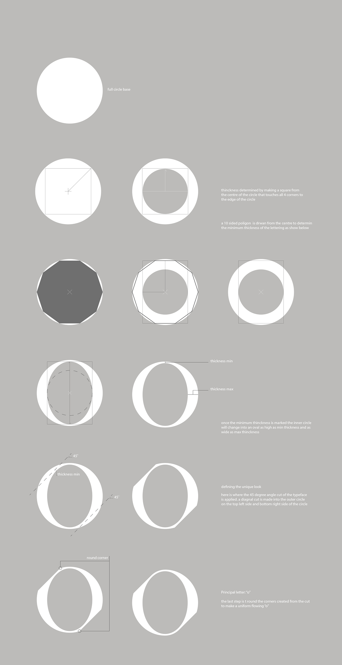
After constructing the letter “o” the principals for the entire typeface became clear. I have sketched a guide to decide where to insert thickness.
The lines drawn from top right to bottom left are thin, like in “e” “A” “H”
The lines drawn from top left to bottom right should be thick like in letter ‘s’ so that it contrasts the thin origin in the top left and end point in the bottom right.
The idea is to break the square into 8 areas of top, top right, right, bottomright, bottom, bottom left, left, and top left. Each area of the letter therefore has contrasting breadths.

Uses
Due to the variety of depth and the flow of thick to thin, Acute is a good choice for a big font and large presentations. On the other hand due to its extreme thinness in small fonts it is hard to read. The Acute ‘book’ and ‘bold’ are much more suitable for small fonts.
The ratio of minimum thickness to maximum thickness in ‘book’ and ‘bold’ are reduced so they make for easier reading in 14pt and smaller.
Process and challenges
The first letter I developed was the lowercase “o”. Then came “a” and “l” and the rest quickly followed. I made letter after letter with the principal “o” and “l”. One of the first challenges that I faced early on in the development was the letter “s”. The letter “s” could not be constructed in the same ways as the two primary letters that I had constructed. Up until that point, all of the letters I’d created were lowercase. The fact that I needed a diagonal line from top left to bottom right was going against the principal signal of top right to bottom left. At the end I tried to custom make the curve and create the thickness and cuts as close to the principal as possible. The result was good after a few days of working on it and it resulted in an “s” that is one of my favorite letters of the entire family.
I initially considered publishing the font without capital letters but I was later convinced it needed to be a complete family. Afterall it would have been a waste after I had spent so much time and energy on the typeface. The uppercase “O” was constructed with a thicker principle: “o” stretched into the height of “l”. The rest just fell into place. I had some hesitation on creating “T” and “L” since I couldn’t find any helpful clues in the lower case letter to make these two.
Next step was the numbers. The number 2 gave me a particularly hard time. I am still a bit unsure about its final appearance. The number breaks a few rules and still does not deliver a shape that is coherent and can beautifully stand alone. If I ever update the type, “2” will be the first one that I will return to.
Creating two extra weights of ‘bold’ and ‘book’ became necessary when I tested the original type on 12pt and 10pt sizes. The ratio of the thicknesses needed to be reduced for it to be readable in smaller sizes. This is the challenge I shared with using Didot Typeface.
After creating all the symbols, glyphs and letters I moved the shapes I had made in Adobe Illustrator to fontforge. Even though it was my first experience with the software, I found fontforge to be extremely easy and self explanatory. Besides, it is a free download.
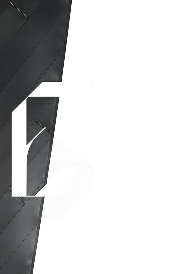
Presentation
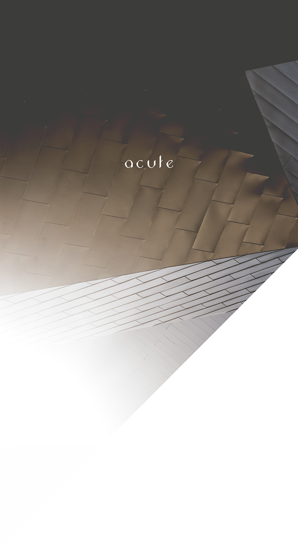
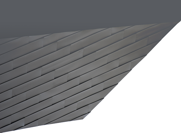
In the presentation I have tried to pull in some of the images I have taken of the Aria Crystals in the Las Vegas Strip in 2014. The building has sharp angles and the forms are enforced by the aluminum patched covering in brick form. I thought this might define the feel and use of the typeface. At the end of the presentation there is an image of a building at the Hoover dam on the border of Arizona and Nevada. I like the boldness and sharpness of the design of the Dam.
Below, I have a visual explanation of how I constructed the “o” which is the defining bit of the entire typeface.


Uppercase
I initially considered publishing the font without capital letters but I was later convinced it needed to be a complete family. Afterall it would have been a waste after I had spent so much time and energy on the typeface. The uppercase “O” was constructed with a thicker principle: “o” stretched into the height of “l”. The rest just fell into place. I had some hesitation on creating “T” and “L” since I couldn’t find any helpful clues in the lower case letter to make these two.
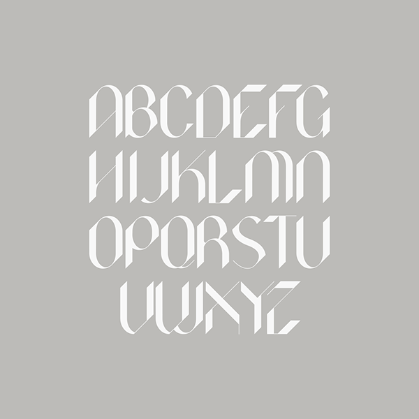
Numbers
Next step was the numbers. The number 2 gave me a particularly hard time. I am still a bit unsure about its final appearance. The number breaks a few rules and still does not deliver a shape that is coherent and can beautifully stand alone. If I ever update the type, “2” will be the first one that I will return to.

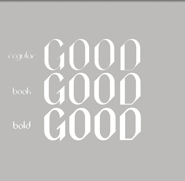
Weights
Due to the variety of depth and the flow of thick to thin, Acute is a good choice for a big font and large presentations. On the other hand due to its extreme thinness in small fonts it is hard to read. The Acute ‘book’ and ‘bold’ are much more suitable for small fonts. The ratio of minimum thickness to maximum thickness in ‘book’ and ‘bold’ are reduced so they make for easier reading in 14pt and smaller.
Due to the variety of depth and the flow of thick to thin, Acute is a good choice for a big font and large presentations. On the other hand due to its extreme thinness in small fonts it is hard to read. The Acute ‘book’ and ‘bold’ are much more suitable for small fonts. The ratio of minimum thickness to maximum thickness in ‘book’ and ‘bold’ are reduced so they make for easier reading in 14pt and smaller.

Thank you for sharing the project on your website.
Please redirect to this page and dowload link so the dowloads can be tracked
_______________________________________________________________
Pubishing partners:

______________________________________________________________

Acute_Regular is avalable for download
(personal use only)
***If you are interested in purchasing a licence for
commercial use and Acute Famiy Font Pro Here


