With our first foray into Europe of the Brand New Conference we knew we wouldn’t be able to go as production-crazy as last year with the identity materials given time, distance, sanity, and other factors. Still, we couldn’t go back to just the basics, so through some key twists in print production and hand-assembly we were able to generate something interesting, memorable, and, most tellingly, with a weird angle. Literally.
Logo

Main, static logo.

Different logo configurations with ×××s in constant motion.
I won’t spend too much time on the logo as the concept and construction of it is explained in detail here. The main evolution from that first explanation to the actual use was the flexibility of moving the letters around (as shown above) to be able to fit the logo into different situations, always maintaining the italicized angle that ended up influencing the materials.
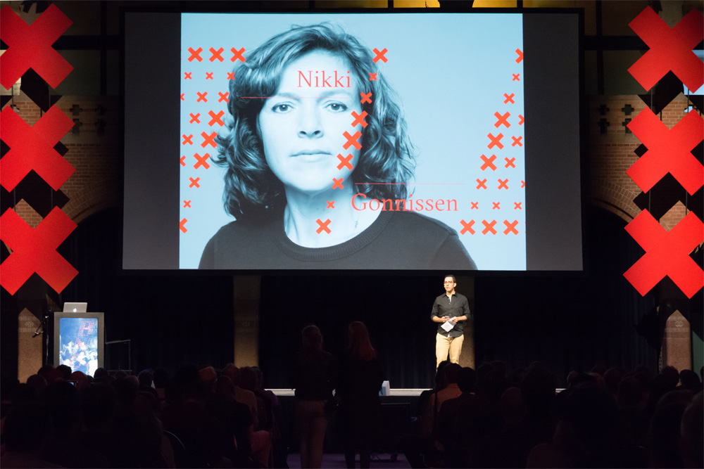
Screen Animations
Screen animations while other stuff happens on stage.
Since the main attraction of the logo is that the ×××s are in constant motion we did a few different “screen savers” for segues between speakers and other announcements. (As a reminder, all the paintings and background images came from the digital collection of the Rijksmuseum in Amsterdam.)
For the speaker slides we ventured into splitting the main 9-by-9 grid so that it opens up to add room for the speaker names. Pro tip: always ask speakers for high-resolution head shots. Most of the time they end up as tiny thumbnails online or in the program but when you want to go full-bleed it’s super nice to have them handy.
By the way, all these animations were done in Flash! Yes, Macromedia Flash. Well, Adobe Flash, but we learned it when it was Macromedia and still works as good as if it were 1999.
Program

The program is trimmed at an angle and each cover has a B, N, C, O, N, or F laser-cut on it.

The covers were printed digitally so we cycled through 25 different images from the Rijksmuseum.
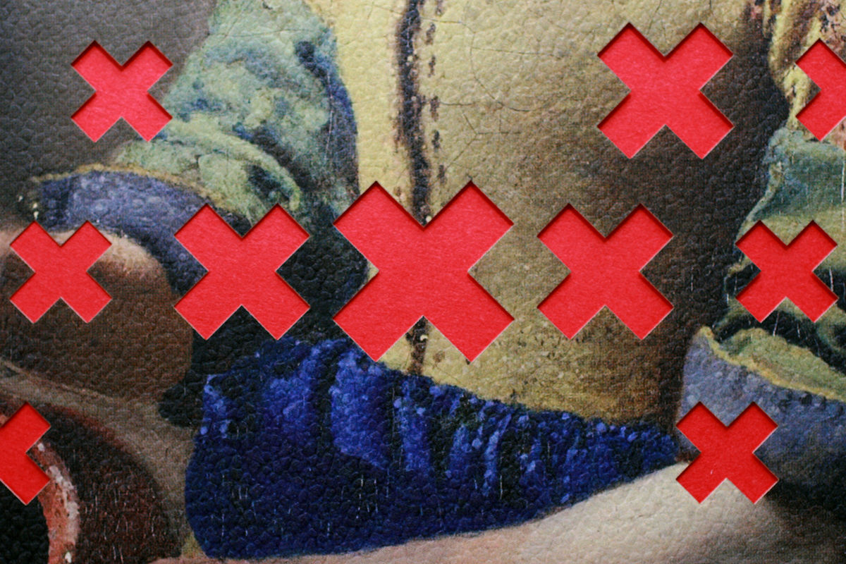
Detail of the laser-cutting and Colorplan paper texture.
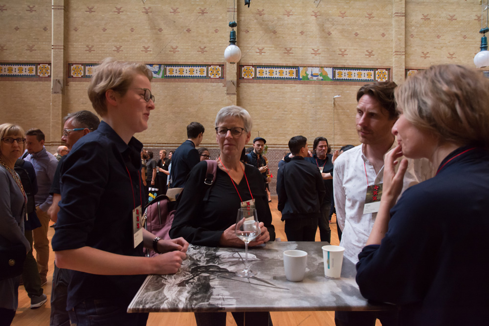
Since Cerovski in Zagreb was our print sponsor we knew we could ask for something crazy and they would be able to do it. So we did: Instead of doing a regular square or rectangle program, it’s a parallelogram that echoes the angle of the logo. Then each cover has a different letter from the logo laser-cut on it; we liked the idea of inverting the layering of the ×××s with the paintings where, so far, we had put the ×××s on top of the paintings but now the laser-cutting revealed the red ×××s through red stock on the inside. There are 25 different paintings and drawings that repeat in the print run, so each one looks different. The covers were printed on Colorplan, from our sponsorG . F Smith, which has a crazy range of textures (they call them embossings) and we chose a “Morocco” embossing that made the covers feel like an old canvas. (You can see the texture in the photo above.)
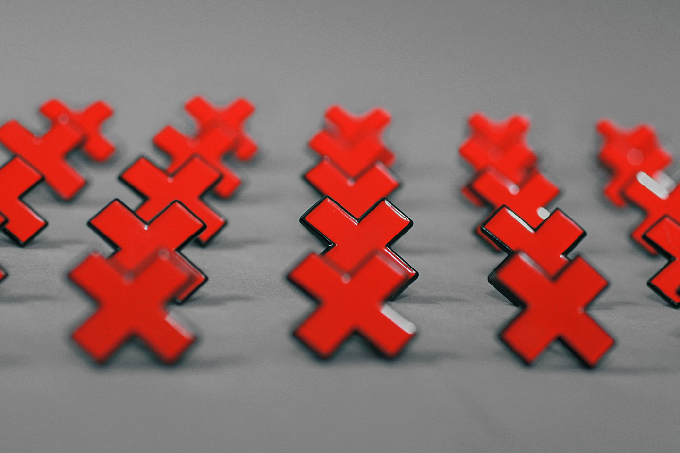
Badges

Badges are trimmed at the same angle as the program and logo.

Each badge has three enamel pin crosses.

And it’s awesome.
For the badges we had the grand idea of doing them at the same angle as the program and logo — it’s “grand” because all these are completely hand assembled and if cutting hundreds of things at 0- and 90-degree angles is hard imagine how much harder it is to do them at an angle. The badges are mounted on black foamcore (foam board) which is usually not the fanciest of materials but in this case it proved to be just right: light weight, easy to cut, and thick. Then we printed a bunch more paintings in the same paper as the program covers and the names are printed separately on an off-white label paper. The finishing touch comes from three enamel pin ×s we had custom-made. This further extended the variation in how the paintings and ×××s interact. Plus, enamel pin ×××s
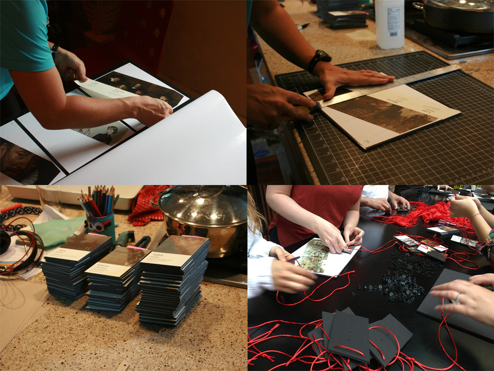
Some of the process of making the badges.
Stage

Two sets of ×××s flanked the screen and stage. We couldn’t place them at an angle, otherwise, we would have.
They complemented the speaker title slides quite well.

And served as cool backdrops for the speakers.
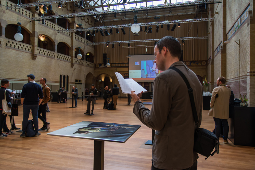
Because the venue is humongous we didn’t want our room to feel empty so we asked Bryony’s cousin’s husband who is a craftsman to build some giant ×××s and, to our amazement, he did
Tables
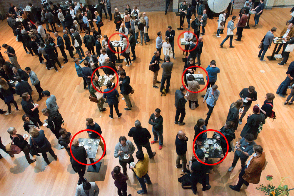
24 tables in the break room that we wrapped in paintings. If it looks empty it’s because the room is MASSIVE.

A few shots of the tables wrapped in paintings.
The break room was insanely big and we didn’t have the budget to somehow brand that space so at the last minute we came up with the idea of printing 30 A0 posters with the paintings and wrapping the very friendly-sized tables in the space so that there was some connection with the rest of the event.
Tote and T-shirt
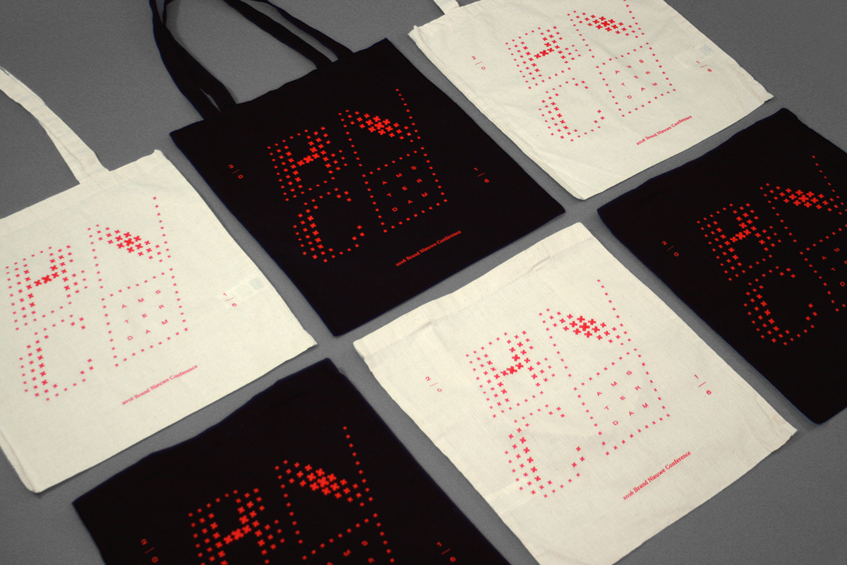
Tote in black and tan versions.
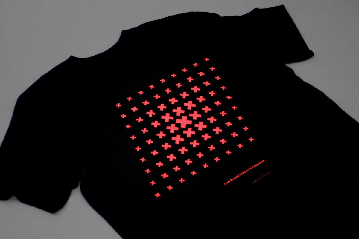
T-shirt.

Some of our volunteers sporting the t-shirt.
Provided by another one of our sponsors, Awesome, these two items are fairly straightforward. One-color printing on black t-shirts and a combo of black and tan totes.
That's it!
Instagram posts of attendees enjoying their swag.
As always, the best ROI we can get — aside from people buying tickets — is when attendees Tweet or Instagram the materials we produced and that they provide some instant (also hopefully long-lasting) gratification and satisfaction worth sharing with their friends, just like a picture of a good burger or a sunset would. The biggest problem with the identity is that we will be coming back to Amsterdam with the conference and we basically burned through four concepts in one year.

