Grocer's Warehouse
Year Completed
2016
2016
Disciplines
Branding & Identity
Web Design
Signage & Wayfinding
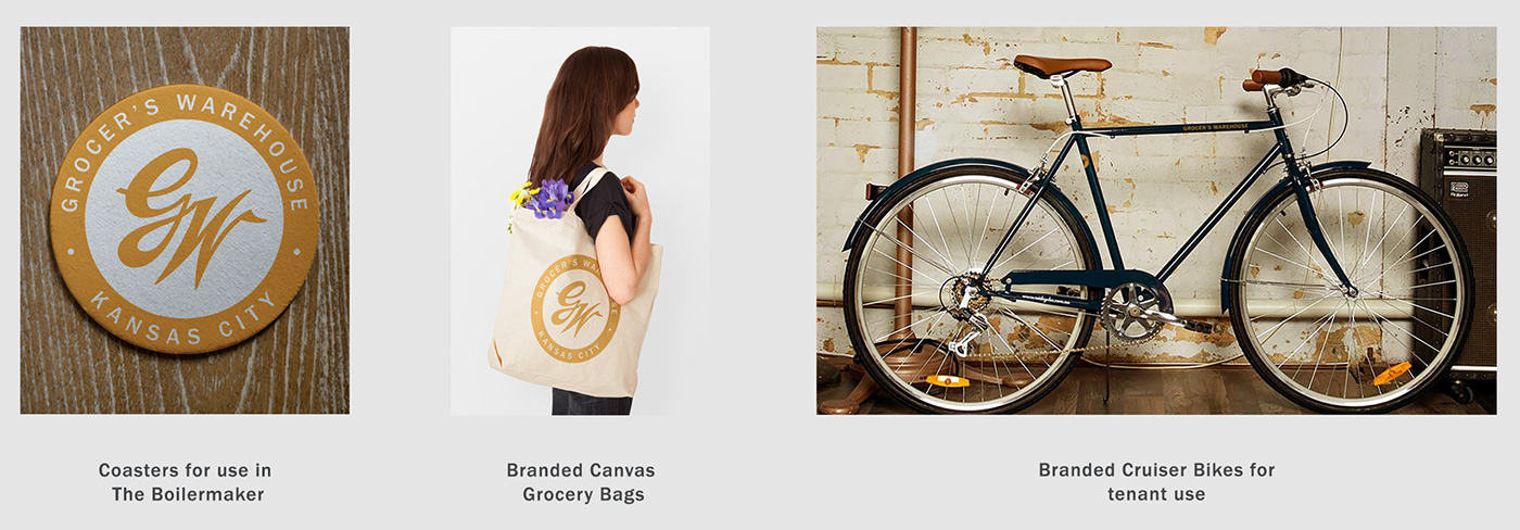
Promotional Advertising
Lettering
Branding & Identity
Web Design
Signage & Wayfinding
Promotional Advertising
Lettering
Grocer’s Warehouse is a renovation of a manufacturing facility originally built in 1949 by Kansas City grocer Fred Wolferman. The 60,000 square foot warehouse sits at the base of historic Roanoke Park. The flagship tenant, Hufft Projects – a multi-disciplinary design studio, led the renovation of the historic warehouse.
The visual identity for Grocer’s Warehouse speaks to the rich history of the building and its original use, but also to its modern day redevelopment. A juxtaposed mix of nostalgia and contemporary design, the concept draws inspiration from building relics, vintage Wolferman advertisements, 1940’s signage; paired with present-day life in the building and its distinctive offering as a multifaceted, high design space.
The visual identity for Grocer’s Warehouse speaks to the rich history of the building and its original use, but also to its modern day redevelopment. A juxtaposed mix of nostalgia and contemporary design, the concept draws inspiration from building relics, vintage Wolferman advertisements, 1940’s signage; paired with present-day life in the building and its distinctive offering as a multifaceted, high design space.
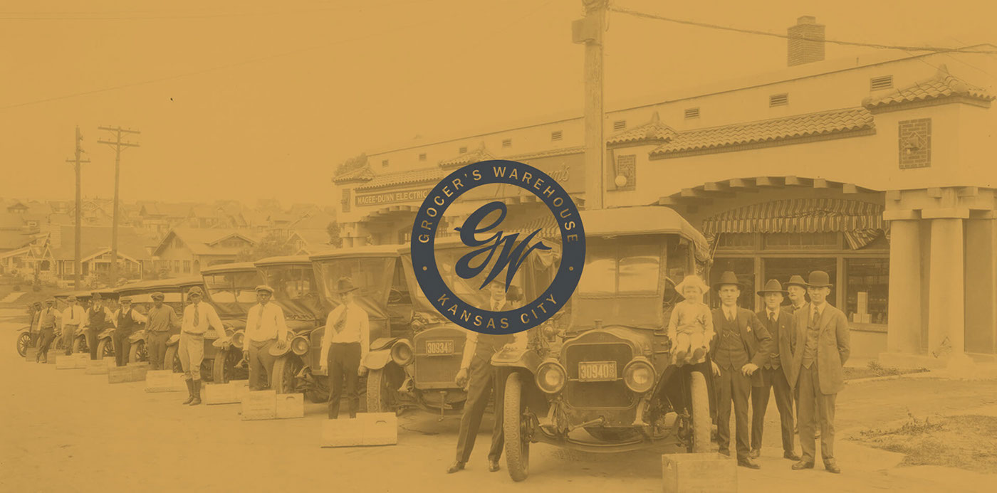
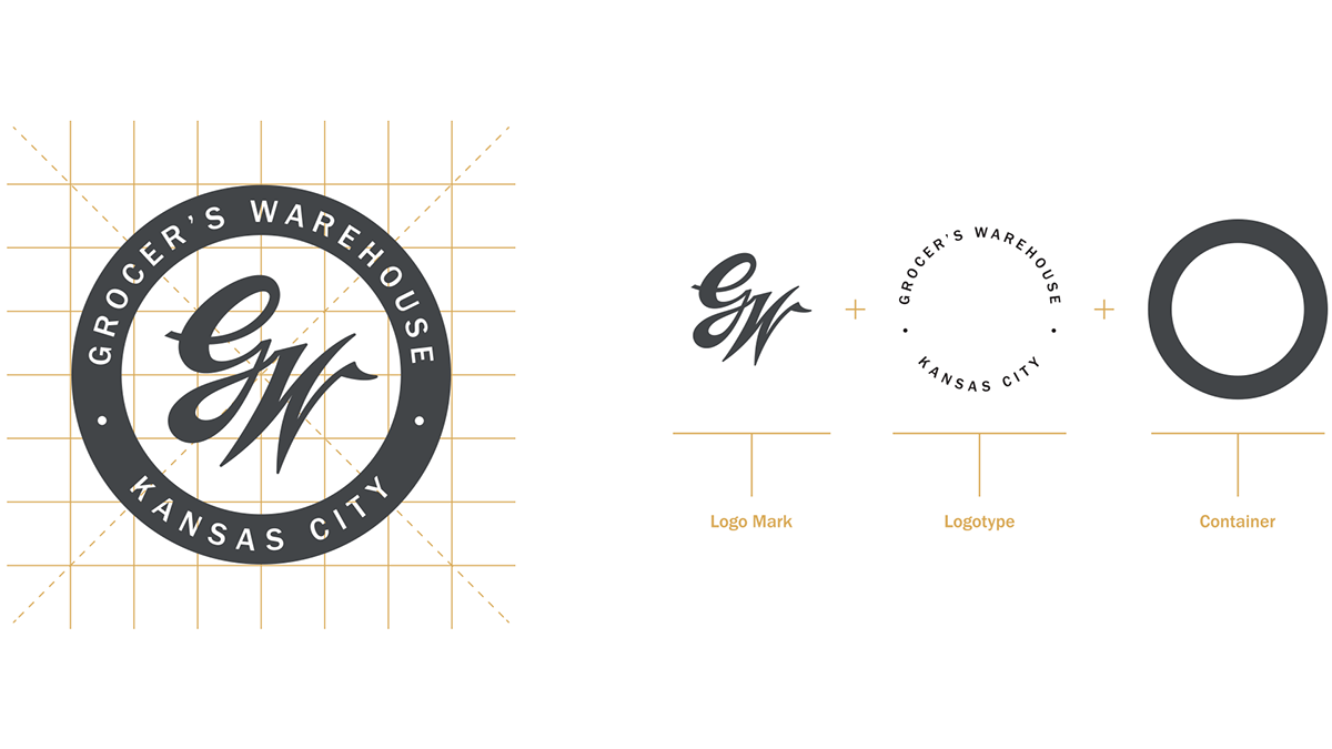
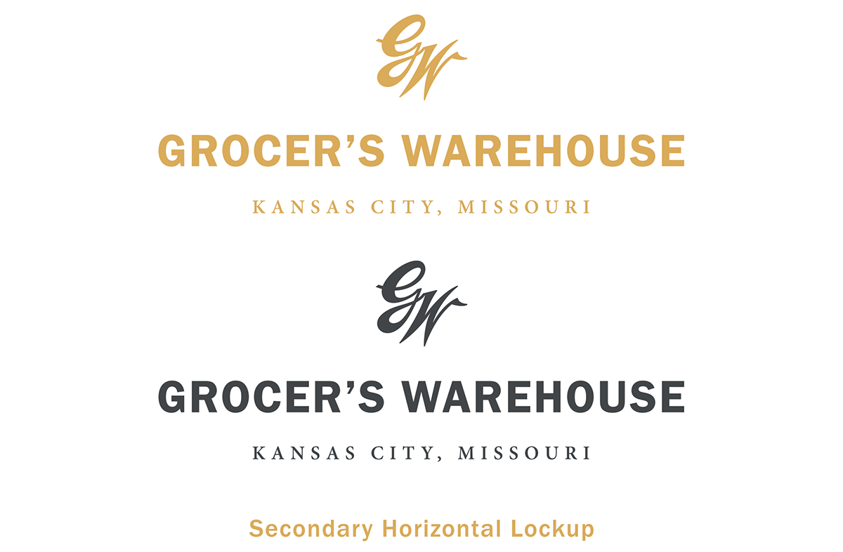
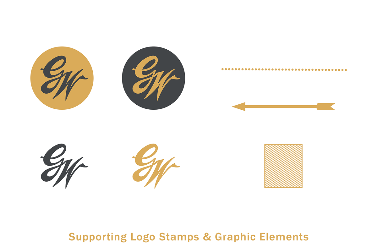
The logo consists of three elements: the mark, the logotype and the container. The mark is inspired by early Wolferman Grocer’s script lettering, the sans-serif logotype set in uppercase is reminiscent of vintage grocery store and building signage from the 1940’s and the dense, *circular container grounds the mark, offering a sense of authority and structure. The full lockup manifests itself as a modern stamp-esque mark with nostalgic ties to the past.
* The circular container also references Wolferman Grocer’s English Muffins, which were baked in tuna cans with the top and bottom cut off. They became one of Wolferman’s most popular items and are still available in grocery stores.
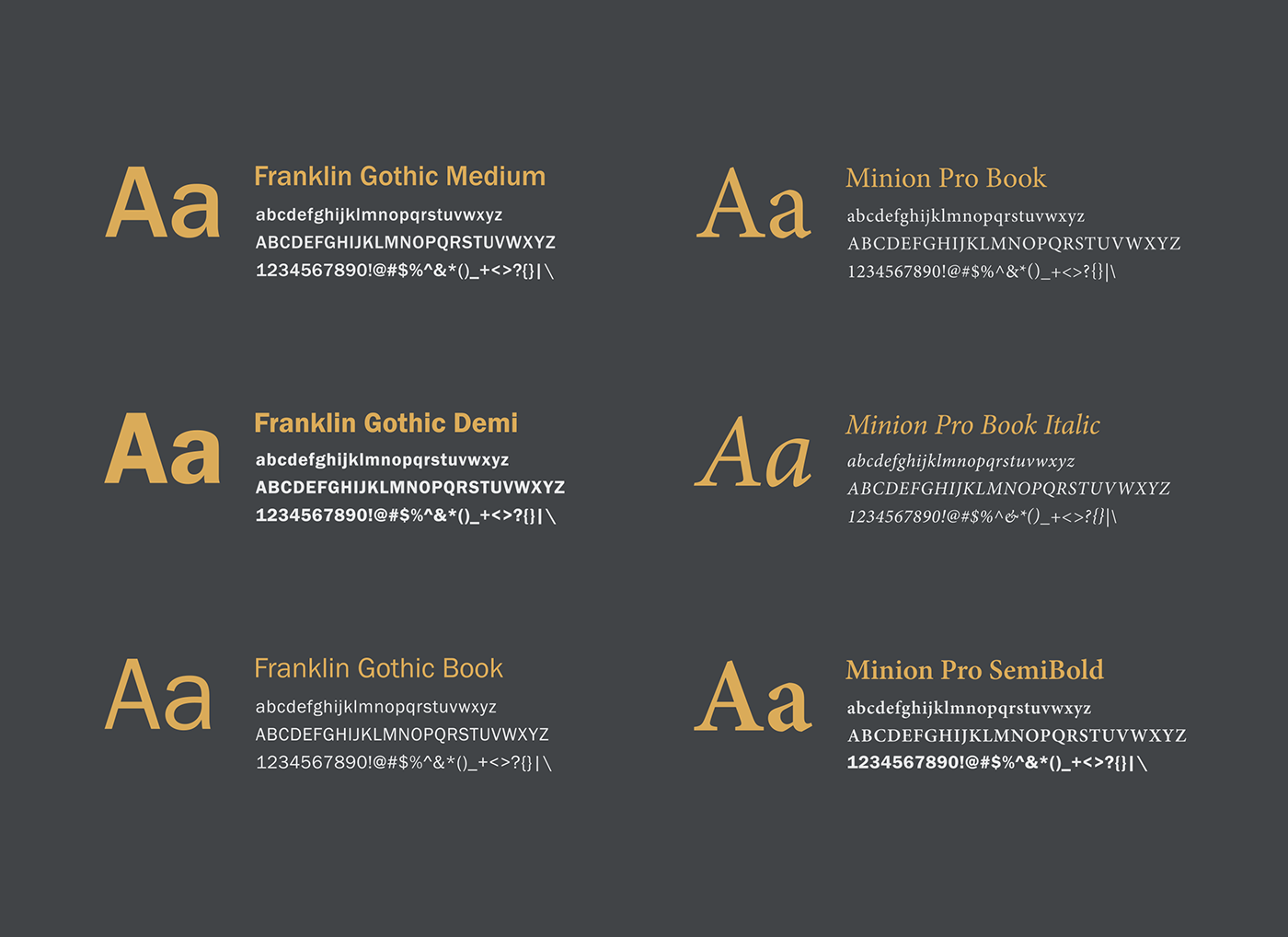
Franklin Gothic
A bold, sans-serif typeface designed in the early 1900’s, Franklin Gothic has been used in advertisements, headlines and signage throughout the 20th century and also shares architectural influence and structure when set in uppercase.
Minion Pro
An elegant contrast to the geometric form of Franklin Gothic, Minion Pro is inspired by beautiful and sophisticated classical typefaces. It combines the aesthetic and functionality of text type and is perfect for copy or display.

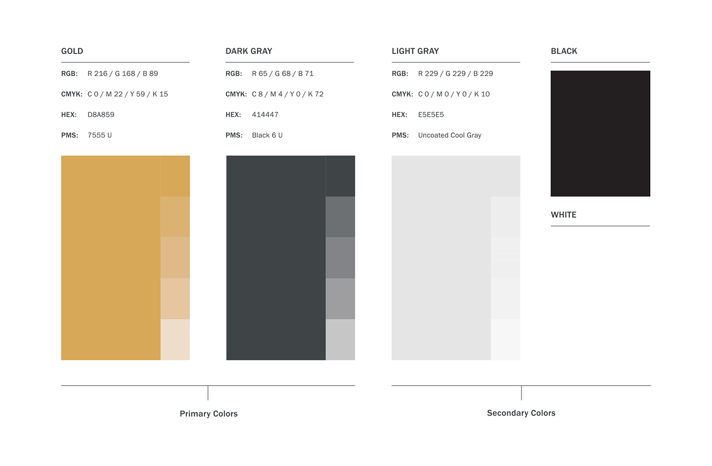
The brand color palette for Grocer’s Warehouse focuses on sophistication and timelessness. Gold accents were prominent in the 1940’s when the building was originally built. Dark gray references the color of the current building exterior. Light gray, white and black act as secondary colors which support the primary palette.

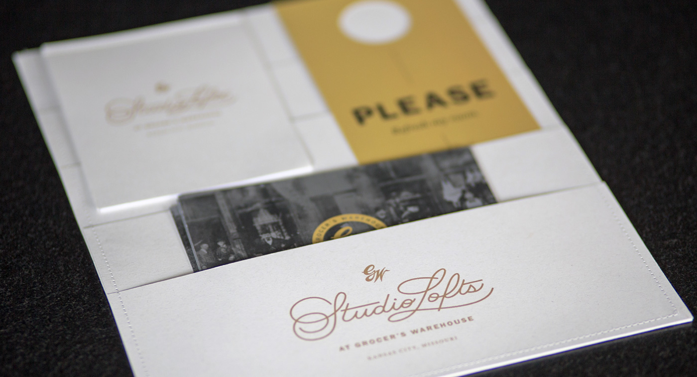
Print Collateral Set: Business Cards, Letterhead, Envelope, Stamp
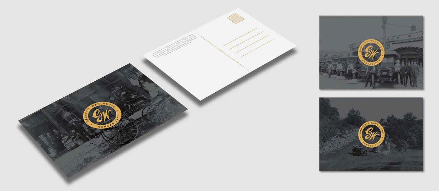
Promotional postcards featuring historic Wolferman & Roanoke Park imagery


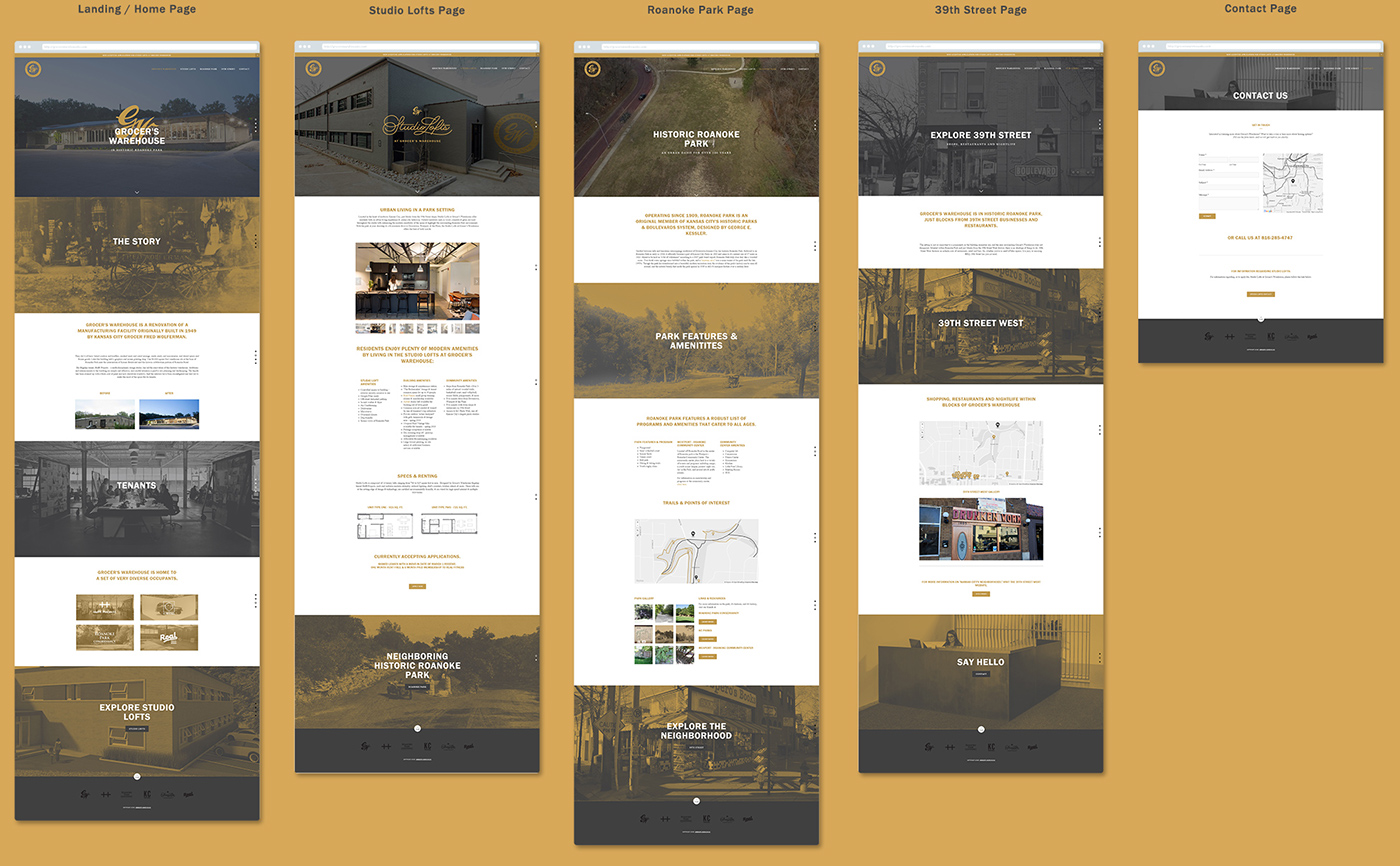
Website
The website for Grocer’s Warehouse presents historical information about the building and its renovation, Studio Lofts, trails and attractions in Roanoke Park, and recommendations of shops and restaurants just minutes away. Consisting of several long-scroll pages, the site is easy to navigate and responsive.
grocerswarehousekc.com
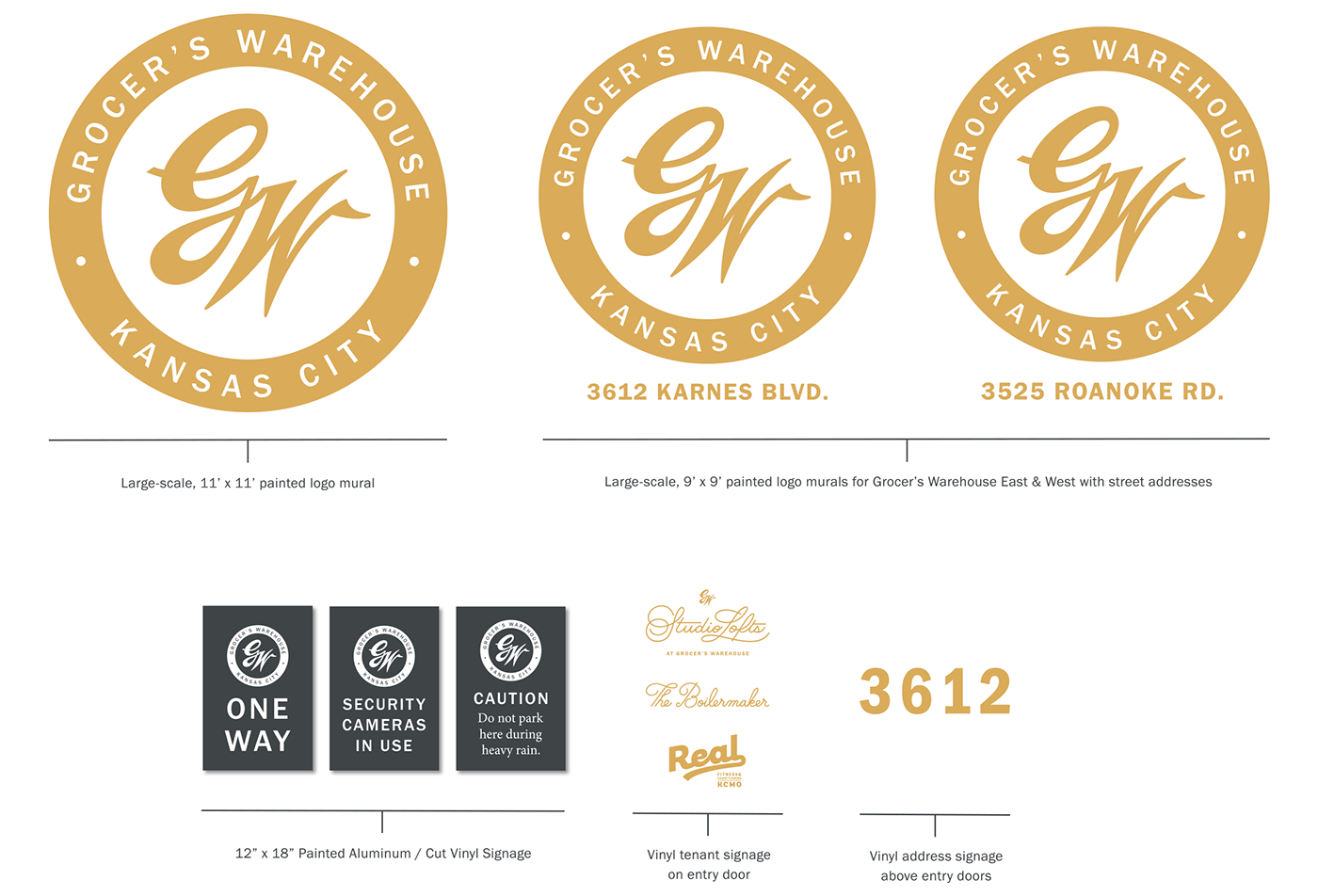
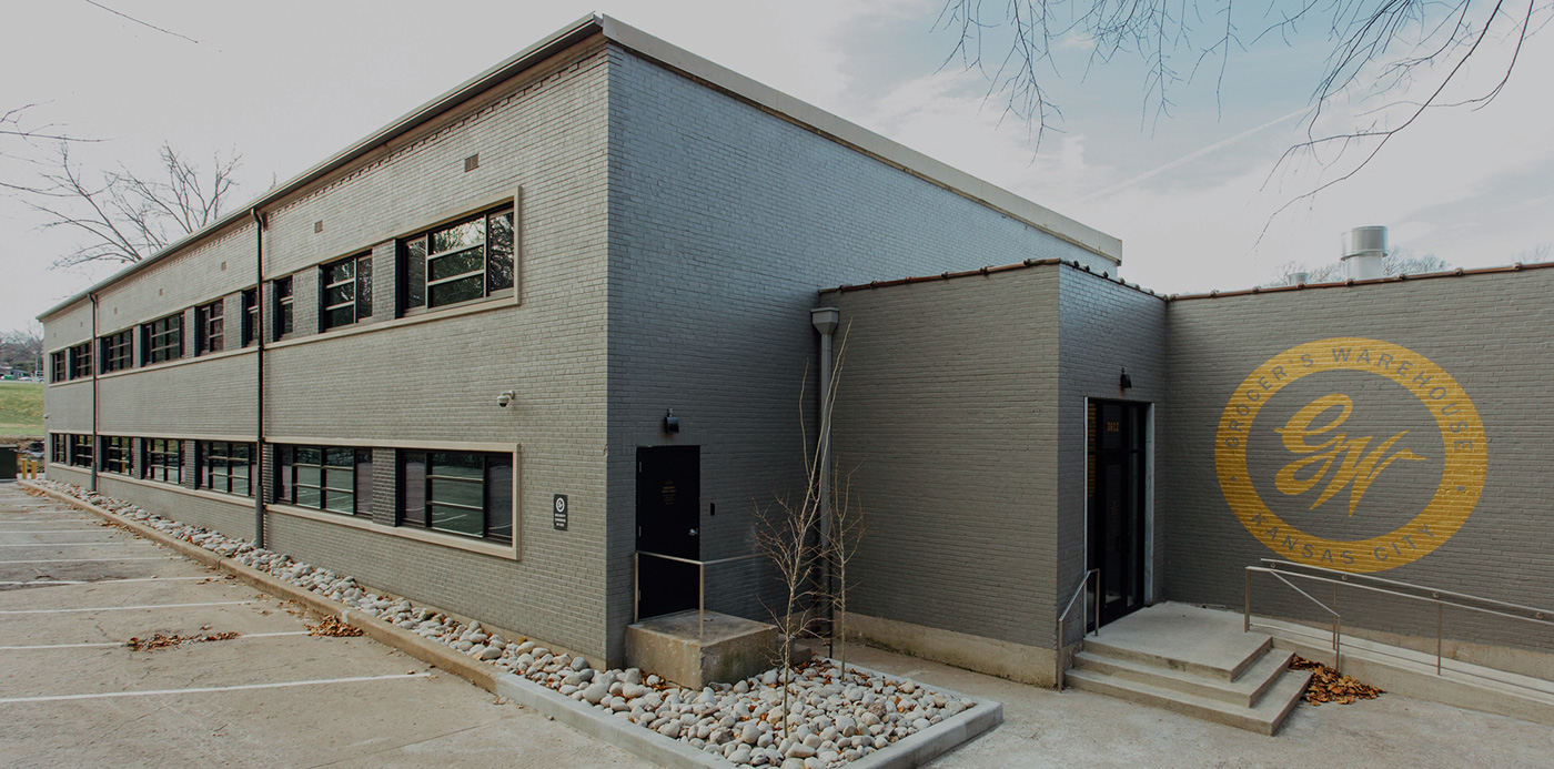
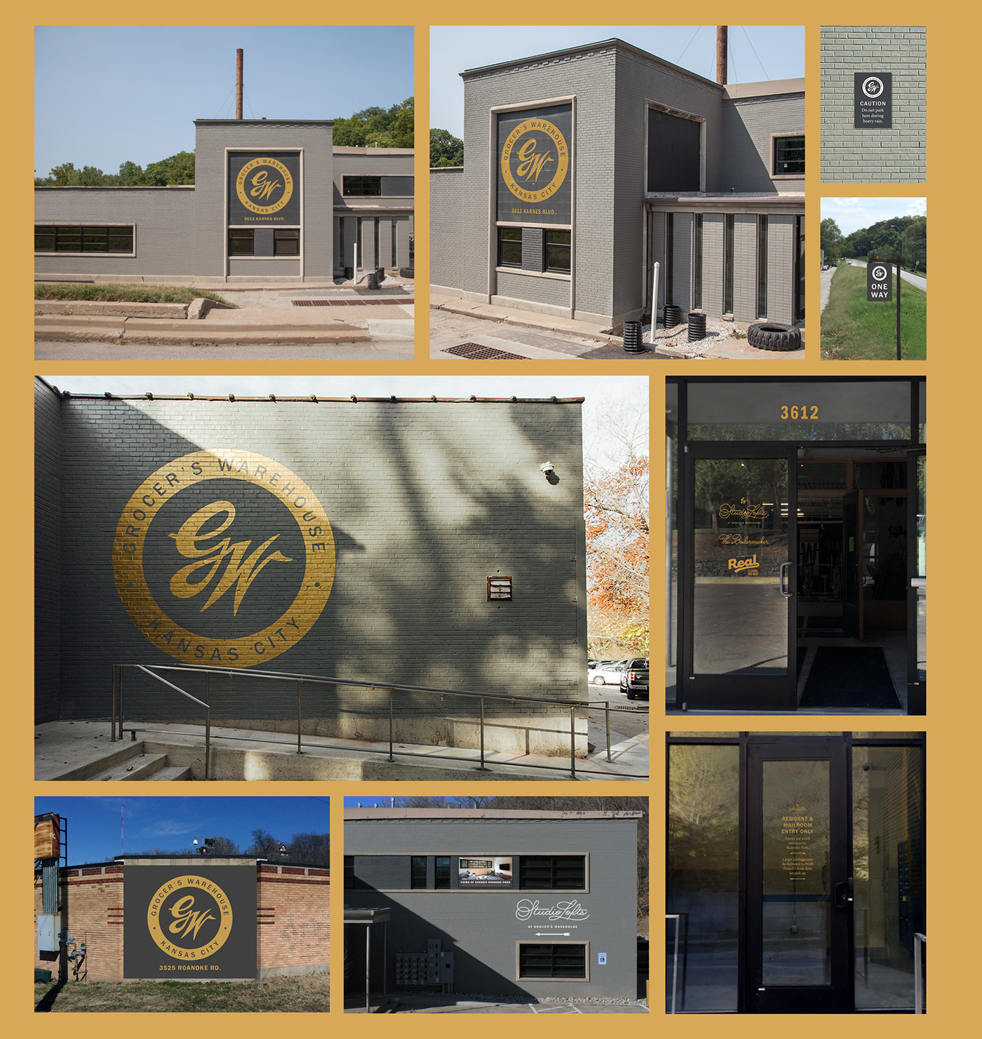
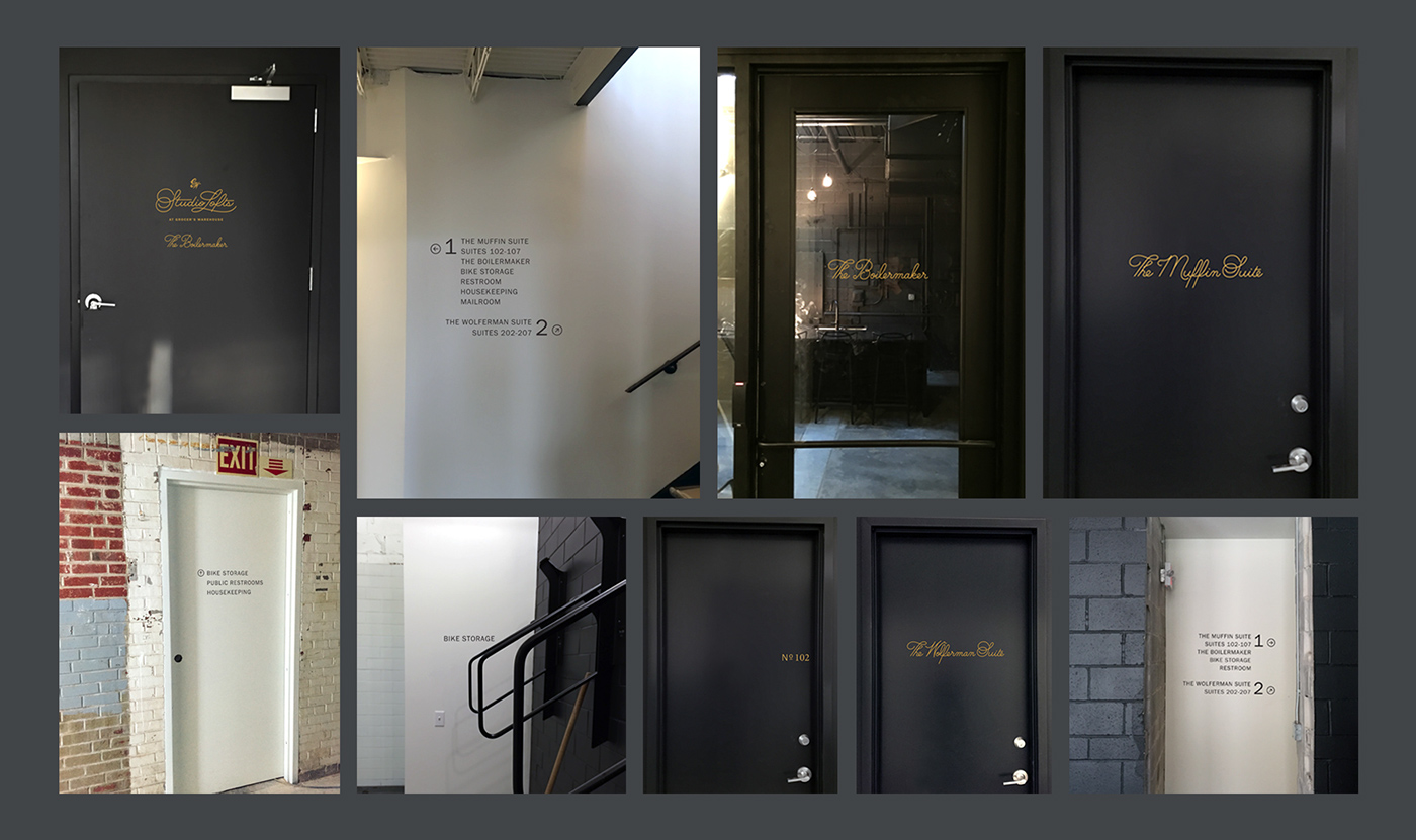
Grocer’s Warehouse Signage & Wayfinding
The signage and wayfinding package for Grocer’s Warehouse focuses primarily on the exterior of the building. The logo appears as several large-scale, painted metallic signs which act as the main building identifiers. Cautionary signs feature a high contrast color-way of dark gray and white to grab attention. Gold cut vinyl tenant and street address signs appear on and above entry doors.
Grocer’s Warehouse is home to a set of very diverse occupants. Tenants include Hufft Projects, KC Photo Wall, Roanoke Park Conservancy, Real Fitness and Conditioning, and Studio Lofts.
_
_
Tenants
The building’s flagship tenant, Hufft Projects – a multi-disciplinary design studio, has led the renovation of this historic warehouse. KC Photo Wall, located in the office of Hufft Projects, is one of Kansas City’s largest private photo and video studios and is available for hourly rental. The Roanoke Park Conservancy exists to coordinate efforts benefiting the park by honoring the past and planting the future. An on-site fitness studio, Real Fitness, offers access to trainers and fitness classes.
The building’s flagship tenant, Hufft Projects – a multi-disciplinary design studio, has led the renovation of this historic warehouse. KC Photo Wall, located in the office of Hufft Projects, is one of Kansas City’s largest private photo and video studios and is available for hourly rental. The Roanoke Park Conservancy exists to coordinate efforts benefiting the park by honoring the past and planting the future. An on-site fitness studio, Real Fitness, offers access to trainers and fitness classes.
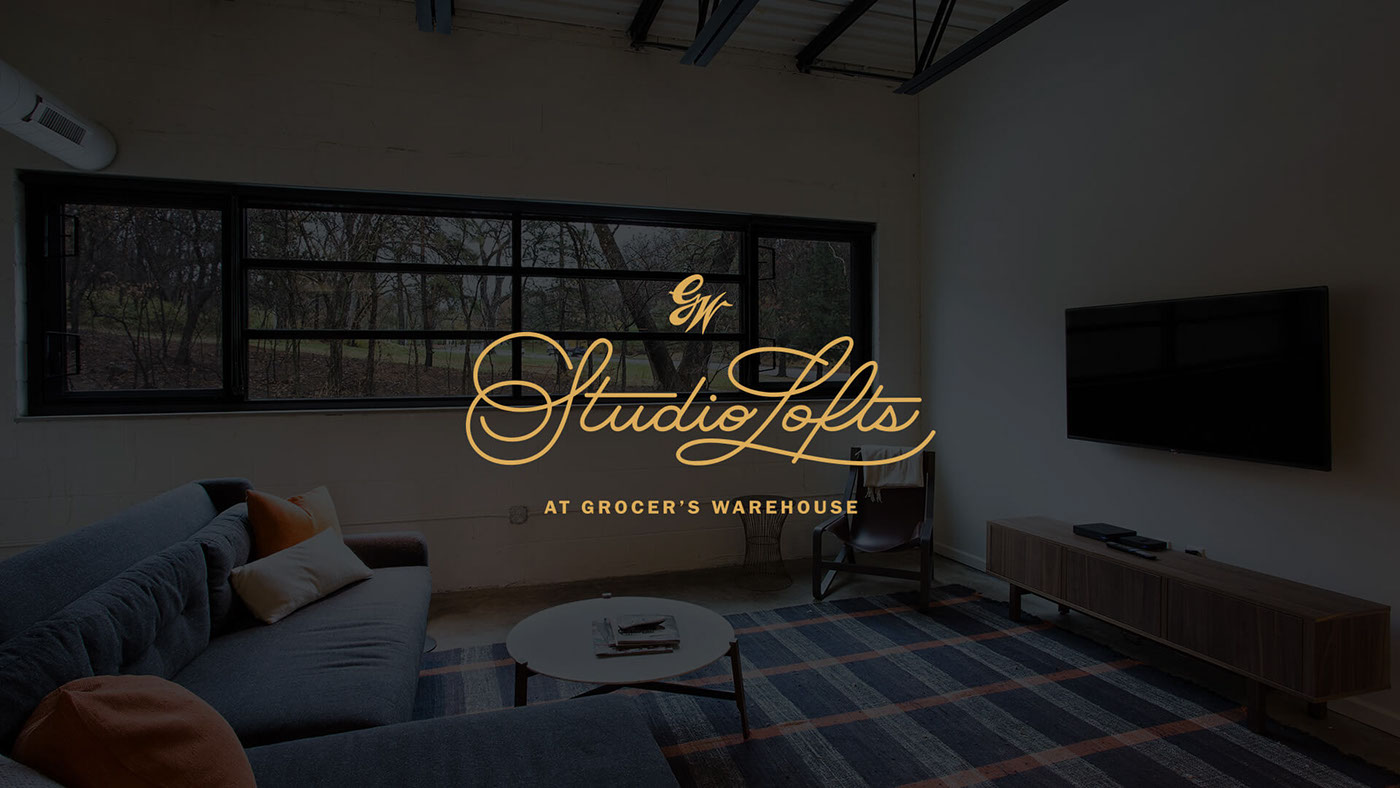
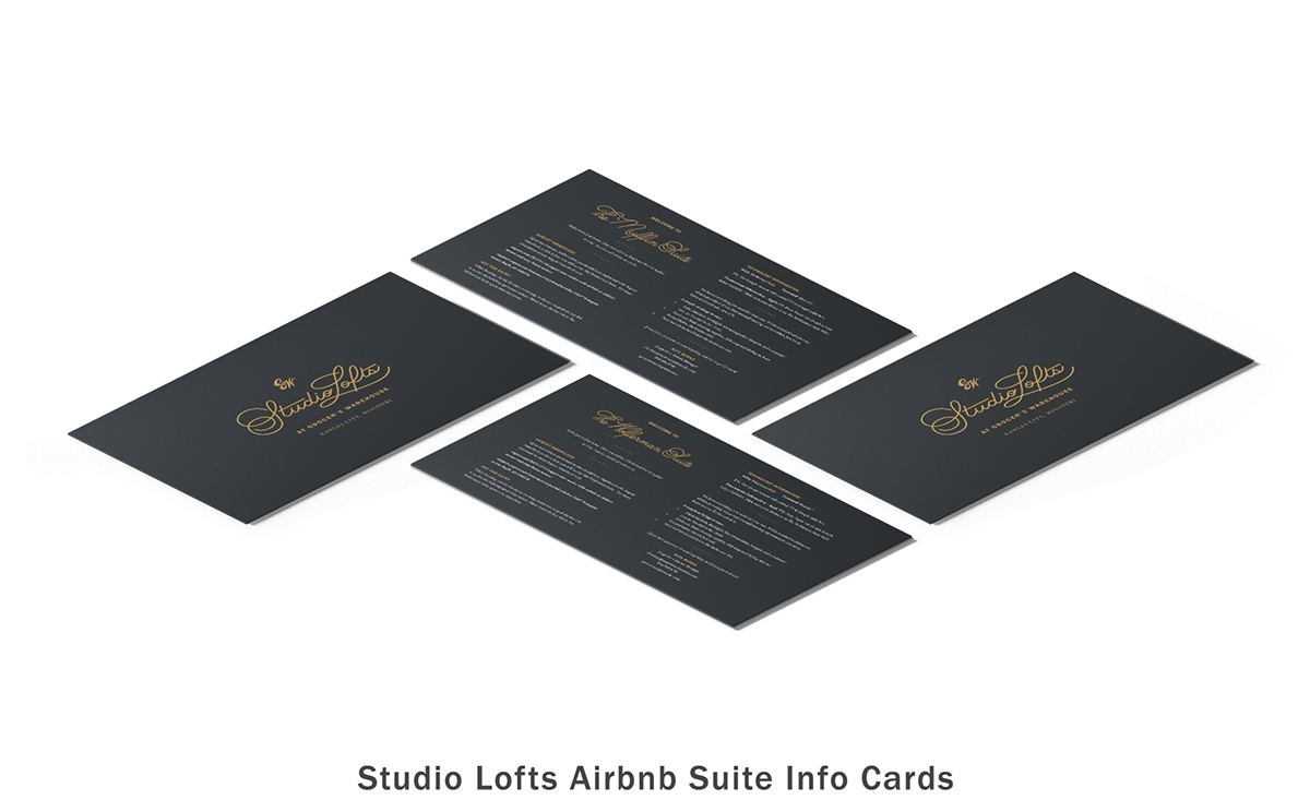
Studio Lofts
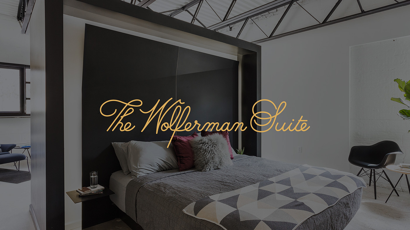
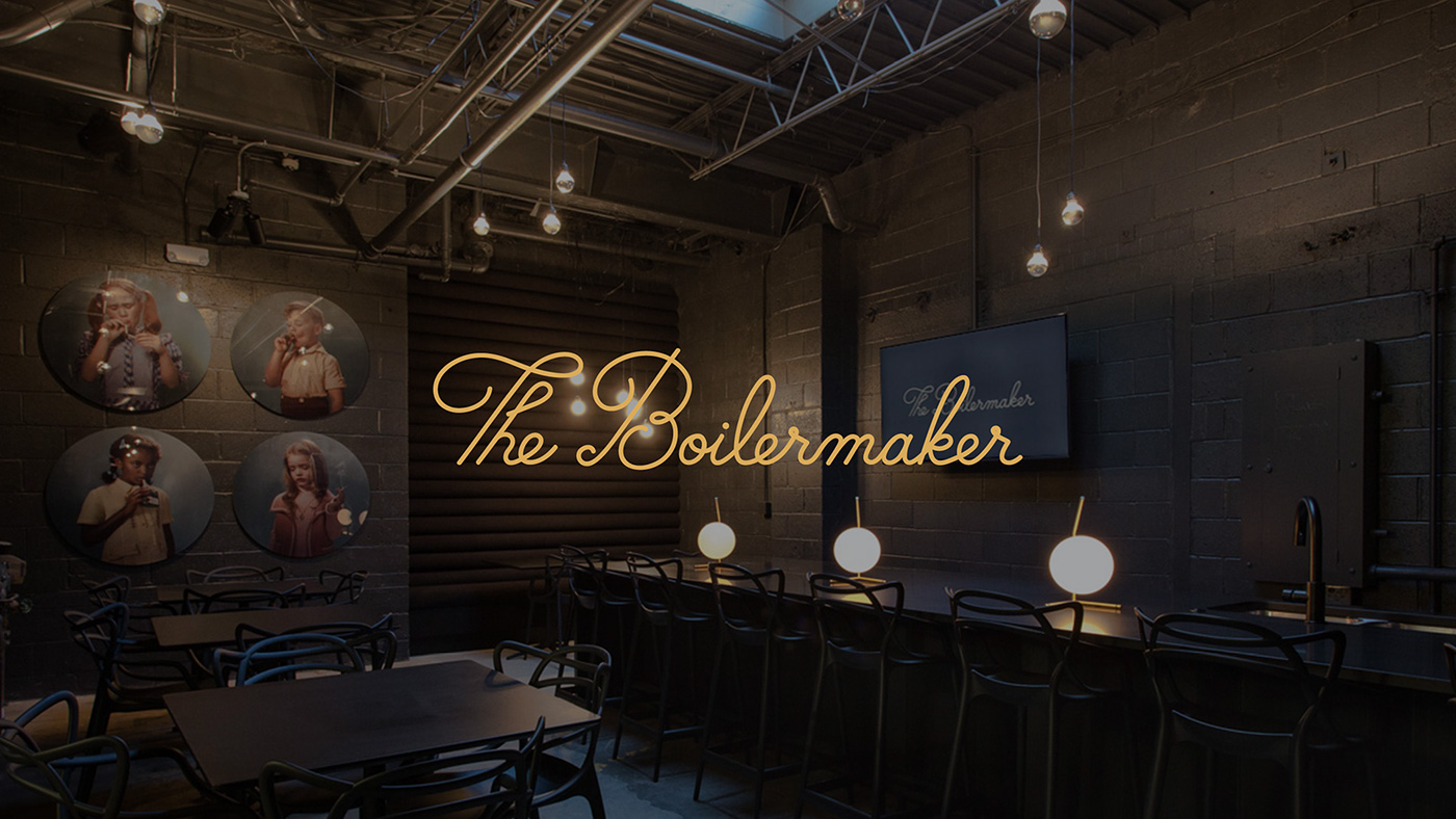
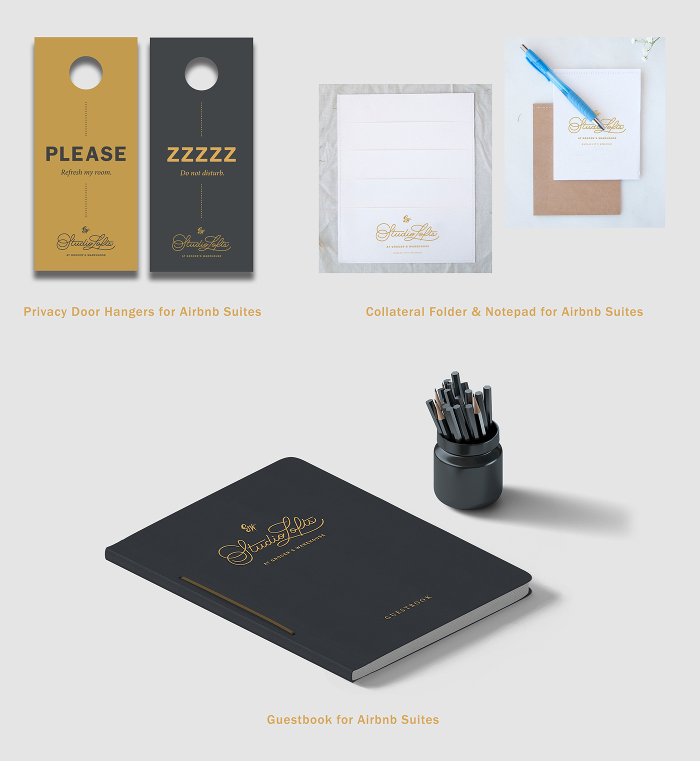
Designed by Grocer’s Warehouse flagship tenant Hufft Projects, Studio Lofts is comprised of 14 luxury lofts. Each space is inspired by the historic architecture of the building, but with the clean and modern aesthetic of a high-end loft apartment. Located in Roanoke Park, Studio Lofts at Grocer’s Warehouse offer residents both an urban living experience and a serene city hideaway. Out of town guests can reserve The Muffin Suite or The Wolferman Suite, Fred Wolferman’s corner office, on Airbnb. Residents at Studio Lofts can also enjoy The Boilermaker, the building’s private lounge and social space.
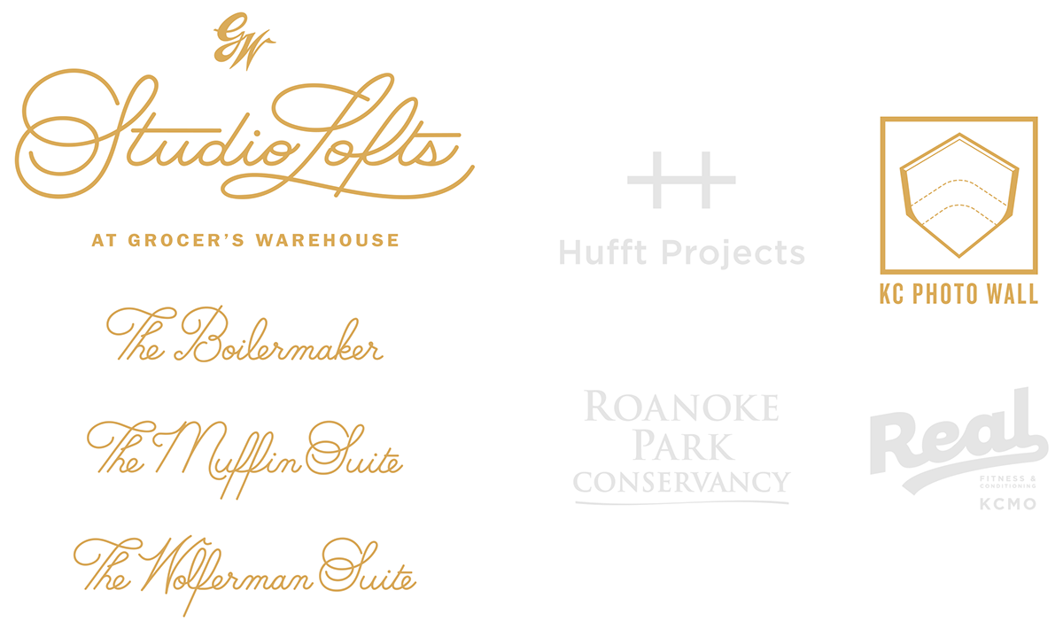
Studio Lofts and its sub brands, as well as the KC Photo Wall brand were designed as part of Grocer’s Warehouse identity.


Studio Lofts Branding
The Studio Lofts logo is a hand-generated custom script mark. The identity also utilizes the same color palette as Grocer’s Warehouse for consistency. The logo is paired with the GW mark above and "At Grocer’s Warehouse" below in Franklin Gothic.
The Studio Lofts logo is a hand-generated custom script mark. The identity also utilizes the same color palette as Grocer’s Warehouse for consistency. The logo is paired with the GW mark above and "At Grocer’s Warehouse" below in Franklin Gothic.
Sub Brands
The sub brands for Studio Lofts are also hand-generated script logos maintaining the same aesthetic. The Wolferman “W” is inspired by early Wolferman scripts in advertisements. The sub brands utilize the Grocer's Warehouse color palette.


Studio Lofts Signage & Wayfinding
The signage and wayfinding package for Studio Lofts is simple, but considered. It reflects the identity of Grocer’s Warehouse through typography and circular containers for directional arrows, but also ties directly to the clean, modern aesthetic of Studio Lofts' interior design.

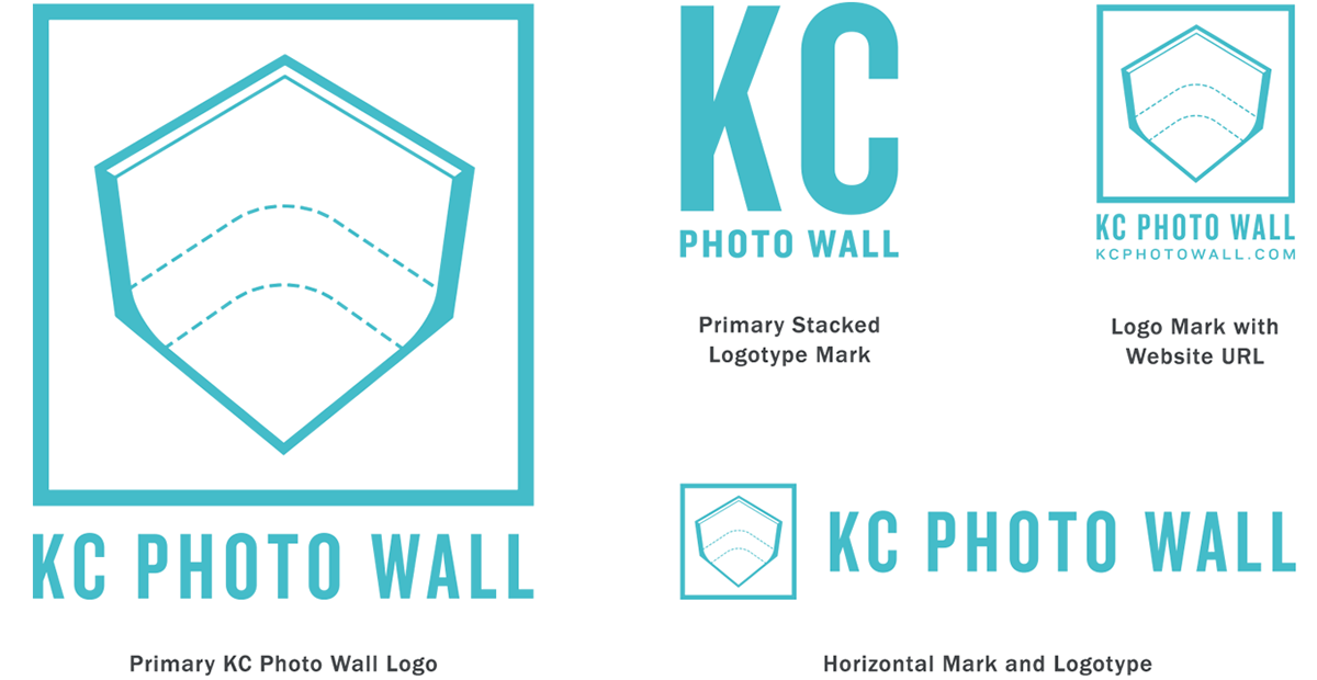
KC Photo Wall Branding
KC Photo Wall’s primary logo is an isometric graphic representation of the wall. The color references a green screen due to the wall’s similar nature and infinite appearance for photo of video work.


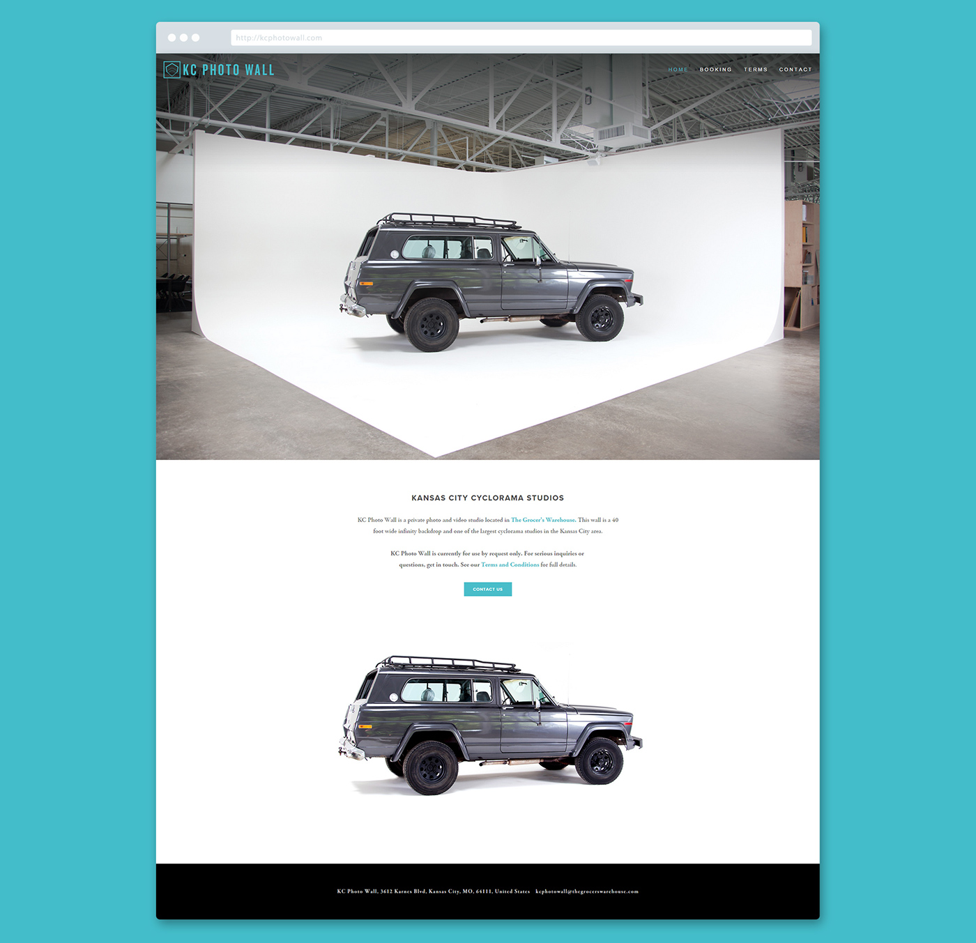
KC Photo Wall Website
The KC Photo Wall website is a simple, long scroll site which contains rental information for photo and video shoots. It features a homepage, terms and conditions page, and a contact page with a printable map to Grocer’s Warehouse.
The KC Photo Wall website is a simple, long scroll site which contains rental information for photo and video shoots. It features a homepage, terms and conditions page, and a contact page with a printable map to Grocer’s Warehouse.
Thanks for checking out my work. If you like what you see, check out my full portfolio!