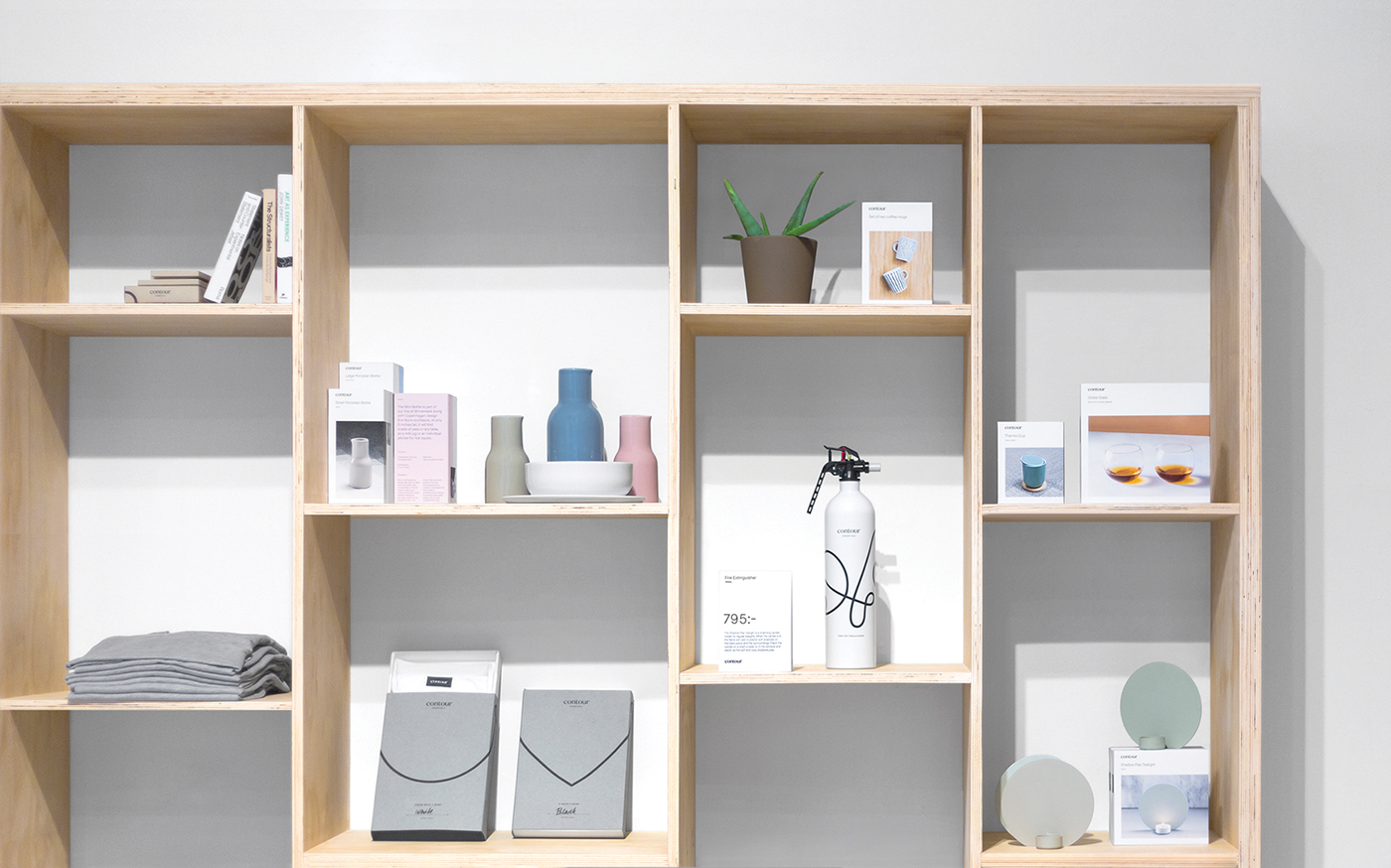
Concept, branding, packaging system and art direction for a store selling premium, highly curated products.
Team
Rasmus Nilsson
Erik Berger Vaage
Jacob Bang
Daniel Lindqvist
Sewon Chun
Erik Berger Vaage
Jacob Bang
Daniel Lindqvist
Sewon Chun
2015

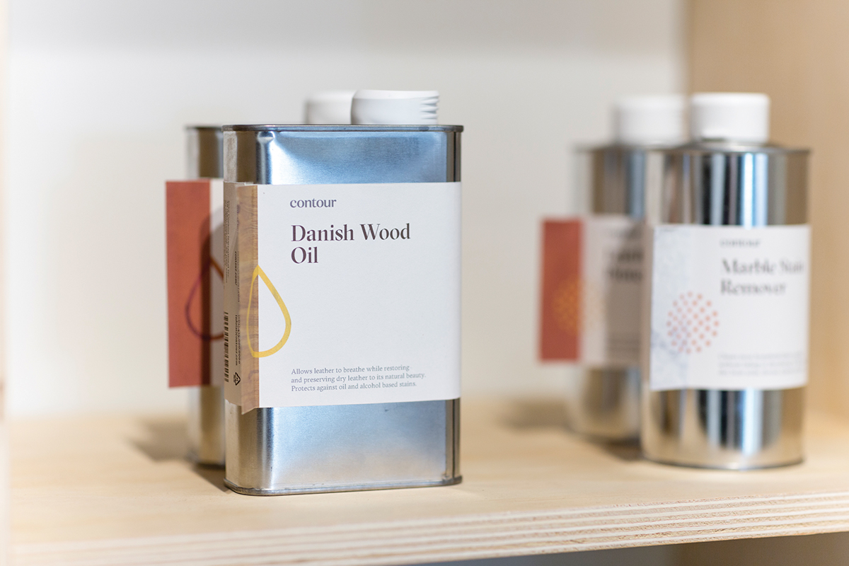
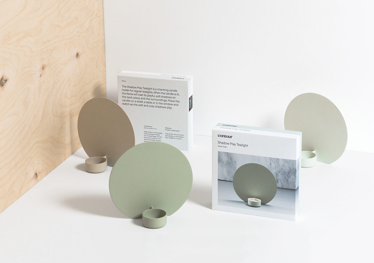
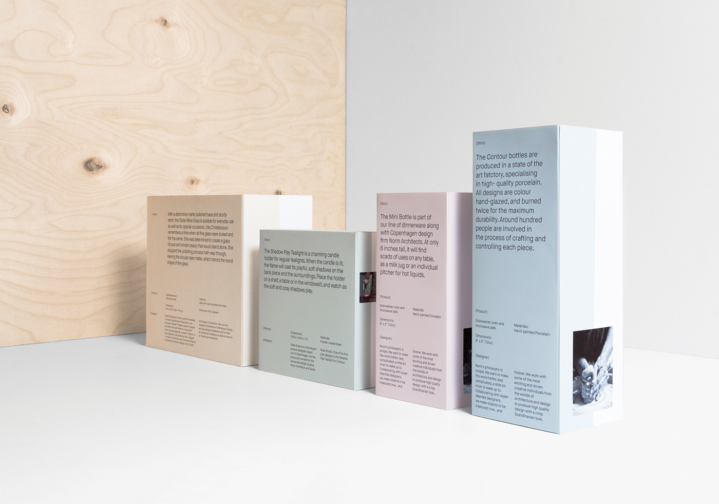
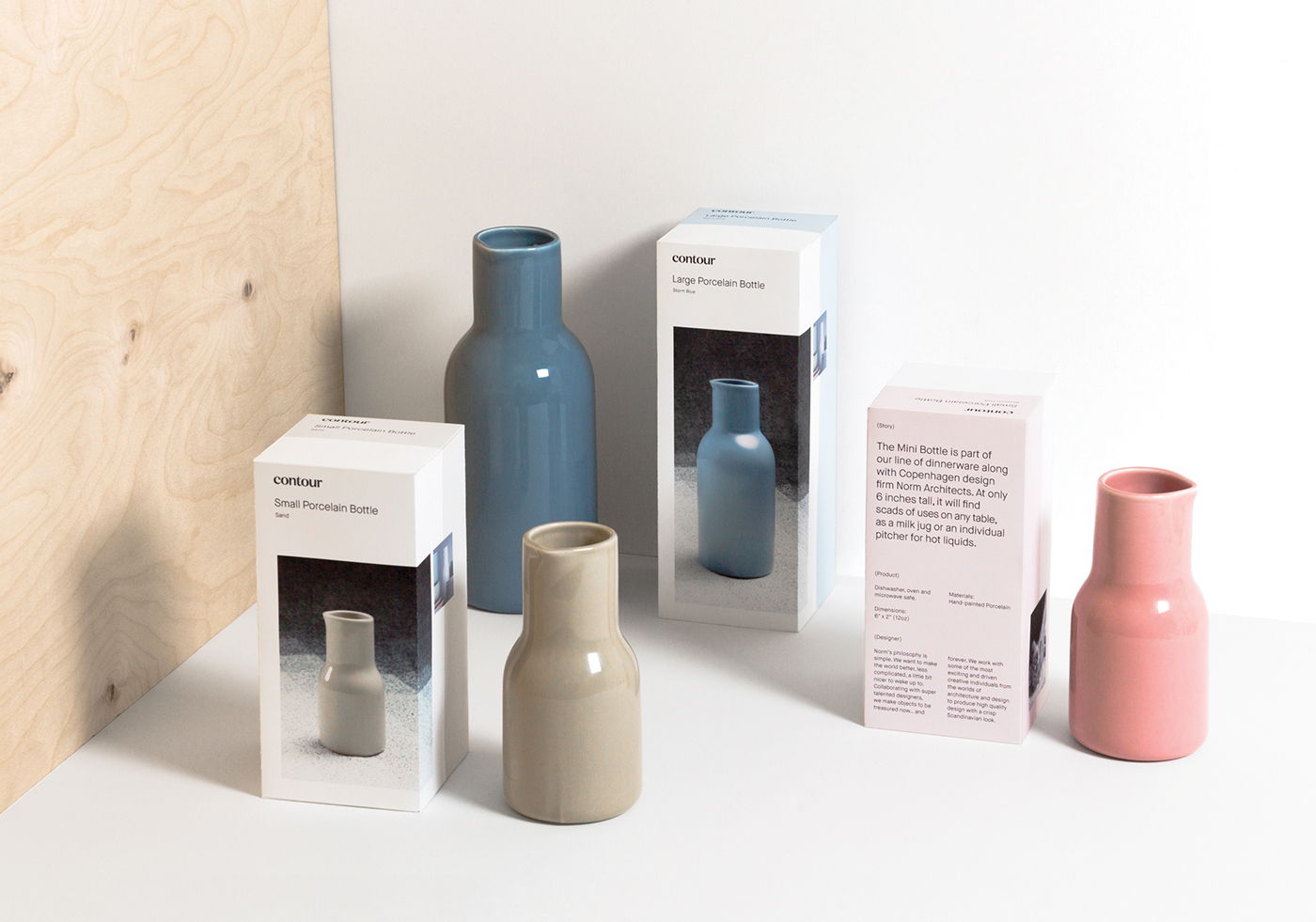
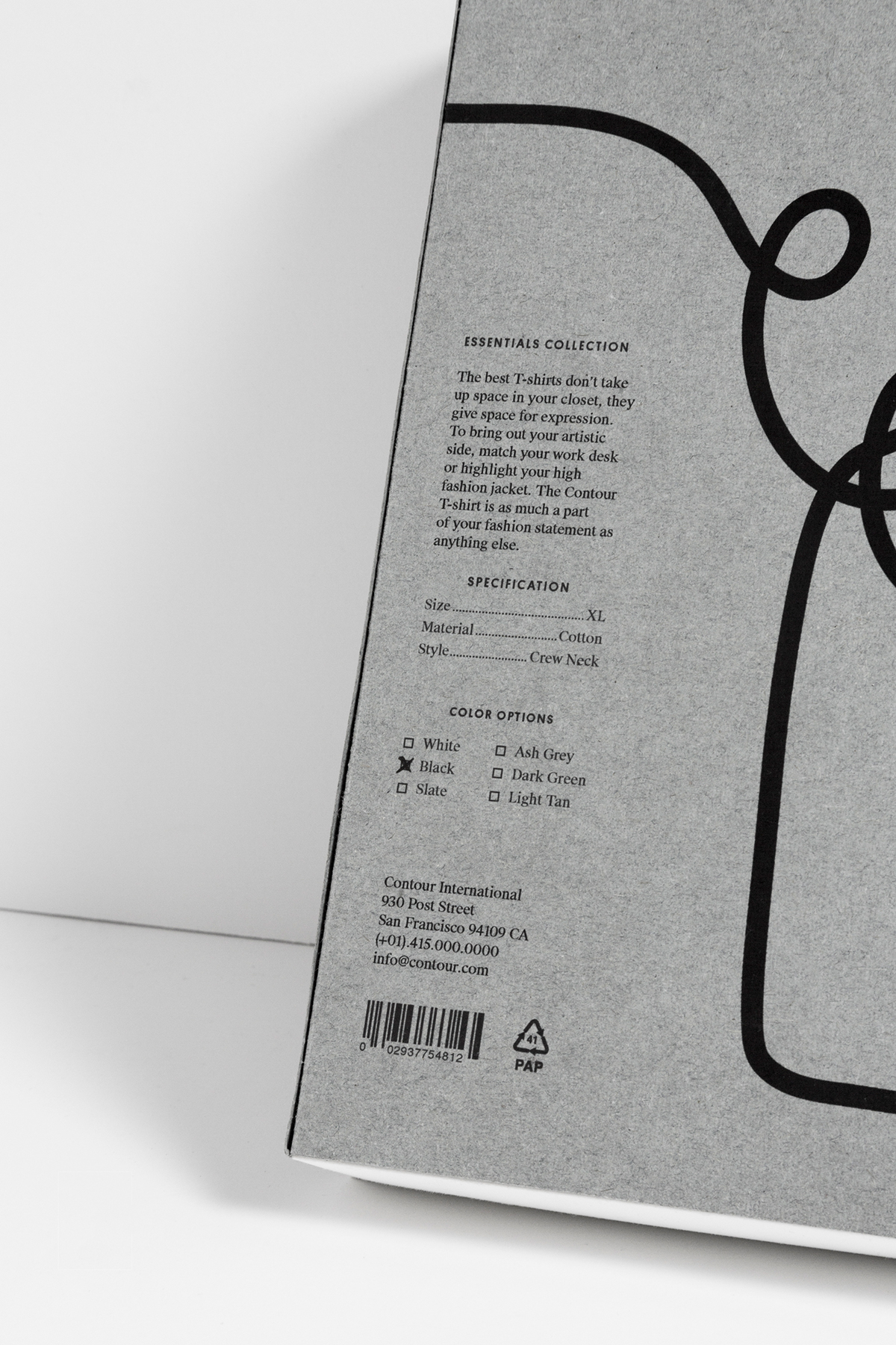
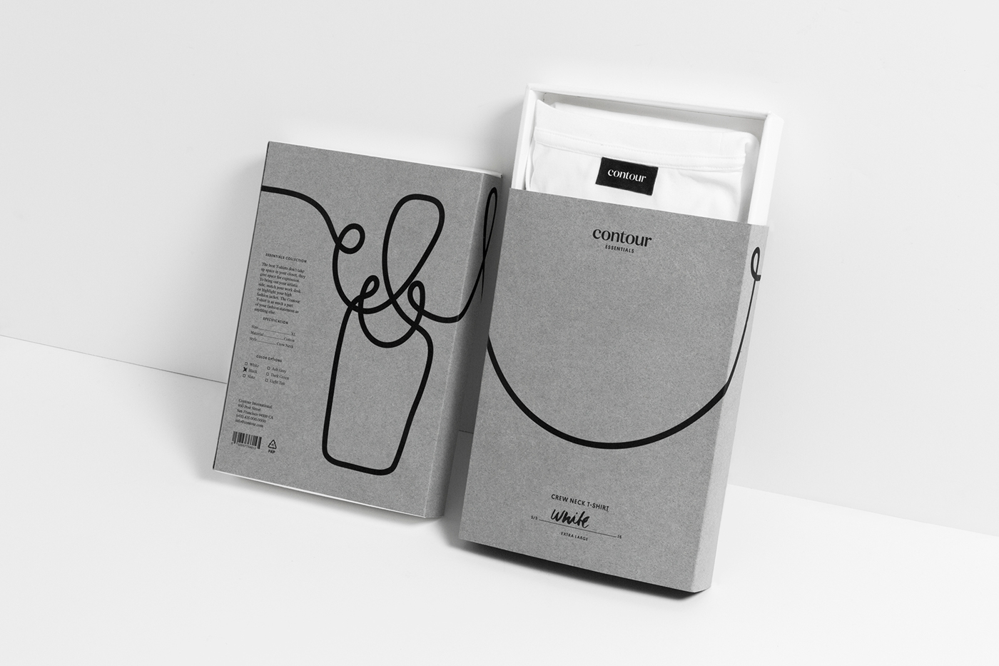
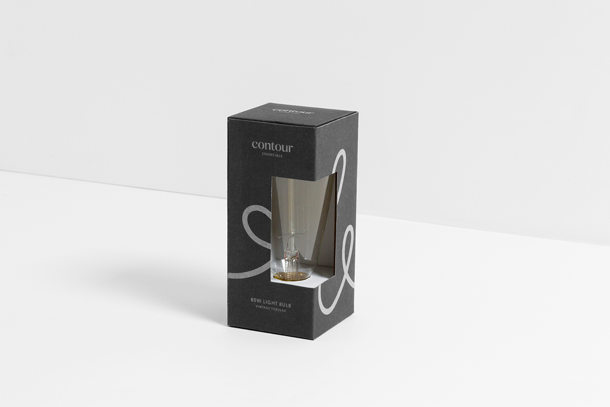
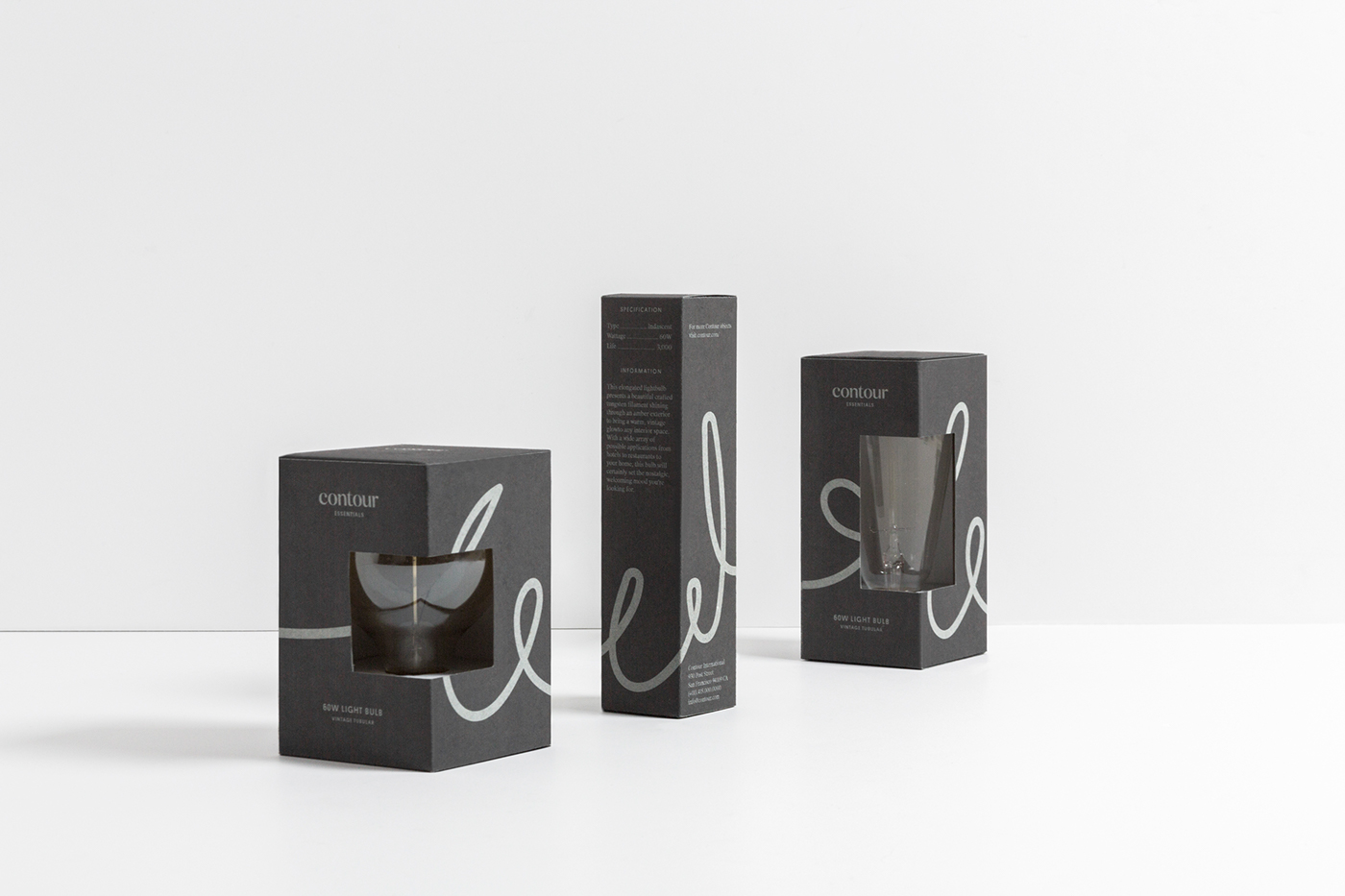
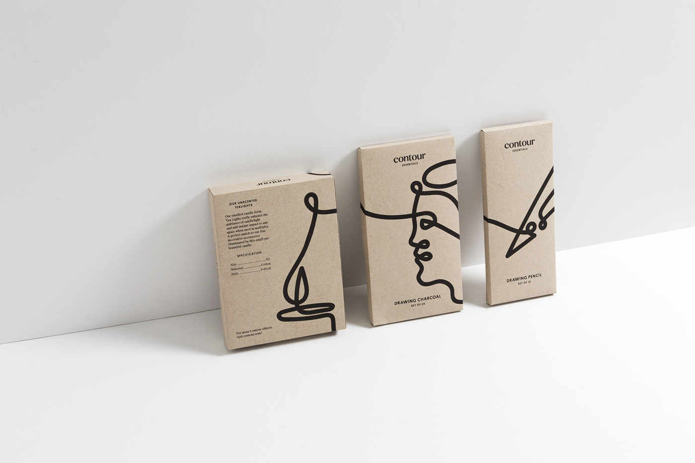
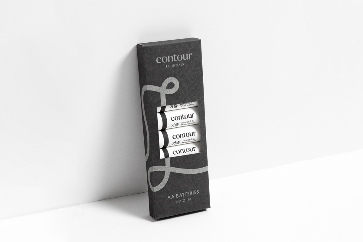
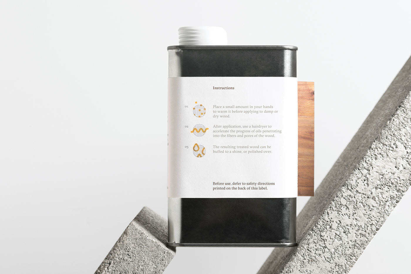
An integral part in the development of the visual system was to create a strong and flexible packaging system that never would over-power the product nor the designer.
The solution was to strip the package down to its bare essentials: the product itself, its story, and the designer. This enabled us to bring the components together into one cohesive system of product photography, a pared down color-coding, and concise typography. The result is a package design honoring the product while telling its story with clarity and honesty.
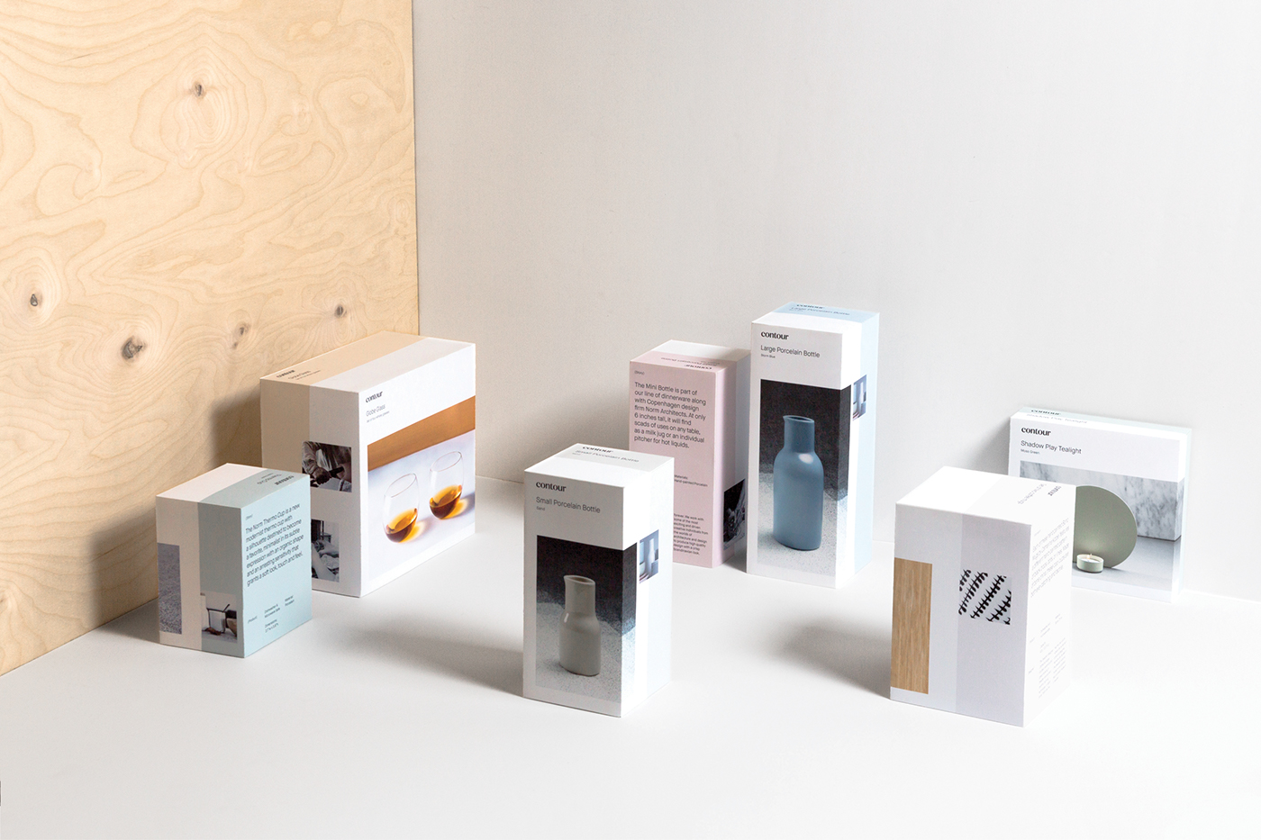


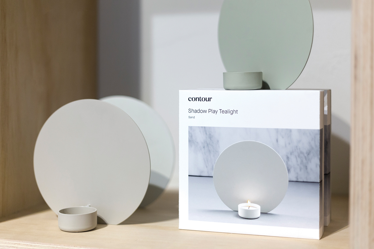
In addition to being an extension of other product lines, the objects themselves are to be considered stand-alone pieces of design striving to make every day life a bit better through form and function. The visual system consists of a line art graphic that illustrates the product and its use in a naively straightforward manner.
The line, or contour if you will, has an opening meaning, but for us it’s representative of the narrative of each product that together form the story of Contour.


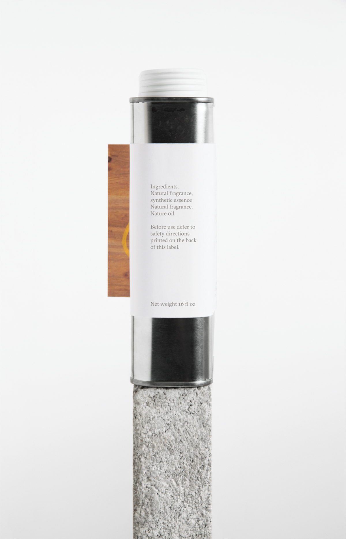
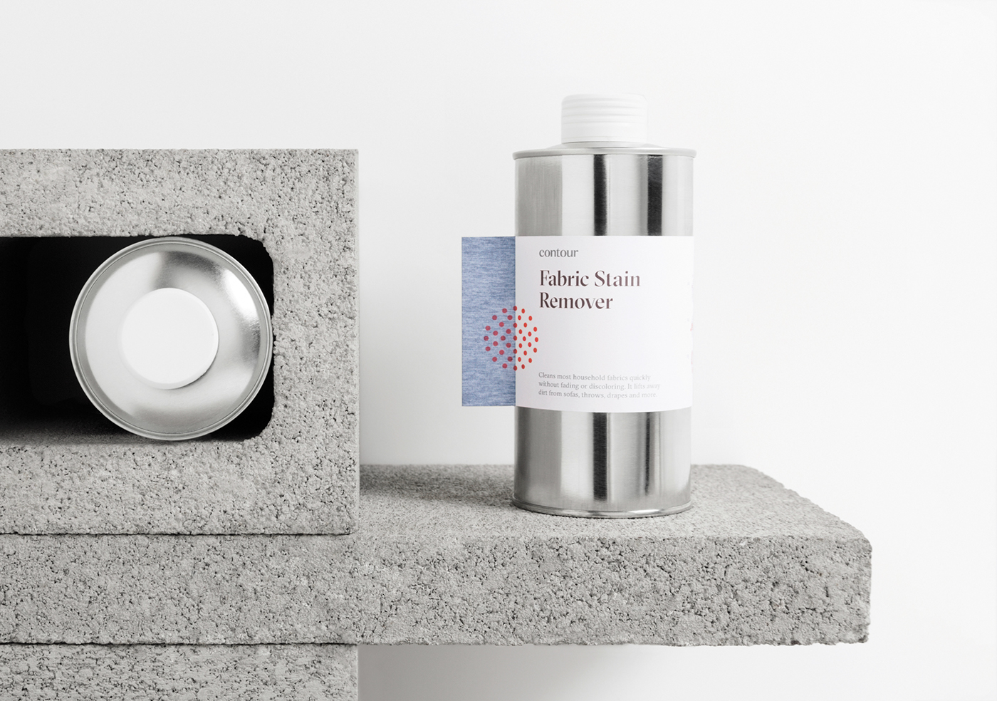
The product line offers a wide range of liquids, soaps and waxes taking care of natural materials such as wood, stone and leather.
The packaging uses a system of distinct typography, imagery, and iconography of the material intended to be treated, creating a simple and intuitive experience for the consumer.
The aluminum structures communicate the contrast between natural and man-made. In addition, they provides the packaging with a sense of trust and cleanliness.

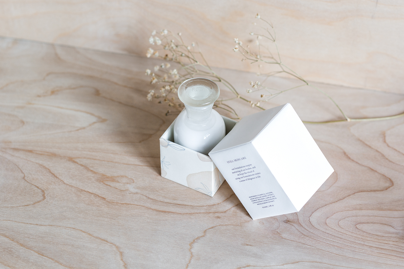
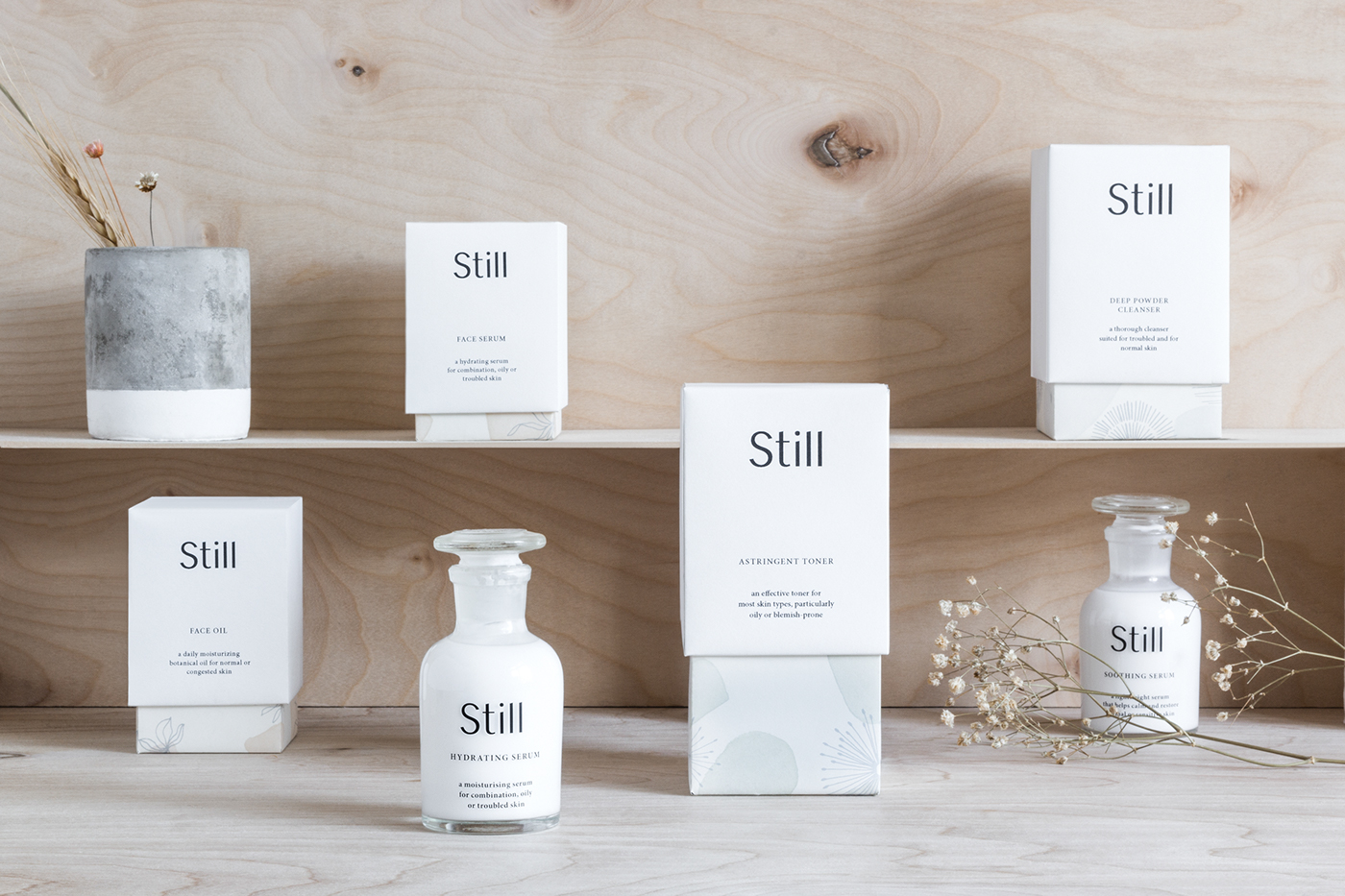
The wide range of plant derived cleansers, toners and serums are crafted and filtered by hand before finally being bottled. Once filled, the translucent bottles become the quality assurance for the consumer displaying the purity of the inside.
The sense of honesty and integrity is carried on throughout the identity by the use of a simple yet concise typographic system. To evoke the intimacy of the product the white structures are matched with pastel watercolors and floral illustrations.


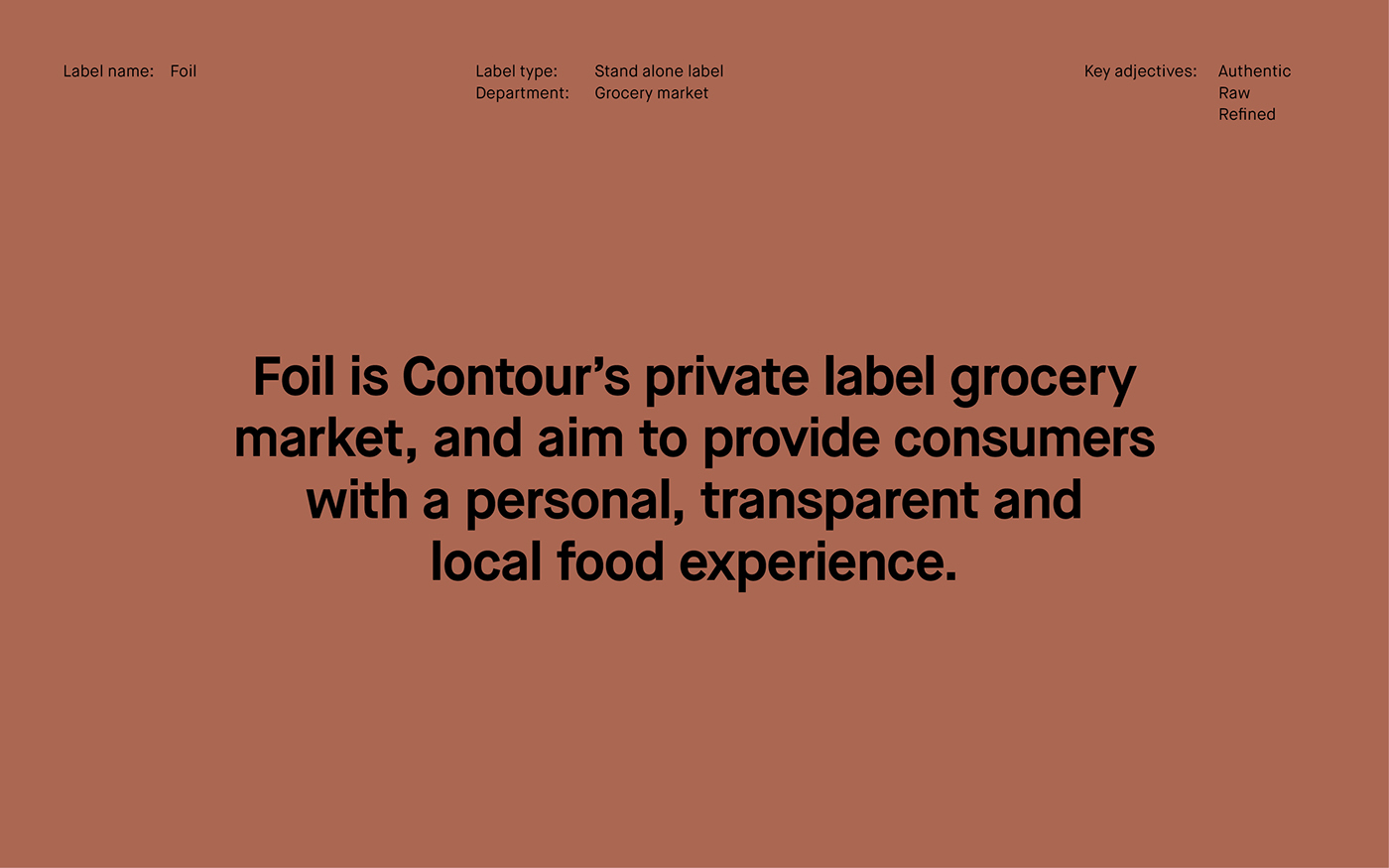
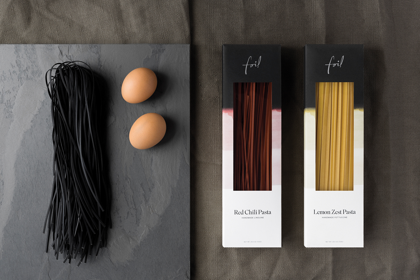
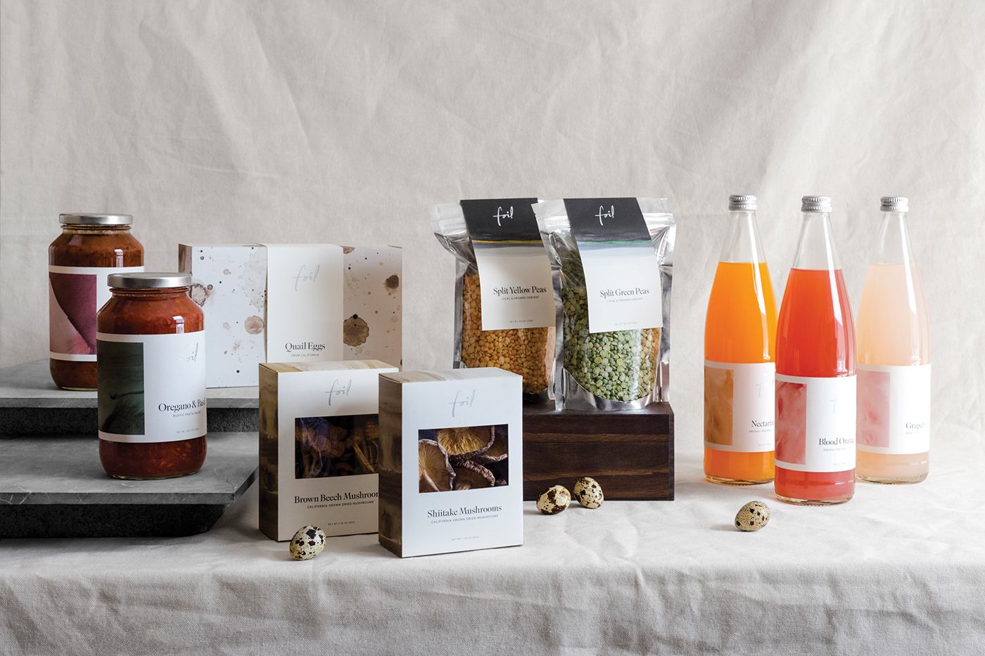
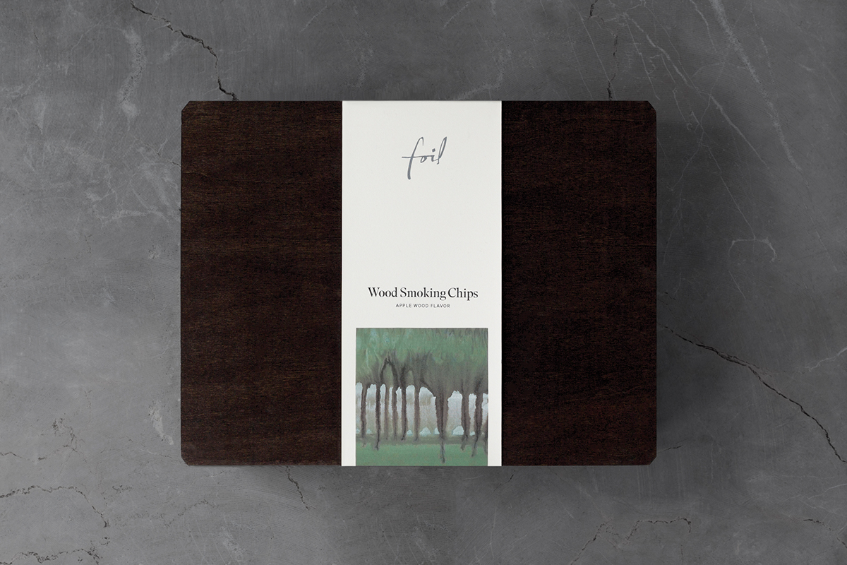
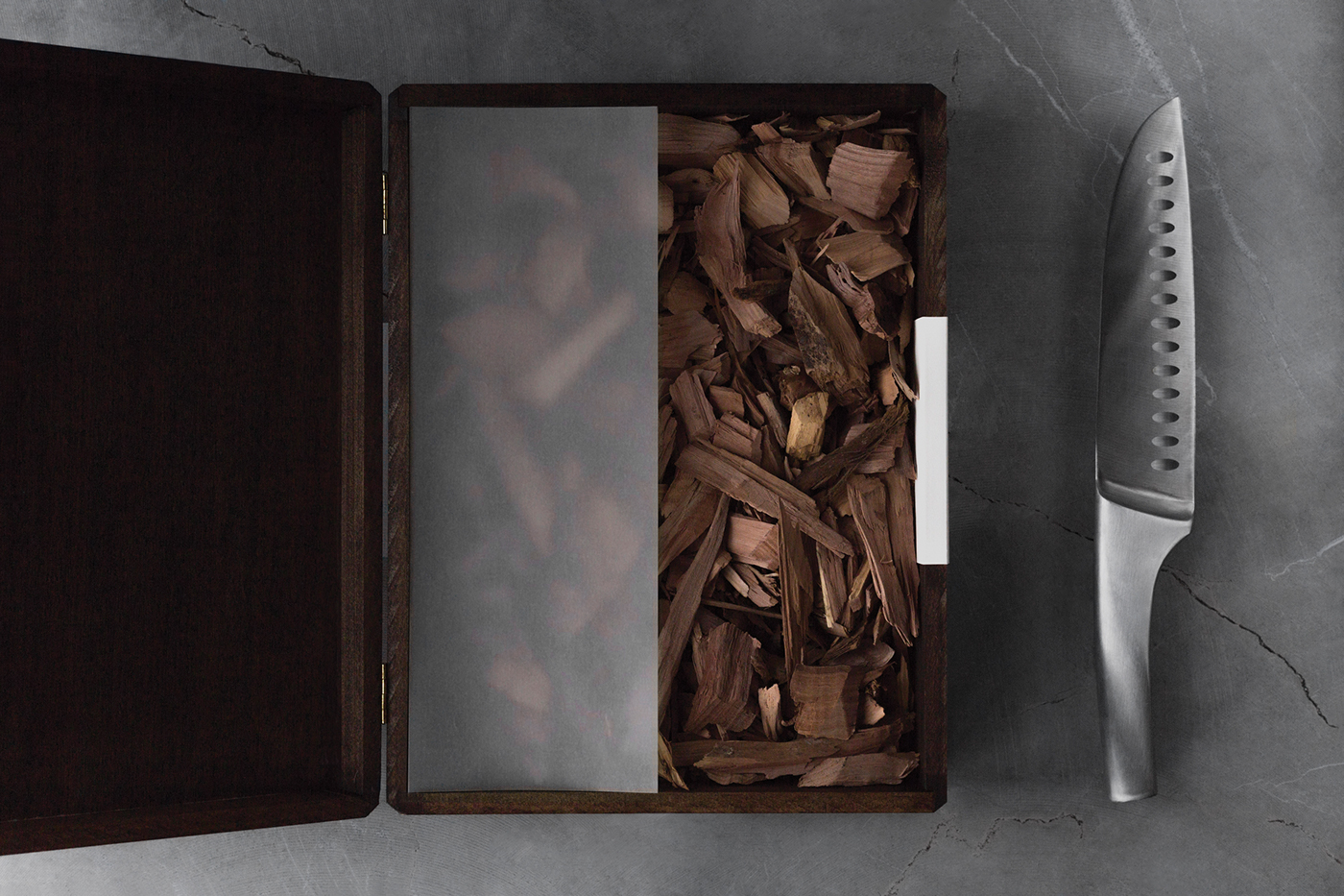
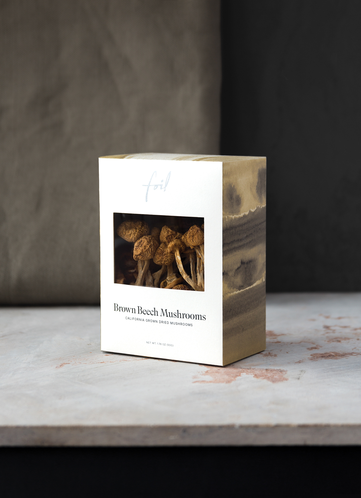
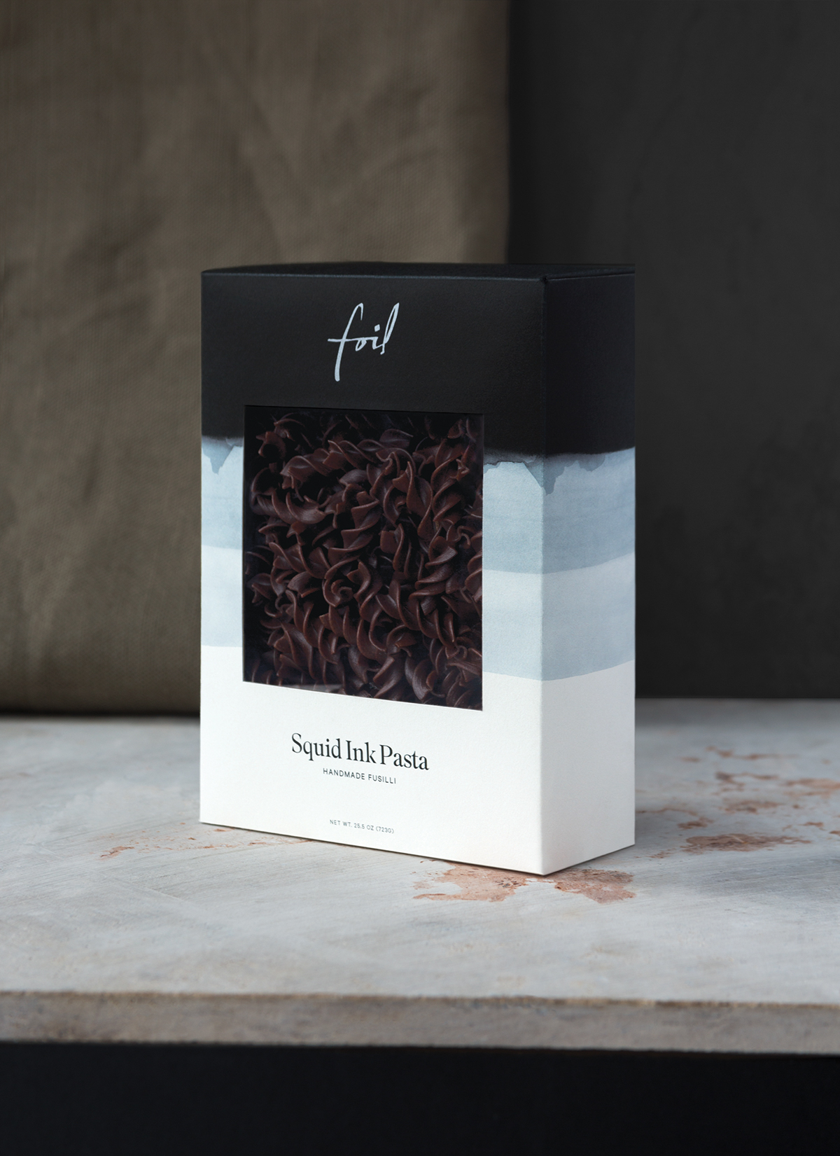
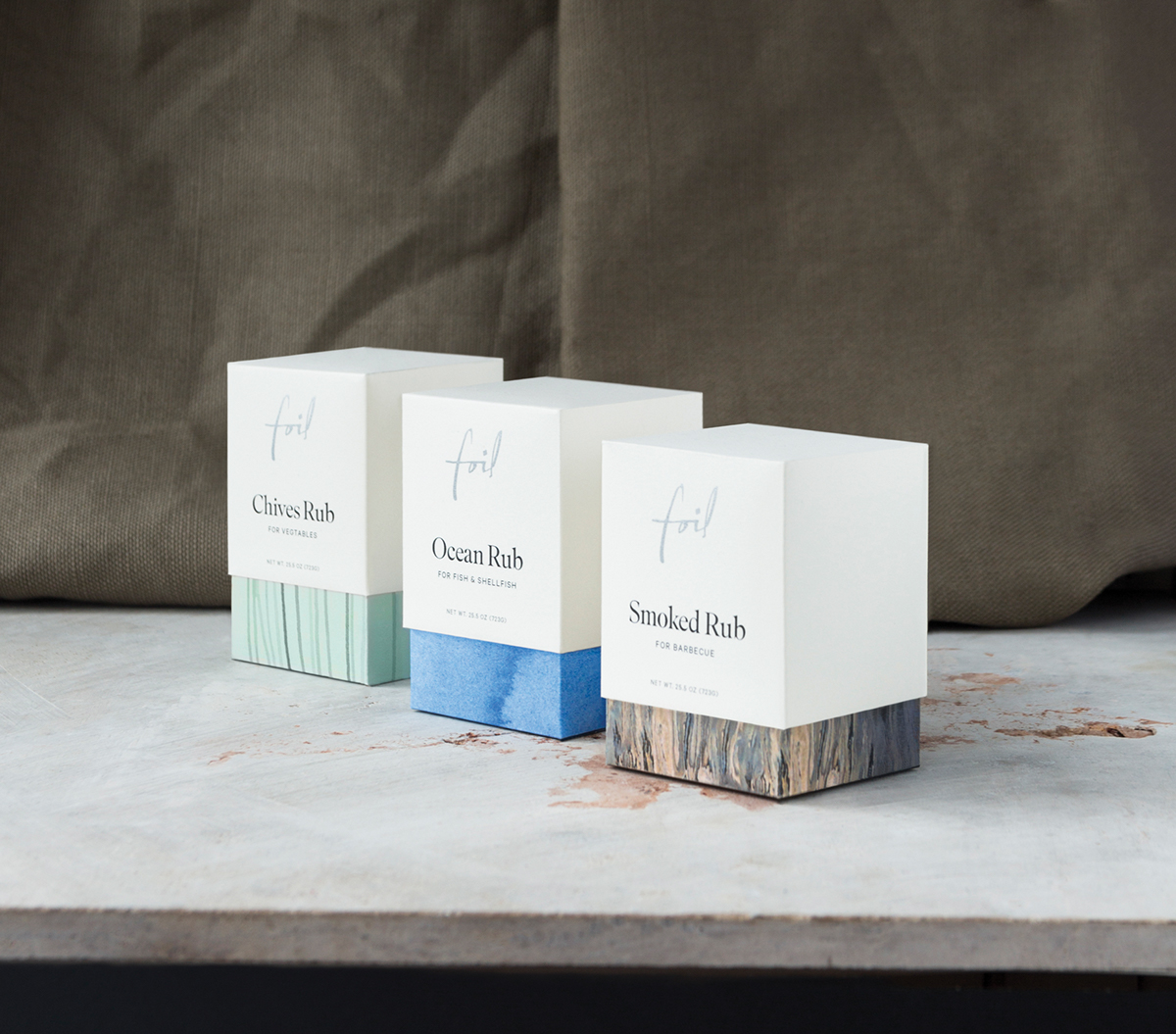
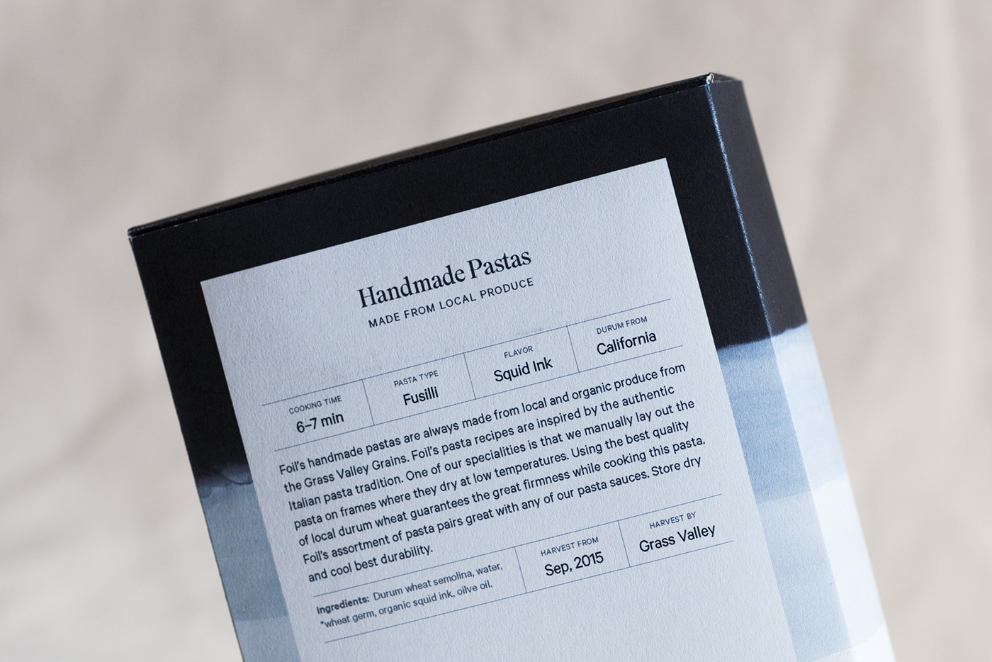
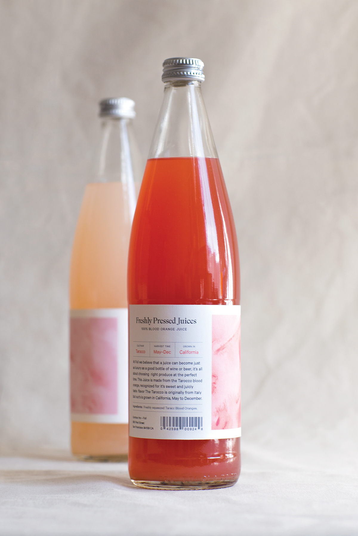
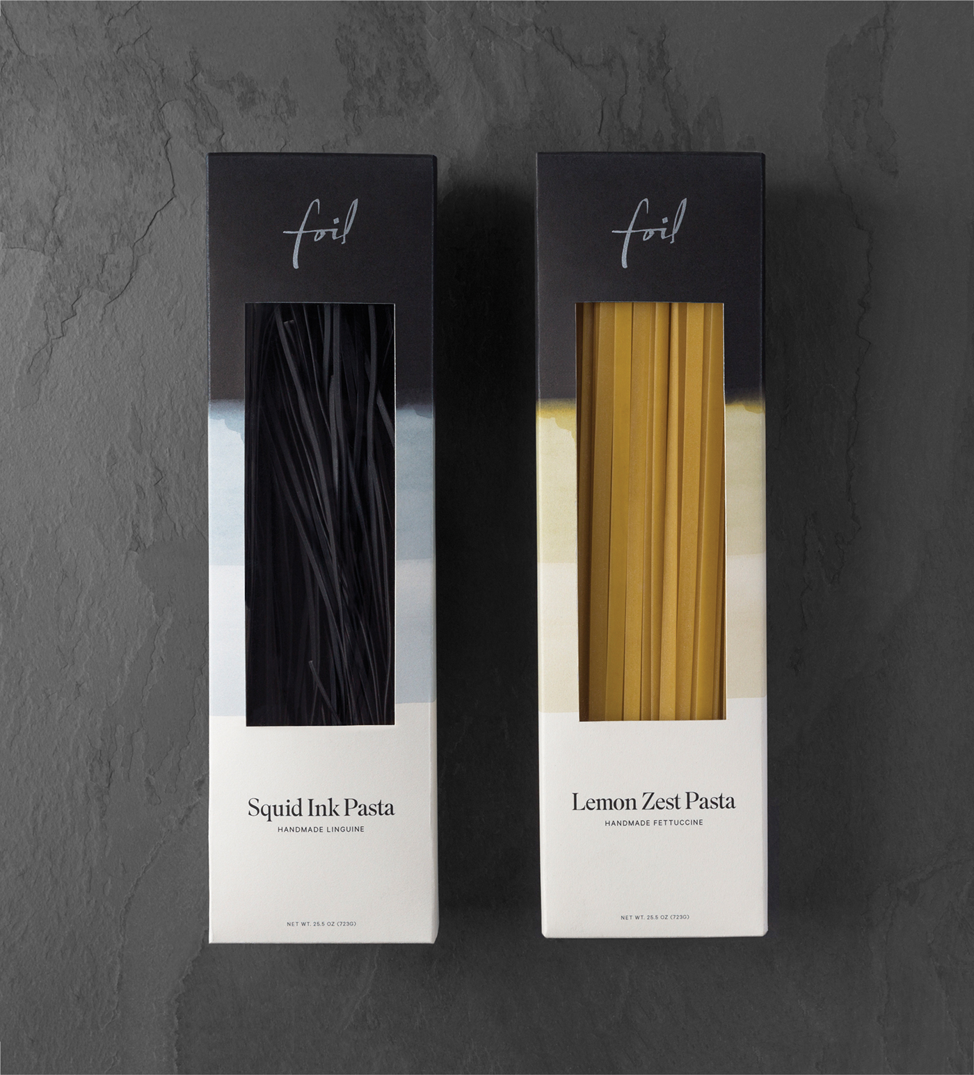
With a curated selection of local produce and freshly prepared food, Foil offers a refined alternative to conventional grocery stores.
The importance of the produce origin is signified by abstract graphics inspired by the natural surrounding of each product. In contrast with the raw nature and to emphasize the quality of the products, each package is adorned with the calligraphic word mark and a delicate typographic system.