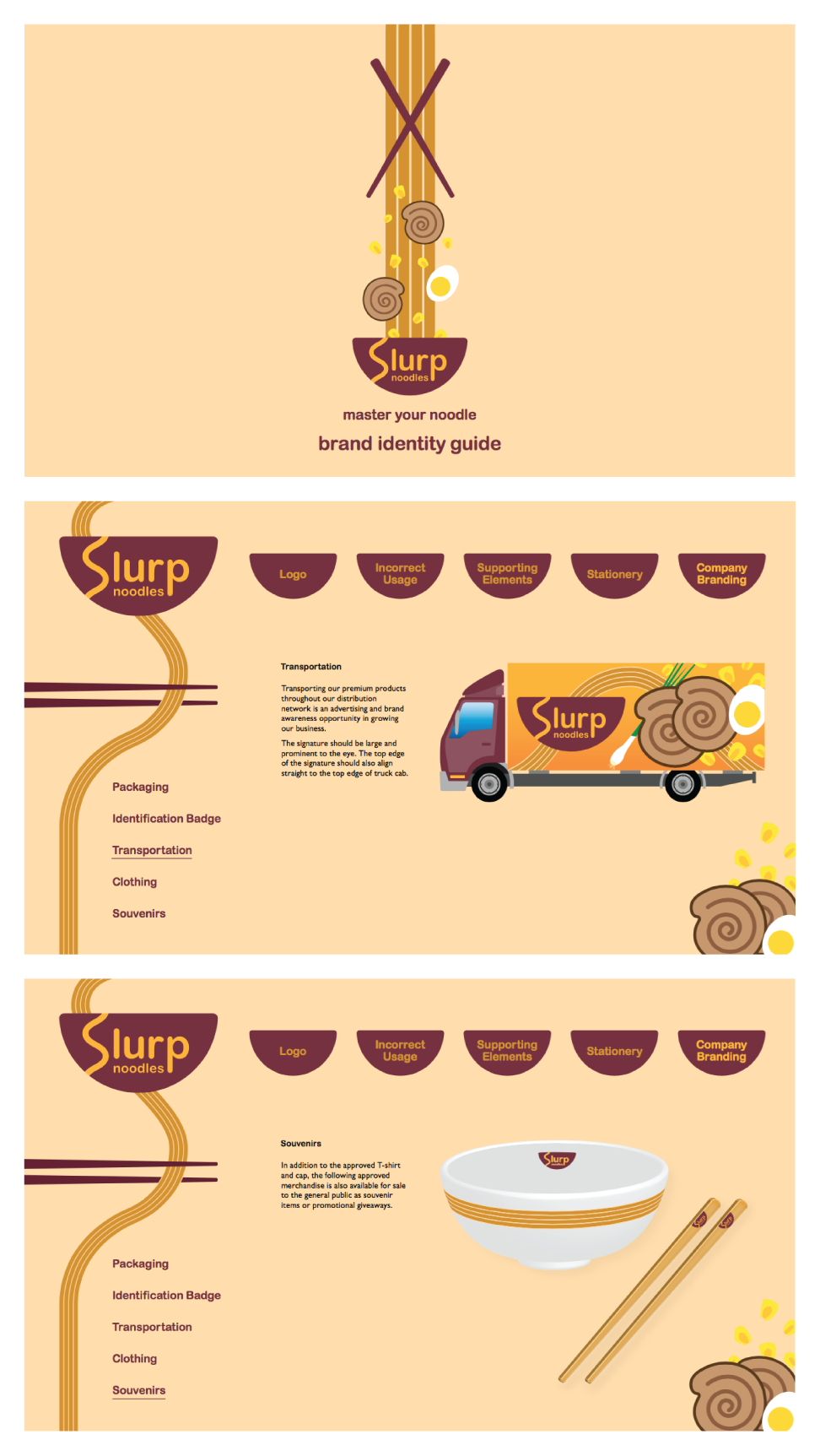

PREFACE
Brand identity style guide for a new concept instant noodles company specializing in fresh premium ingredients.
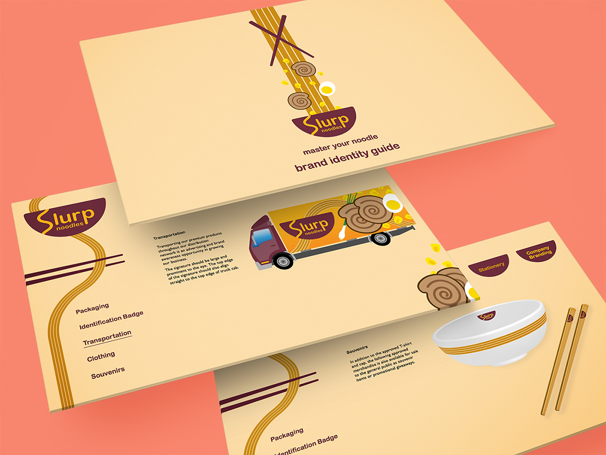
THE COMPLETE PACKAGE
The logo in the final design consisted of the "S" representing the curliness of the fresh noodles. The soft-nature of noodles is also carried throughout the design of the bowl and the typography. There are no sharp corner edges in the new company's logo identity.
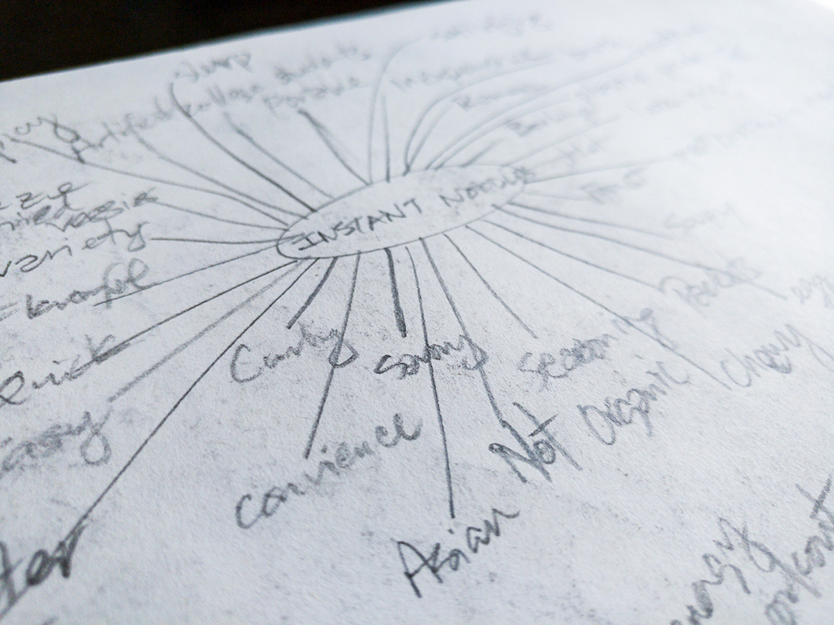
BEFORE DRAWING
Before logo sketching could begin, a network of ideas that could potentially conceptualize the new company were mapped to a visual diagram.

LET THE FUN BEGIN
Diving into logo sketching, various approaches were utilized in trying to capture the essence of the brand.