Ehara Engineering
Corporate Identity
Corporate Identity
Focussed on precision, reliability and efficiency in manufacturing, the mumbai based engineering firm, Ehara Engineering helps its clients compete and grow by providing quality manufacturing solutions and cutting edge precision sheet metal draws.
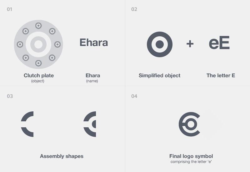
To bring about the essence of the company in a symbol, it had to reflect their core competencies (like precision, reliability) and their primary expertise (Metal pressing, deep drawing, assembly).
To bring about the essence of the company in a symbol, it had to reflect their core competencies (like precision, reliability) and their primary expertise (Metal pressing, deep drawing, assembly).


To bring about the essence of the company in a symbol, it had to reflect their core competencies (like precision, reliability) and their primary expertise (Metal pressing, deep drawing, assembly).

The logo comprises of precisely cut rings that assemble together to form the letter "e" denoting ehara, the name.
The logo has been kept simple and is easy to reproduce on various surfaces ( like paper, web, metals etc).
The logo has been kept simple and is easy to reproduce on various surfaces ( like paper, web, metals etc).


The symbol is Clear - representing precision & Rigid - representing reliability


The colors used belong to the yellow-orange and Navy blue families. The significance behind using them are
Orange - a bright and warm color indicates ambition, stimulates activity and enthusiasm.
Dark navy blue - this is a more earthy color with cooler shades used to complement the orange. It indicates rigidity and acts as a solid foundation color.
Orange - a bright and warm color indicates ambition, stimulates activity and enthusiasm.
Dark navy blue - this is a more earthy color with cooler shades used to complement the orange. It indicates rigidity and acts as a solid foundation color.


