This is our response to a request for proposals of the french Réunion des Musées Nationaux (united national museums) - Grand Palais for which we have already been working for several years. The request was to symbolize Art History through logo and possibly face compositions by gathering a few artistic works.
The difficulty was that a logo distinguish itself from an illustration in the sense that it is extremely schematized. Therefore, it is hard to make a piece of art recognizable with only a few lines, even if it's famous. So we had to select very famous works that were highly different for a non informed eye to understand that it's a fusion between two separate worlds, styles and times.
This is the main difficulty. The logo has to be effective in black and white as well. But all styles do not transpose easily into black and white. Here are some of our propositions.
This is the main difficulty. The logo has to be effective in black and white as well. But all styles do not transpose easily into black and white. Here are some of our propositions.
//
Voici notre réponse à l'appel d'offres auquel nous a convié à participer la Réunion des Musées Nationaux - Grand Palais pour qui nous travaillons déjà depuis quelques années. La demande était de symboliser l'Histoire de l'Art au travers du logo et éventuellement, la composition d'un visage par l'addition de plusieurs oeuvres.
La difficulté que nous avons rencontrée pour cette piste est la suivante: alors qu'un logo se démarque d'une illustration par sa schématisation à l'extrême, une telle composition est complexe, car il faut en peu de trait représenter une oeuvre et surtout, permettre à un spectateur de la reconnaître. Il faut donc sélectionner des oeuvres suffisemment célèbres et aux styles radicalement différents pour qu'un oeil non averti comprenne qu'il s'agit là d'une fusion entre deux monde, entre deux styles et entre deux époques.
Là est la difficulté principale. Tous les styles et toutes les oeuvres, ne se traduisent pas facilement en noir et blanc, car avant d'être pensé en couleurs, le logo devra fonctionner en noir et blanc. Voici donc certaines de nos propositions.


Here we propose another logotype principle.
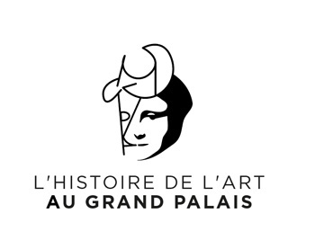
We merged a horse representation from the Lascaux caves painted 18'000 years ago (the croup), and a drawing of Pablo Picasso (the head). With only a few lines, even a single one for Picasso, we remind about the fact that man always tried to represent the same subjects with not such a different eye throughout the ages.
//
Ici, nous proposons un autre principe de logotype.
En deux mots : et si nous choisissions de mettre en scène l'une des toutes premières choses que l'homme s'est appropriée artistiquement.
Nous avons ainsi fusionné une représentation du cheval provenant des grottes de Lascaux, peinte il y a 18 000 ans (la croupe), et un dessin de Pablo Picasso (la tête). Réalisés avec quelques traits, voire même un seul pour Picasso, l'on rappelle ainsi que l'homme ne cesse de représenter les mêmes sujets avec des regards pas si différents finalement...


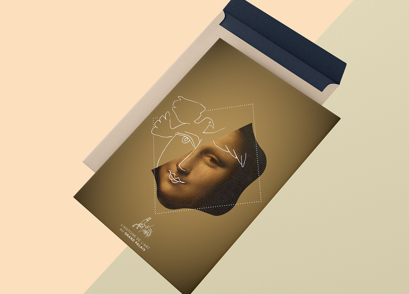
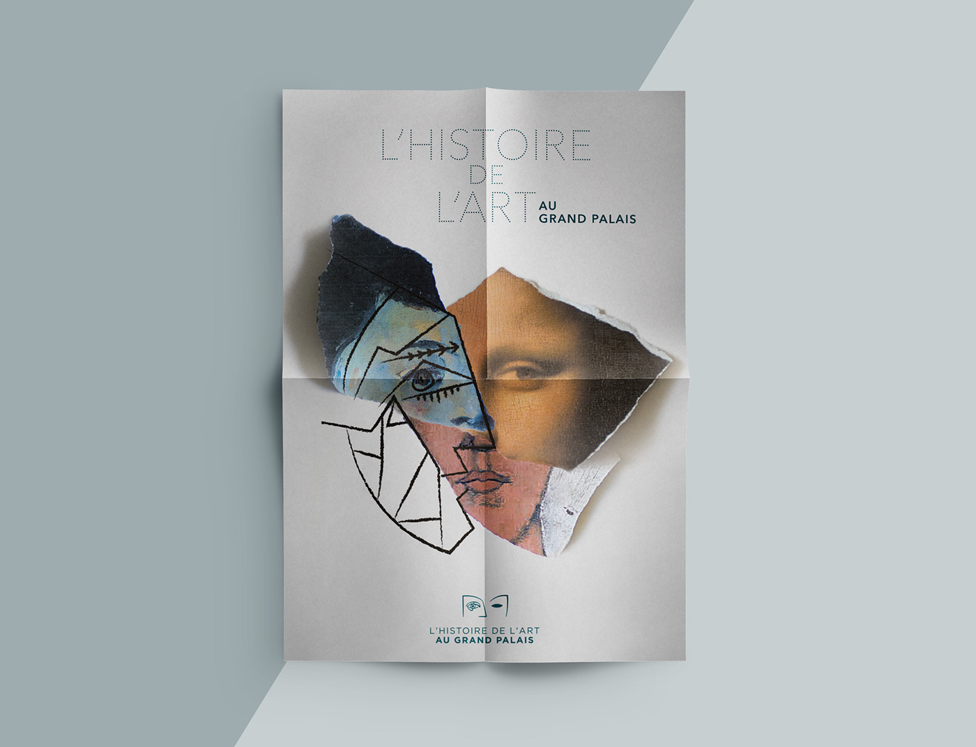
The visual inspires from several art works. Combining two works is playing with two times, playing with representation styles and techniques. This is what we wanted to show here. The Mona Lisa portrait has similarities with the face drawed by Picasso. What if we would tell something more with this imagery ? If we alluded to the idea that artistic movements, often launched in contradiction to the previous ones, were maybe not so distant, or at least, not so incompatibles. What if arts anwsered each others back throughout centuries ? Isn't the artistic expression essentially a universal thing beyond all movements and trends ?
The selected art work fragments jostle, are piled up but are building... history. We remind in the second proposition, with the canvas-like or paper representation of artworks, that they are before everything tree-dimensionnal products, originaly blank, that men have sublimated with their magic.
//
Le visuel reprend l'idée d'un mélange entre plusieurs oeuvres. Allier deux oeuvres, c'est jouer avec les époques, jouer avec les styles de représentation et les techniques. C'est ce que nous avons voulu représenter ici. Le portrait de Mona Lisa a des similitudes avec le visage dessiné de Picasso. Et si l'on racontait quelque chose de plus avec ce visuel. Si l'on évoquait l'idée que les mouvements artistiques, souvent lancés en contradiction avec ceux qui les ont précédés, n'étaient peut-être pas tant éloignés, ou du moins, pas tant incompatibles. Et si les arts se répondaient au travers des siècles? Car au fond, l'expression artistique qui anime l'homme depuis des siècles, voire même des millénaires n'a-t-elle pas un caractère universel au-delà des mouvements et des modes.
Des morceaux d'oeuvres sélectionnés se bousculent, s'entassent mais construisent... l'histoire. L'on rappelle dans la seconde proposition, par la représentation des oeuvres sous forme de toiles ou papier, qu'elles sont avant tout des produits en trois dimensions, vierges à l'origine que des hommes ont transcendé par leur magie.